Latest news about Bitcoin and all cryptocurrencies. Your daily crypto news habit.

I’ve been hiring designers for the past 4 years. During that time, I’ve seen amazing portfolios and terrible ones.
This is probably going to be controversial. It might annoy you — but this isn’t about what’s right. This is just my practical trick to get you more interviews.
Here’s the biggest hurdle I faced when recruiting designers:
UX portfolios have too much text
Recruiters review hundreds of portfolios per day. They spend probably 5 minutes per portfolio on a good day. On a bad day, it might be 30 seconds.
They won’t admit it, but they don’t read most of what you write.
As a UX designer, this is horrifying because your portfolio is mostly information. It’s the problems you need to solve. It’s your research, your deep insights, and the clever ways you solved these problems. None of this matters if the recruiter doesn’t read it.
Even if the recruiter has time to read, it’s tough to properly judge UX from looking at wireframes and mocks. The best way to evaluate an onboarding or a purchase flow is to use the product.
If available, you should provide links to shipped products and interactive prototypes. Even then, recruiters might only have time to try one or two. Also, recruiters are not your target audience. They might not appreciate your solution as much as your real users would.
Most of the time, I review student portfolios. This means there is no real product to try. It’s all text, wireframes, and a few mocks.
So what should graduate UX designers do?
Show as much UI and visual design as you can
Maybe you specialize in UX. Maybe you don’t think you’re good enough at UI.
However, if you want to get more interviews, my recommendation is to get good at it and have a lot of it in your portfolio.
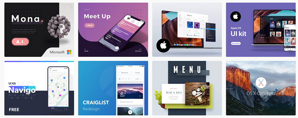
One of my favorite designer out there is Salomon Aurélien. Check out his Dribbble and Behance. I guarantee he’s flooded with job offers every day.
 Aurélien’s Behance page.
Why? Because it’s easier and faster to judge UI than UX. Great visual design is instantly obvious. A 10-seconds look at Aurélien’s portfolio is enough to immediately feel the quality.
Here’s the most messed up part: When recruiters see amazing UI, they immediately assume that the designer is also amazing at UX.
This is the attractiveness bias. We attribute unrelated positive qualities to beautiful things. It’s true for people, architecture, and also for design portfolios.
I know, it’s wrong. I’ve worked with great UI designers who were terrible at UX, and vice versa. Still, when I see great UI, I can’t shake off that feeling.
Aurélien could be terrible at UX. It wouldn’t matter. He would still get a ton of job offers.
If you want to make it as easy as possible to get interviews, focus on UI.
UI gets you the interview. UX gets you the job
This is how it usually plays out. Recruiters source hundreds of portfolios. They make quick judgment calls based on first impressions. They narrow down to a few candidates. Then, they reach out and talk about UX.
The interview is the best time to show off your UX work. You have the full attention of the recruiter. You have the time to explain the problems, the research, your findings, and your clever solutions. You can demo your prototypes and explain why the design matches your target audience’s needs.
UI gets you the interview. UX gets you the job.
“But I suck at UI”
Bullshit.
There is no such thing as being bad at UI. Visual design is a skill that can be learned just like anything else.
When someone tells me they suck at UI, I assume two possibilities. Best case scenario: they never took the time to properly learn it. Worst case: they suck at design in general, so they “specialize” in UX because it’s easier to hide.
I’ve done both UX and UI for 10 years. In my experience, UI is much easier than UX. It’s the easy and fun part — the dessert at the end of a hard project.
If you can’t figure out proper color and spacing, I don’t know that I can trust you to fix our multi-million dollar purchase flow.
“How can I learn UI?”
Here are the best ways to improve at UI design:
- Learn the fundamentals
- Develop an eye for good design
- Practice and share
1. Learn the fundamentals
“I’m not the artistic type”
The first thing to understand about UI is that is not art. It’s more objective than subjective. There are rules and logic to good aesthetics.
These rules are fairly simple to learn. I’ve seen engineers create high-quality UI after a few hours of reading up on the basics.
There’s a lot of information online about these rules. Here are a few articles to get you started:
- How To Make Your Not-So-Great Visual Design Better
- Fundamental design principles for non-designers
- How to use colors in UI Design
- Optical Adjustment
- White Space
- Hierarchy
2. Develop an eye for good design
Once you got the basics, you should develop your taste.
This is done by looking at good designs every day. Over time, you build an intuitive understanding of what proper typography, color, spacing, and layout looks like.
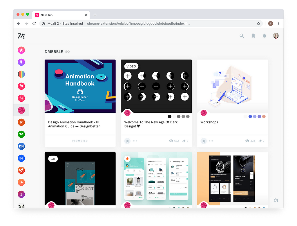
To do so, I recommend using a browser extension to replace your default tab with a Dribbble feed. I use Muzli, but you can also use Panda or Design Hunt.
 Muzli can replace your new browser tab with a Dribbble feed.
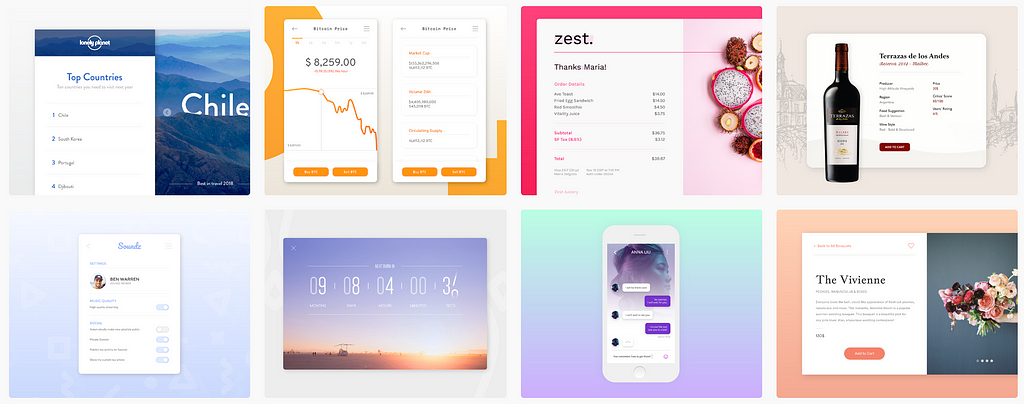
It also helps to create a Dribbble and a Behance account, and start following great designers. Here are some good ones to start with:
3. Practice and share
A friend of mine, who’s an incredible UX designer, was looking for a new job. She applied to a few places and didn’t get the responses she wanted.
She thought her portfolio was ugly, and she hated it.
So she started the Daily UI challenge.
At first, I made fun of her. I said:
“This isn’t real design. There are no constraints. This is art.”
But she did it anyway. She shared her Daily UI on Behance, every day.
After 10 days, the private messages started pouring in. Recruiters were contacting her on LinkedIn and Behance to offer interviews.
After 20 days, she had accepted her new job at Wix. She was happy, and she stopped the challenge. I was blown away.
As a designer, I don’t think she improved that much in those 20 days. She still considers herself a UX designer. She mostly does UX at her new job.
However, by creating a lot of great visuals and sharing them to the world, she got the recruiters’ attention. They couldn’t care less that there was no context or hard problem behind her designs. They saw a variety of great visuals. They saw talent, and they reached out.
P.S.
It’s OK if you want to focus on UX. Don’t force yourself into a UI if you don’t want to. But if you want to make it as easy as possible to get interviews, this is what I’ve seen works best.
Also, if you want to try Daily UI, check out CollectUI for some nice inspiration.
If you enjoyed or learned something from this, please hit the 👏 clap button. It helps to bring this text to more people.
Pro-tip: You can clap up to 50 times :)
The Biggest Mistake UX Designers Make In Their Portfolios was originally published in HackerNoon.com on Medium, where people are continuing the conversation by highlighting and responding to this story.
Disclaimer
The views and opinions expressed in this article are solely those of the authors and do not reflect the views of Bitcoin Insider. Every investment and trading move involves risk - this is especially true for cryptocurrencies given their volatility. We strongly advise our readers to conduct their own research when making a decision.
