Latest news about Bitcoin and all cryptocurrencies. Your daily crypto news habit.
I recently spoke at a Sketch Vancouver Meetup about what makes good design. The Spark co-founder (Cody Curley) who spoke before me quoted Dieter Rams’ 10 Principles (Hackernoon), which made it easy for me to follow by posing the question of whether or not people* (*designers) pondered consequences. How might we design for ‘good’? Asking the right questions before starting your next sprint is just as important as designing the right thing.
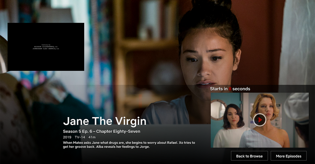
Take Netflix’s Auto-Play feature: how many of you know that there’s a checkbox you can untick in your Settings, so that this temptress in the night doesn’t autoplay the next telenovela episode of Jane the Virgin? I didn’t expect that 90% of the Meetup crowd would be incredulous to the fact that there was even such a feature.
 Deadly cliffhangers — but quirky writing good in small dosesDid the designers of Netflix’s Auto-Play feature consider how it would effect people’s sleep in the wee hours of the morning, or were they only concerned about meeting engagement KPIs?
 A possible ‘dark pattern’ (https://www.darkpatterns.org/). Want to sleep? Turn that Auto-Play off!
If you were the designer, keeping in mind that everyone has some form of time constraints before client approval, would you consider letting people opt-in to use this feature during its rollout, or would you purposefully layer it into a deeper Playback Settings menu so that people wouldn’t think twice about letting the next show auto-play?
“It depends.”
Define: Good
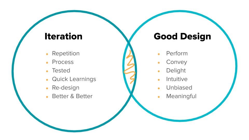
Before I started my talk, I asked everyone what they thought iteration meant, and what ‘good design’ meant. The verdict: meaningful, intuitive, and simple designs (aka ‘good’) cross paths with better and better re-designs that result from sound usability testing and UX research. My favourite!
Benefits of Qualitative Research
Once we all aligned on the same perspective as a starting point, we talked about how to get there. I shared some case studies about how live usability testing, using qualitative methods such as Fly on the Wall observation, Shadowing, Experience Sampling Method, Card Sorting, Paper Prototyping, and Cognitive Walkthroughs helped hone in on the right research questions. We all have our personal biases, regardless of how many years we’ve been doing this. Taking ourselves outside of our assumptions, and (re)immersing ourselves in the shoes of the people we are designing for more often than not results in new ideas.
Ever had a stakeholder be skeptical about spending money on qualitative research? Whenever we gave them direct access to end customers who interacted with their product or service, which is better than any video recording or verbatim quote, leeriness transformed into confident advocacy for user research prior to validating a product strategy.
Of course, we always triangulate qualitative insights with quantitative data, wherever possible.
Why ask The Five Whys
Good designs fit our needs so well they are invisible. — Donald Norman
When I shared an example from my Master of Interaction Design project with Tuen Mun Nursing School (Experience Sampling Method) that was featured in TU Delft’s Pick-A-Mood product manual, I also remembered how Donald Norman (interaction-design.org) swore by The Five Whys when I had a master class with him in Hong Kong as his favourite design methodology.
Whether it is at the beginning Discovery phase, middle Synthesis, or conclusive Design and Test part of the design process (which doesn’t need to be sequential), asking ‘why’ is important in any good design. For example:
- Why does the client want people watching this video?Because we want people to learn what the video has to say.
- Why do we want people to learn what the video has to say?Because that’s the whole point of creating this tool.
- Why are we creating this tool?Because people are complaining about this change.
- Why is this change happening?Because more and more people don’t understand it.
- Why don’t people understand it?We’re not sure why people don’t understand it…
This is a great question to answer the original question, and one way to ask the primary research question: How do people currently understand the changes that are happening?
Don’t be afraid to ask ‘why’. Here’s why.
You may be wondering why this topic is discussed at a Sketch meetup anyway. Why not? As designers, we make meaningful decisions in any UX and UI Sketch file that impacts people. Every atom, molecule, organism, component, design system, webpage, website, and product or service leads to an interaction (read Brad Frost). Every interaction I currently design is between a human and a computer, where time is a constant, though a constant change. If time is always ticking away, how might we spend it with the people who matter most to us? I hope you spent your time well (see Humane Tech, aka Time Well Spent) reading this reflection, and consider this a break in your day to get back to what’s left of your day.
Iterating on Good Design was originally published in Hacker Noon on Medium, where people are continuing the conversation by highlighting and responding to this story.
Disclaimer
The views and opinions expressed in this article are solely those of the authors and do not reflect the views of Bitcoin Insider. Every investment and trading move involves risk - this is especially true for cryptocurrencies given their volatility. We strongly advise our readers to conduct their own research when making a decision.
