Latest news about Bitcoin and all cryptocurrencies. Your daily crypto news habit.
 Image Source
For as much press as SEO, PPC, and other digital marketing methods get these days, there’s no denying that the experience customers have when they visit your website is ultimately what makes or breaks your e-commerce platform.
As a marque panel of mine established at Web Summit 2018: Quite simply, it doesn’t matter how good the rest of your digital marketing efforts may be.
If your website is full of UX mistakes, your potential customers aren’t going to stick around, and your business will suffer. When 88 percent of customers are unlikely to revisit a website after a poor user experience, this can seriously hurt your business.
Sadly, despite all the strides we’ve made in the world of Web development, far too many companies still let themselves get tripped up by easily-avoidable UX mistakes.
So which UX mistakes do you need to watch out for?
Here’s a look at seven that are surprisingly persistent:
1. No White Space
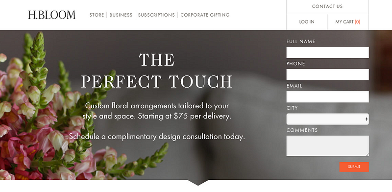
Whether site visitors are greeted by a massive wall of text or a cumbersome collage of images and site elements, a cluttered design that is lacking in white space can be an immediate turn-off to prospective customers.
White space gives breathing room to the elements on your site.
It makes your content easier to digest, and it helps the most important pieces of information on your page — like a signup form — stand out that much better.
Even simple steps — like converting large paragraphs into bullet point lists, or adding blank areas between separate design elements — can make your website more visually appealing and less likely to intimidate visitors.
2. Complicated Forms
Signup forms are especially popular for B2B companies trying to get visitors to sign up for a newsletter or free software trial, but many e-commerce companies also rely on signup forms — particularly those that get consumers to sign up for a monthly subscription or membership.
While you clearly need some personal information in order to land a signup, many companies unnecessarily complicate the process by overwhelming visitors with form fields.
Research has actually shown that the more form fields a website has, the less likely it is to convert. Internet users don’t want to waste their time filling out a lengthy form — especially if it asks for too much private information.
Don’t scare potential customers into thinking your site poses a security risk — only ask for the information that you absolutely need to help your customers sign up or make a purchase.
3. Slow Load Time
We live in an age of instant gratification, where high-speed internet connections allow users to load the majority of site content in only a few seconds.
Unfortunately, this serves as a double-edged sword — almost any delay in your site’s load time can cause users to click away before ever viewing your content.
Google itself notes that e-commerce websites shouldn’t take longer than two seconds to load.
This is what users expect, and even a minor delay can cause you to miss out on key conversions. It’s estimated that even a one-second delay will cause you to lose seven percent of your conversions.
Simple steps like optimizing images and minimizing HTTP requests and plugin use can help you shave precious seconds off your site loading time and ensure a better overall user experience.
Web Page Test and other performance-evaluating sites can help you evaluate if you need to do more to speed up your site.
4. Mobile Unfriendly
It’s painful that this point still needs to be brought up in 2019, but far too many e-commerce businesses have not taken steps to optimize their site content for mobile users.
As bad as a website that hasn’t been optimized for mobile is, however, many companies move from one mistake to another by trying to force consumers to download an app to access their content, rather than simply providing access to a mobile-friendly site.
The average mobile consumer already has plenty of apps on their device.
They aren’t going to want to add to the clutter by downloading your app, especially if they’re not sure they actually want to use your product or service.
Don’t make it impossible for your potential customers to access your store. Optimize your website for mobile users so customers can quickly find what they’re looking for in as few steps as possible.
5. No Contrast
Many e-commerce sites aim for a cautious approach when selecting a color scheme, and for good reason. Nobody wants to relive the garish website blunders of the 1990s.
However, this cautious approach causes many e-commerce sites to miss out on an important factor in using color: implementing appropriate contrast.
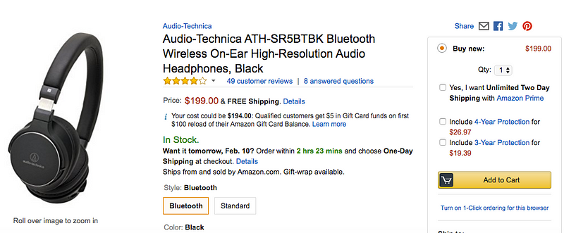
If your entire website is in varying shades of blue, it can become difficult for customers to find the information that is most important — like a “Buy Now” button, for example.
Contrasting colors, on the other hand (like an orange button over a blue background) allow the most important elements to visually stand out.
UX testing has indicated that contrasting design elements tend to generate the highest number of clicks — so if you want to make it easy for your customers to make a purchase, you’d do well to offer up a bit of contrast for your most important design elements.
6. Poor Content Quality
It’s easy to get caught up in the design elements of your store experience and let the actual content take a backseat. But as many e-commerce stores have learned, no amount of quality design can make up for poorly-written content.
From your store’s “About” page to individual product listings, the written content on your website sets the tone for the user experience. It highlights your brand’s personality. It offers calls to action. It provides the information that will persuade consumers to make a purchase.
Make written content a low priority, however, and you’ll have a hard time convincing customers to buy your product or service, regardless of how great the rest of your UX is.
Focus on creating attention-grabbing headlines and persuasive body copy that will convince customers to make a purchase — otherwise, site visitors will look at your nice design and quickly move on.
7. Not Testing
As important as the above UX elements are, testing is by far the most important thing you can do to ensure a quality experience for your customers.
It’s hard to imitate the actual experience of someone who is visiting your store for the first time.
You can’t just assume that your design will work flawlessly because you think you’re following top UX principles. A group of test users could encounter a killer flaw that would cause the majority of customers to quit your site altogether.
Testing can be especially valuable when comparing different color schemes, call-to-action buttons or images. By conducting A/B testing, you could very easily discover new insights that will dramatically increase conversions when your site launches.
In most cases, multiple rounds of testing are required to get the best results.
Conclusion
At the end of the day, your site’s user experience will completely define the way customers perceive your brand. Actually, it will likely determine whether or not they ever interact with your brand again after that initial contact.
As you adjust your design to avoid these common UX mistakes, your site will become easier to navigate, be more visually appealing and most importantly, do a better job of converting site visitors into paying customers.
7 Painfully Common UX Mistakes That Kill E-Commerce Conversion was originally published in Hacker Noon on Medium, where people are continuing the conversation by highlighting and responding to this story.
Disclaimer
The views and opinions expressed in this article are solely those of the authors and do not reflect the views of Bitcoin Insider. Every investment and trading move involves risk - this is especially true for cryptocurrencies given their volatility. We strongly advise our readers to conduct their own research when making a decision.


