Latest news about Bitcoin and all cryptocurrencies. Your daily crypto news habit.

No matter whether you’re a beginner or a professional, humans are prone to mistakes. But do you know mistakes in UI can create havoc in your career? User Interface is all about how the app or a website interacts with the user including the interface logic, human-computer interaction as well as appearance. The main purpose of UI design and development is to deliver the product to customers in a timely and graceful way. If you come up with effective UI design the number of visitors will eventually increase!
However, if you are beginner, it is important to change your attitude towards criticism and mistakes. Don’t get panic when you commit a mistake while developing the UI design! You should learn the preventive actions and discuss with the seniors regarding the issue and get a popular resolution.
So here in this article, we will discuss top mistakes made by beginner UI designers and ways to avoid them:
1. Not adhering to grids-
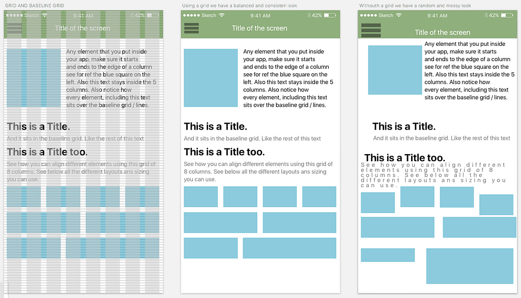
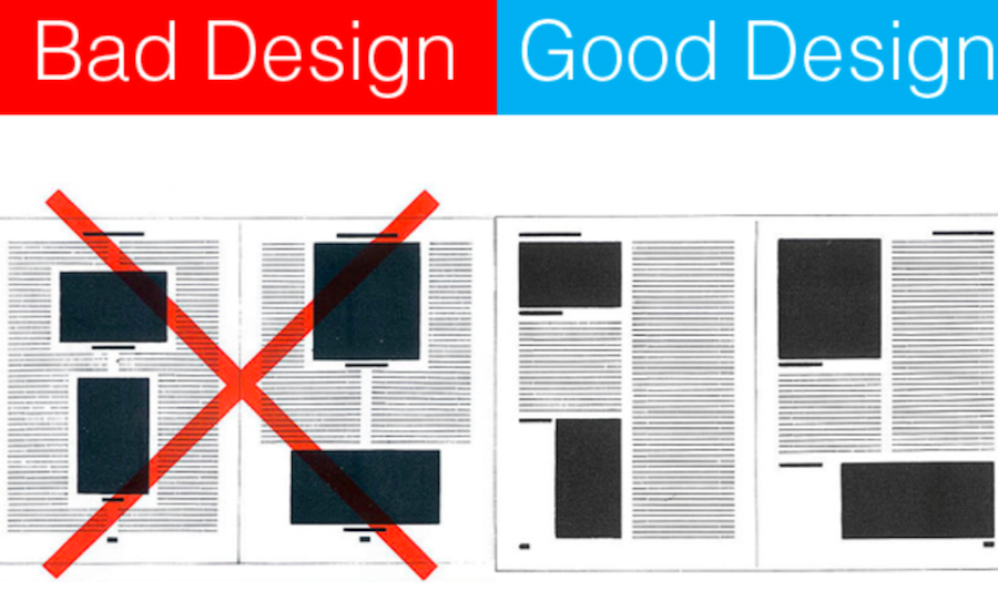
Grids assist designers to line up the elements on the page in relation to each other which often creates a neater and more logical design. Even though the grids are invisible, most successful designers stick to a strict grid, usually made up of 8, 12, or 16 vertical columns. If you are capable enough to implement a well-organized grid, it can transform your design from somewhat average to something clear, effective and clean.
Below image can help you see the difference between without grids the mess and with grids the perfect design:
2. Don’t forget to consider different resolutions-
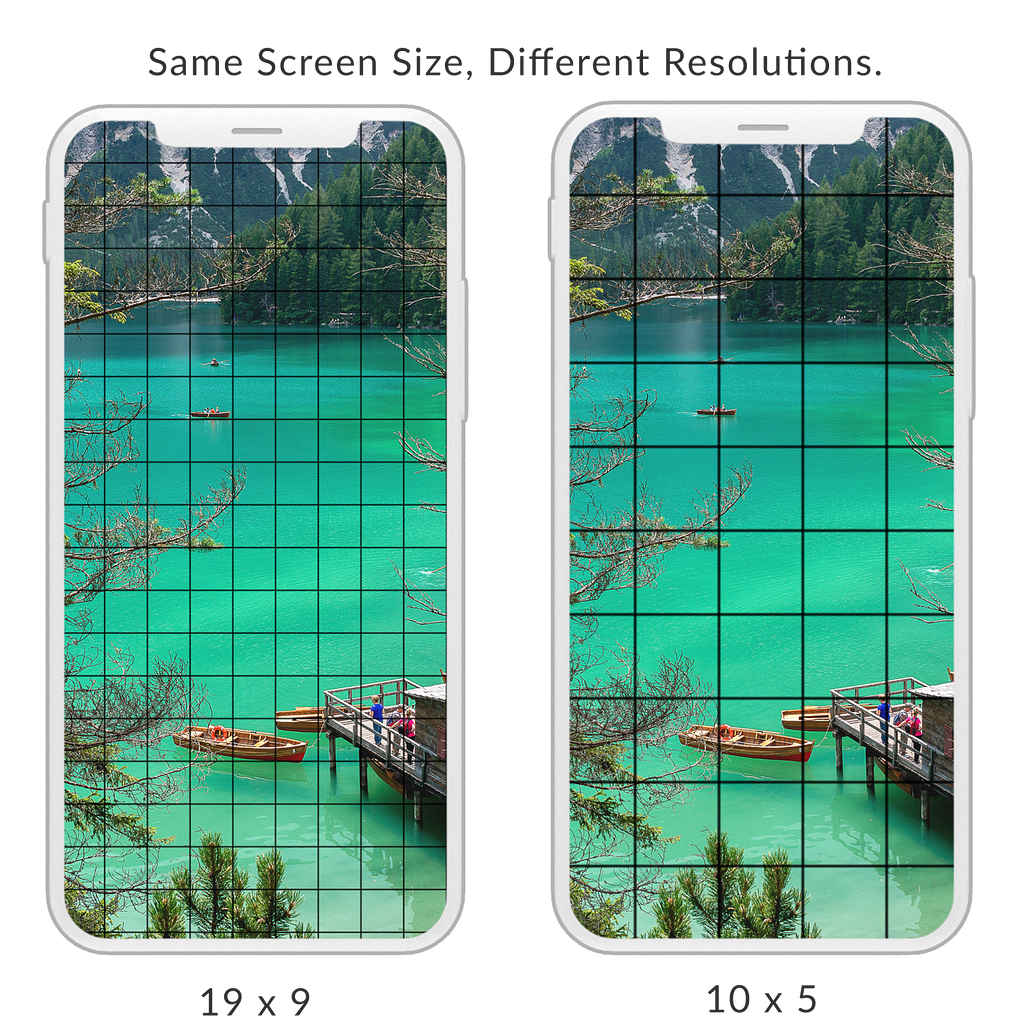
When you keep difference in resolutions in limelight it helps in creating a new interface that will make sure less updates in the future and maximize visibility. There are innumerable designers who test their designs on desktops a number of times, but when they publish it, the design seem wrong to them. And more importantly, it looks worse on the client’s desktop. It has been proven by experts that customers don’t like to scroll websites or apps to the end, so design your website in a way that it covers all the information in the upper most part.
See how images look in different screen size with different resolutions. Therefore, it is important to take the resolution work seriously and test your website on every desktop available as well as mobile devices.
3. Not boasting high contrast between background and figures-
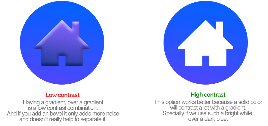
We all know that elements are alleged as ground (the landscape or ground on which figures lies or figures (distinct elements of focus). A low contract between these two results in a loud design, which means the background compete with the figures, creating messy and disgusting look.
Observe the image below:
4. Drop shadows-
Many designers fail in this phase. When it comes to adding drop shadows it is vital to do it in a “realistic way”. Now you might be wondering how a realistic drop shadow looks like? Well, it should be soft and amalgamate with the background well. For achieving this, one must utilize black color to add drop shadows. However, in reality, shadows are not in black color they are the dark versions of whatever they sit on top of. Observe the image.
5. Ignoring the White Space-
When you use white space it seeks the attention of users, guide their eye in a particular direction and create clear visual hierarchy. So don’t ignore the white space and utilize it as much as you can. It will help you avoid “cluttered” look that can hamper your efforts to communicate with your audience. If you don’t utilize the spaces smartly around elements, it will just compound more problems and result in clutter website or app.
6. When clickable items don’t seem to be clickable-
If you want the visitor to click on a certain element, it is apparent that you should make the appearance of the element clickable. For example, if it’s a link, either change color or underline the link and if it’s a button add contrast color to the webpage. Moreover, don’t forget to add a hover state, mostly in Menu links: it is important to highlight items in the menus when customer hovers over them.
7. Inconsistent icons-
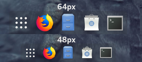
Many beginners make the mistakes of mixing squared corners with rounded corners, which doesn’t a give consistent look to the website or app. If your each icon is in different color it will make the appearance of the website worse.
8. Sluggish and clunky contact us forms-
Sometimes businesses require client’s data and so they add contact us form in their website. If you create a sluggish and clunky form demanding excessive details, no one will fill it. So it is important to keep the design of the form simple and straightforward with minimal details and step involve that will make it concise and clear.
UI designing seems to be tough in the beginning, but the real challenge begins when you have so many approaches in hand to resolve the problem that you don’t know which one is the best. If you’re a beginner it is important to learn all the rules involved in UI and the standard rules applicable in specific niche.
8 Beginner Mistakes to Avoid by a UI Designer was originally published in Hacker Noon on Medium, where people are continuing the conversation by highlighting and responding to this story.
Disclaimer
The views and opinions expressed in this article are solely those of the authors and do not reflect the views of Bitcoin Insider. Every investment and trading move involves risk - this is especially true for cryptocurrencies given their volatility. We strongly advise our readers to conduct their own research when making a decision.
