Latest news about Bitcoin and all cryptocurrencies. Your daily crypto news habit.
New websites come and go each day, but some always stay on the top. The reasons for this could be their content, their images, the way they style their entire webpage, all the before mentioned reasons or something else altogether.
We have decided to list out the top classic and modern website design trends that are making all the noise in 2019. Now this list will help you to choose the best website & web app design technology and trends to take into account when developing your business website.
Without wasting any more time, let’s dive straight into the list of the most trending website design elements and approaches.
Top 5 Modern Website Design Trends of 2019
The web design trends and elements mentioned here have been incorporated thoughtfully by many successful businesses. Some elements of the list may help in user interaction while other elements work to improve how the content looks on a specific device.
1. Bring a Good Hero for Your Site
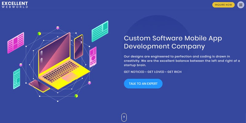
No need to find a famous model or actor to become your company’s brand ambassador. What we meant is to add a high-quality hero image. What is better than a good CTA button? A large and responsive hero image.
Famous examples of this trend can be seen on sites like Medium, Apple, and Stride. With an amusing hero image, you can give a clear and precise idea about what your particular web page is offering and also create more interest in the minds of the site visitors.
Your site visitors can access your website from many different types of devices like desktop, tablet, and smartphone, so making sure that your hero image looks perfect and is responsive for all the different devices is of utmost importance in this web design trend.
2. A Picture Says a Thousand Words; A Video Says More
What is better than a large and beautiful Hero image? A Hero Video. It’s a modern website design trend that has caught attention in the last year. If you visit websites of renowned companies like Uber, Samsung, and PP Perform.
In a world where websites showcase only high-resolution pictures if you show relevant and beautiful video bytes on the website of your product or services or better yet, your customers speaking for you; it will create a tremendous impact on your site visitors.
According to a survey conducted by Forbes, a Hero video on your website can increase your conversion rates by 80% and influence customer decisions by 90%. For instance, if you provide high-end cab services like Uber, creating a video where your company’s vision like safety and comfort is highlighted will impact how people view your company.
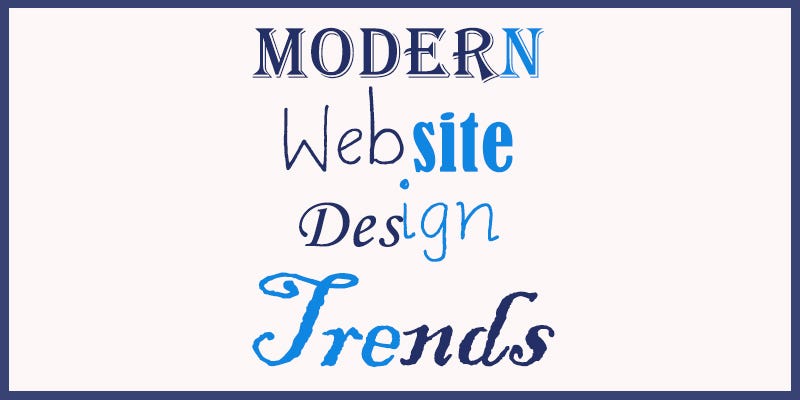
3. Typography is the Most Underrated Element of Web Designing
Instead of going with the usual fonts like Roboto, Open Sans, or Ariel. You can create your own font especially for your website (or search for a unique font that not many sites use). A unique font will not just put a fresh impression in your reader’s minds but also give you a chance to show yourself as a unique brand.
Most of the websites overlook fonts, and that is precisely where they fail to convert their customers. Just imagine how will it feel if you used a comic sans font for a bank website or a gothic font style for a children’s product website. Although the examples are much graphical, you get an idea of how it could impact your site visitors.
Using large and clear typography all through your website gives a good alignment and white space usage. Your choice of typography gives a subtle hint on what type of company you are and what are your business values.
4. Are You Up for a Hamburger?
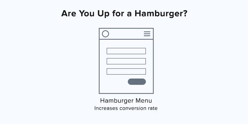
I don’t mean that we get to the nearest burger king for a bite. Hamburger menus are improving your website’s header section. If you haven’t integrated the hamburger menu to your website, you are missing out on this beautiful and helpful modern website design trend.
If you are wondering why it’s called a hamburger menu? Just view the three lines and imagine a hamburger, the layer of bun then the hamburger patties and a final layer of another bun. Due to this design element, your header will collapse to a small logo in the corner, making the webpage more viewable.
With this design element, the pages of your website will have a clear path for the readers, making the experience cleaner and distraction free. Due to this website design trend, you can be sure that your customers will find the exact information that they are looking for.
5. 3D is Out and Flat is in
Since the last two to three years, the 3D website craze was high, so high that now it has lost its charm. This year is of bringing back the good old school styles, and a semi-flat webpage design is back in style. Apple (the smartest marketing geniuses) is doing the semi-flat design.
In layman’s term, flat design is elements that don’t give a 3D perception in any way. So no drop shadows or tilted elements. Such a classic website design approach gives the reader a simpler sense to comprehend the page as well as drastically improve the site loading speed.
Conclusion
So these are the top web design technology and trends for the year. It’s not necessary to include every trend mentioned here, rather find a good blend of these elements according to your vision and style. There are many award-winning web development companies that can help you with your website development project.
Top Modern Website Design Trends for 2019 was originally published in Hacker Noon on Medium, where people are continuing the conversation by highlighting and responding to this story.
Disclaimer
The views and opinions expressed in this article are solely those of the authors and do not reflect the views of Bitcoin Insider. Every investment and trading move involves risk - this is especially true for cryptocurrencies given their volatility. We strongly advise our readers to conduct their own research when making a decision.
