Latest news about Bitcoin and all cryptocurrencies. Your daily crypto news habit.

The cliche that first impressions are everything is only a cliche because it’s true. And never more so than in the digital age.
New users can quickly get turned off by an experience when their time is at a premium, so it’s crucial to engage them from the off if your app is going to stand a chance of converting them into customers and even power users.
The onboarding process is a great opportunity to tell them how you can fix a specific problem for them, so don’t waste it.
What is an onboarding process?
Not many would disagree that the ultimate aim of an app’s onboarding process is to accommodate your potential customers to make them feel as comfortable as possible as quickly as possible.
This is exactly why a seamless app design is so important for acquisition and retention. The first process they go through is far and away the most crucial process because if they don’t come out of the other side feeling better than they did before, you might have lost them for good.
A successful onboarding is ultimately about getting your users onboard with your idea. Get that right and the rest will follow.
 Get your onboarding right and the rest will follow
Why is an onboarding process important?
If what you’re offering is something new, something fresh (if it’s not, why not?), it might take a bit of getting used to with your users. An understanding of this is a critical part of the design process for your app, so taking the time to get it right cannot be underestimated.
According to Intercom, between 40 and 60% of SaaS app users will open an app once after downloading and never return, which is obviously a worryingly high number of potentially lost users.
The simple fact of the matter is that customers have more choice and less patience than ever before, so it’s becoming harder and harder to win people over. That’s not to say, though, that your onboarding process can’t be successful; the trick is in following the kinds of approaches that bring about more ingratiation than alienation.
Customers have more choice and less patience than ever before.
Option #1: The walk-through approach
Rather than letting a user wander aimlessly through your app to work it out for themselves, it’s a great idea to walk them through the process from the second they land.
This is the most obvious choice for an onboarding process — why wouldn’t you want to be walked through a new experience to get familiar with it?
It’s a common and simple approach that has a lot of benefits, but it can also take the power away from the user if you go overboard with the onboarding.
There are many different creative directions you can take here to hook your users in, but the ‘sweet spot’ will be different for every type of product or service. Google Maps, for instance, can offer a straightforward onboarding process that takes users no time at all to get used to, which isn’t the case for many other apps.
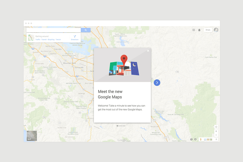 Google Maps’ walk-through design
Option #2: The involved approach
If your app requires the curation of information from a user, a nice way to begin the onboarding process is to promise the personalisation of the experience based on the answers to a few questions about them.
Apps like Headspace do this really well — the more relevant information the new user gives, the more they’ll get out of the app experience on the whole.
There’s another balancing act at play here when it comes to asking just the right number of questions so as not to turn a user off:
Ask too much of them and they’ll get bored and go elsewhere; ask too little of them and you’ll leave them frustratingly unfulfilled.
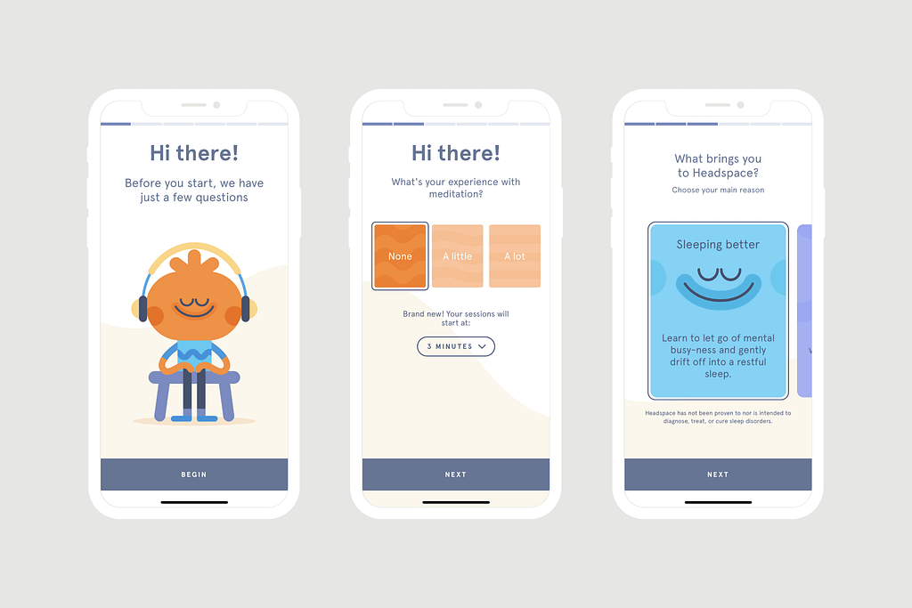 The onboarding process of the Headspace app
Option #3: The set-up approach
One strategy that is usually combined with the first option of walking people through the process is to ask them to set up an account right off the bat.
This way, they can be slightly more committed to getting to know the app, so they may be more likely to complete the walk-through after signing up.
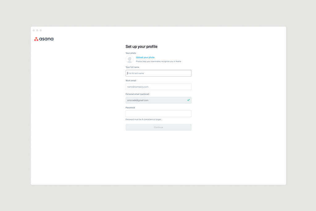 Setting up a new user profile with Asana
It’s very important to get the UI spot on here — clarity is crucial when it comes to engaging new users to the point of completing tasks within your app.
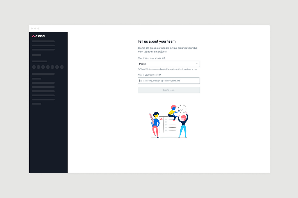 Asking for information in the set-up process with Asana
Option #4: The all-in-one approach
A brave but altogether more fruitful approach to app design is to combine all of the above and ask people to sign up whilst they submit information to personalise the experience and get shown what to do and where to go once they’re through the onboarding process.
It takes a lot more care and consideration from a design perspective, but the results can be great for your engagement metrics.
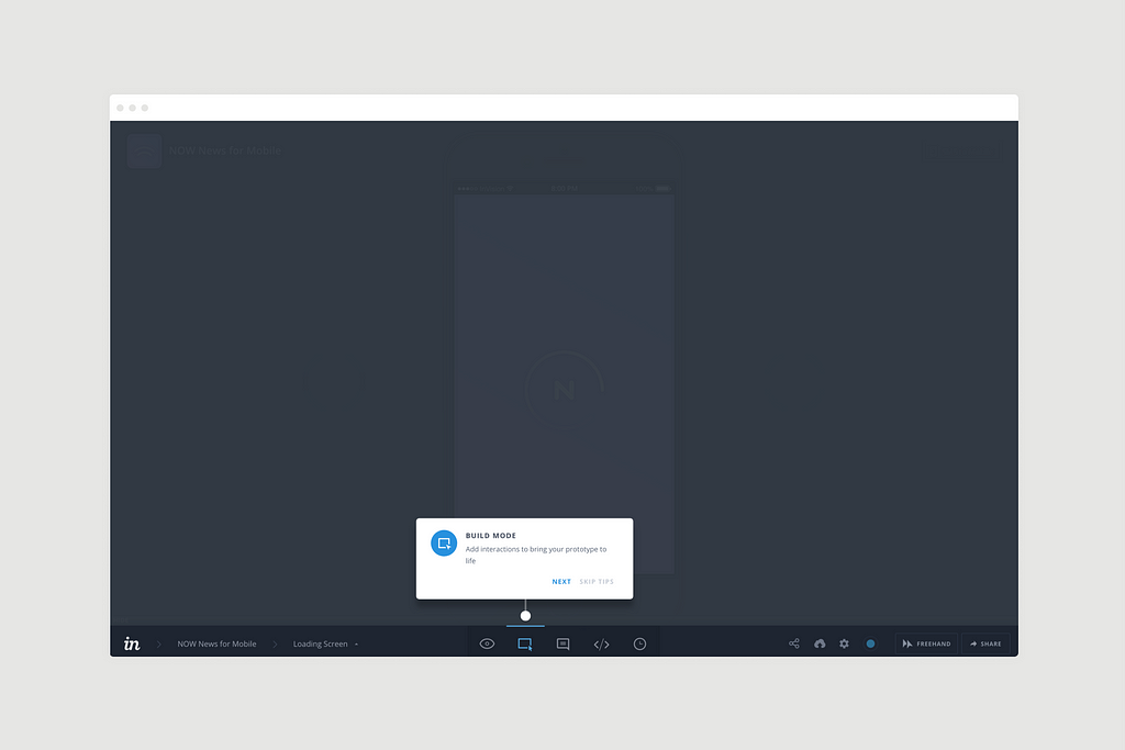
InVision has this nailed on in the way it keeps you moving through the app with more and more tool tips after you’re a committed user. You learn as you go and get a richer experience as a result.
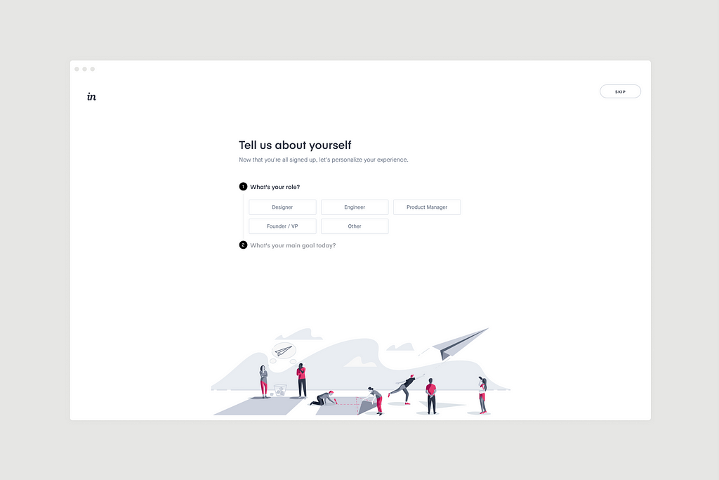 Personalising the user experience in InVision
The routes you can take as a new user in InVision are mapped out from the beginning, so you know what you can get from the app:
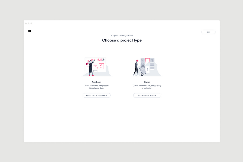 Choosing a project type in InVision
Once you’re in, InVision will still guide you through the process of using it so you’re not left high and dry:
Invest the time to invest in your users
There is so much to consider for the UX and UI design of a tech startup app that it can sometimes be overwhelming, but there is help out there if you need it.
Resources like Useronboard give non-designers, such as engineers, the inspiration they need to invest in their own users — there are many examples of how other web apps do it for theirs on there.
A failure to make it clear to a new user means a failure to complete the task you want them to complete.
It can be a difficult and time-consuming process if you don’t have the right expertise at your disposal, but it’s for that reason that too many startups overlook it and pay for it further down the line.
If you’re not confident in designing your app yourself, there is so much to be gained from seeking advice from an expert.
After all, understanding what, how and when to include certain features and benefits in an onboarding process is a crucial part of engaging and retaining customers.
Dishing out the detail
The ultimate takeaway here is that there is no one-size-fits-all approach. There are many ways to onboard users depending on the product or service you offer, so carefully consider exactly what your users need before deciding how to give it to them.
There’s nothing wrong with spelling things out in detail for people if your app needs to be complex, but remember that the longer the onboarding process, the more necessary it will be to show new users some form of progress throughout it.
The onboarding process is a brilliant opportunity to capitalise on the first impressions rule; make it easy to engage from the moment they land and engagement with the rest of your content will be an easier win in future.
 Making a good first impression is crucial for every new app
Onboarding users is crucial to any early-stage tech startup
The absence of a great onboarding process for a new startup app is likely to result in the absence of any significant levels of engagement and conversions, which will ultimately mean lost customers and even potential brand advocates in the short-, medium- and long-term.
That’s why, as part of my design consultancy services, I offer tech startups the kinds of UI and UX approaches that will make lasting first impressions on their customers.
If you’d like to know more, why not schedule an appointment today to discuss how we can solve the problem of designing a way for you to solve your users’ problems?
Need additional advice? Request my FREE Cheatsheet which includes ’47 Actionable UX Hacks to Fix Your App’.
Thanks for taking the time to read this article. If you found it helpful, please let me know. 👏👏👏
If you’d like to read more, check out my blog for regular updates.
This article was originally published at www.simonmccade.com.
4 Functional Designs to Consider When Onboarding New Users was originally published in Hacker Noon on Medium, where people are continuing the conversation by highlighting and responding to this story.
Disclaimer
The views and opinions expressed in this article are solely those of the authors and do not reflect the views of Bitcoin Insider. Every investment and trading move involves risk - this is especially true for cryptocurrencies given their volatility. We strongly advise our readers to conduct their own research when making a decision.
