Latest news about Bitcoin and all cryptocurrencies. Your daily crypto news habit.
Before I discovered CSS grid, I used bootstrap grid a lot. Bootstrap grid was a reasonable solution to the many responsiveness issues I had back then as a newbie. Then I discovered CSS grid. CSS grid’s edge over bootstrap grid is its two-dimensional quality (ability to use rows and columns) as opposed to bootstrap’s one dimension row.
On the internet, there are a lot of debates over which is better, when should each be used and how to use them. This confused me a lot. Although I use CSS grid more, I love them both. While CSS grid is considerably more powerful, I find bootstrap grid to be more flexible. Do I really have to choose?
Bootstrap has an in-built grid options system that works across multiple devices and this has helped me eliminate the use of media queries. With the use of bootstrap grid options, I can adequately position <divs> how I want them to appear on different screens without using media queries.
Here’s what I mean
Link to the pen https://codepen.io/Barrisam/pen/KYJgMm
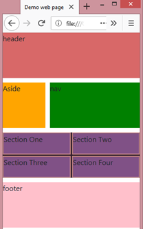
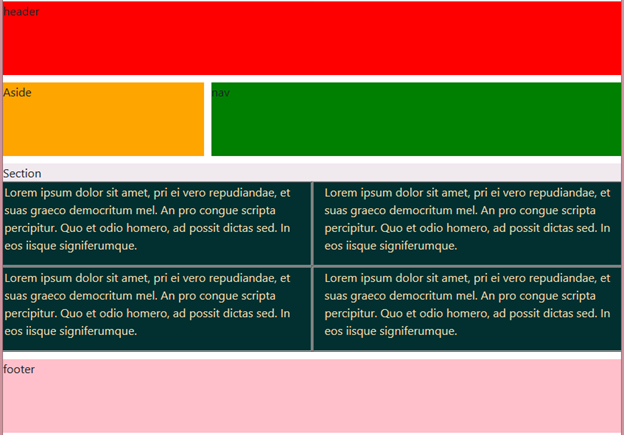
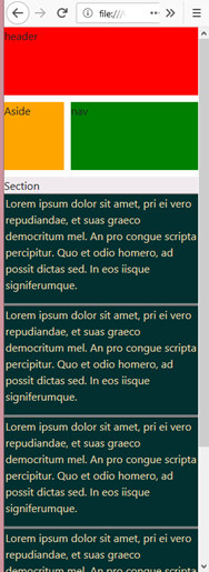
In the code above, I have created a nested grid in <section> with class .section of four columns. I actually want the four columns to each take-up half the screen width in devices less than 998px and to be stacked on each other on a small screen for easy reading. But CSS grid is not giving me this. It remains the same throughout as you can see in the image below.
 for large screen
 small screen (mobile view)
The nested grid stays the same throughout. I don’t want this. And I don’t want to specify media breakpoints in the CSS.
So I decided to nest a bootstrap grid in the class — .section to see if I could achieve the desired result.
Bootstrap grid layout allows up to 12-columns per row. On a large screen, the four columns are placed side by side. Each column taking up 3 units out of the 12-columns.
On medium screen, the columns now take up 6 units, which is an equal division of the 12-columns into two columns.
While on smaller screens like mobile devices, the columns take up the entire width and are stacked on each other.
CSS grid and bootstrap grid can work together perfectly. Rather than pit them against each other, it’s up to you to find a way to blend these two powerful grids.
Combining CSS Grid with Bootstrap Grid was originally published in Hacker Noon on Medium, where people are continuing the conversation by highlighting and responding to this story.
Disclaimer
The views and opinions expressed in this article are solely those of the authors and do not reflect the views of Bitcoin Insider. Every investment and trading move involves risk - this is especially true for cryptocurrencies given their volatility. We strongly advise our readers to conduct their own research when making a decision.


