Latest news about Bitcoin and all cryptocurrencies. Your daily crypto news habit.
Welcome to another edition in our series on data and model visualization!
In this post, we’ll:
- Examine machine learning classification algorithms on data resembling real-world use cases
- Learn about classifier metrics, including ROC and PR curves
- Visualize metric curves in Matplotlib and Bokeh
- Discuss why context matters when deploying classifiers in “real world” settings, such as in diagnostics
Code, including a Jupyter Notebook, is available on GitHub.
Classification with Real World Data
Introductory datasets for machine learning are often idealized; they’re balanced (same number of instances per class) and have a guarantee of high accuracy with most classifiers. This is great for learning — you want to encourage someone with quick wins to keep going — but doesn’t reflect how data looks in the “real world”.
Consider this example: you’re tasked with building a classifier for alphanumeric characters. If you train on real-world documents, the classifier won’t see each letter with the same frequency. Heck, if you train on certain books, you won’t see some letters at all!
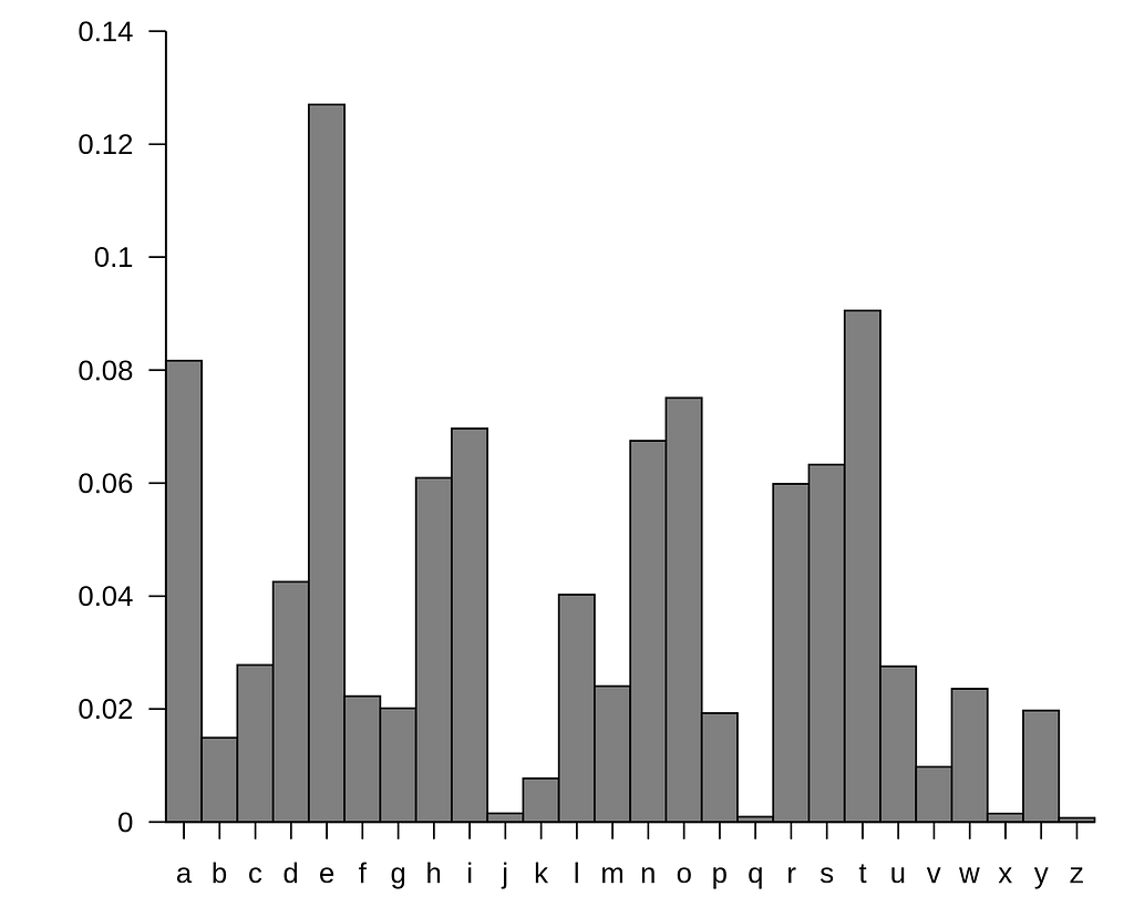 Approximate frequency (y-axis) of individual letters (x-axis) in the English language. Source: Wikipedia.
I spend a lot of my time thinking about and working on the application of machine learning to biomedicine, where populations are extremely imbalanced and we are often interested in identifying a razor-thin minority class.
Let’s dig into a toy use case:
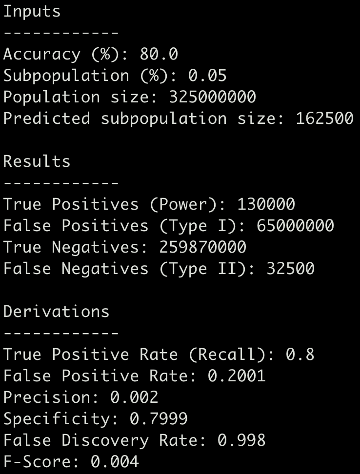
Say a patient receives a blood test to determine if they have a particular type of cancer, that the test claims to be 80% accurate, and that the percentage of people with the disease is 0.05%. Given this situation, If you tested every individual in the United States (325 million), how many people would be misdiagnosed?
I created a Python script to model this (you can find it here).
According to the math, 65 million people would falsely receive a positive result (and 32,500 patients would get a false negative) — resulting in a False Discovery Rate of 99.8%!
What’s Measured is Managed
In the aforementioned toy example, we can conclude that accuracy, while very high, leads to enough false positive results that the test is not useful if administered to all-comers. This is not to say our model is not useful (we’ll circle back later), but what I hope to illustrate is that it is useful to look at all available metrics to properly evaluate a classifier.
The most common framework to examine the utility of a classifier, in my opinion, is the Receiver Operating Characteristic (ROC) curve and the area underneath it (AUC). ROC curves are very useful, but they are made more by supplementing them with additional metrics and forming a cogent story about the behavior of the model, and how it can inform your analysis.
My favorite way to build intuition (and the inspiration for this series) is to prototype visualizations, and turn those into tools that I can embed into my workflows. In the following sections, I’ll demonstrate how to generate static and dynamic plots, including ROC and precision-recall (PR) curves, in Python (Matplotlib, Bokeh). I’ll also discuss what to look for when examining their application to balanced and imbalanced datasets.
What are ROC and PR curves?
ROC curves describe the trade-off between the true positive rate (TPR) and false positive (FPR) rate along different probability thresholds for a classifier. True positive rate is also known as recall and sometimes Sensitivity — it’s a measure of how well you can find the needle in a haystack.
Precision-Recall curves describe the relationship between true TPR and the precision or positive predictive value (PPV), which is the ratio of your true positives to all positives. In other words, it helps you understand how many fake needles you will discover on your way to finding all the real ones.
ROC curves are useful when used right
The receiver operating characteristic (ROC) curve has become the p-value of machine learning classification — it’s very frequently used, misused, misinterpreted, and mis-maligned.
However, I’d like to make the case that ROC curves (like, ahem, p-values) are useful when used right. By that, I mean they are useful when not used as a rote score, but when they form part of a nuanced description of a model’s ability to help solve the problem at hand (e.g. in the case of minority class identification, do they perform better than a random guess or assuming all instances are in the majority class).
body[data-twttr-rendered="true"] {background-color: transparent;}.twitter-tweet {margin: auto !important;}
The area under the ROC curve (AUC) is so frequently criticized and misunderstood that I often wonder whether I am the metric's only fan. Let me explain why how I see and value the AUC. (thread)
For this walkthrough, we’ll use the UCI Breast Cancer Wisconsin (Diagnostic) dataset which is bundled with scikit-learn (additional details about the dataset are at scikit-learn.org).
The UCI-WDBC dataset has data for 569 patients — who have tumors indicated as either benign (357) or as malignant (212).
First, let’s look at the distribution of the data in PC space. A quick look at the first two principal components suggests that we should be able to train a classifier with high accuracy fairly easily (you can draw a fairly good line to separate each group):
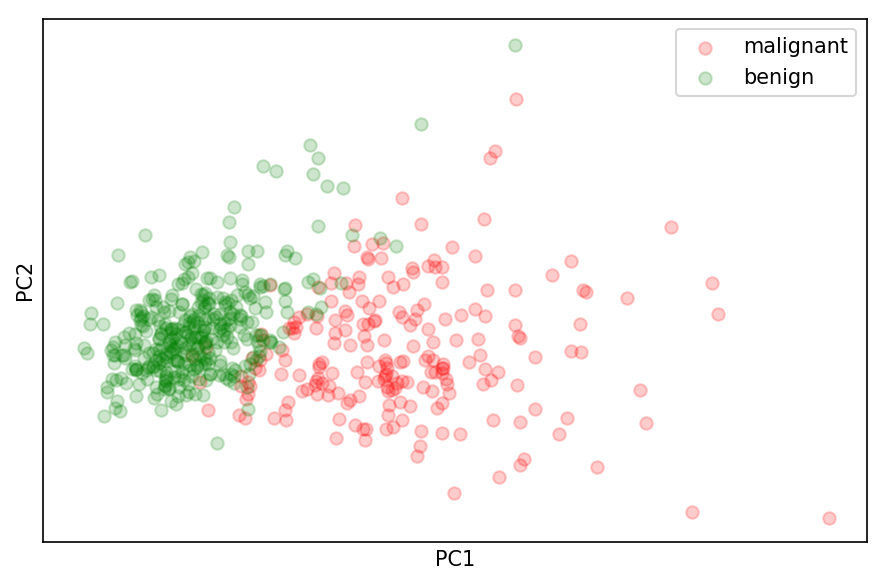 Projection of malignant (red) and benign (green) instances along the first two principal components
Let’s next train our classifier — we’ll go with the usually trusty Random Forest— and train/test on a 50/50 split of the data:
# train test split the data (X, y)from sklearn.model_selection import train_test_splitX_train, X_test, y_train, y_test = train_test_split(X, y, test_size=0.5)
# trainfrom sklearn.ensemble import RandomForestClassifierrf_clf = RandomForestClassifier(n_estimators=100)rf_clf.fit(X_train, y_train)
Once the classifier is trained, we can use it to predict the probability of each withheld test data point being in either class:
# get the probability distributionprobas = rf_clf.predict_proba(X_test)
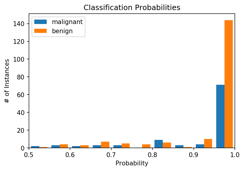
# plotplt.figure(dpi=150)plt.hist(probas, bins=20)plt.title('Classification Probabilities')plt.xlabel('Probability')plt.ylabel('# of Instances')plt.xlim([0.5, 1.0])plt.legend(target_names)plt.show()For most instances, the classifier is very confident of its determination (note the tall bars at 0 and 1 on the x-axis). However, there are a number of instances where the classifier is less certain. In some cases, it’s nearly a coin toss (0.5 on the x-axis). And you’ll note that it’s more uncertain about malignancies (our minority class) than benign instances.
So how do we choose a threshold that gives us the “best classifier performance”, i.e. one that is optimized for a metric we are interested in? In the case of a diagnostic for which we may want to minimize false negatives and tolerate some false positives, where should we assign a probability threshold?
The answer can come from the ROC and PR curves! Once your model is trained, the ROC curve is very straightforward to implement:
from sklearn.metrics import roc_curve, auc
# get false and true positive ratesfpr, tpr, thresholds = roc_curve(y_test, probas[:,0], pos_label=0)
# get area under the curveroc_auc = auc(fpr, tpr)
# PLOT ROC curveplt.figure(dpi=150)plt.plot(fpr, tpr, lw=1, color='green', label=f'AUC = {roc_auc:.3f}')plt.title('ROC Curve for RF classifier')plt.xlabel('False Positive Rate')plt.ylabel('True Positive Rate (Recall)')plt.xlim([-0.05, 1.05])plt.ylim([-0.05, 1.05])plt.legend()plt.show()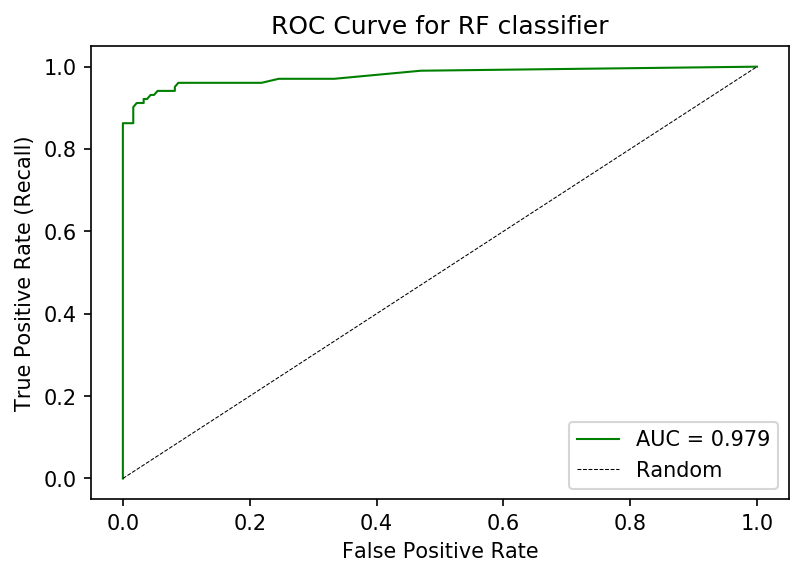 ROC curve for a Random Forest classifier trained on the UCI-WDBC dataset.
Hey — this curve is not too shabby! We achieve high TPR/Recall while maintaining a low FPR. Depending on our tolerance for False Positives, we can increase our TPR as well by shifting the threshold. Additionally, we observe an AUC of 0.979 —pretty, pretty good.
Now let’s look at the Precision-Recall (PR) curve. We can generate an informative PR curve with the following code:
from sklearn.metrics import precision_recall_curve, average_precision_score, auc
# get precision and recall valuesprecision, recall, thresholds = precision_recall_curve(y_test, probas[:,0], pos_label=0)
# average precision scoreavg_precision = average_precision_score(y_test, probas[:,1])
# precision aucpr_auc = auc(recall, precision)
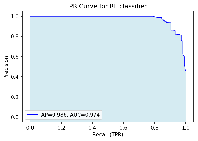
# plotplt.figure(dpi=150)plt.plot(recall, precision, lw=1, color='blue', label=f'AP={avg_precision:.3f}; AUC={pr_auc:.3f}')plt.fill_between(recall, precision, -1, facecolor='lightblue', alpha=0.5)plt.title('PR Curve for RF classifier')plt.xlabel('Recall (TPR)')plt.ylabel('Precision')plt.xlim([-0.05, 1.05])plt.ylim([-0.05, 1.05])plt.legend()plt.show()From this PR curve, we observe a high degree of precision can be maintained while maximizing recall (upper-right corner). We can determine a large fraction of real malignancies without false detection.
Finding the Right Imbalance
As a first step, let’s use scikit-learn to generate a synthetic, imbalanced dataset. The make_classification module allows us to synthesize data with a custom number of classes, features, and samples:
""" Make a synthetic dataset """from sklearn.datasets import make_classification
# Synthetic data with imbalanced classesminority_class_prevalence = 0.05class_balance = [minority_class_prevalence, 1.0-minority_class_prevalence]
# make 2d dataX, y = make_classification(n_classes=2, n_features=2, n_informative=2, n_redundant=0, n_repeated=0, n_samples=10000, weights=class_balance, random_state=10)
# print out classessum_class_1 = np.sum(y)sum_class_2 = len(y) - sum_class_1print(f"Majority: {sum_class_1}; Minority: {sum_class_2}")# 2D PCA on scaled dataX_2D = PCA(2).fit_transform(StandardScaler().fit_transform(X))
# plotplt.figure(dpi=150)for c, i, t in zip(['blue', 'orange'], [0, 1], ['minority', 'majority']): # plot each column with a color pertaining to the labels plt.scatter(X_2D[y==i, 0], X_2D[y==i, 1], color=c, alpha=.05, lw=1, label=t)plt.legend(loc='best')plt.title('Synthetic Data')plt.show()The code above generates a dataset of 2 classes having 2 informative features and 10000 instances overall (Majority: 9457; Minority: 543). Because of how skewed this dataset is, assuming all instances are in the majority classes yields an accuracy of 94.57%.
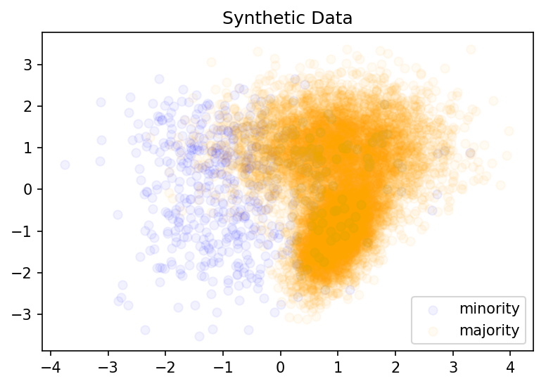 Synthetic two-dimensional dataset with ~95% belonging to a single class
Now we train a Random Forest on these examine each of the metric plots we’ve developed:
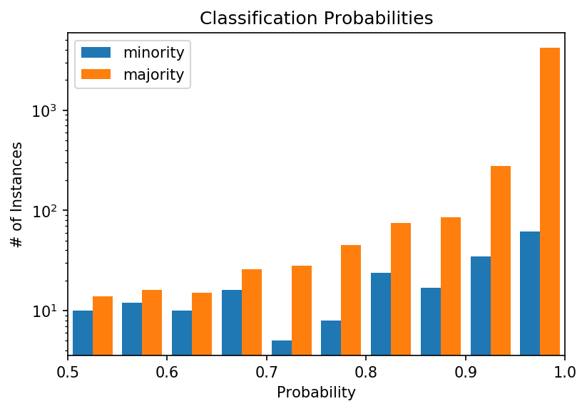
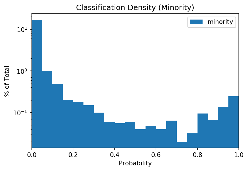
From the (log-scale) probability distribution plot, we note that the distribution for the minority is rather even. A confident classifier would yield a plot where most values are towards the right. Instead, the classifier is unable to distinguish the classes with high confidence for hundreds of instances.
This is especially obvious when we look at the overall distribution for the minority class (0 to 1):
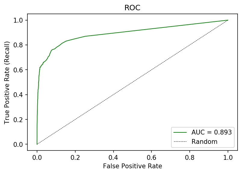
However, if we look at the ROC curve, we may not see much of an issue. The ROC curve we achieve has an AUC of 0.893 (certainly publication grade!), though achieving a high recall comes with a high false positive rate.
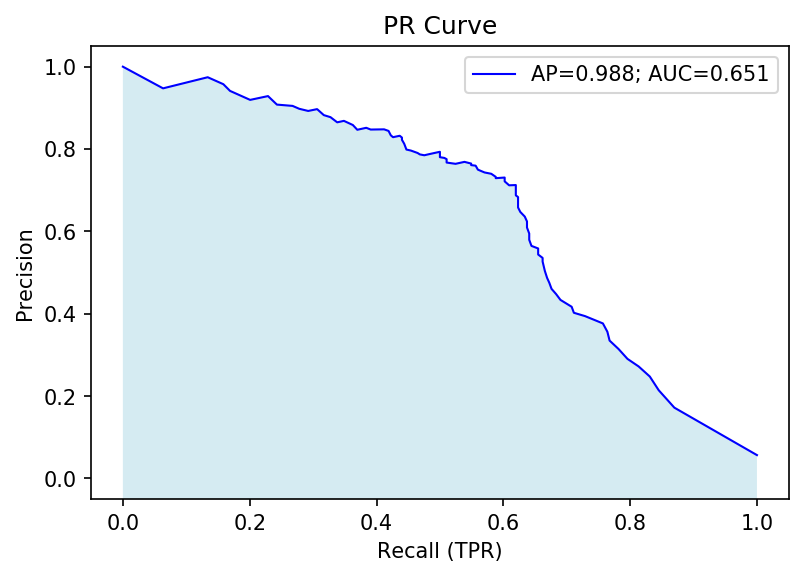
The PR curve shows a much different picture:
What we see instead is a much lower PR-AUC, indicating that setting a threshold for a high recall will also lower precision, or the positive predictive value, very quickly. In the end, the number of ‘positive’ instances that are actually in the minority class will be <50% once we reach a recall of ~0.65.
Ultimately, examining the PR curve for an imbalanced dataset reveals more information on the fitness of a model than ROC alone.
Note:
- These results are with a default Random Forest — you can try rerunning the code with a different classifier to examine how each algorithm performs.
- Many of our minority instances are indistinguishable from the majority class along the two features we measured. In a real case, we’d try to collect more features to improve our classification accuracy.
Interactive visualizations with Bokeh
The above tools will allow you to rapidly examine the performance of a model. However, we can go one step further and generate dynamic or interactive visualizations, which can allow us to more deeply inspect tradeoffs between metrics at different thresholds, and more rapidly select a classifier of interest.
For this section, we’ll use Bokeh, an interactive visualization library in Python. If you’ve read previous posts in this series, you’ll already be familiar.
Bokeh has become an incredibly useful way to generate interactive visualizations in Python. A major value of making plots interactive with Bokeh is that it is now easy to use with pandas dataframes and the HoverTool function allows you to add additional dimensionality to your data without cluttering it. For example, we can generate a HoverTool that has the threshold for each point on the ROC curve, or even add additional metrics (such as F1 score, precision).
To generate a Bokeh plot, we’ll use ColumnDataSource to encode the output of roc_curve and pass that to the plot. Below is a simple example:
# generate roc curvefpr, tpr, thresholds = roc_curve(y_test, probas_[:,1], pos_label=pos_label_)
# calculate aucroc_auc = auc(fpr, tpr)
# create CDS source_ROC = ColumnDataSource(data=dict(x_fpr=fpr, y_tpr=tpr, thresh=thresholds, auc_legend=roc_auc*len(tpr))
In the above snippet, we get the outputs of the curve, add a “legend” which is the AUC (note we encode this as a vector with the same length as our other variables), package them as a dictionary, and pass them to a ColumnDataSource which we can then use to plot:
""" Very basic ROC curve plot """
# create custom HoverTool that will show exact valueshover_ = HoverTool(names=['ROC'], tooltips=[("TPR", "@y_tpr"), ("FPR", "@x_fpr"), ("Thresh", "@thresh")])# add custom HoverTool to toolbox we want with our plotp_tools = [hover_, 'zoom_in', 'zoom_out', 'save', 'reset']
# create plotp = figure(title=f'ROC curve', tools=p_tools)
# add roc curve linep.line('x_fpr', 'y_tpr', line_width=1, color="blue", source=source_ROC)# add explicit data points along line - note we apply legend herep.circle('x_fpr', 'y_tpr', size=5, color="orange", legend='auc_legend', source=source_ROC, name='ROC')# show show(p)
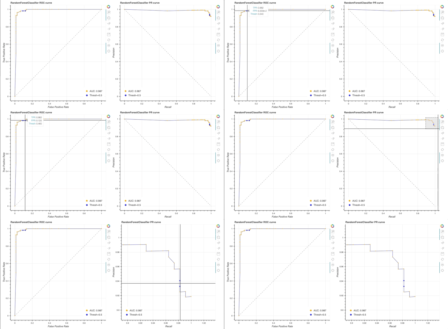
The code in our notebook is more detailed and will yield the following plot (GIF of interactive viz below):
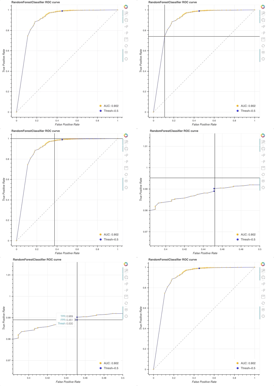 Interactive ROC curve in Bokeh. Note that HoverTool allows us to explicitly see the TPR, FPR, and threshold at each datapoint (orange) along the curve (blue). At a threshold of 0.5 (blue dot), we achieve a TPR of 0.98 and FPR of 0.39.
If you navigate to the repo, you’ll see example of different ROC curve implementations. For example, one in which a cross-validation is performed and the mean of the ROC curve is shown, as well as a version that shows performance of different classifiers:
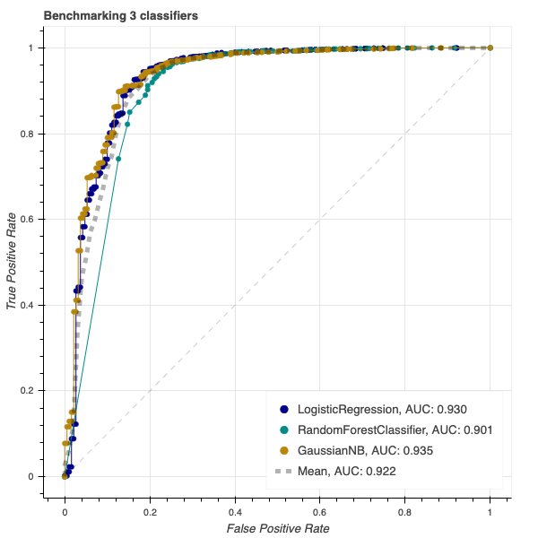 Screenshot from the CodePen.io embed above.
Finally, I include code for how to generate a combined interactive ROC and PR curves:
A quick note on scikit-learn (0.23.0) quirks and their relevance to plotting: both precision_recall_curve() and roc_curve() are very helpful functions, but they are inconsistent about the shape of the thresholds array they return. roc_curve() will return three arrays with the same shape, so it’s easy to immediately turn that into a plot. However, where fpr = tpr = 0, the threshold value is arbitrarily set to max(y_score)+1, which is usually 2. I’ve overrode this to be not a number (np.nan) to avoid confusion.
Meanwhile, precision_recall_curve() returns a thresholds array with a length 1 less than precision or recall—no threshold is assigned where precision is 1 and recall is 0. Here, we append a value to threshold to make the lengths equal. The reason we do this is that when plotting in Bokeh, equal-length arrays are necessary for ColumnDataSource.
Postscript: putting accuracy into context in medical diagnostics
At the top of this article, we conjectured about a diagnostic test with 80% accuracy which results in a high rate of false discovery. The metrics we interrogated might suggest that the test is ultimately useless, but that may not be the case. Tests with an accuracy of 80% do exist on the market, as they can still provide tremendous value to patients and the physicians that treat them.
Why can 80% accuracy still “acceptable” for a diagnostic product in the market? Because diagnosing patients is about more than a single metric. The context around the administration of the test matters.
A machine learning algorithm with less than 100% accuracy can still be useful.
A diagnostic is one component of a complex medical workflow. Clinicians are unlikely to administer a test to patients that have no risk for the disease. Further, they assess test results along with other metrics, such as symptoms, family history, and other diagnostics tests. A positive result on one test may trigger other diagnostics that may be more expensive/time-consuming/inconvenient to confirm a diagnosis.
An “imperfect” model can still have utility, in the same way a p-value of 0.051 may be “statistically insignificant” but can inform a scientific hypothesis when interpreted reasonably. Careful examination of the analysis and context clues can allow for meaningful applications or conclusions to be drawn.
If your goal is to create translational models, then your ultimate metric should be one that reflects your ability to improve upon existing solutions and workflows.
Additional Resources
If you’re interested in diving deeper into the themes in this post, I recommend the following reading:
- Devin Soni wrote a great piece on managing imbalanced datasets in machine learning
- Will Koehrsen authored a series on data visualization with Bokeh that dives deeper into how to use their APIs and generate complex plots
- See Cecile Janssens’ thread on ROC curves and AUROC on Twitter. Cecile also has a thread on the Gail curve, an interesting discussion of why AUC can be misleading for certain problems. The threads also features lots of interesting use cases and visualizations in R.
- If you’re interested in R, I recommend this post on animating ROC curves and this Twitter thread with links to animations and code.
- Stay in touch via Twitter to hear about new posts and topics in data science and machine learning: Gaurav @ Cascade.Bio
Making sense of real-world data: ROC curves, and when to use them was originally published in Hacker Noon on Medium, where people are continuing the conversation by highlighting and responding to this story.
Disclaimer
The views and opinions expressed in this article are solely those of the authors and do not reflect the views of Bitcoin Insider. Every investment and trading move involves risk - this is especially true for cryptocurrencies given their volatility. We strongly advise our readers to conduct their own research when making a decision.
