Latest news about Bitcoin and all cryptocurrencies. Your daily crypto news habit.
 Get the edge. Quit boring.
About the author
Pavel Pekanov is a seasoned Creative Director, Art Director and Designer (and a Developer, but tss-s tell no one). Started his creative career in 2004, followed by the launch of his own Creative Agency in 2008. Ranked a top earning freelancer on Upwork (former Elance) in 2013. Launched a few startups of his own. Featured on CSS Design Awards. Former Creative Director at QUOINE. Pavel has been helping startups, founders and well run businesses with Branding, Product Design, UI/UX and Brand Experience for 14+ years.
Personal website: pekanov.com
What Makes The Product?
Let’s start with an eye-opening — you may not even have a Product at your hands. You may have a service, an app, a website. Having a Product is different from just having a website.
Value + Team + UX + Community = Product.
I’ve got a list based on a few quite expensive mistakes, my extensive design and startup practice (co-founder/founder).
[✓] Value proposition. Products bring value.
[✓] Team with a common goal. There has to be people besides just you alone believing in your Product.
[✓] User experience. Interacting with a Product is meaningful.
[✓] Community. There has to be people besides your friends and family aligning with your Product.
Your Product must have all that in check.
Picking The Right Time
We improve Products gradually along their lifecycles. While we do, we come across two decisive milestones that change the perspective, direction and expectations.
1. Realizing the market fit
Make or break for an MVP. You’re still testing concepts, but you’ve already discovered the selling feature. Your Product is en route to building a strong relationship with early adopters.
Focus: Product.
2. Building a relationship
A contrasting milestone as it takes months-years to get there. You’ve got a technically solid Product disconnected from the community. It lacks the Emotional Intelligence. Your company is set on course of molding the Product with company vision.
Focus: Company.
Some Products shape themselves with the big picture, the mission and the company vision right from the start. The result is exceptional just like the amount of time and effort required to ship them. Very few businesses can play the game that long.
The difference between these two isn’t a subtle one. So is the focus and the expectations.
Focus V Expectations
I’ve seen to a lot of companies trying to channel their vision before even having a viable Product and realizing the market fit. Hell, I did it myself with my own projects! This may not be a mistake per se, but it’s a drain on creative, emotional and financial resources.
We’re still at a point when no one cares, literally. Here are we, here are they and here is a cold-hearted bottomless pit between us.
No market fit equals having no community. Without a Product community, you’re channeling your vision into the abyss.
I’ve also seen to a lot of teams improving their tech passionately and tirelessly. They refactor the code, resolve bottlenecks, improve the platform performance, introduce the new database architecture, et cetera. There is little to no regard for their Product brand. That’s a big no-no.
Your techies may score a miraculous win (case of Nginx). That may happen with luck and years of dedication. Are you willing to bet on luck and spend years on something that may not turn out that good?
I’m telling you forget the tech and focus on your brand.
I’ve been on both sides of the coin, and what I came to appreciate is the moment the Product starts getting momentum. That’s when it’s the right time to raise the bar and come to understand one hard simple truth — the tech isn’t the king.
Yes, your tech got you there. But circumstances change, the landscape evolves and your engineers aren’t omnipotent. Your Product may be better off with less focus on the tech itself.
I’m saying that having an engineer/developer background myself. I enjoyed improving APIs from 10ms to 1ms latency even though no one would ever notice that kind of improvement. I understand it’s cool and it’s kind of an internal competition and such. Let’s leave it at that — improving tech is a race against yourself. Take a step back, instead.
Let me repeat myself — the tech isn’t the king. The tech isn’t the unstoppable force that drives the Product further, neither it should be. It’s not even a single force.
The “driving force” are the personas behind the Product (the foundation team), company vision and where the CEO stands. It’s time to work with that once your Product is recognized.
Unless.
Unless you launch rockets to space. In this case, forget everything you read so far and please God focus on the tech.
You’re building a Product for the people. What do people expect? Better experiences.
Product Re-Evaluation
Over the past few years I’ve done quite a number of re-designs. I’ve been at various Product stages and I’m a big fan of re-designs. I considered myself a seasoned pro able to deliver the best design to any kind of Product out there.
The work I did all those years now feels sketchy at best.
Where I’m heading with that?
I believe company vision and values, mission statement, people behind the team, community voice — all that should come together to shape a better Product and then that could be called a true re-design. Something to be proud of.
And the data is there too — funnels, bounce rates, user journeys click-throughs, LTVs — the data we don’t have at the beginning. It helps massively in developing a better UX, UI, building the next level Product Experience, and simply doing better design overall.
It’s funny thinking analytics improves the design, until it does. Having reliable data helps you discover (or interpret reliably):
- Bounces. The number one metrics to see whether something’s broken beyond repair. A bounce rate high enough can deliver a punch to the gut to any business.
- Broken Task Flows. A broken Task Flow means your users don’t get to the goal at all. For e.g. they can’t reach the final Sign Up step, therefore they can’t create an account. Terrible.
- Broken User Flows. Users lose their way, never complete the flow, jump off the flow, you name it. In other words, there is a bump.
- Broken User Journey. Users are getting somewhere not the way it’s designed. In other words, a design bug — your Product is being used not the way it was intended. Can be a case of “not a bug, it’s a feature”, though rarely.
Understanding The Reason
Why re-design something that’s not broken? You see the room for improvement, you act upon it. If your Product can become better, you make it happen. It’s that simple.
- Pivot. Your Product selling feature is something else.
- Conversions. Your Product isn’t converting people.
- Impact. Your Product is boring.
- Story. Your Product is sterile.
Building The Story
You start the re-design with 1) defining the reason for it, 2) evaluating the Product metrics and 3) getting an understanding of where the Product is headed after.
Those are the prerequisites for the re-design. The following are the four high-level pillars that are the foundation for a great re-design.
1. Having a great logotype
Your Product must have a great logo. Great logos look good, they tell a story, they stand out. They make people curious about your Product.
Your Product story starts with the logo and so does your company vision. A good logo channels the deepest message you have without you having to explain it.
You should be after the logo with great marketing potential and the ability to deliver a powerful opening on its own.
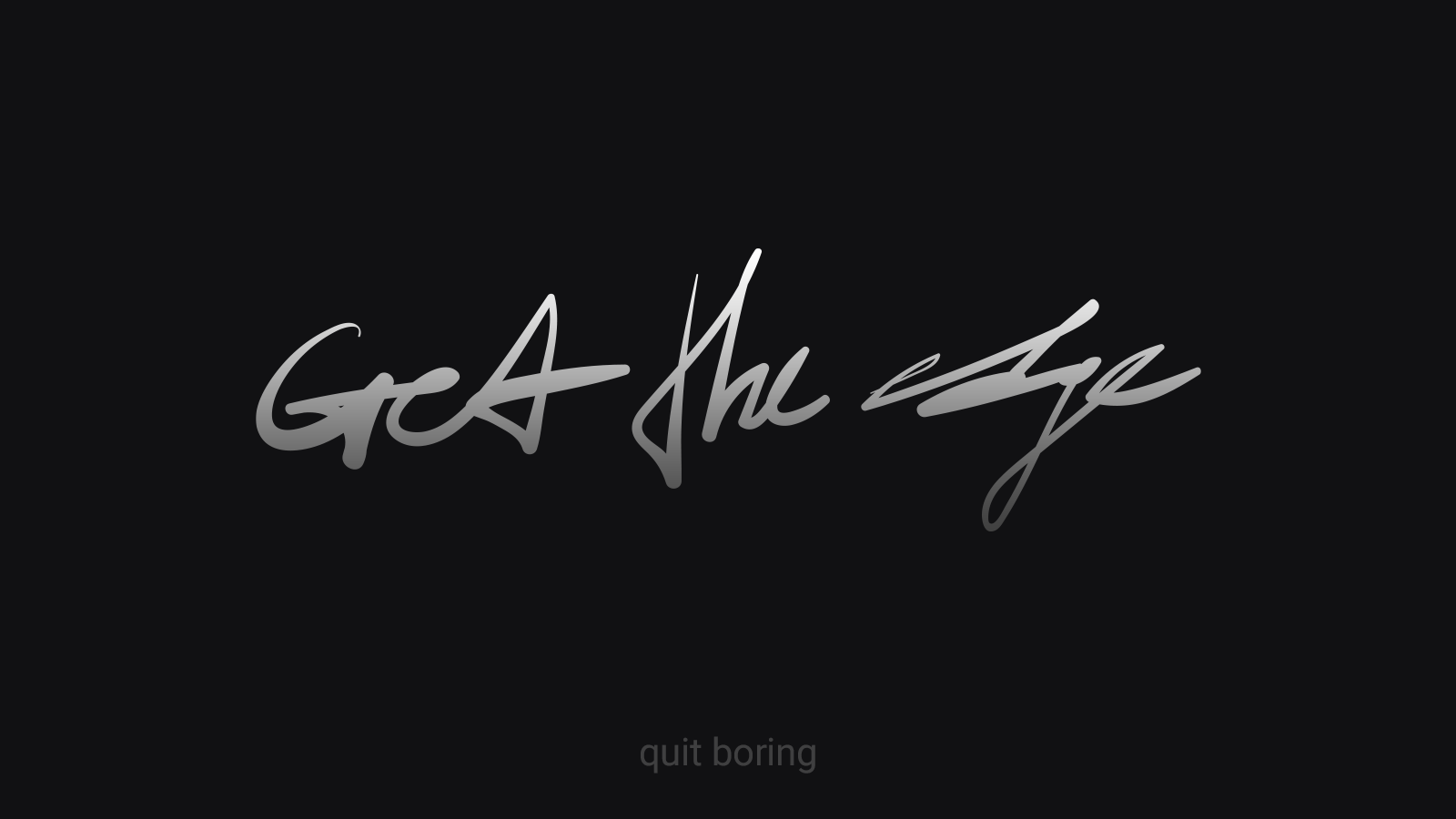
 The most popular chart types visualized in the logo animation. The emphasis is put on the Product, features and services.
Charts creation platform logotype tells a story of creating a chart. Simple, straight-forward, enjoyable to look at.

 The logotype is supported by various animations that can be used on the website (or in app) to further solidify the Product Experience.
Here is a very different storytelling example:
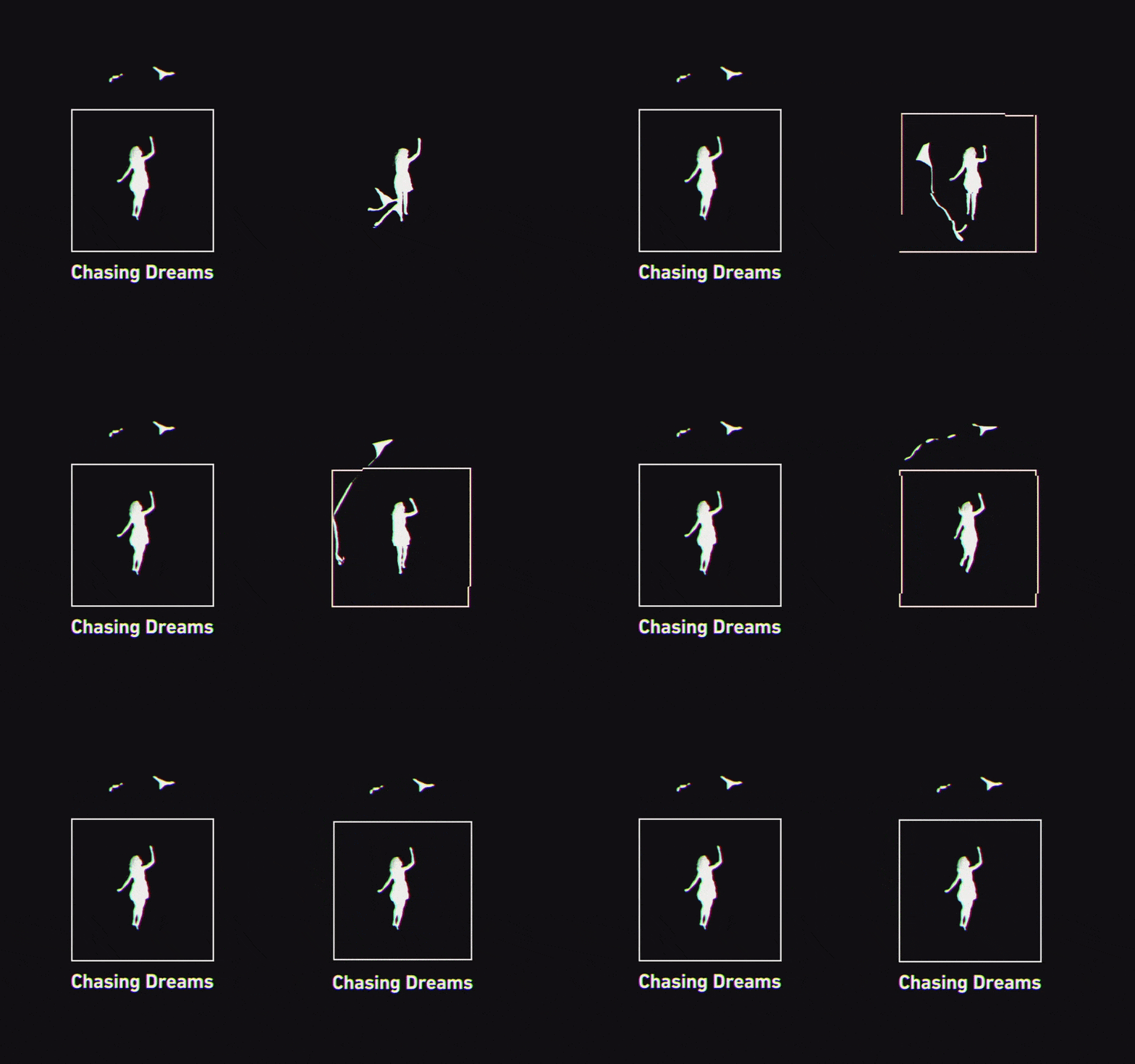 Flying kite, a couple of seagulls and running into the sunset to chase the dream. The emphasis is put on the Product vision, company mission and Product expectations.
Game development and publishing studio delivers their company vision thru a mesmerizing logotype animation. It’s a storytelling within a storytelling, a dream inside a dream.
The opening story is a story of a girl chasing her kite that transforms into seagulls. It serves as a metaphor for “chasing dreams”.
The closing story is told at the final frames — seagulls leaving the box. The “thinking outside the box” message is delivered with them flying out of the box outline while the girl keeps an eye contact on [a former] kite.
Logotypes are the perfect take-off points for Product storytelling. We use the logos to deliver all kinds of messages:
- Product vision. We’re doing this to save Earth from space-pirates.
- Company vision and mission. Making Earth a safer planet.
- Expectations. Kids-friendly, easy to use, a single function.
- Innovation. Flat, thin, red. Color options available.
- Introduction to services. You press one button and all’s gone.
- Introduction to company values. A guarded space is a secure space.
- Introduction to the Product. A multi-purpose pocket device.
Your logotype is your story. The very best logotypes out there drive the storytelling for entire companies, let alone the Products themselves.
2. First impression
The first impression is naturally established via a Product landing page, or a company website and it’s usually the former where you meet your future customers.
Meeting your customers starts with a “hi” and then following up with a proposition, a Call To Action.
A few proven CTAs that you’ll most likely end up using:
- Sign Up to start using the Product.
- Try a Product demo.
- Subscribe to get early access to the Product.
It’s worth mentioning that the very last CTA is mostly used when testing concepts, i.e. when you don’t have any Product at all. Keep that in mind and don’t abuse your customer’s trust.
Once you’ve decided on the CTA you’re going to use, you should decide on the approach for your landing page. What are you going to show there? Your Product, your team, or both? Does it feel like a friendly welcome, or a sales pitch?
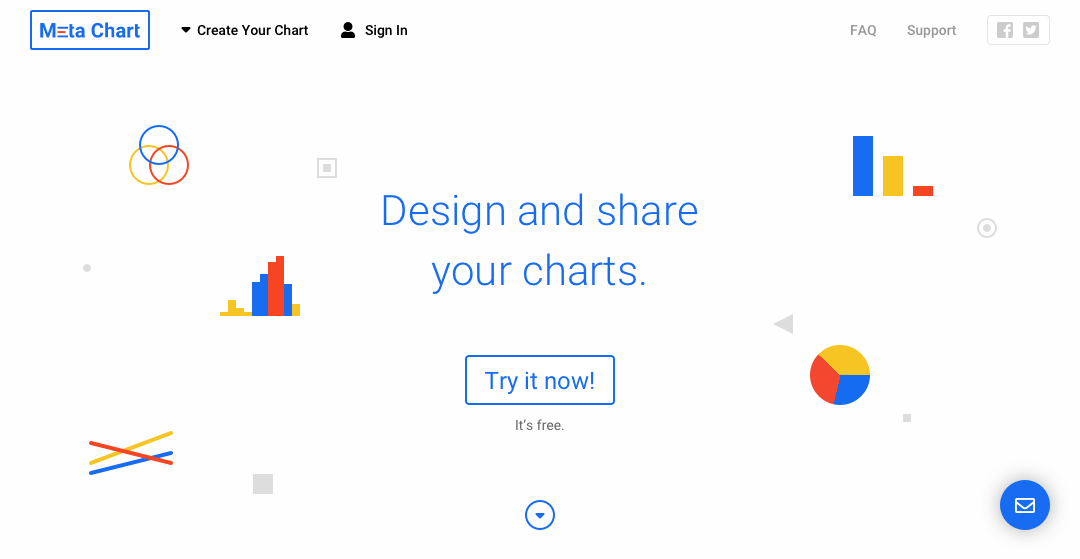 The above the fold for online charting platform. It doesn’t show the Product or the team, but instead it builds up the Product connection with showing essential charts icons. Clean Product message and a visible CTA to try the actual Product right away. Everything about the Product, pricing plans, features, etc — that goes below the fold.
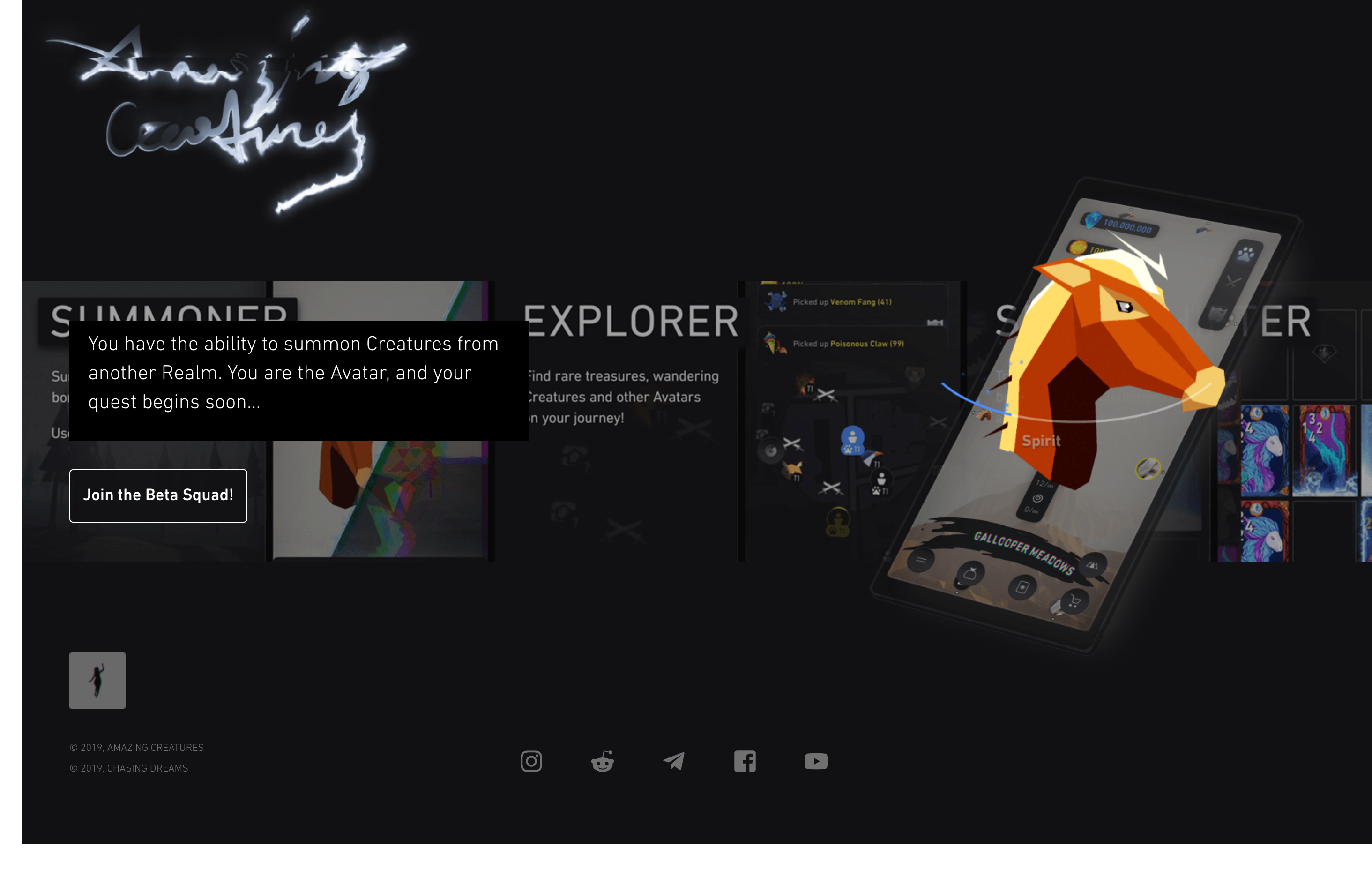 A very different example, a mobile game. The landing page builds a connection with the Product by showing the actual game, game art and concept. The right-hand visual is fully animated, using the very animations one would see in the game. This one-pager delivers the end-product feel.
The holy grail of landing pages has always been about showing the Product.
However, we now enter the age of Human Oriented design. Human Oriented design is all about building relationship with the Product, building a unique Company Experience and finding the right emotional connection with the customers.
Showing the Product early may not be as effective as you think.
People are less excited about the Products in general, as they are about the change in their life a particular Product can bring.
3. Sell at Sign Up
This is one of my most favorite pillars as it’s the most overlooked one.
Do you tease your Product at Sign Up flow? Do you show your team members? Does your CEO provide a heartfelt welcome message?
Usually, a Sign Up page is a simple form that gets your name, e-mail, password, or you can bypass it altogether and Sign Up with Facebook or Twitter. The only purpose a Sign Up flow serves is getting your credentials.
This definitely doesn’t sound like you’re using this flow’s full potential.
Imagine you saw a Product so promising that you discovered an urge to create your account. Would you like to learn more about the Product? Would you like to learn more about the people behind it?
Would you like to know and see how great that Product turned out to be for others just like you?
Of course, you would! And that’s the moment when you create the connection between your customers and your Product values. It’s emotional, it’s strong. That’s the point in time when your customers get connected and hooked up on the Company vision and mission.
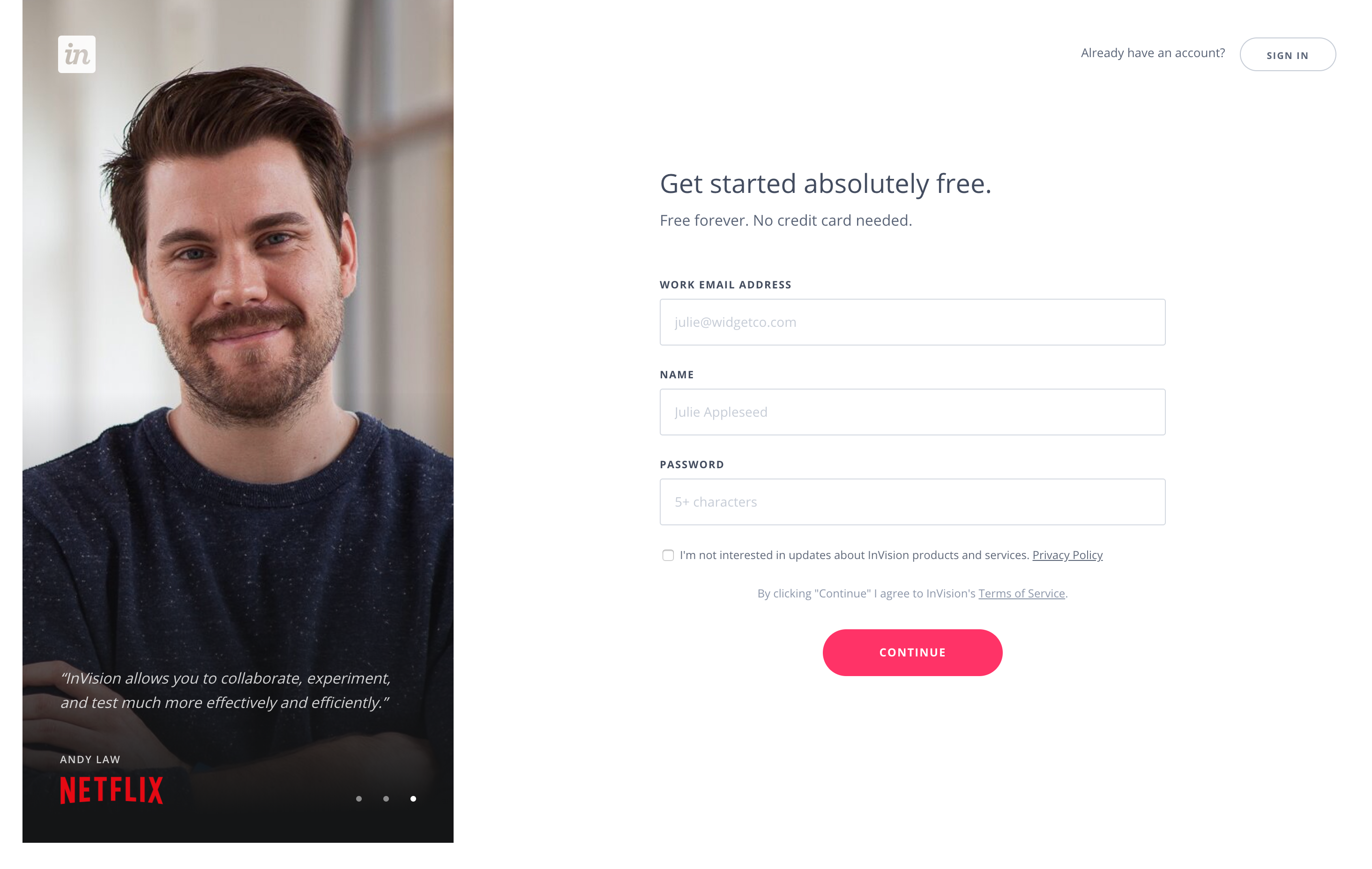 Absolutely stunning InVision’s approach to delivering their existing Customers Stories and hooking you up early with their Product. It’s all about building trust and positive experience, and they nailed it.
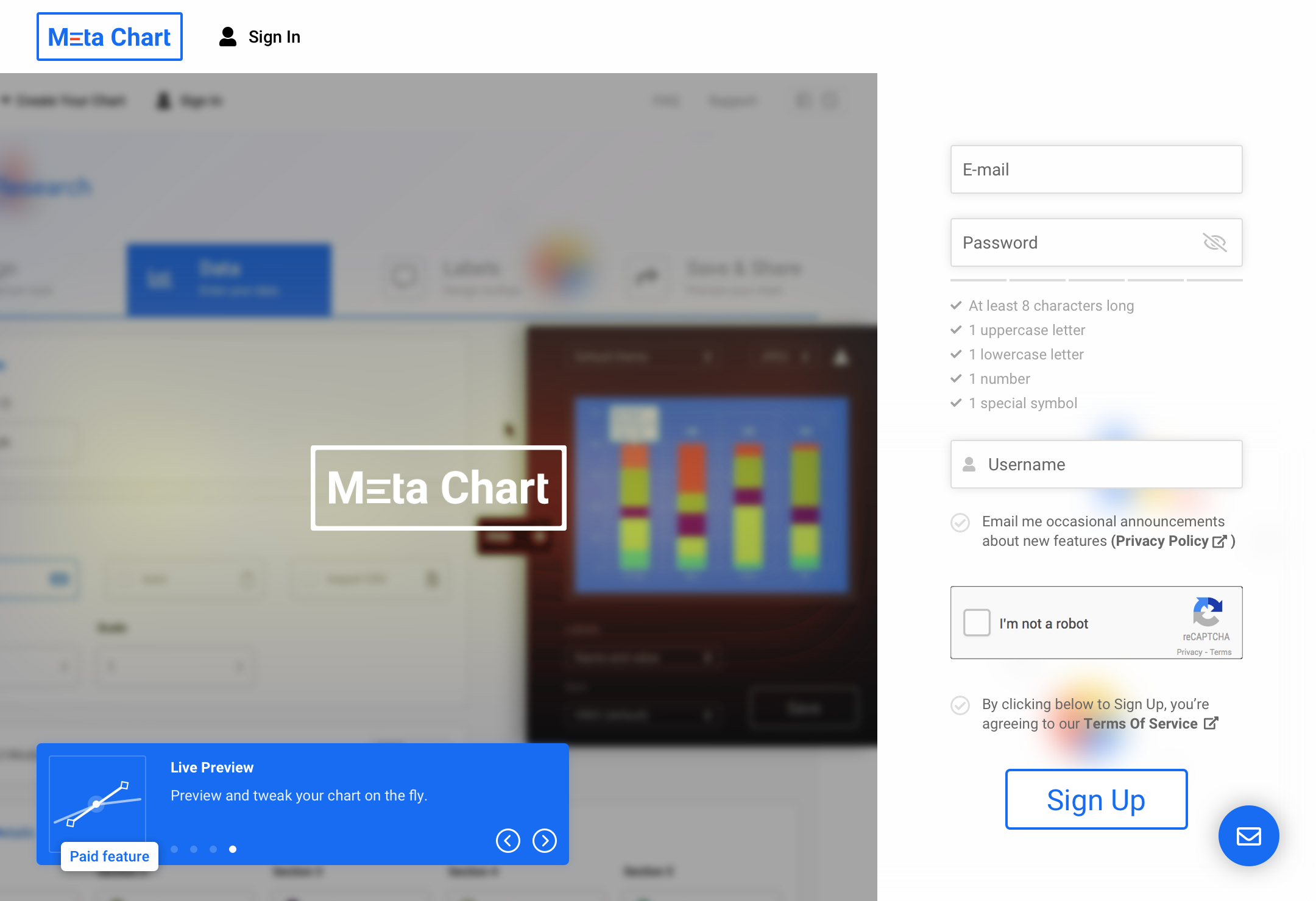 Core Product video tour at Sign Up page. Keeping the tour on-point and fast-paced ensures the customer stays here and isn’t too distracted from filling in the actual Sign Up form. Paid features are discovered early on — a transparent, healthy and trustworthy Product relationship.
Selling at Sign Up doesn’t mean to be the actual “sale”. Sell differently. Sell your vision, sell the big picture. Sometimes it takes that little to convert a customer into a Product fan.
4. Always On-Board
All right, this one kind of goes along my other point — a good Product needs explanations. Actually, the better the Product is the more explaining it would probably need.
I mean, a great story behind the Product, lots of useful features, various inter-connected services — that should be explained somehow, right? Unless you’re offering a day job of digging through all that to your potential customers.
By explanations I don’t mean the abundant FAQs, tutorials, tours and such. Instead, you should always engage the customers. Engagement is playful, engagement is fun and it just feels more natural (like a human conversation).
So, what’s up with On-Boarding? It should be a quick game-like experience, a few steps to complete in rapid succession, a chit-chat. Having a reward at the end of your On-Boarding session doesn’t feel like a bad move either. Gamify it.
On-Boarding provides you with the chance to know your customers better too and simplify the connected flows. Having On-Boarding flows simplifies the actual Product Experience and makes your Customer Experience more entertaining and fun.
On-Boarding flows are the friendly chats between you and your customers. Did you forget to tell them something? Do you need to know their names? Do that at On-Boarding flows. Simplify the rest and create a positive Customer Experience.
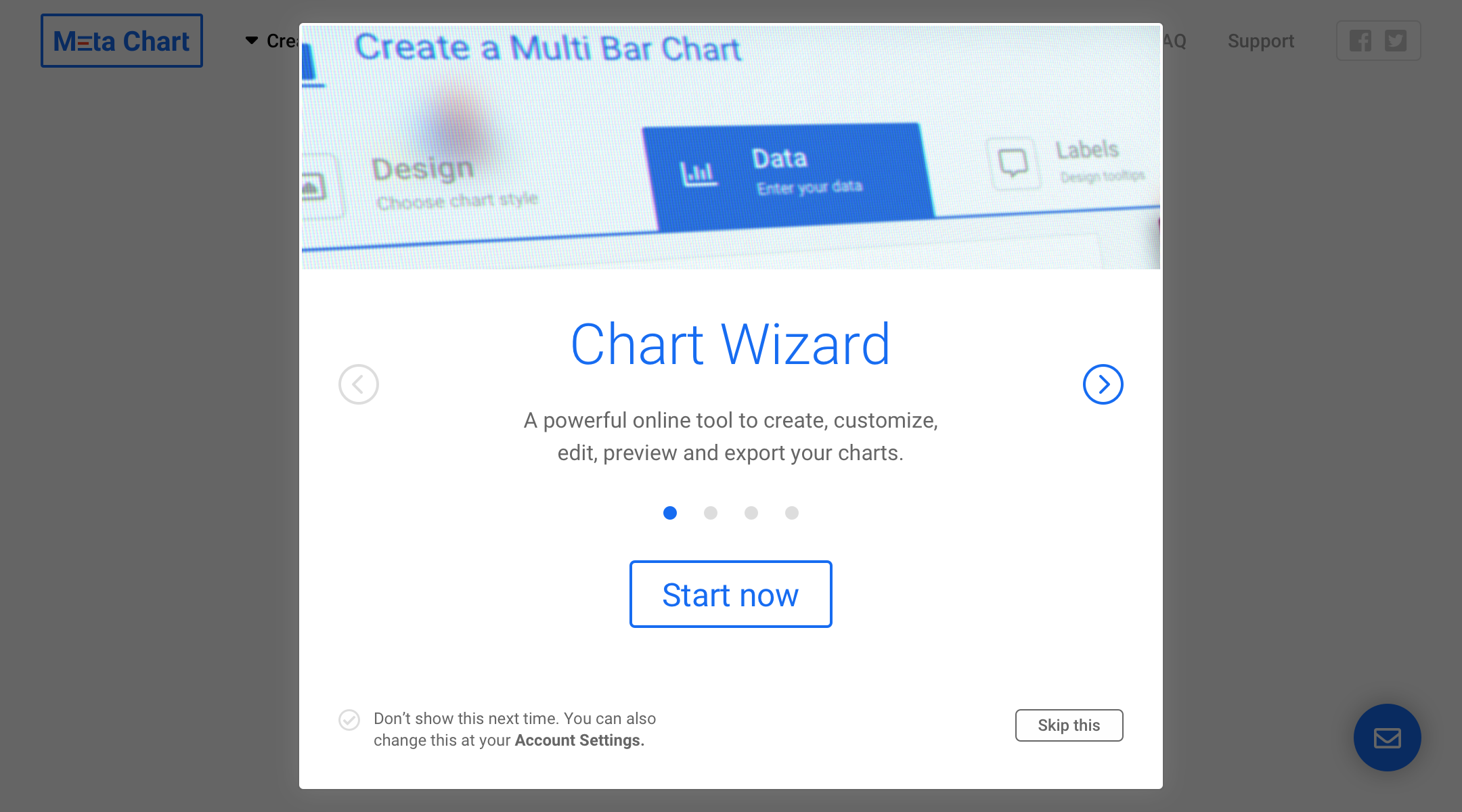 Going over the Product features one more time, in case our customers signed up in a hurry.
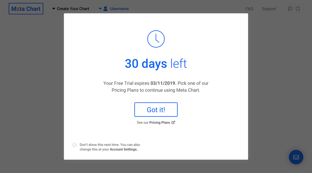 On-board trial users and try to convert them right then and there.
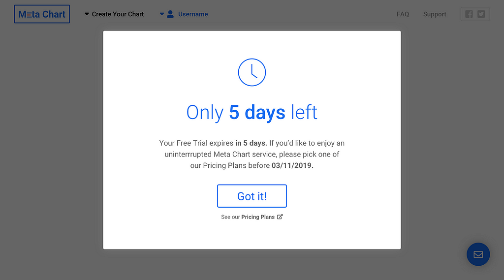
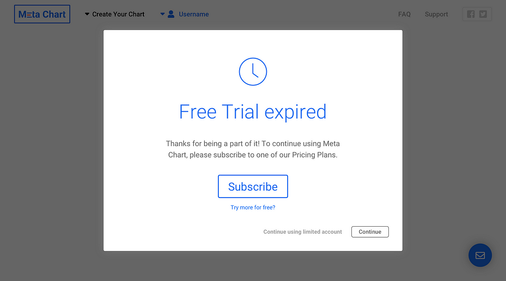 Different scenarios require different approaches.
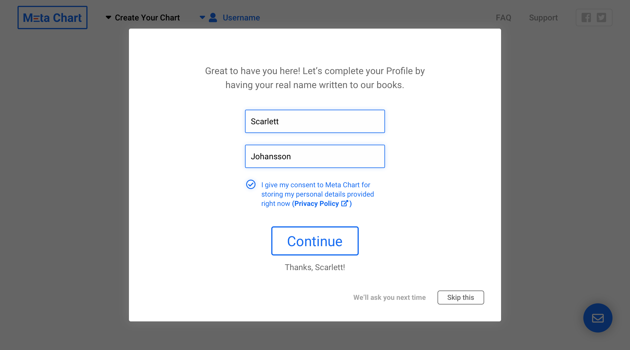 Simplifying the Sign Up flow means moving personal data entry to one of the optional On-Boarding screens.
Mind The End Game
Finally, you should mind the end-game of your efforts.
I can’t stress enough the importance of picking the right re-design approach and the importance of choosing the right re-design goal. Once the decision has been made we shall not divert, neither we can without the risk of needlessly burning up lots of resources.
There are different re-design approaches that you can choose from, depending on the kind of improvements you’re after:
- Conversions and sales. The re-design goes around UI and UX, working with the Task Flows and User Flows. We may re-think User Journey, though that’d usually mean going a bit beyond the scope. The goal is an increased number of registrations and sales, and a decreased cost per user acquisition.
- On-boarding and retention. The re-design goes around UX and working with User Journey. We may even create new User Flows to remove discovered bottlenecks. The goal is an increased avg. session time, and a decreased number of support requests.
- Features. The re-design goes around UI and UX, working with the Task Flows and User Flows. The goal is having a Product 2.0 with new features.
- Product-focused story (features, team, roadmap).
- Company-focused story (vision, mission, leadership).
To be continued?
Leave a comment if you’d like to know more about Company Experience, ways to measure and track it, ways to improve and design for great Company Experience. Did I miss anything? Let me know in the comments.
Are you after the best Company Experience?
I’d love to hear from you, if you’re after the best Company Experience your customers can have or if you’re after the ultimate Product Experience. Shoot me an email.
Engaging Product Design was originally published in Hacker Noon on Medium, where people are continuing the conversation by highlighting and responding to this story.
Disclaimer
The views and opinions expressed in this article are solely those of the authors and do not reflect the views of Bitcoin Insider. Every investment and trading move involves risk - this is especially true for cryptocurrencies given their volatility. We strongly advise our readers to conduct their own research when making a decision.