Latest news about Bitcoin and all cryptocurrencies. Your daily crypto news habit.
Published by Roshni Uppala (Director of Operations & Marketing). Credits: Joshua Murphy (Design Manager).
As the Director of Operations & Marketing of Advancing Women in Product, I am very proud to share some exciting news today! This year our focus was to bring the best events and resources to our community and help shape the next generation women product leaders. One of the steps we have taken was to update our brand to a more bold and leading look that would help drive our strategy. We will be shortly announcing new programs such as Mentoring program and news on our partnerships and programming.
New Brand Identity
Since its foundation, Advancing Women in Product has been growing not only in terms of community members but also in engagement, partnerships and involvement from various top tech companies. We are also proud to expand our mission to DC, Boston and Seattle this year. As we continue to grow our AWIP family, and expand our offerings, we want our brand to best reflect our mission, beliefs and future.
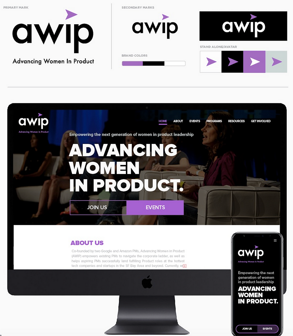
The new AWIP brand design is the elevation of the identity and brand system. The new identity reflects the AWIP mission in moving forward and now in a bold way. The design look is confident and expressive with a vibrant color palette, bold, modern typefaces and a professionalism that many organizations desire to obtain. The new look will not only add legitimacy and trust to the brand but will help maintain a leading-edge mentality in the industry.
The AWIP brand mark is primarily a word mark with a directional arrow graphic. The word mark utilizes an altered typeface (based on Futura) that uses a lower case format to give it an approachable and friendly appearance. The brand colors (black, white and purple) juxtaposed with the friendliness of the typeface give it a bold and exciting punch. The arrow graphic (based on a compass arrow) tells the viewer that the organization is moving forward. Graphically it is positioned to appear as the tittle (dot) over the i in awip as well as line up with the w to provide visual harmony. Supporting the brand mark — AWIP’s new identity utilizes bold headers in Proxima Black. The starkness of the typeface in black and white will further reinforce the bold/proud direction the organization is heading in.
In the coming months we will be updating all our communications with the new brand. So stay tuned for more updates!
Please drop us a line info@advancingwomeninproduct.org for comments or more information.
AWIP moves forward BOLDLY! was originally published in Hacker Noon on Medium, where people are continuing the conversation by highlighting and responding to this story.
Disclaimer
The views and opinions expressed in this article are solely those of the authors and do not reflect the views of Bitcoin Insider. Every investment and trading move involves risk - this is especially true for cryptocurrencies given their volatility. We strongly advise our readers to conduct their own research when making a decision.

