Latest news about Bitcoin and all cryptocurrencies. Your daily crypto news habit.
We’re back with one of the biggest updates we’ve done so far! It’s very similar to the CodeSandbox 2.5 update one year ago. It includes VSCode extensions, many design tweaks, and a new devtool pane. CodeSandbox will feel far more polished from now on. Let’s get to it!
VSCode Integration
In October we released an experimental version of VSCode that you could turn on in your preferences. This replaced the core editor in CodeSandbox with VSCode, which gave us keybindings, user snippets, commands, editor grid view and much more from VSCode.
Since October we’ve been fixing a bunch of bugs and improved the general integration. From now on we’ll run VSCode as the only editor in CodeSandbox, and with that, we decided to give the editor a new look! Here’s what was added with the new integration:
Extensions Support
We now support VSCode Extensions! The cool thing about this integration is that everything runs in the browser. Instead of spawning node processes, we spawn web workers with stubbed node modules like fs, net and module. This means that there’s less latency and there’s no need for us to run servers for VSCode. I’ll do a better write-up on how this works after all the remaining releases.
Initially we’ll support a predefined list of extensions, we’ll gradually open up the possibility for everyone to add and install their own extensions.
VSCode Extensions comes with a lot of new functionality, I want to highlight some of the things that I found nice:
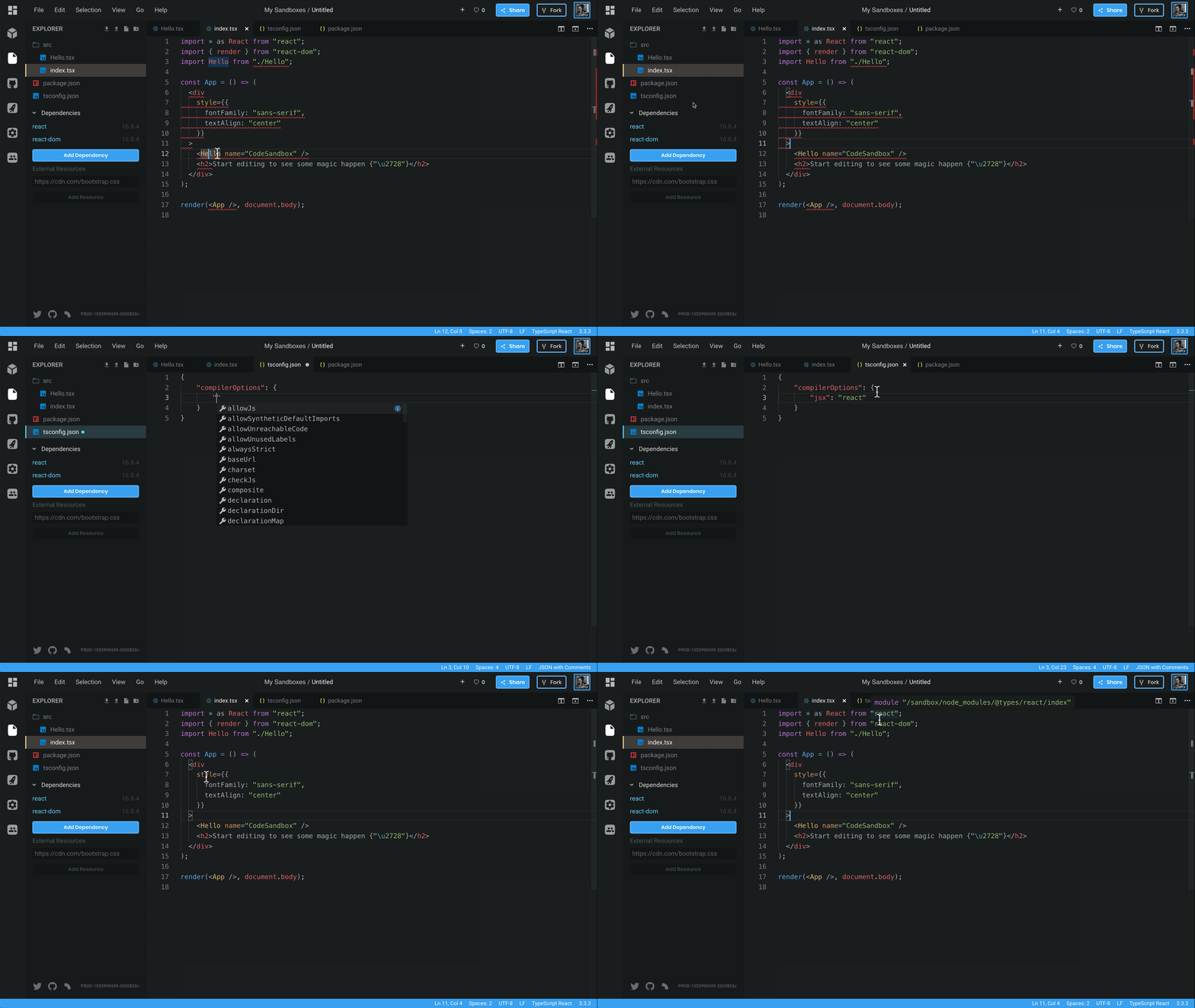
Native TypeScript Type CheckingThe TypeScript extension runs exactly the same as the local VSCode installation, it now reads tsconfig.json , will give the same autocompletions and it runs the latest TypeScript version.
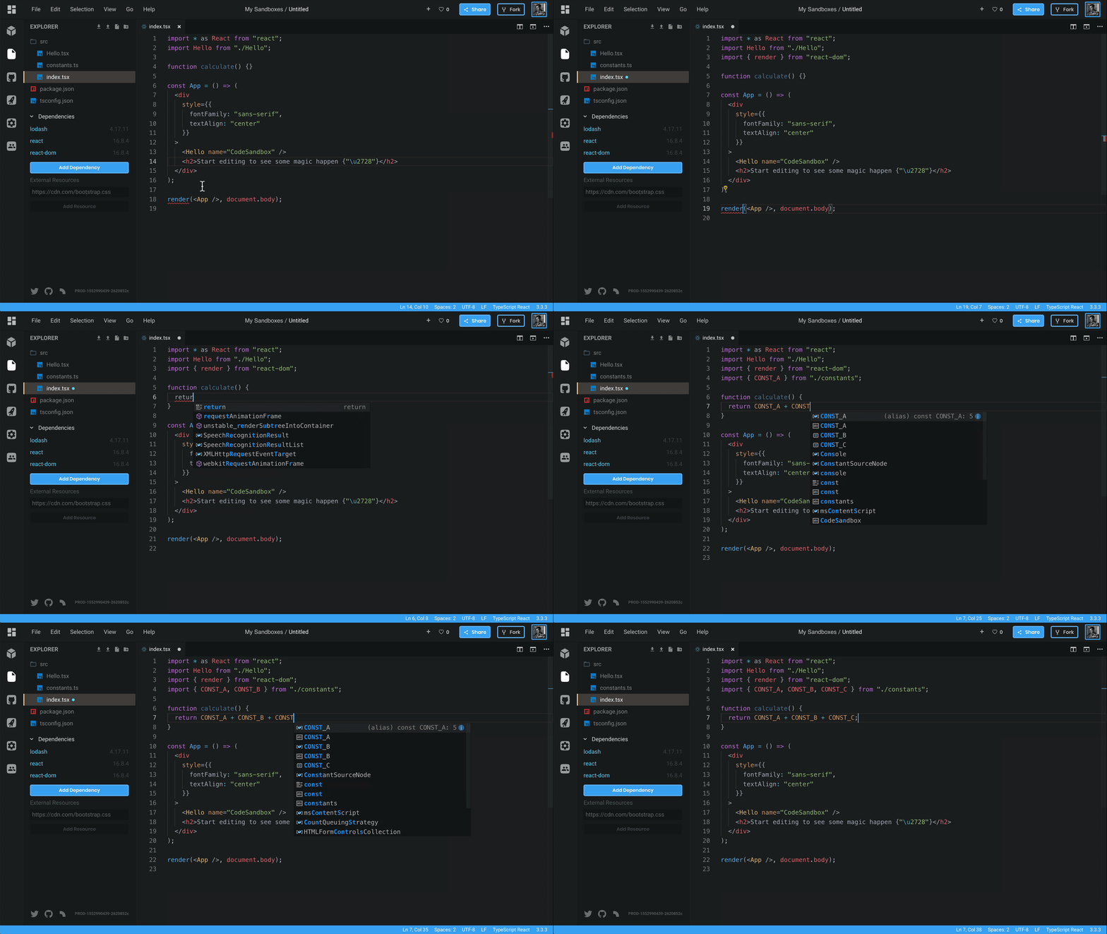
Auto ImportAutomatically importing variables from your own files or dependencies now work!
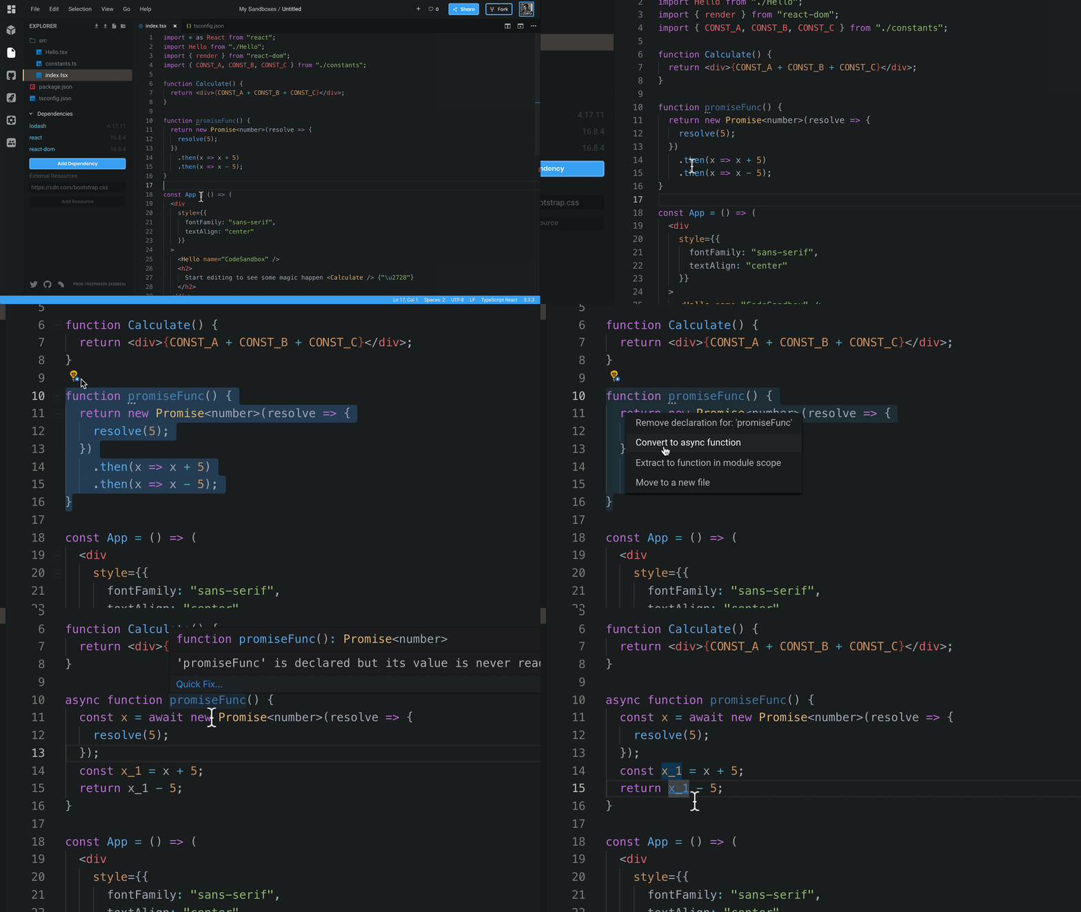
Refactoring SupportYou can also use the same refactoring options as in VSCode, like refactoring a function from promises to async, or moving a function to a new file. It works exactly the same!
VIM ExtensionWe also include the VSCodeVim extension by default, you can enable it by opening preferences and going to Editor.
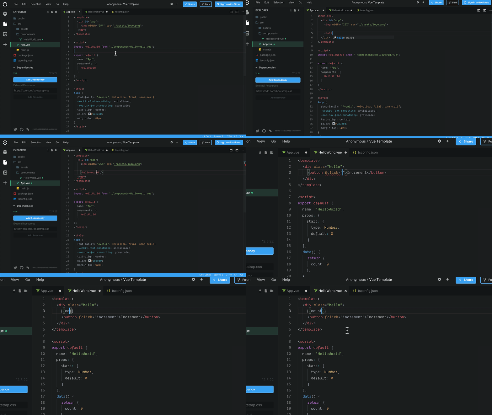
Vue & VeturWe also run the Vetur extension from source, which gives the same autocompletions, linting, and prettifying as VSCode. It is really powerful, this also includes the recent addition of autocompletions in templates.
We also added graphql, styled-components and yarn.lock syntax highlighting/autocompletions using the new extensions. Small quality of life improvements!
Existing Functionality in VSCode
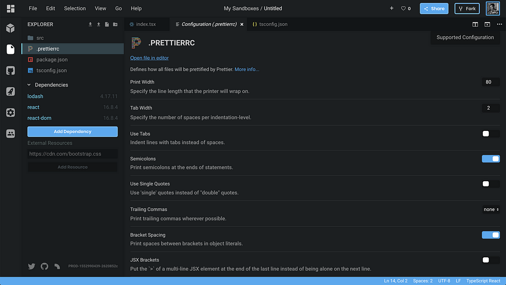
Functionality that didn’t work before, like the configuration UI and the image viewer now work in VSCode as well. We added some custom editor types that are actually rendered in React, which is quite interesting. We now mount VSCode in a React application, and we mount React in the VSCode view.
A New Design
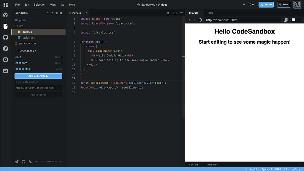
Since we’re now full-on on VSCode it was high time to adjust the design to fit better with this code editor. We tweaked the design in many ways to give a more coherent and less cluttered feel. I’ll go by the changes one by one.
The browser preview has become multi-functional! We added tabs to the preview (devtool) view that you can use to switch between different devtools. Browser is the default devtool, but if you think that the console is more suitable for your example you can just drag the tab to the first place to make it the default!
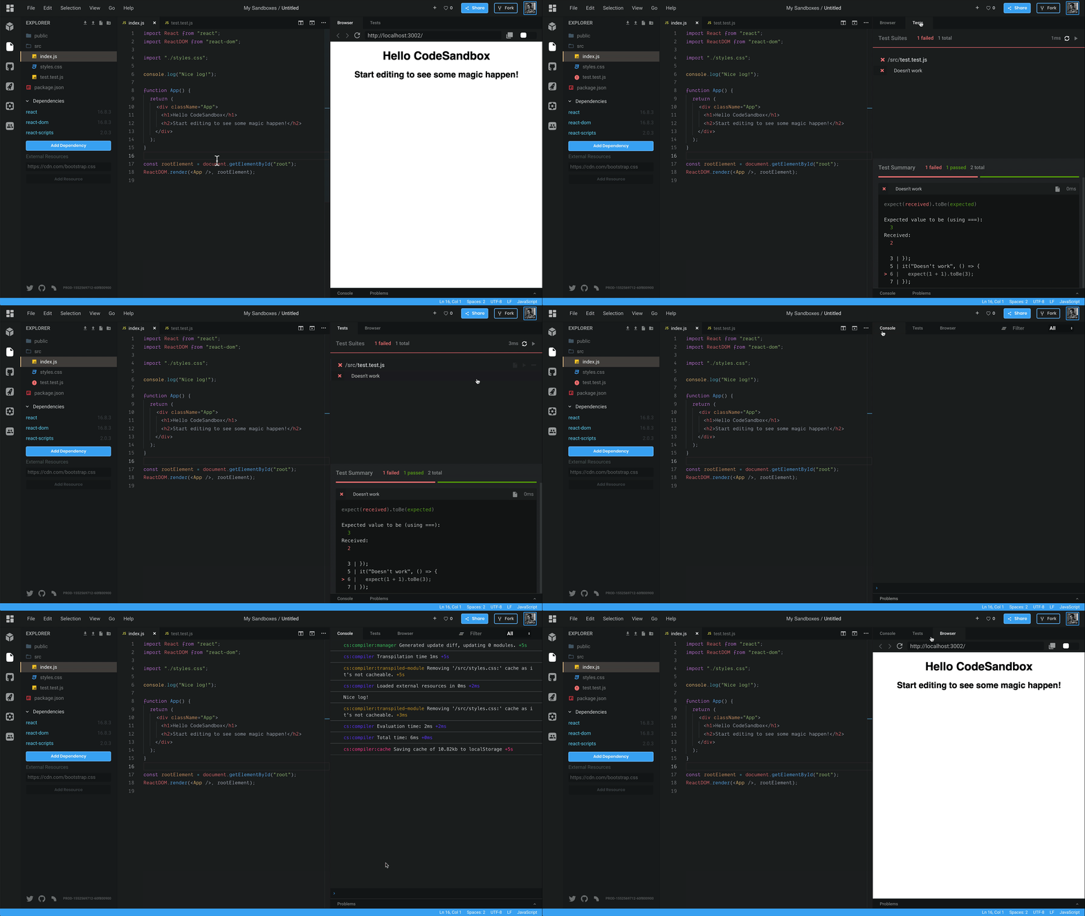 Changing the tabs of the devtools!
We think that this new devtool pane will make it easier for people to demo things like tests or console output. This also affects the embed. Here’s an embed with the console pane as the first tab. Expect to see more devtools added in the future!
Menu bar & Status bar
One big contributor to a cluttered look of the editor was the header. There were so many buttons that it became hard to actually find the button you were looking for. We decided to change this by removing a bunch of buttons and by putting them under a menu that’s familiar to many of you: the menu bar! We removed all buttons that are not relevant to the editing experience (who goes to “Explore” from the editor?) and put them in the menu bar.
We also added a status bar, the functionality of the status bar became more useful as we added extensions and support for the image view, for example. We’re planning to use this status bar quite a bit with CodeSandbox integrations in the future.
Both the status bar and the menu bar are taken directly from VSCode! This is one of the advantages of having VSCode as our single editor.
Color & Themes
Together with the new UI parts we also have a new color theme and new icons. You can expect to see the CodeSandbox color theme in the VSCode marketplace in the future!
Confusing Parts
Previously we would hide the activity bar (left most bar) when you were viewing a sandbox that you don’t own. We’ve reverted this, it turned out to be quite confusing for people when they saw CodeSandbox for the first time.
Conclusion
I hope you’re as excited about this update as I am! We’ve been working a long time on this, and it’s great that we can now show it to everyone. Let us know what you think! Did you find something that didn’t work? Please let us know on our repo: https://github.com/CompuIves/codesandbox-client.
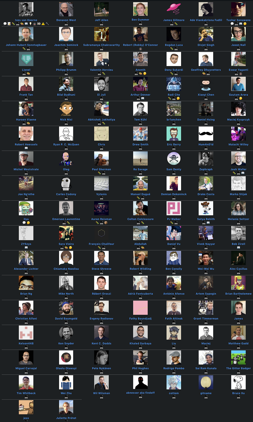
Also a huge thanks to all contributors who have contributed to CodeSandbox, we already have 114! The list almost getting too big to show in one image!
This update is the first of 4 updates that we’re releasing this week. Stay tuned!
Announcing CodeSandbox v3 was originally published in Hacker Noon on Medium, where people are continuing the conversation by highlighting and responding to this story.
Disclaimer
The views and opinions expressed in this article are solely those of the authors and do not reflect the views of Bitcoin Insider. Every investment and trading move involves risk - this is especially true for cryptocurrencies given their volatility. We strongly advise our readers to conduct their own research when making a decision.
