Latest news about Bitcoin and all cryptocurrencies. Your daily crypto news habit.
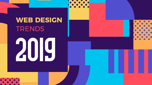
Web design has moved to rife designing including everything to choose from layout to colors, white space to typography, and everything in and around in between — none of the design elements has been possibly left out in the Web design trends of 2019.
2019 web designs to be huge in trend:
1. Animated GIFs
2. Parallax Scrolling
3. Conversational Bots & Machine Learning
4. Broken Grid & Asymmetrical Layouts
5. White Space
6. Overlapping design elements
7. The Trend of Usage of Organic Shapes
8. Typography uniqueness and creativity
1. Animated GIFs
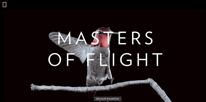
Animations have always been used as an ethereal effect to UI designs which in turn breaks out of a grid of symmetrical design adding dynamism into the website.
Animations have always provided uniqueness and interactivity in design which makes the element stand out proving visual delight, user engagement and encourage interaction through contextual help.
Different usage of animations has added different effects in website visualization whether its images in circles, the old gold effect in images, or shadow light effect in drawings, the rotating view of images every bit of transition has been an eye catcher encouraging the user to visual effects of website design.
Via National Geographic
2. Parallax Scrolling
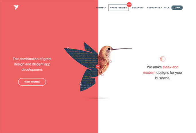
The special scrolling technique parallax used in web design is breaking the modular grid system. It creates a 3D effect as scrolling through the website as it looks like the background image is moving slower than the foreground image.
Parallax scrolling uses a subtle implementation draws more attention on the headers typography and getting the user dive into the content of the page.
Via Designer Mag
3. Conversational Bots & Machine Learning
With a trend to Artificial Intelligence website have also witnessed the same in their design pattern giving users Bots (chatbots) conducting a conversation via auditory or textual methods.
Auto-suggestions by Google or giving instant responses to users have enhanced efficiency and time-saving transitions and website designers have enrolled this concept in websites giving it easy accessibility to information.
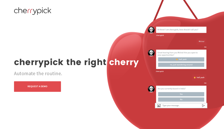 Artificial Intelligence Website
Via cherrypick
4. White Space
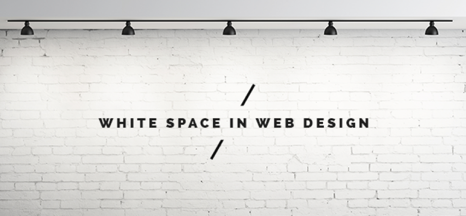
White space has been used from decades as an effective design tool. White space is canvas space left in between elements keeping the design from being too cluttered or too confusing. It sometimes referred to negative space, the portion of the page left unmarked. In design terms, it means space between margins, text, columns and other elements in the page.
White space makes the website design look more dynamic, active and elegant providing emphasis on structure and freedom of elements as it does not mean blank space but space between columns, text, images and other elements.
Via psd2html
5. Broken Grid & Asymmetrical Layouts
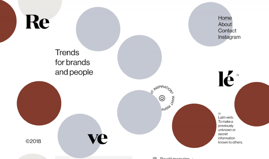
The grid has been used in order to have symmetry and break the page into proportional sections. But a broken grid and asymmetrical layouts is a new trend for website designers to show their design creativity and freedom.
Where grid divides pages into rows and columns giving it a symmetrical look broken grid give a page with less rigid look making it draw attention is accustomed to more and more frequent usage in the coming year.
Via StudioRevele
6. Overlapping Design Elements
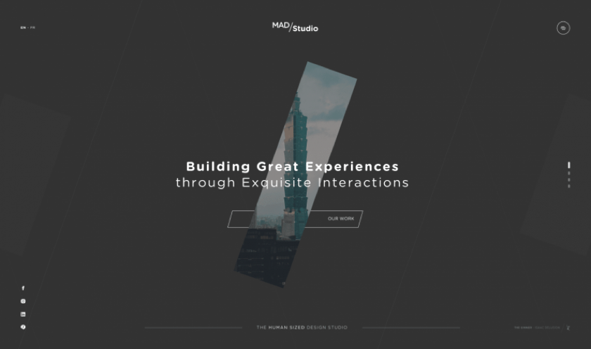
Images with text or icons overlapping (generally not touching one another) create a layering effect in website design and are one of the most trendy designs that break the grid giving the appearance of UI elements depth.
The perception of depth and separation between the layers appears as the top layer is overlapping the grids’ guidelines enhancing the overall aesthetic of the site. Overlapping has to be done in such a way that it maintains the design of UI elements with the execution of grid design in its uniqueness.
Via mad-studio
7. The Trend of Usage of Organic Shapes
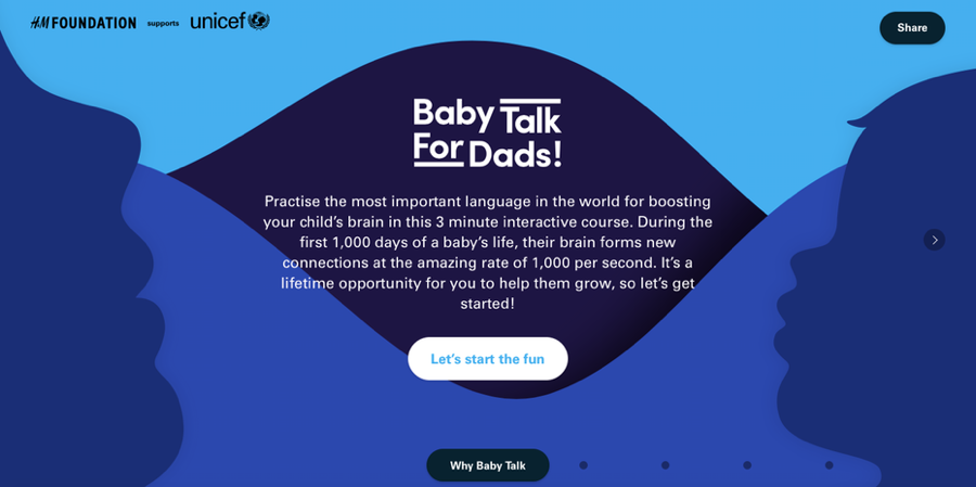
Organic shapes are irregular and uneven as they are not regulated by patterns or exact dimensions. These images are shapes that are found in nature with randomness and freedom giving the website a creative approach to design.
Website designers use the flowing soft and calming nature of organic shapes to showcase the design in a more hand drawn and humanistic appearance. This gives a personal touch and user’s attention with depth illustration to the images.
Via Baby Talk for Dads
7. Typography Uniqueness and Creativity
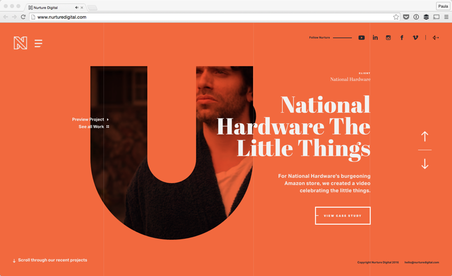
Improving usability and optimizing the design for legibility typography is a timeless trend and core foundation of web design. A remarkable and captivating experience is achieved through interactive typography telling the story of a website in its own designed way.
Typography gives opportunities to break out of the grid by using different font faces, styles, margins, spacing alignments, line heights that lets you maintain the design structure.
Via Nurture Digital
Author Bio
Written by Sandeep Mehta website designer, the above article is a brief display of his skills and experience acquired throughout his journey in the said niche. I’m having 5 years of experience in website designing and my skills are PHP, HTML, CSS, Javascript, XML.
Where Web Designing is Going in 2019 was originally published in Hacker Noon on Medium, where people are continuing the conversation by highlighting and responding to this story.
Disclaimer
The views and opinions expressed in this article are solely those of the authors and do not reflect the views of Bitcoin Insider. Every investment and trading move involves risk - this is especially true for cryptocurrencies given their volatility. We strongly advise our readers to conduct their own research when making a decision.
