Latest news about Bitcoin and all cryptocurrencies. Your daily crypto news habit.
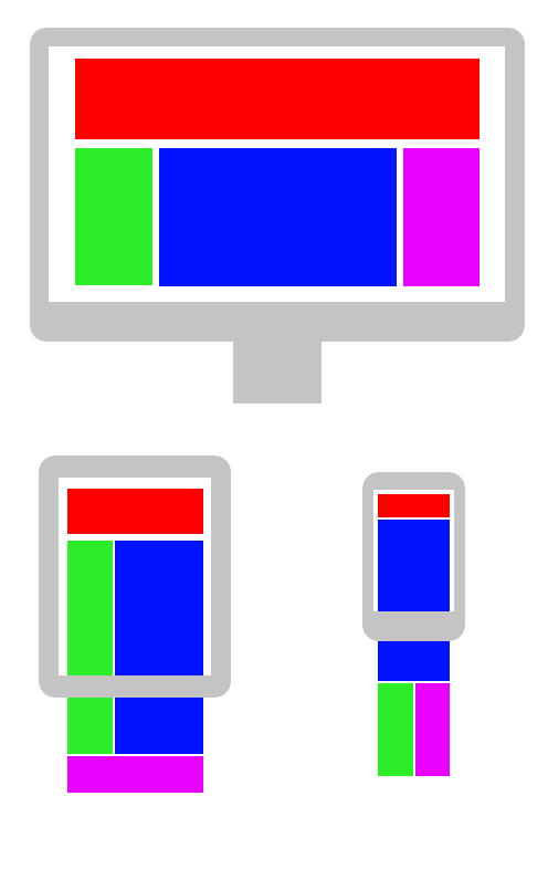
 By Stéphanie Walter — https://blog.stephaniewalter.fr/en/download-illustration-content-is-like-water/
Since the release of React 16.8, I’ve been enjoying the ability to use hooks to create composable and reusable logic, and write fewer class components with explicit lifecycle methods. This not only leads to a more enjoyable dev experience, but (in my opinion) a more readable code base.
Today I am going to introduce a few hooks and use them to build a simple responsive layout. Using the Context API, we can ensure that all components have access to up-to-date window dimensions, without relying on lifecycles to attach and clean up event listeners.
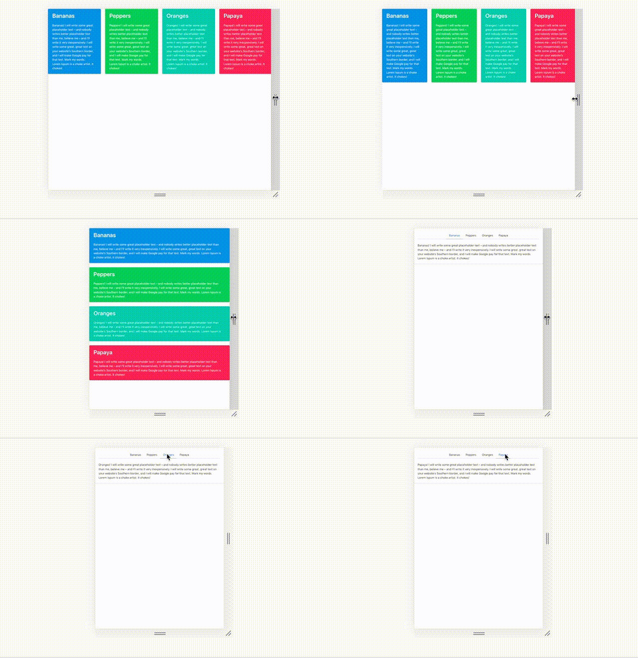
The Finished Product v responsive
The finished code can be found on github.
First Steps
To begin, we will scaffold a new react app with create-react-app, and add the wonderful bulma css library:
$ create-react-app my-responsive-app$ cd !$$ yarn add bulma node-sass$ yarn start
That’s it for getting started. We are going to be using bulma for some nice-looking components, but we will handle all the responsive design using React and JS.
On Being Responsive Handling different device sizes is pretty important from what I hear.
What is responsive web design exactly? According to the internet:
Responsive web design (RWD) is an approach to web design that makes web pages render well on a variety of devices and window or screen sizes
— Wikipedia
Okay! This seems like something we can handle in CSS, using relative units and media queries, right?
Well, yes and no. Most of the time, CSS can handle the job if the job is simply arranging content on a page. However, sometimes, you may want to change render behavior based on the page size, and for this, you almost definitely will need some Javascript (or other dark magic).
The React Way
So React is all about creating reusable bits of presentation logic (components) and using them to compose views. Now that we have hooks, we can actually simplify this composition further: hooks allow us to encapsulate certain behaviors, often composed of multiple hooks, into functions that integrate directly into React’s renderer (using the new React Fiber, which we won’t dive into here) to automatically update the components using them.
So?
So, this old thing (/clap if you’ve written this in one of your React Apps):
class NavBar extends Component { state = { open: false } setOpen = open => this.setState({ open }) render() { return (this.state.open ? <NavMenu /> : <HamburgerButton onClick={() => this.setOpen(true)} /> ) }}Has now become:
function NavBar() { const [open, setOpen] = useState(false) return (open ? <NavMenu /> : <HamburgerButton onClick={() => setOpen(true)} /> )}If this doesn’t seem like a big deal yet, you can check out some of the cool things people have made with hooks here: https://codesandbox.io/react-hooks
The point is, hooks are nice. We don’t have to type as much, and we almost never have to worry about componentDidMount/componentDidUpdate/setState or the status of the class properties proposal (thank you babel) again.
Now that we know what responsive web design is (kind of), and hooks (also kind of), let’s use both of them to build something! To start, let’s implement our fundamental building block (for this article): the ResponsiveLayout component.
To start, we’ll create a good old functional component (in src/components/ResponsiveLayout/index.js), that accepts three props: renderDesktop, renderMobile, and breakpoint.
import { useState, useEffect } from 'react'const ResponsiveLayout = ({ breakpoint, renderMobile, renderDesktop }) => { const [width, setWidth] = useState(window.innerWidth) useEffect(() => { const handleResize = () => { setWidth(window.innerWidth) } window.addEventListener('resize', handleResize) return () => { window.removeEventListener('resize', handleResize) }, []) return (width > breakpoint ? renderDesktop() : renderMobile())}We are simply reading the window’s width when the component gets created and storing it using the useState hook, then establishing an event listener inside of our useEffect hook. useEffect will normally run its code every time a component re-renders, however it accepts a second argument, an array of variables, that inform useEffect that it should only re-run when a value inside the array is changed. When provided an empty array, it will never re-run, so it behaves exactly like componentDidMount!
The return value for useEffect should be a cleanup function, if required, so that it can be run when the component is being removed from the DOM. Here we specify an anonymous function that will remove the event listener when this component is un-mounting (sound familiar? this is what we’ve been doing inside of componentWillUnmount).
Now this seems pretty good, but what happens if there are multiple places where things on the page need to render based on a breakpoint? We shouldn’t be setting up new event listeners for the same event every time one of these components is mounting, especially since we only have one window resize to listen for.
Enter useContext
One of the ways hooks have really made things better is in the Context API. Previously, using Context required creating Consumer and Provider components, and utilizing the Consumer in any component that needed access to the value. This led to devs creating Higher Order Components for providing context as props (for example, react-redux's connect) or simply very verbose code. Now, with useContext, we no longer have to use Context.Consumer Components to make children aware of values from Context.
Let’s rewrite the above component, using Context and an App-wide WindowDimensionsProvider.
In src/components/WindowDimensionsProvider/index.js:
import React, { createContext, useContext, useState, useEffect } from 'react'const WindowDimensionsCtx = createContext(null)
const WindowDimensionsProvider = ({ children }) => { const [dimensions, setDimensions] = useState({ width: window.innerWidth, height: window.innerHeight, }) useEffect(() => { const handleResize = () => { setDimensions({ width: window.innerWidth, height: window.innerHeight, }) } window.addEventListener('resize', handleResize) return () => { window.removeEventListener('resize', handleResize) }, []) return ( <WindowDimensionsCtx.Provider> {children} </WindowDimensionsCtx.Provider> )}export default WindowDimensionsProviderexport const useWindowDimensions = () => useContext(WindowDimensionsCtx)
This component should be invoked in src/App.js, like so:
import React from 'react'import Content from './components/Content'import WindowDimensionsProvider from './components/WindowDimensionsProvider'import items from './data.json'import 'bulma/css/bulma.css'
const App = () => ( <WindowDimensionsProvider> <div className="App"> <Content items={items} /> </div> </WindowDimensionsProvider>)export default App
Don’t worry about the Content and items, we’ll get to those later. What’s important is that the Provider component appear higher in your app’s render tree than any component that wants to rely on its Context for data. (this is important so React knows which context to provide, in case you have multiple instances of the same type of Provider in different places in your app.)
By doing this, we have ensured the following:
- There will only be one ‘resize’ event listener active on the page
- It will remain active as long as React is rendering our App component
- All components inside our app (here, just the Content component) will have access to the WindowDimensionsProvider’s context
With this plumbing set up, let’s rewrite our responsive layout handling component:
import { useWindowDimensions } from '../WindowDimensionsProvider'const ResponsiveLayout = ({ breakpoint, renderMobile, renderDesktop }) => { const { width } = useWindowDimensions() return (width > breakpoint ? renderDesktop() : renderMobile())}Wow! Not only do we have a better performing implementation (as each instance does not have to set up/tear down event listeners), but there’s much less going on in the component. Semantically, each line of code perfectly describes what it is doing:
- Get the width using window dimensions.
- If the width is greater than the breakpoint, render the desktop view. Otherwise, render the mobile view.
Pretty straightforward.
Now that we have this tool, let’s use it to make a responsive layout.
Needs More Content
So let’s build our two layouts. For our mobile view, we’ll render a tabbed view:
import React from 'react'import TabbedView from './TabbedView'
const MobileView = ({ items }) => ( <div className='container box'> <TabbedView items={items} /> </div>)export default MobileView
For the TabbedView, we will use useState to keep track of the active tab, so it receives proper styles and we know what to render in the content box.
import React, { useState } from 'react'const TabbedView = ({ className, items, renderItem }) => {const [active, setActive] = useState(0)return ( <div className='tabs-container'> <nav className='tabs is-centered'> <ul> {items.map(({ title }, idx) => ( <liclassName={idx === active ? 'is-active' : ''}key={title} > <a onClick={() => setActive(idx)}>{title}</a> </li> ))} </ul> </nav> <div> <p className='content'> {items[active].content} </p> </div> </div> )}export default TabbedView
Here we simply set up a container for tabs at the top (inside a nav) and render the content based on the active tab.
For Desktops, we will instead give each item its own tile.
import React from 'react'import Tile from './Tile'import { useWindowDimensions } from '../WindowDimensionsProvider'const DesktopView = ({ items }) => {const { width } = useWindowDimensions() return ( <divclassName={‘tile is-ancestor ‘ .concat(width < 1088 ? ‘is-vertical’ : ‘’)} > {items.map((item, idx) => ( <Tilekey={item.title} {...item} /> ))} </div> )}export default DesktopView
Our desktop view can even handle width as well, for a minimal change (like adding a class name), without getting too complex.
Our Tile is just a couple of divs ‘n’ spans:
import React from 'react'
const Tile = ({ title, content }) => ( <div className='tile is-parent notification box'> <div className='tile is-child'> <p className='title'>{title}</p> <span className='content'>{content}</span> </div> </div>)export default Tile
In src/Content/index.js, we’ll write a basic wrapper for the responsive layout:
import React from 'react'import ResponsiveLayout from '../ResponsiveLayout'import MobileView from './MobileView'import DesktopView from './DesktopView'
const Content = ({ items }) => ( <ResponsiveLayout breakPoint={767} renderDesktop={() => ( <DesktopView items={items} /> )} renderMobile={() => ( <MobileView items={items} /> )} />)export default Content
Wrapping Up
Now we’ve defined our Content component, we just need some data to render. In src/data.json, we can create some placeholder data to see how we’re doing so far:
[ { title: "Bananas", "content": "Bananas! I will write some great placeholder text – and nobody writes better placeholder text than me, believe me – and I’ll write it very inexpensively. I will write some great, great text on your website’s Southern border, and I will make Google pay for that text. Mark my words. Lorem Ipsum is a choke artist. It chokes!" }, { "title": "Peppers", "content": "Peppers! I will write some great placeholder text – and nobody writes better placeholder text than me, believe me – and I’ll write it very inexpensively. I will write some great, great text on your website’s Southern border, and I will make Google pay for that text. Mark my words. Lorem Ipsum is a choke artist. It chokes!" }, { "title": "Oranges", "content": "Oranges! I will write some great placeholder text – and nobody writes better placeholder text than me, believe me – and I’ll write it very inexpensively. I will write some great, great text on your website’s Southern border, and I will make Google pay for that text. Mark my words. Lorem Ipsum is a choke artist. It chokes!" }, { "title": "Papaya", "content": "Papaya! I will write some great placeholder text – and nobody writes better placeholder text than me, believe me – and I’ll write it very inexpensively. I will write some great, great text on your website’s Southern border, and I will make Google pay for that text. Mark my words. Lorem Ipsum is a choke artist. It chokes!" }]With everything in place, we should be able to confirm by resizing the window that the view switches from a tabbed view to a set of tiles.
I hope this walkthrough has shown a few ways hooks can be used in your React apps today.
Simplifying Responsive Layouts with React Hooks was originally published in Hacker Noon on Medium, where people are continuing the conversation by highlighting and responding to this story.
Disclaimer
The views and opinions expressed in this article are solely those of the authors and do not reflect the views of Bitcoin Insider. Every investment and trading move involves risk - this is especially true for cryptocurrencies given their volatility. We strongly advise our readers to conduct their own research when making a decision.