Latest news about Bitcoin and all cryptocurrencies. Your daily crypto news habit.

Tyler O'Briant and I are building Kowalla, a platform for creating, collaborating, and sharing projects in real-time. We’re both engineers, and every instinct we had told us to put our heads down and code our faces off. We just had one problem…
Our first features were engineered, not designed; and it showed.
We took a step back and scratched our heads. We had a UI design only a mother could love.
Traditional wisdom told us to get out the initial MVP as fast as possible, get features in front of users, and iterate. But were we sacrificing our design for speed?
We decided our process would be design first, and building second. Taking an engineer’s approach to design, we focused on functionality and simplicity. Here’s what we learned.
Focus on the flow
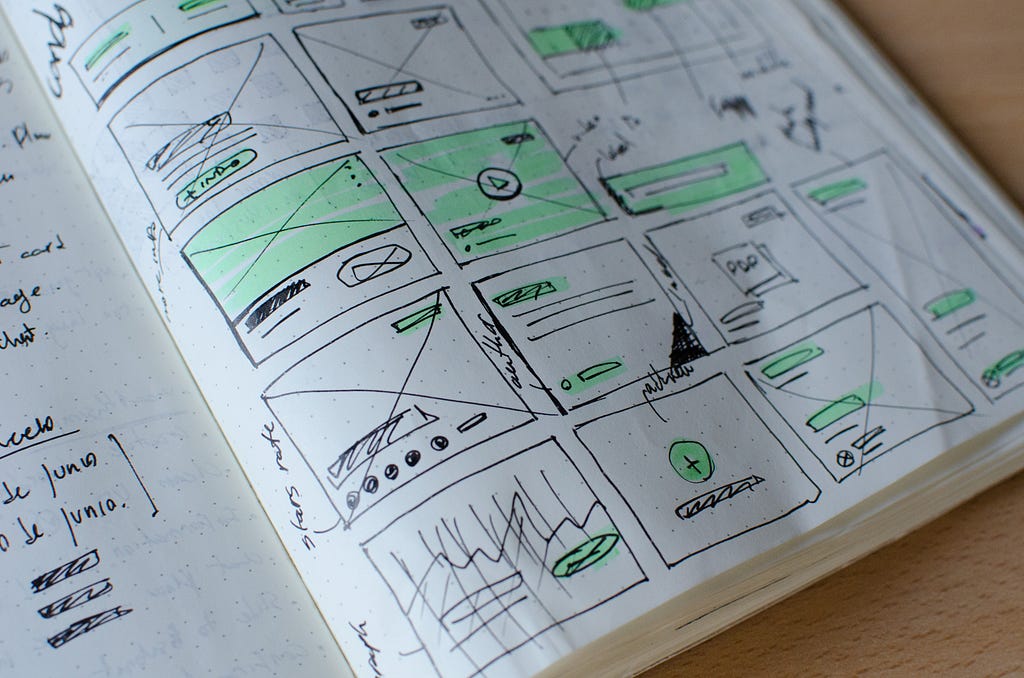
At the start of our design process, we sought out inspiration to make something visually unique. We trawled through Dribbble and web design subreddits to concoct the secret sauce for a unique user experience. We quickly realized colors and button placement were the least of our worries.
When you start designing, it’s fun to think about the visuals, but the real challenge is in seeing the big picture. Having a cohesive user journey through your app is more important than having a perfect visual design.
 It’s not pretty, but it works.
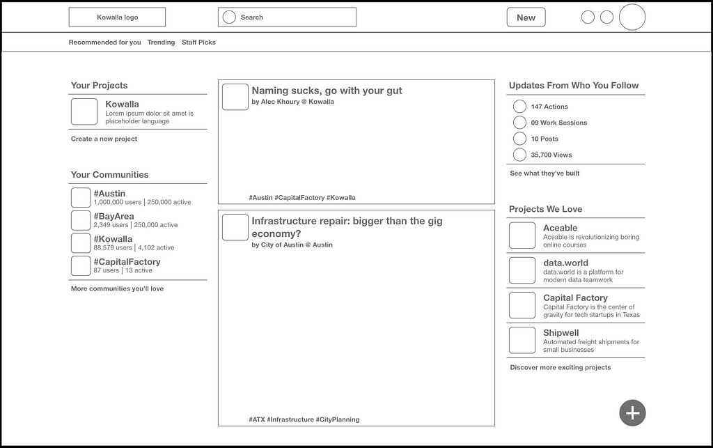
If you get ahead of yourself by trying to make your design look “cool” before it’s functional, you’re guaranteed to waste time. A function-first strategy strips away all distractions, so you can ensure the site makes sense before you make it look good. It doesn’t matter how striking your site looks if people don’t know how to use it. The wireframe above could be a generic frame for Twitter, Facebook, Tumblr, or even Reddit, but it had just enough elements for us to simulate user flows unique to our platform. Once we understood and plotted out those experiences, we could flesh out more details.
Don’t re-invent the wheel
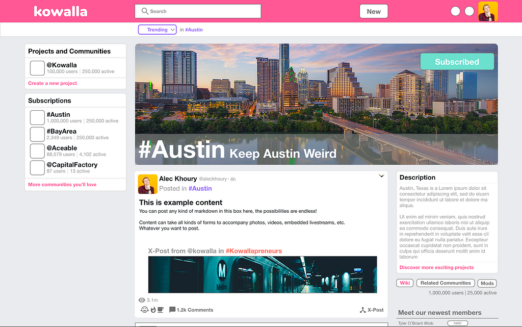
I wrote above that we wanted to make a platform that was different, but “different” does not mean “new”. We wasted a lot of time on our wireframes playing with unique color schemes we thought might set us apart. Once we had solid user flows, we realized all of those colors just became unmanageable. In the end, we opted for a pattern based on a single color, building out subtle variations for different functions.
 I concede this may have been a low point in our design process.
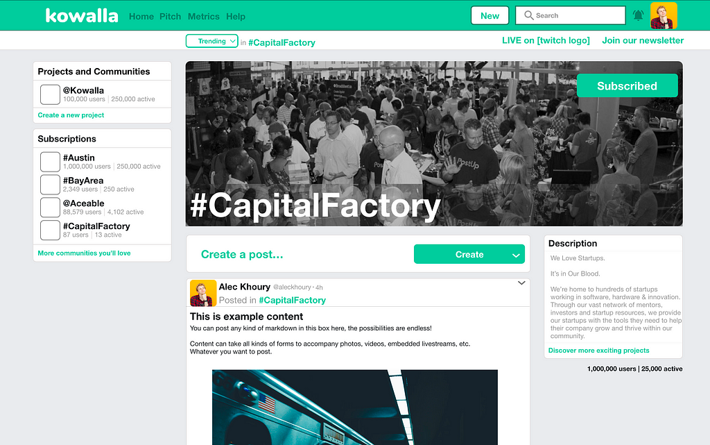
After surviving the horror that is the above image, we observed how other sites handled colors. Our quintessential example is Twitter. Twitter strikes a balance between clean design and enough variation to keep things interesting, by allowing users to pick a single color, then applying that color across the site’s most important elements. We decided to follow their lead and moved to the simpler design below:
We went through this process repeatedly while designing our app. A cycle of generating unique ideas, but then ultimately looking for guidance in existing design patterns. The key takeaway for MVP design: capturing the unique value prop your product brings to user experience should be the top priority. Once you’ve done that, you can move faster by using established design patterns to build anything that doesn’t affect your unique value prop.
Keep it simple
Another design trap to avoid is overthinking decisions. It can be helpful after a long discussion to take a step back and re-evaluate how you’re looking at the problem.
If you’re designing the right way, you will be basing your work off of some form of user research or validation. However, this can only get you so far before you need to move into territory that your user research may not have covered. You need to walk a tightrope in the design process between predicting user needs and not making assumptions.
While we went back and forth on visual and structural decisions about our site; we sometimes found ourselves stacking assumptions on top of assumptions to make a decision. The solution here is almost always to take a step back and simplify. We’d rather create a simple solution to solve a problem we know exists, rather than build a complex solution based on an assumption.
The importance of simplicity becomes most apparent right at the end. While reviewing your final design, you should feel some level of satisfaction as you walk through each user flow. This is the best time to find areas where you made assumptions or overcomplicated the experience. You will find issues.
A bit about us
We’re Kowalla. We believe an opportunity gap exists for people who want to build their dreams, but don’t have a community to collaborate and learn with. We’re building a platform with tools for people to connect and collaborate, no matter the distance between them. Sign up below for more articles like this, and updates as we build.
Lean Design For A Better MVP was originally published in Hacker Noon on Medium, where people are continuing the conversation by highlighting and responding to this story.
Disclaimer
The views and opinions expressed in this article are solely those of the authors and do not reflect the views of Bitcoin Insider. Every investment and trading move involves risk - this is especially true for cryptocurrencies given their volatility. We strongly advise our readers to conduct their own research when making a decision.

