Latest news about Bitcoin and all cryptocurrencies. Your daily crypto news habit.
The Step-by-Step SaaS Landing Page Formula [2019 edition]
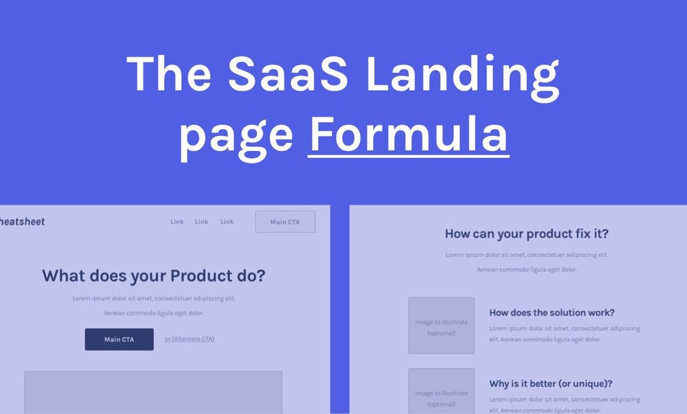 You can also check the cheatsheet here (with the full image)
In this article, I’ll give you a step-by-step formula for the “perfect” SaaS Landing page…
And you know what? I’ll make a bold claim.
If you follow this article you’ll be able to come up with a great SaaS Landing page that should convert fairly well out of the gate! (same claim as my book)
Without marketing skills, without design skills…Even if you struggled in the past!
How is this possible?
You see, people usually get super overwhelmed when designing these pages and end up not focusing on the stuff that matters…the reasons people buy.
If you don’t use them then you won’t be able to convert (at all!), regardless of how pretty your page is…
You have no margin for error. This formula only focuses on simple principles (as you’ll see below) so you’ll only focus on what generates results.
It took me years to perfect it, but now, you can get results pretty much right away once you use it (clients pay me $$ to use it).
Get the formula below in the article (or get the .pdf version + a free course explaining the full process for free here).
Free course: My full 5-step process for creating SaaS Landing pages + the .pdf version of the formula.
The 5 Step Process for SaaS Companies to Turn Visitors into Customers - Free Email course
But first, some principles…
Look, I’m not going to talk to you about button colors, minor tweaks in words and some “magic” split testing secrets…
Those simply don’t work!
Like anything you read on my blog (or book), this will be highly actionable and universal so it’s something you can use right after you read it!
My content is based on Marketing and Psychology principles learned from the best Marketers and Copywriters of all time (before the internet even existed)!
I simply took those principles and I applied them with SaaS companies (my niche), with great success so far!
Anyway…The formula you’ll see here is a variation of the famous PAS formula (Problem — Agitate — Solution) popularised by Marketing legend Dan Kennedy!
Get the overview of the full formula below (my version for SaaS)👇
Breakdown: The “perfect” SaaS Landing page
Follow the tips from both the image and the full explanation below to get the best result possible.
Header
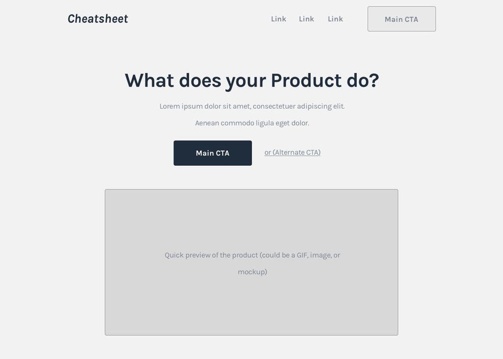 Header — check the full image/cheatsheet here
aka the top of the page. Simply come up with a good title, a short description and a clear CTA to introduce what the product does. To do this, use the hints in the image.
The whole purpose of this section is to create curiosity so people keep scrolling and you get more time to explain your product as they scroll.
If you don’t get it right you might loose up to 90% of your traffic here!
Initial Social proof
 Initial Social proof — check the full image/cheatsheet here
Simply add some well-known logos in your niche about the product to create authority before the next section.
Pro-tip: Only use well-know logos in your niche otherwise it might seem you are trying to hard to make your company seem important or that you operate in a different niche than you actually do… Otherwise, your potential customers won’t be able to relate to this social proof!
Alternatively, you can use some statistics about your product as long as the numbers are high enough and are related to the product.
 TransferWise using stats for social proof
Here’s an example of how Transferwise used stats to proof that they are a legit company processing a ton of transfers already. They previously had “We transfer £2 billion pounds per month” (or similar) which would have been a better example for what that point I’m making here.
Problem intro
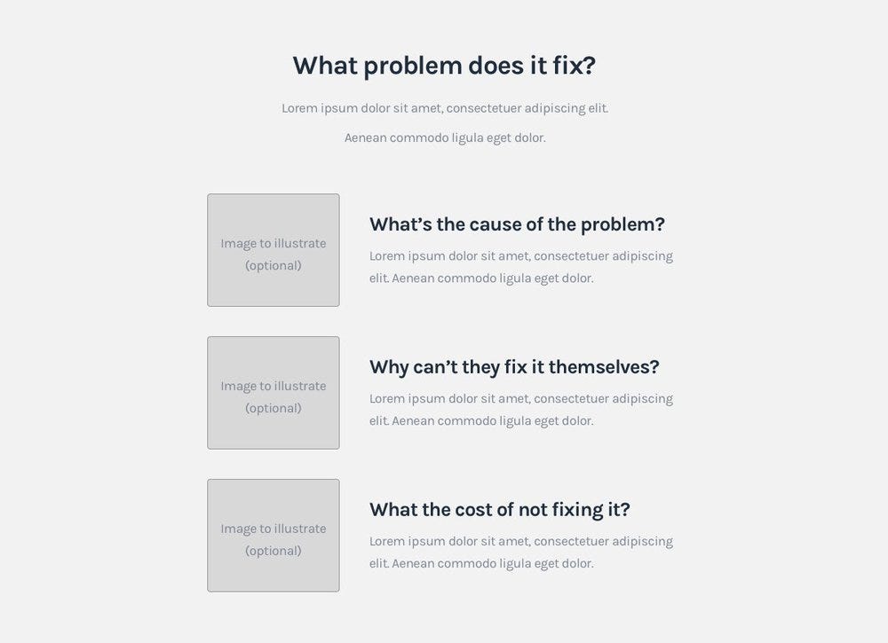 Problem intro — check the full image/cheatsheet here
This is something that is incredibly rare to see SaaS companies doing right… It’s probably the most important section on your page!
Why is this important?
Let’s face it…people buy SaaS products because they want to fix their problem so explaining the problem first avoids 2 big issues:
1) Not knowing which problem your product fixes -> They’ll think it’s either useless or be confused about it.
2) Thinking it doesn’t fix their problem (or the “big problem”) -> If they don’t think it fixes their problem or a big enough problem then there’s literally no reason for them to convert…
Pro-tip: Make sure you do your research to find what’s the underlying problem(s) people want to get fixed, otherwise, they might not value it enough to convert or you might pitch the wrong problem altogether (which is even worse).
How it works/Solution
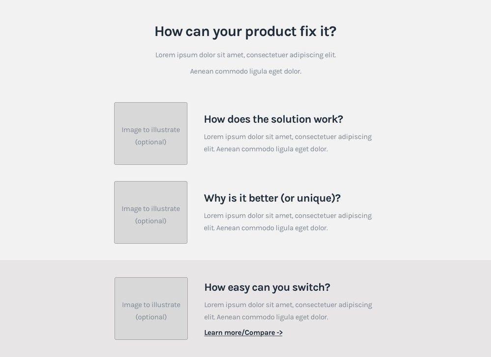 How it works/Solution — check the full image/cheatsheet here
This is where you explain the solution and add 3–5 points on how the product can fix the problem introduced above.
Simply reply to the questions from the image to understand what you need to do here.
Reinforcing benefits
 Benefits — check the full image/cheatsheet here
After you explain the solution you can reinforce the benefits by saying how fast it is to use, that it already integrates with the tools they use or that you have amazing support (just some examples).
It’s a good place to answer: Why is your product different/better?
In this example, I used “How easily can you switch?” meaning how easily can the customer switch from the method they are using (competitor or just normal process) to using your product?
More Social proof
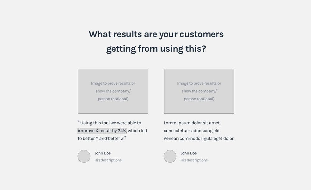 More Social proof — check the full image/cheatsheet here
Just add testimonials to make your potential customers feel other people are already getting good results.
Ideally, focus on result driven testimonials like “We were able to reduce costs by 24%” not “Awesome tool, I’d highly recommend it!” (the latter has no value).
The key here is to provide testimonials people can relate to, the more similar the examples are to their situation the better!
Final CTA
 Final CTA — check the full image/cheatsheet here
Have a clear CTA so people can have a chance to convert before leaving, you don’t want them to leave them without an easy way to convert after that awesome pitch from the sections above ;)
Make sure to make it seem lower commitment like: “The first 14 days are on us!” if you’re using a free trial as your main CTA.
Alternate CTA
 Alternate CTA — check the full image/cheatsheet here
Find alternatives to get people’s contact info even if they are not ready to convert now.
Examples of alternate CTA’s:
- Demos
- FAQ’s
- Lead magnets
- Chat widgets
- Exit Popups
- (and more)
All of them could be great you just need to find one that fit’s your product or what your target market would expect.
Demos, chat widgets, FAQ’s, lead magnets and exit popups are all great for this.
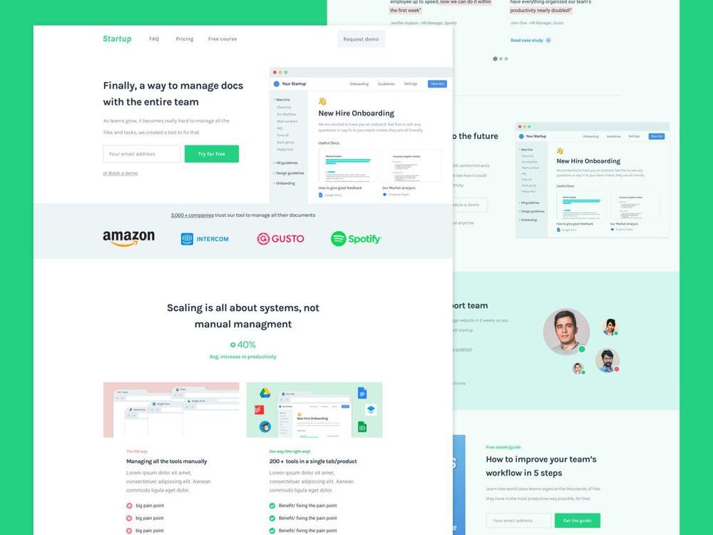
Example of a SaaS Landing page using this formula
Check out the breakdown of this page using the same formula
This formula might seem hard to picture how it might look like once it’s done so here’s an example of another article breaking down a SaaS Landing page using the same formula:
Related article: Breaking down a conversion driven SaaS Landing page
Breaking down a SaaS Landing page designed to capture more leads
Common concerns/misconceptions…
“Why should I use a formula?” It’s the only way to get predictable results as many times as possible. Unless your process is fully defined you’ll end up focusing on the wrong stuff, get shitty results and waste a TON of time (that’s how companies take months to redesign their page)… If you want to learn my entire process (before and after this formula) get my free email course here.
“Does it work for my company too?” Yes, it works with all companies. If you notice, the formula only covers problems and solutions…To my knowledge, there’s no company (still running) who doesn’t provide a solution to a problem :P
“This is not the “perfect” SaaS Landing page!” It could be…that only depends on how good you are at communicating these problems vs solutions and how you make the most out of this formula. Yes, you can tweak this to fit the project (I do it all the time) but if you’re not experienced doing it I wouldn’t advise it at all!
“What about the images?” Simply create or find images that illustrate what the copy is saying so the image can support that message. Personally, I can design my own images so it’s not a problem for me or any good designer learning this. You could also choose to keep it text only which is definitely not ideal but could still work well enough.
“What about the copy?” Once the structure is well defined (as it is in this formula) you just need to write simple/short/direct titles around the content covered and replace the “lorem ipsum” with a further explanation of what the titles talk about.
[Warning] This is only 20% of the magic!
This formula is not the first step nor the last one in the process of designing conversion driven SaaS Landing pages or entire funnels.
This is a 5 step process…there are several steps before I even think about the structure of the page!
The results you’ll get are dependent on the content and the research done before you use the formula, that’s what distinguishes successful landing pages from ones that don’t convert at all!
Don’t worry! I can also teach you that (and it’s free)…get it in the link below 👇
Get the full process with my 100% free email course.
Want to improve your SaaS Website/Funnel?
Hey, I’m Pedro! I help SaaS Companies turn visitors into customers through better messaging.
This involves:
- Identifying problems with your website that are keeping you from acquiring a ton of customers.
- Finding growth opportunities that can let you acquire more customers.
- Explaining the product (problem + benefits) in a way the customer understands well and can relate to (that’s how they convert).
- Redesigning entire websites or individual pages in order to increase conversions and/or reduce customer acquisition cost.
There’s a catch tho…I only work with slightly more than a handful of clients a year!
Want to see if you qualify? Simply schedule a free strategy session here to see if there’s a fit or not.
Originally published at www.cortes.design.
The Step-by-Step SaaS Landing page Formula [2019 edition] was originally published in Hacker Noon on Medium, where people are continuing the conversation by highlighting and responding to this story.
Disclaimer
The views and opinions expressed in this article are solely those of the authors and do not reflect the views of Bitcoin Insider. Every investment and trading move involves risk - this is especially true for cryptocurrencies given their volatility. We strongly advise our readers to conduct their own research when making a decision.
