Latest news about Bitcoin and all cryptocurrencies. Your daily crypto news habit.

Shape: It’s kind of a big deal
You can’t have a UI without shape. Cards, buttons, sheets, text fields — and just about everything else you see on a screen — are often displayed within some kind of “surface” or “container.” For most of computing’s history, that’s meant rectangles. Lots of rectangles.
But the Material team knew there was potential in giving designers and developers the ability to systematically apply unique shapes across all of our Material Design UI components. Rounded corners! Angular cuts! For designers, this means being able to create beautiful interfaces that are even better at directing attention, expressing brand, and supporting interactions. For developers, having consistent shape support across all major platforms means we can easily apply and customize shape across apps.
My role as engineering lead was truly exciting — I got to collaborate with our design leads to scope the project and find the best way to create this complex new system. Compared to systems for typography and color (which have clear structures and precedents like the web’s H1-H6 type hierarchy, or the idea of primary/secondary colors) shape is the Wild West. It’s a relatively unexplored terrain with rules and best practices still waiting to be defined. To meet this challenge, I got to work with all the different Material Design engineering platforms to identify possible blockers, scope the effort, and build it!
When building out the system, we had two high level goals:
- Adding shape support for our components — giving developers the ability to customize the shape of buttons, cards, chips, sheets, etc.
- Defining and developing a good way to theme our components using shape — so developers could set their product’s shape story once and have it cascade through their app, instead of needing to customize each component individually.
From an engineering perspective, adding shape support held the bulk of the work and complexities, whereas theming had more design-driven challenges. In this post, I’ll mostly focus on the engineering work and how we added shape support to our components.
Here’s a rundown of what I’ll cover here:
- Scoping out the shape support functionality
- Building shape support consistently across platforms is hard
- Implementing shape support on iOS:
- — Shape core implementation
- — Adding shape support for components
- Applying a custom shape on your component
- Final words
Scoping out the shape support functionality
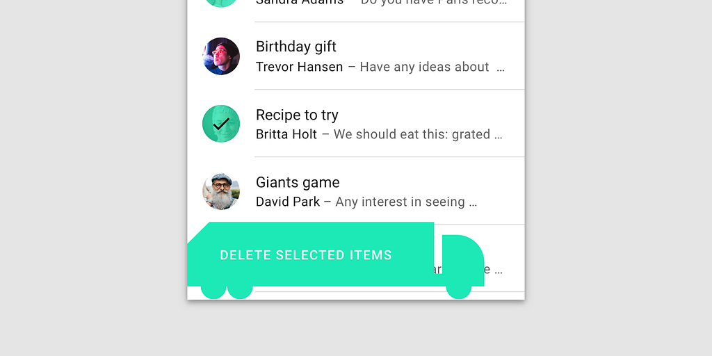
We soon found that having no restrictions would make it extremely hard to define such a system. More flexibility doesn’t necessarily mean a better result. For example, it’d be quite a feat to define a flexible and easy API that lets you make a snake-shaped FAB and train-shaped cards. But those elements would almost certainly contradict the clear and straightforward approach championed by Material Design guidance.
 This truck-shaped FAB is a definite “don’t” in Material Design guidance.
We had to weigh the expense of time and resources against the added value for each functionality we could provide.
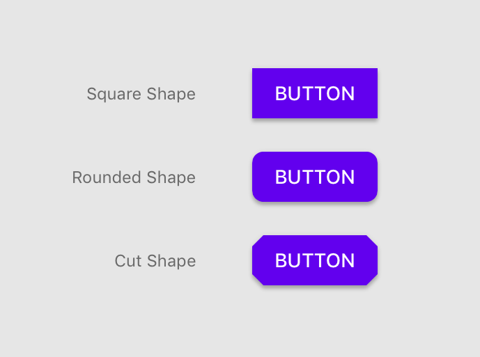
To solve these open questions we decided to conduct a full weeklong workshop including team members from design, engineering, and tooling. It proved to be extremely effective. Even though there were a lot of inputs, we were able to hone down what features were feasible and most impactful for our users. Our final proposal was to make the initial system support three types of shapes: square, rounded, and cut. These shapes can be achieved through an API customizing a component’s corners.
Building shape support consistently across platforms (it’s hard)
Anyone who’s built for multiple platforms knows that consistency is key. But during our workshop, we realized how difficult it would be to provide the exact same functionality for all our platforms: Android, Flutter, iOS, and the web. Our biggest blocker? Getting cut corners to work on the web.
Unlike sharp or rounded corners, cut corners do not have a built-in native solution on the web.
Our web team looked at a range of solutions — we even considered the idea of adding background-colored squares over each corner to mask it and make it appear cut. Of course, the drawbacks there are obvious: Shadows are masked and the squares themselves need to act as chameleons when the background isn’t static or has more than one color.
We then investigated the Houdini (paint worklet) API along with polyfill which initially seemed like a viable solution that would actually work. However, adding this support would require additional effort:
- Our UI components use shadows to display elevation and the new canvas shadows look different than the native CSS box-shadow, which would require us to reimplement shadows throughout our system.
- Our UI components also display a visual ripple effect when being tapped — to show intractability. For us to continue using ripple in the paint worklet, we would need to reimplement it, as there is no cross-browser masking solution that doesn’t provide significant performance hits.
Even if we’d decided to add more engineering effort and go down the Houdini path, the question of value vs cost still remained, especially with Houdini still being “not ready” across the web ecosystem.
Based on our research and weighing the cost of the effort, we ultimately decided to move forward without supporting cut corners for web UIs (at least for now). But the good news was that we have spec-ed out the requirements and could start building!
Implementing shape support on iOS
After honing down the feature set, it was up to the engineers of each platform to go and start building. I helped build out shape support for iOS. Here’s how we did it:
Core implementation
In iOS, the basic building block of user interfaces is based on instances of the UIView class. Each UIView is backed by a CALayer instance to manage and display its visual content. By modifying the CALayer's properties, you can modify various properties of its visual appearance, like color, border, shadow, and also the geometry.
When we refer to a CALayer's geometry, we always talk about it in the form of a rectangle.
Its frame is built from an (x, y) pair for position and a (width, height) pair for size. The main API for manipulating the layer’s rectangular shape is by setting its cornerRadius, which receives a radius value, and in turn sets its four corners to be rounded by that value. The notion of a rectangular backing and an easy API for rounded corners exists pretty much across the board for Android, Flutter, and the web. But things like cut corners and custom edges are usually not as straightforward. To be able to offer these features we built a shape library that provides a generator for creating CALayers with specific, well-defined shape attributes.
Thankfully, Apple provides us with the class CAShapeLayer, which subclasses CALayer and has a customPath property. Assigning this property to a custom CGPath allows us to create any shape we want.
With the path capabilities in mind, we then built a class that leverages the CGPath APIs and provides properties that our users will care about when shaping their components. Here is the API:
By providing such an API, a user can generate a path for only a corner or an edge, and the MDCRectangleShapeGenerator class above will create a shape with those properties in mind. For this initial implementation of our initial shape system, we used only the corner properties.
As you can see, the corners themselves are made of the class MDCCornerTreatment, which encapsulates three pieces of important information:
- The value of the corner (each specific corner type receives a value).
- Whether the value provided is a percentage of the height of the surface or an absolute value.
- A method that returns a path generator based on the given value and corner type. This will provide MDCRectangleShapeGenerator a way to receive the right path for the corner, which it can then append to the overall path of the shape.
To make things even simpler, we didn’t want our users to have to build the custom corner by calculating the corner path, so we provided 3 convenient subclasses for our MDCCornerTreatment that generate a rounded, curved, and cut corner.
As an example, our cut corner treatment receives a value called a “cut” — which defines the angle and size of the cut based on the number of UI points starting from the edge of the corner, and going an equal distance on the X axis and the Y axis. If the shape is a square with a size of 100x100, and we have all its corners set with MDCCutCornerTreatment and a cut value of 50, then the final result will be a diamond with a size of 50x50.
Here’s how the cut corner treatment implements the path generator:
The cut corner’s path only cares about the 2 points (one on each edge of the corner) that dictate the cut. The points are (0, cut) and (sin(angle) * cut, cos(angle) * cut). In our case — because we are talking only about rectangles where their corner is 90 degrees — the latter point is equivalent to (cut, 0) where sin(90) = 1 and cos(90) = 0.
Here’s how the rounded corner treatment implements the path generator:
From the starting point of (0, radius) we draw an arc of a circle to the point (sin(angle) * radius, cos(angle) * radius) which — similarly to the cut example — translates to (radius, 0). Lastly, the radius value is the radius of the arc.
Adding shape support for components
After providing an MDCRectangleShapeGenerator with the convenient APIs for setting the corners and edges, we then needed to add a property for each of our components to receive the shape generator and apply the shape to the component.
Each supported component now has a shapeGenerator property in its API that can receive an MDCShapeGenerator or any different shape generator that implements the pathForSize method: Given the width and height of the component, it returns a CGPath of the shape. We also needed to make sure that the path generated is then applied to the underlying CALayer of the component's UIView for it to be displayed.
By applying the shape generator’s path on the component, we had to keep a couple things in mind:
Adding proper shadow, border, and background color support
Because the shadows, borders, and background colors are part of the default UIView API and don't necessarily take into account custom CALayer paths (they follow the default rectangular bounds), we needed to provide additional support. So we implemented MDCShapedShadowLayer to be the view's main CALayer. What this class does is take the shape generator path, and then passes that path to be the layer's shadow path—so the shadow will follow the custom shape. It also provides different APIs for setting the background color and border color/width by explicitly setting the values on the CALayer that holds the custom path, rather than invoking the top level UIView APIs. As an example, when setting the background color to black (instead of invoking UIView's backgroundColor) we invoke CALayer's fillColor.
Being conscious of setting layer’s properties such as shadowPath and cornerRadius
Because the shape’s layer is set up differently than the view’s default layer, we need to be conscious of places where we set our layer’s properties in our existing component code. As an example, setting the cornerRadius of a component—which is the default way to set rounded corners using Apple's API—will actually not be applicable if you also set a custom shape.
Supporting touch events
Receiving touch also applies only on the original rectangular bounds of the view. With a custom shape, we’ll have cases where there are places in the rectangular bounds where the layer isn’t drawn, or places outside the bounds where the layer is drawn. So we needed a way to support proper touch that corresponds to where the shape is and isn’t, and act accordingly.
To achieve this, we override the hitTest method of our UIView. The hitTest method is responsible for returning the view supposed to receive the touch. In our case, we implemented it so it returns the custom shape's view if the touch event is contained inside the generated shape path:
Ink Ripple Support
As with the other properties, our ink ripple (which provides a ripple effect to the user as touch feedback) is also built on top of the default rectangular bounds. For ink, there are two things we update: 1) the maxRippleRadius and 2) the masking to bounds. The maxRippleRadius must be updated in cases where the shape is either smaller or bigger than the bounds. In these cases we can't rely on the bounds because for smaller shapes the ink will ripple too fast, and for bigger shapes the ripple won't cover the entire shape. The ink layer's maskToBounds needs to also be set to NO so we can allow the ink to spread outside of the bounds when the custom shape is bigger than the default bounds.
Applying a custom shape to your components
With all the implementation complete, here are per-platform examples of how to provide cut corners to a Material Button component:
Android:
Flutter:
iOS:
Web (rounded corners):
Final words
I’m really excited to have tackled this problem and have it be part of the Material Design system. I’m particularly happy to have worked so collaboratively with design. As an engineer, I tend to tackle problems more or less from similar angles, and also think about problems very similarly to other engineers. But when solving problems together with designers, it feels like the challenge is actually looked at from all the right angles (pun intended), and the solution often turns out to be better and more thoughtful.
We’re in good shape to continue growing the Material shape system and offering even more support for things like edge treatments and more complicated shapes. One day (when Houdini is ready) we’ll even be able to support cut corners on the web.
Please check our code out on GitHub across the different platforms: Android, Flutter, iOS, Web. And check out our newly updated Material Design guidance on shape.
Originally published at developers.googleblog.com on December 18, 2018.
How Google Built the Shape System for Material Design was originally published in Hacker Noon on Medium, where people are continuing the conversation by highlighting and responding to this story.
Disclaimer
The views and opinions expressed in this article are solely those of the authors and do not reflect the views of Bitcoin Insider. Every investment and trading move involves risk - this is especially true for cryptocurrencies given their volatility. We strongly advise our readers to conduct their own research when making a decision.

