Latest news about Bitcoin and all cryptocurrencies. Your daily crypto news habit.
Data visualizations for text: How to show the process of writing with the writing graph
Scroll to the bottom of this story for a link to the original post.
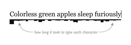
TEXT EDITORS (and the files they work) reveal surprisingly little about the history of editing. If you’re lucky, you get revisions to browse, and if not, you get undo/redo buttons. By adding temporal metadata to files, apps can display more than just the product — they can show process. This post introduces the writing graph, a timeline for viewing editing activity. A proof of concept below shows how new media artists, reflective writers and even casual readers can use this text visualization to learn more about what they’re reading.
THE HISTORY OF MANIPULATING TEXT is rich with innovation (e.g., water-soluble cave paint, clay tablets, printing presses, copy & paste, 💩, etc.). But for the most part, the narrative converges on a digital standard of the late 20th century: Adding and removing characters via a caret in a sequence of lines we call, ever so passionately, the “document” (metaphorical baggage included).
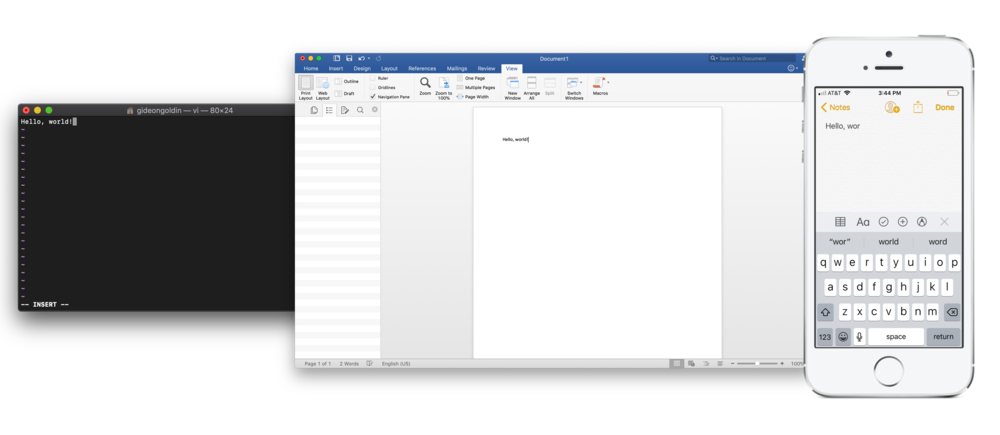 Vi, Word & Notes. The more things change, the more they stay the same.
A quick preface: In all the data vis courses I’ve taught, there have always been students eager to share “novel” visualizations. These are typically tweaks on canonical visualizations, or maybe even complex combinations thereof (like a scatterplot but where it’s in 4D and the scattering is of small multiples of non-geographical choropleths). Unsurprisingly, many researchers have spent a lot of time refining the art of visual communication; visualizations are like wood joints — it’s good to have an optimistic suspicion of anything “new”. Instead of proposing an alternative way to represent data, I’m only applying standard techniques to new content.
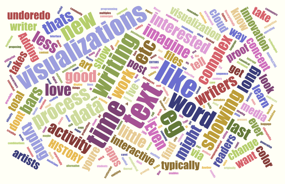 A word cloud of this very post. Can you find the only emoji?
Having said that, I think there is a dearth of text visualizations. Sure, there’s the somewhat (in)famous “word cloud” that maps word count to font size, and apps like iA Writer that gracefully color words by part-of-speech, and a lot of great academic projects, but not so much more (compared to other domains, at least). One reason is the ubiquity of plain text in operating systems and inter-app communication (which markdown embraces). Another is, “if it ain’t broke, don’t fix it”.
But innovation is good, and I know that a growing community of new media artists and creative coders would love tools that felt less utilitarian (e.g., Word) and more exploratory (e.g., Max); as a generative writer once told me, “musicians are spoiled”. It’s good to remember that niche technologies originally designed for expert needs (e.g., hands-free voice recognition for jet fighters) often find their way to the rest of us (e.g., Siri for commuters).
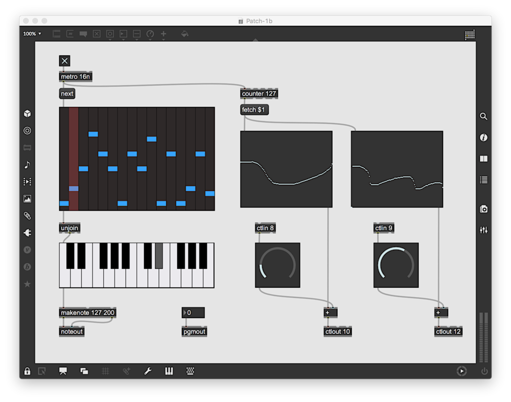 Max enables interactive sounds via a complex (yet playful) interface. Imagine a visual programming language designed for textual synthesis.
WHO WOULD WANT to see this dimension of the writing process? As a former cognitive scientist, I can tell you psychologists happen to be pretty interested in processes; they love timing participants because it helps them infer mental processes, like whether people are thinking fast or slow. In nearly every study I’ve done, response time was a dependent measure (how long does it takes you to make a moral judgment, solve a puzzle, foveate on a target, etc.) If you ever participate in an experiment, you can assume everything you do — including waiting for the “experiment” to start — is being timed (but if you tell your researcher this, they may have to toss your data due to bias). It should be said that scientists, like designers, know that a measure like time-to-completion tells you nothing more than time-to-completion; you might have paused on a word because you were conjuring synonyms, or you might have been distracted by a notification to somehow appease a social network. That’s why experiments often analyze groups of people over multiple trials — to “wash out the noise” of any given individual or situation.
The reason I was interested in seeing this context came after spending a little time with some poets at Brown. I was working on a new text-editor at the time, and the designer in me was intrigued to learn more about writers’ process, to look inside their work. In the spirit of transgression, here are some crazy 8’s for motivation:
- Giving readers x-ray vision into the streams of consciousness in a poem, which are typically only conveyable in a live “writing” or demonstration (i.e., performance art).
- Proving to oneself that with practice, journal entries takes less and less time to write (but what about blog posts?).
- Showing the ebbs & flows of a love letter (or Tinder message).
- Identifying moments of hesitation in a doctor’s note (don’t hold your breath; I trust Epic has more basic priorities in their hierarchy of needs).
- Improving my typing by reporting my slowest words/characters.
- Seeing how quickly POTUS adds tweets to the presidential archive.
- Tracking when a particular line of code was not only committed — but authored in an IDE.
- Confirming your suspicion that research articles rush through their conclusions because authors are drained after typing up results.
Obviously, not everyone wants to be reminded of their writing habits. Even someone looking over your shoulder can be paralyzing. Needless to say, in most cases this information should only be shown on demand, and writers should be able to disable it altogether.
THE APPROACH is simple. I draw a rectangle under each glyph, the height of which represents how long it’s been since the last activity. Define activity however you want (e.g., last click, last edit, etc.). Scale the bars however you like (mine are linear and capped at 1000ms).
 View the demo (and source code) by clicking the link at the bottom of this post.
You can imagine complicating this ad infinitum: coloring the bars by the color of the sky at the time & location of the keystroke; normalizing the bars by difficulty of reaching for different keys on desktop/mobile; showing total time per document/paragraph/line/word/character; etc.
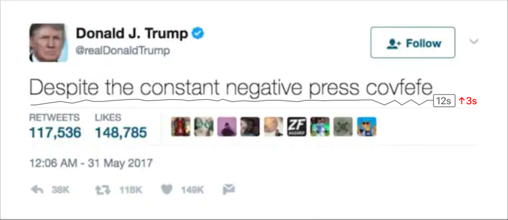 Using an in-situ sparkline & showing total time alongside change from average. How long did this really take to type? How might this look in something more substantive?
You can also imagine looking beyond typing (there are other ways to add/remove characters), like showing how a paragraph and its alternatives were copyedited, or how the complex web of undo/redo was collapsed. Some techniques will be more expensive, requiring a re-engineering of low-level functions (e.g., rendering text layout, handing selections, etc.) — non-trivial. And some will take a toll on familiarity and/or learnability. But that’s where prototyping and your own design sensibility comes in. (Or stop scrutinizing every datum and embrace the zen of less-is-more).
IN UPCOMING POSTS, I’ll discuss some other topics (and visualizations) in text. If you’re interested in using any of these visualizations in your work, or in a text editor/word processor/infographic/etc., send me an email.
You can subscribe to new articles (some of which aren’t on Medium) via my blog cognitionandcraft.com.
Copyright © 2018 Gideon Goldin. All rights reserved.
Originally published at cognitionandcraft.com on November 28, 2018.
Data visualizations for text: How to show the process of writing was originally published in Hacker Noon on Medium, where people are continuing the conversation by highlighting and responding to this story.
Disclaimer
The views and opinions expressed in this article are solely those of the authors and do not reflect the views of Bitcoin Insider. Every investment and trading move involves risk - this is especially true for cryptocurrencies given their volatility. We strongly advise our readers to conduct their own research when making a decision.
