Latest news about Bitcoin and all cryptocurrencies. Your daily crypto news habit.
Having worked with product teams of all shapes and sizes we’ve become familiar with a huge variance of working approaches. Making product decisions is a balance of logic and gut — our approach across-board is to take as much gut out as possible and rely on the data in every area we can. Here are 5 key questions we use when debating roadmaps.
How many people are using feature x?
Before we scratch the surface of roadmapping brand new features it is critical to assess the current usage landscape. Not only does it highlight customer behaviour that can point you in the direction of new features that might be useful, it will also show you quick wins within your current feature framework which can often explore new value at a much lower risk.
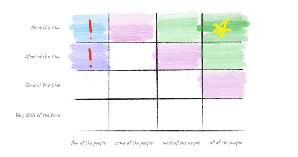
A feature dependency chart is where we normally start…
Let’s break down each area briefly before we explain why ‘it’s not always this simple’.
Top right will hold your most valuable features. Never neglect these.
Bottom right will typically hold things like administrative functions which need to work but have little impact on the value your product drives. A great product manager will give as little focus to these as they can get away with.
Top left is an interesting area. It can highlight niche markets that are using one small feature set but using it frequently. This might mean spinning off a feature into a separate product for a new demographic or it could mean emphasising the use case to the majority of users who have maybe not discovered its use. Qualitative measures must come in to play when data like this can’t provide a clear binary direction.
Bottom left — Kill it. Unless it is young and under-tested.
Nishant Bhalla has become famous in product circles for his stern and frequent answer of “KILL IT”. When weighing up feature development decisions his response would be; “How many people use it? Below 5%? Kill it”. It takes a certain type of person to chop limbs off a product in an instant. Sometimes you’re dealing with an entire team that’s dedicated itself to a feature for months or years but ruthlessness can also be the thing that saves a product.
“Kill it.”- Nishant Bhalla, Product Director, Cart/Checkout, Post Purchase & Loyalty, Toys”R”Us Inc.
A Feature Dependency Chart only gets you so far though. It doesn’t provide the context we really need and so it must be mixed with qualitative analysis.
Foresight + Hindsight = Insight
If you’re only data guided it’s like driving down the road while only looking at your rear view mirrors.
“Data gives you hindsight and that’s great, but it can’t tell you where you need to go, it can only tell you where you’ve been.”- Chris Armstrong, Founder, Niice
Foresight is a qualitative element that is just as important as the quantitative data you have. Your data reflects your product as it currently stands. What it doesn’t show you is (hypothetically) the most valuable part of your app that’s hidden under bad UI — your data doesn’t know this.
“Qualitative research is invaluable. There’s a lot to be said for getting into a customers office and seeing the whites of their eyes, seeing what lights them up and what bores them.”- Chris Armstrong, Founder, Niice
If a feature on your chart has momentum towards ‘up and to the right’ consider why. Stats might say kill it but if its usage is ramping up you might just be dealing with slow customer adoption. Try and remember that while you dream about your product in your sleep, your customer interacts with your product minimally. It might take a customer a year to discover a new feature.
If you’ve figured out where you need to go, that’s where data can be really helpful. Until then (sometimes up to the first 5 years of a product lifecycle) you’re still learning a market — don’t forget this and allow data to become blinkers that lead you down a rabbit hole.
What features will positively effect your conversion funnel?
Are you selling hotel rooms? Are you selling seats in a SaaS product? Understanding where your customers come from and the many ways they turn from an interested spectator to a paying customer is key to your customer journey. Map this, look for gaps, look for success and improve upon it.
Can we be less dramatic?
If you are following test driven design, use A/B testing to your advantage and run mini experiments. Amazon deploy code every 11.7 seconds. You don’t need to develop features in all their glory, run the smallest test you can to see what gets the most action.
Where is the value?
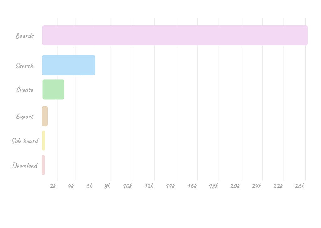
This is a rough feature usage chart of Niice today — the first product we built at Dawson Andrews.
Niice kicked off as a product that creatives used to find and collect inspiration on the web. As a result its usage of search and boards were high. While this feature set got Niice international status and over a million users, it also lead it down a path that wasn’t its most valuable. If Niice had merely used a feature dependency graph it would have directed us towards improving more features for the wrong type of user — the non-paying type.
“If you make something interesting you get traffic, but that’s it.If you make something useful you get users but that’s it.If you make something valuable you get customers. It was key to define who is actually going to pay us rather than those who just find us useful.”- Chris Armstrong, Founder, Niice
Finding value is by far your greatest responsibility as a designer. If you’re not doing this you’re not designing effectively.
As a result, of focusing on features paramount to the target audience such as Export board and style control, Niice has become an integral part of some of the top design teams around the world including Nike, TIME, and AirBnB. By putting an emphasis on a few high use / low amount of users features, it focused the product towards a feature set that creative teams couldn’t live without and hence — would pay for.
Rounding up, a feature audit ends with four options;
- Kill it — in our experience, most people aren’t doing this enough due to emotion. Be ruthless.
- Increase adoption rate — marketing, on-boarding, feature design.
- Increase frequency — make your feature stand out within key customer journeys.
- Improve it — make it more useful by providing more value (save time, increase performance, etc.)
—
Learn more
📧 When I write, I always send it out from the Dawson Andrews newsletter- ‘Minutes’. If you’d like to never miss this madness, sign up to the newsletter.
🎧If you’d rather listen to me when you’re driving — podcast it up — Camcast. (proper Apple version coming soon!)
🐦Tweet tweet.
Five Questions to Make Product Decisions was originally published in Hacker Noon on Medium, where people are continuing the conversation by highlighting and responding to this story.
Disclaimer
The views and opinions expressed in this article are solely those of the authors and do not reflect the views of Bitcoin Insider. Every investment and trading move involves risk - this is especially true for cryptocurrencies given their volatility. We strongly advise our readers to conduct their own research when making a decision.


