Latest news about Bitcoin and all cryptocurrencies. Your daily crypto news habit.
This is important prior to using any ML predictive models, in order to ensure meaningful and actionable outcomes.
The goal of this case study is to illustrate how to use python to better understand the data. In this case we are going to use State Drug Utilization data sets which can be found from the Medicaid.gov website. Creating visually rich images of tabular data can provide insights that are often difficult to see in tabular format.
Examples of what can be created include displaying the total number of hydrocodone(a narcotic analgesic) units that were reimbursed by Medicare in 2017. The size of the blue circles are representative of the number of units (based on Unit Type) reimbursed by Medicaid sorted by each state.
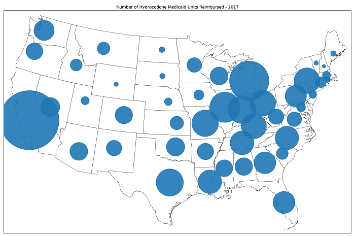 (Fig 1) Number of units (based on Unit Type) of Hydrocodone that Medicaid Reimbursed in 2017
According to the Kaiser Family Foundation there were a total of 14,487 deaths in 2016 related to natural and semi synthetic opioids such as hydrocodone.
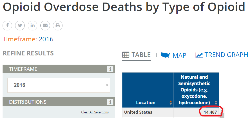 Henry J Kaiser Family Foundation
Another example includes comparing the number of prescriptions Medicaid paid for in full or in portion in 2008 and 2018.
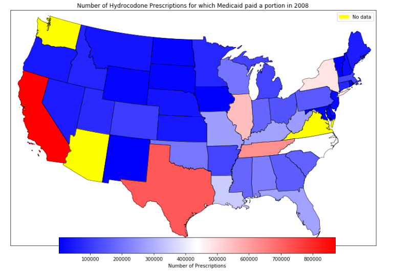
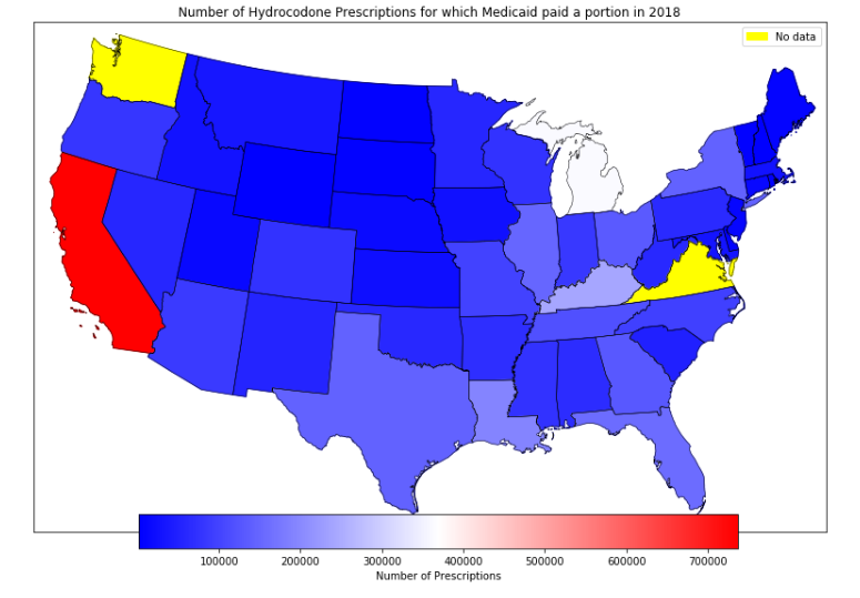 (fig 2) Number of Hydrocodone prescriptions for which Medicaid paid a portion in 2008 and in 2018
It is clear to see that there is a decreasing trend in the number of hydrocodone prescriptions for which Medicaid paid a portion in 2018 compared to 2008. This is in line with most states adopting tougher prescription size limits as well as some states requiring prior authorizations before approval. Most states show decreasing numbers. However in 2018, even with a 15% decrease in the number of prescriptions paid for by Medicaid, California still stands out by far for having the most number of hydrocodone prescriptions paid for in part or full by Medicaid.
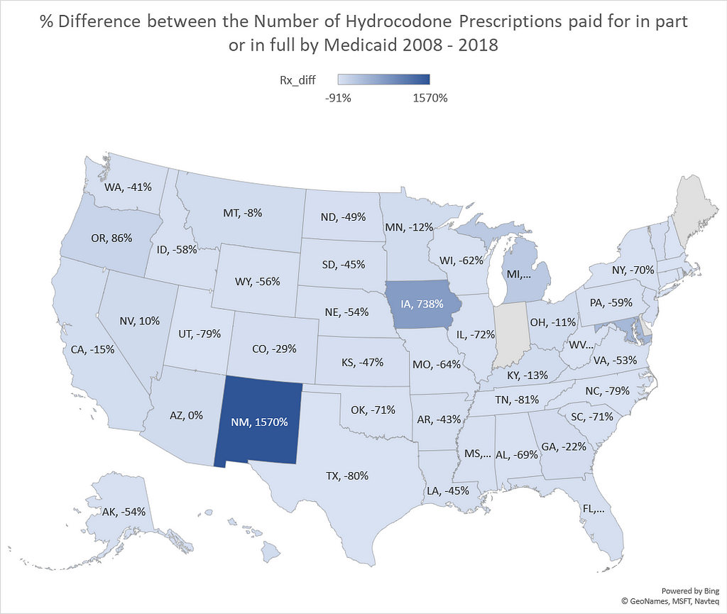 % Difference between the Number of Hydrocodone Prescriptions paid for in part or in full by Medicaid 2008–2018
The percentage difference in the number of prescriptions varied from -91% to 1570%.
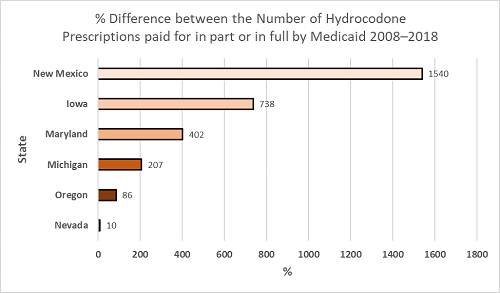 Top 6 States with highest % increase in the Number of Hydrocodone Prescriptions paid for in part or in full by Medicaid 2008–2018
6 states showed increases in the number of hydrocodone prescriptions over the 10 year period; New Mexico 1570% increase, Iowa 738%, Maryland 402%, Michigan 207%, Oregon 86%, Nevada, 10%.
The International Narcotics Control Board reported that in 2015, Americans represented about 99.7% of the world’s hydrocodone consumption (CNN)
Step 1: Accessing the dataYou can access the data from the Medicaid.gov website here. The data sets are broken down by year. I used the State Drug Utilization 2017 data set for fig 1 and the 2008 and 2018 data sets for the comparisons.
Publication of these drug utilization data sets have been available since the start of the Medicaid Drug Rebate Program, where states report drug utilization for covered outpatient drugs paid for by state Medicaid agencies.
More information about the data set and an explanation of the data field descriptions can be found in this FAQ here.
Step 2: Install and import dependencies
You can access the Jupyter Notebook here:
import numpy as npimport pandas as pd
from pandas_summary import DataFrameSummaryfrom IPython.display import displayfrom sklearn import metrics
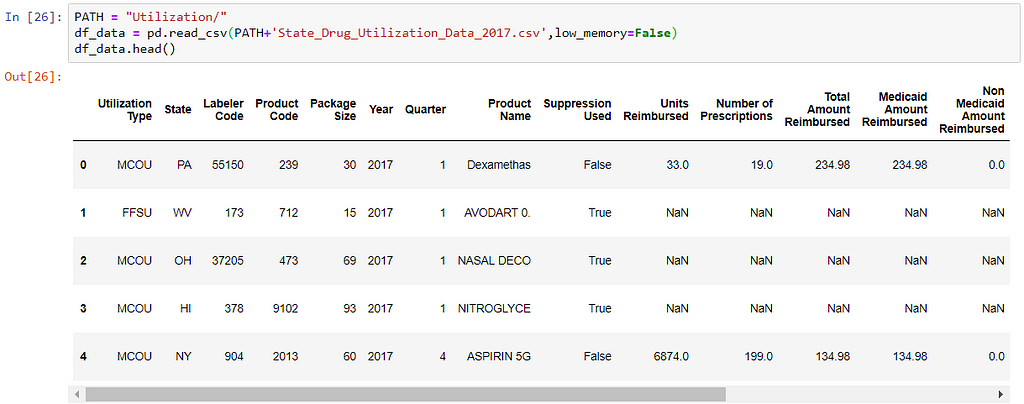
2. Load the data set
PATH = "Utilization/"df_data = pd.read_csv(PATH+'State_Drug_Utilization_Data_2017.csv')df_data.head()
The output above results in the data being loaded with the following warning message:
This is easily fixed by including low_memory=False ,this warning occurs because guessing dtypes for each column is very memory demanding.
How much data are we dealing with here? df_data.shape returns 4.7 million rows and 20 columns
3. Review the data
df_data.columns
Here is the first issue, notice the gap between the column names for example Utilization Type needs to be re-named to Utilization_Type , having a gap within a column name will only give us errors further down.
Renaming columns is done by using rename
df_data.rename(columns={'Utilization Type':'Utilization_Type','State':'State','Labeler Code':'Labeler_Code','Product Code':'Product_Code', 'Package Size':'Package_Size','Year':'Year','Quarter':'Quarter','Product Name':'Product_Name','Suppression Used':'Suppression_Used', 'Units Reimbursed':'Units_Reimbursed','Number of Prescriptions':'Number_of_Prescriptions','Total Amount Reimbursed':'Total_Amount_Reimbursed', 'Medicaid Amount Reimbursed':'Medicaid_Amount_Reimbursed','Non Medicaid Amount Reimbursed':'Non_Medicaid_Amount_Reimbursed', 'Quarter Begin':'Quarter_Begin','Quarter Begin Date':'Quarter_Begin_Date','Latitude':'Latitude','Longitude':'Longitude','Location':'Location','NDC':'NDC'}, inplace=True)And now df_data.columns
should now look like this:
The following commands df_data.info() , df_data.count() and df_data.describe(include='all') help with getting additional information:
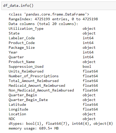
df_data.info() prints out information about the data frame; number of entries, number of columns, column data types and memory usage. Knowing data types is important especially if we are merging .csv files and also for memory error issues.
Working with large data sets can result in memory error issues and reviewing the dtypes can be very helpful in resolving these memory issues. I did not encounter any memory issues until merging the different year data sets.
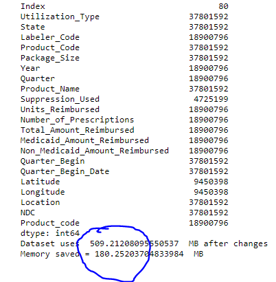
As an example changing all int64 dtypes into int32 dtypes results in a saving of 180 MB (from 689 MB to 509 MB).
However you have to be careful when changing dtypes, if you have large numbers you need to be aware of the storage capacity range of each int for example:
Int16 -- (-32,768 to +32,767)Int32 -- (-2,147,483,648 to +2,147,483,647)
Int64 -- (-9,223,372,036,854,775,808 to +9,223,372,036,854,775,807)
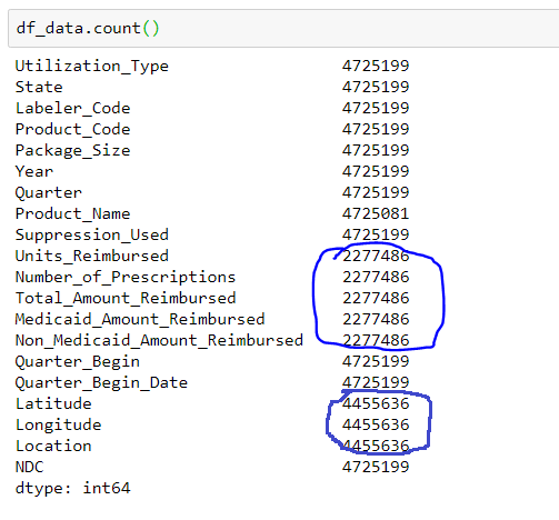
df_data.count() prints out the number of entries in each column, here we can see that there are missing values in 8 columns (circled in blue).
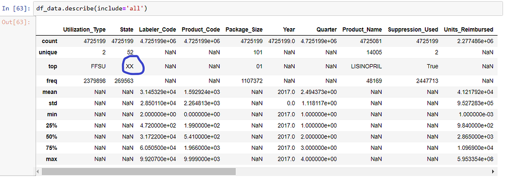
df_data.describe generates descriptive statistics that summarize the central tendency, dispersion and shape of a dataset’s distribution, excluding NaN values. Here we can see the number of unique values in each column, the value most commonly found in that column and more. However here is another problem… looking under State the top state is XX!
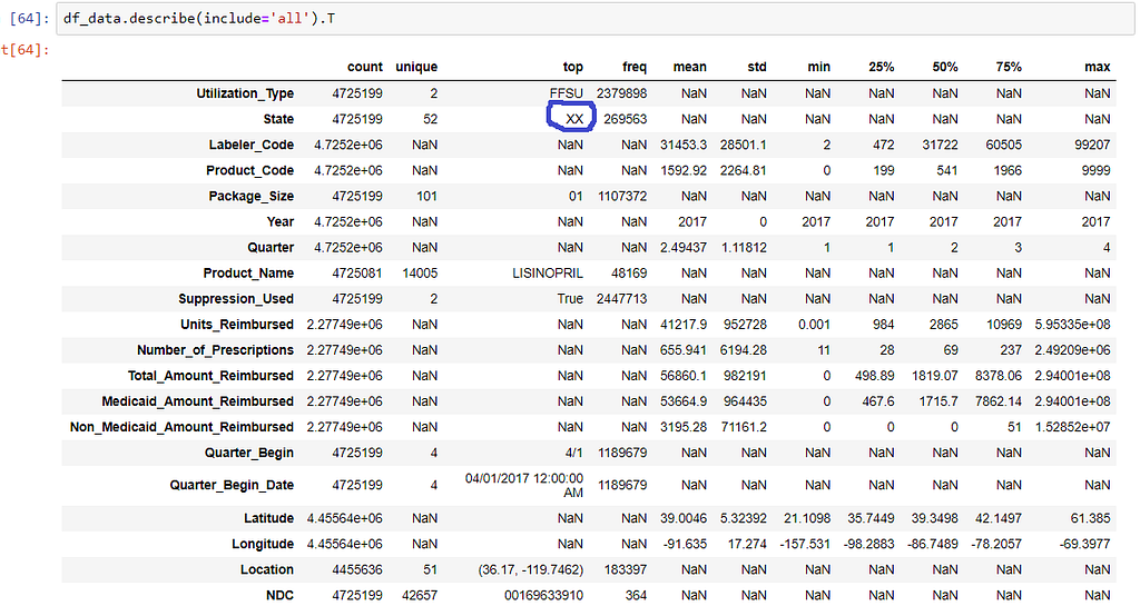
Its also sometimes annoying to have to scroll through the describe output, I want the ability to see all the data together. This can be done by using transpose.
So what does state ‘XX’ mean? According to the FAQ here, it refers to any data where the National Drug Code (NDC) are aggregated for example for National Totals so the code ‘XX’ represents multiple states. For the sake of this project we are going to remove any entries where the State is ‘XX’
There are 20 columns in this data set and we do not need to use all of them so I am going to get rid of a number of columns and save the new file. We now have the file we need to create Fig 1.
4 Create the Visualization
The visualization was created using Basemap which is a great tool for creating maps using geographical projections. You will have to download the shape files for all the state boundaries. You can download the shape files from here, you should download the .shx .dbf and .shp files.
You can find the Jupyter Notebook for this project here
If you are interested in reading more about AI and healthcare here are my other articles. Thanks for reading!
- Data Augmentation Experimentation
- Not Your Typical Health IT Company - Becoming Human: Artificial Intelligence Magazine
Visualizing State Drug Utilization Data Sets was originally published in Hacker Noon on Medium, where people are continuing the conversation by highlighting and responding to this story.
Disclaimer
The views and opinions expressed in this article are solely those of the authors and do not reflect the views of Bitcoin Insider. Every investment and trading move involves risk - this is especially true for cryptocurrencies given their volatility. We strongly advise our readers to conduct their own research when making a decision.

