Latest news about Bitcoin and all cryptocurrencies. Your daily crypto news habit.

Data visualization is the creation and study of the visual representation of data in a visual context, like a chart or a map. It helps understand the significance of that data.
Data visualization can be static or interactive.
The static visualization is commonly seen as infographic posted on the web or printed as handouts. It is usually focused on a specific data story. The users can’t go beyond a single view to explore additional stories.
The interactive data visualization can encourage engagement with the data in ways that static images cannot. Some visualizations can make exploring data feel more like playing a game.
Ready to feel inspired?
In this article, we’re going to highlight some of the most powerful and engaging interactive visualizations out there. We’ll look at our favorite examples first and then fast-forward and highlight some visualization tools and list of useful books I have created during my research.
Data Visualizations You Must See
View Transitions by Quintin Lodge for RALLY in New Tactics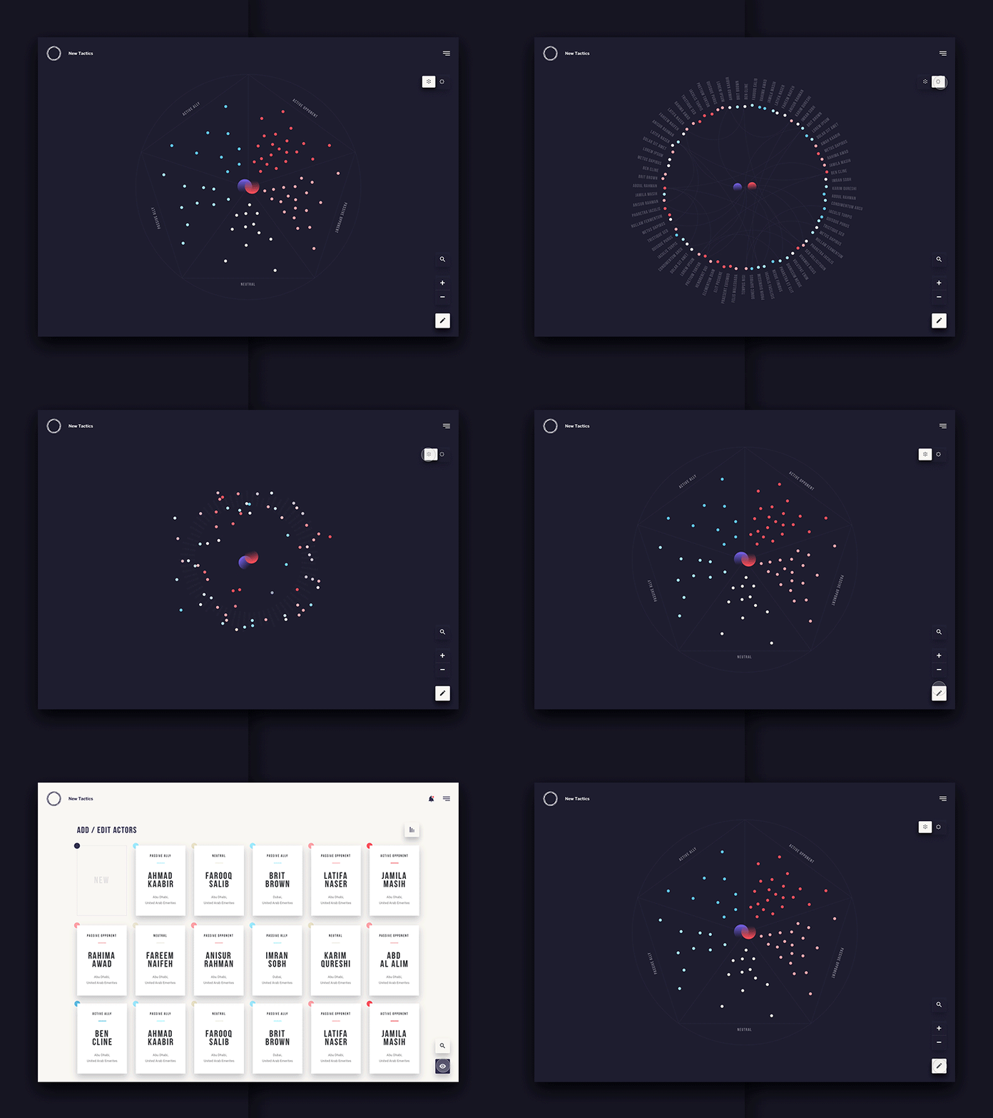
This visualization enables exploring transitions between the three main views of the New Tactics core experience: Terrain View (health/alliance), Connection View (nature of relationships), and Card/Grid View for editing and sorting individuals.
Event Truth by Uber Design for Uber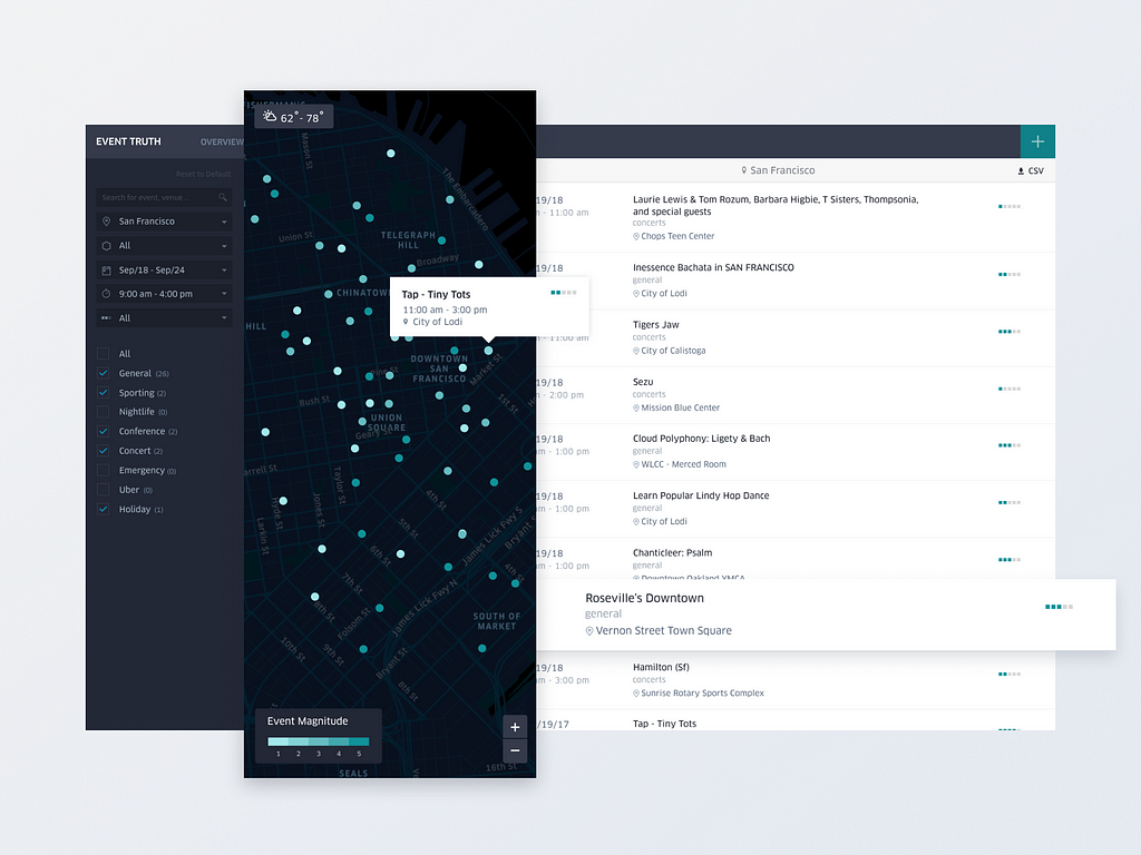
Event Truth tool gives users the ability to explore events and gain insight into how they can affect the marketplace with the historical and future context of their markets.
Uber Atlas by Uber Design for Uber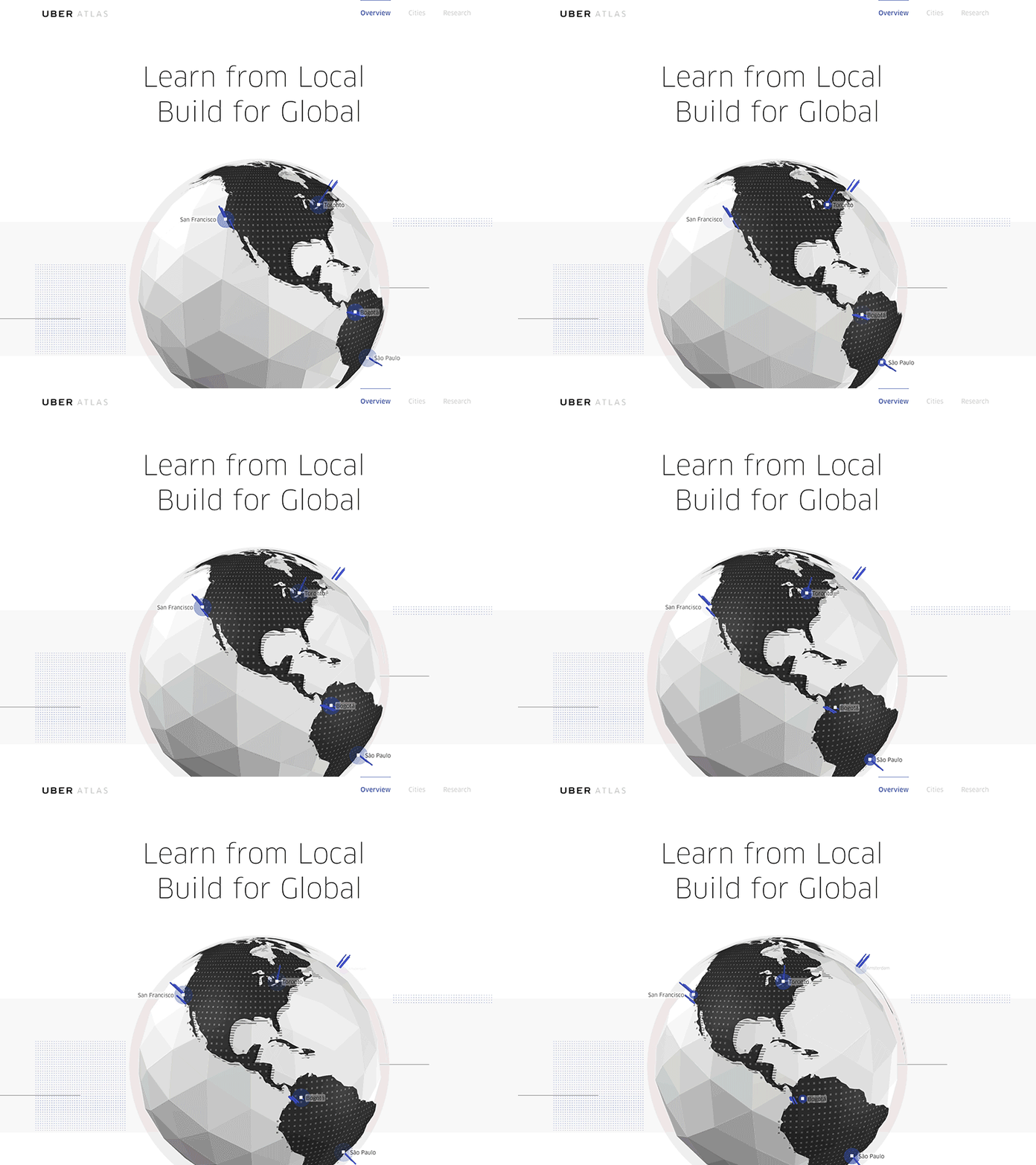
Uber Atlas is an internal site that helps Uber’s team members understand the markets they’re designing for. So they can create appropriate product concepts.
Data visualization for runners by Christian Vizcarra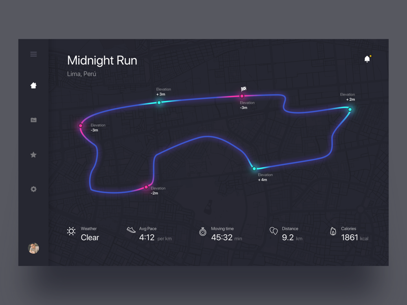
This dashboard for runners allow you to check data when you run, timing, directions, burned calories, etc.
Marvel Cinematic Universe by Billy Ker, Chee Wei Xian, and Denise Chong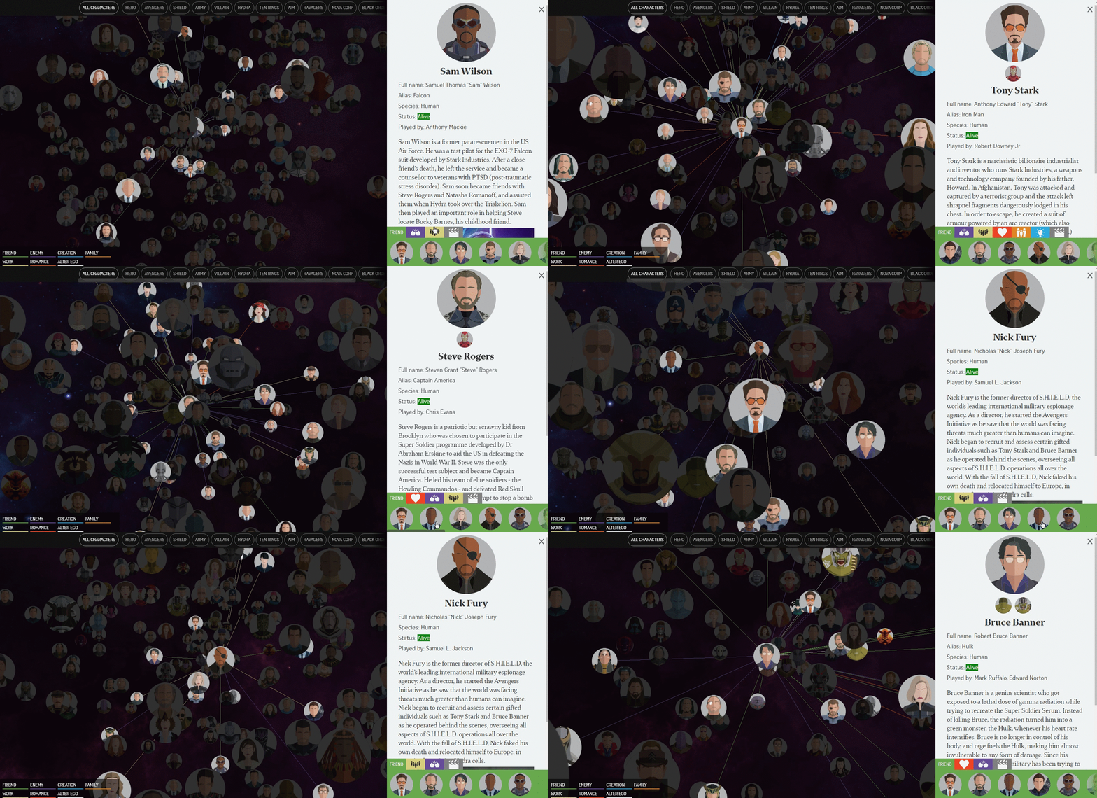
As Avengers assemble with characters from all corners of the Marvel universe, this visualization will tell you who fights whom, who has a hellish sister, and more.
An Anatomy of the Perfect Stay at Home Movie Night by Becca Searns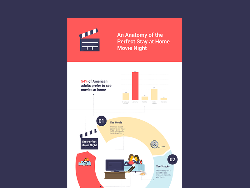
The Anatomy of a Perfect Stay at Home Movie Night Infographic is a personal project created by Becca Searns to practice informational design and illustration skills.
Fast Food Outbreak Interactive Infographic by Brit Moran
This infographic is an expansion of fast food over the years, and show how it relates to obesity. The wrapper represents the map, and the food represents the areas that the locations are most prominent in. The user can click on a state, or view the full United States map, and from there the user can select a fast food restaurant, and see how the locations change over time as the user scrolls through the timeline.
History of Bruce Springsteen by Adam McCann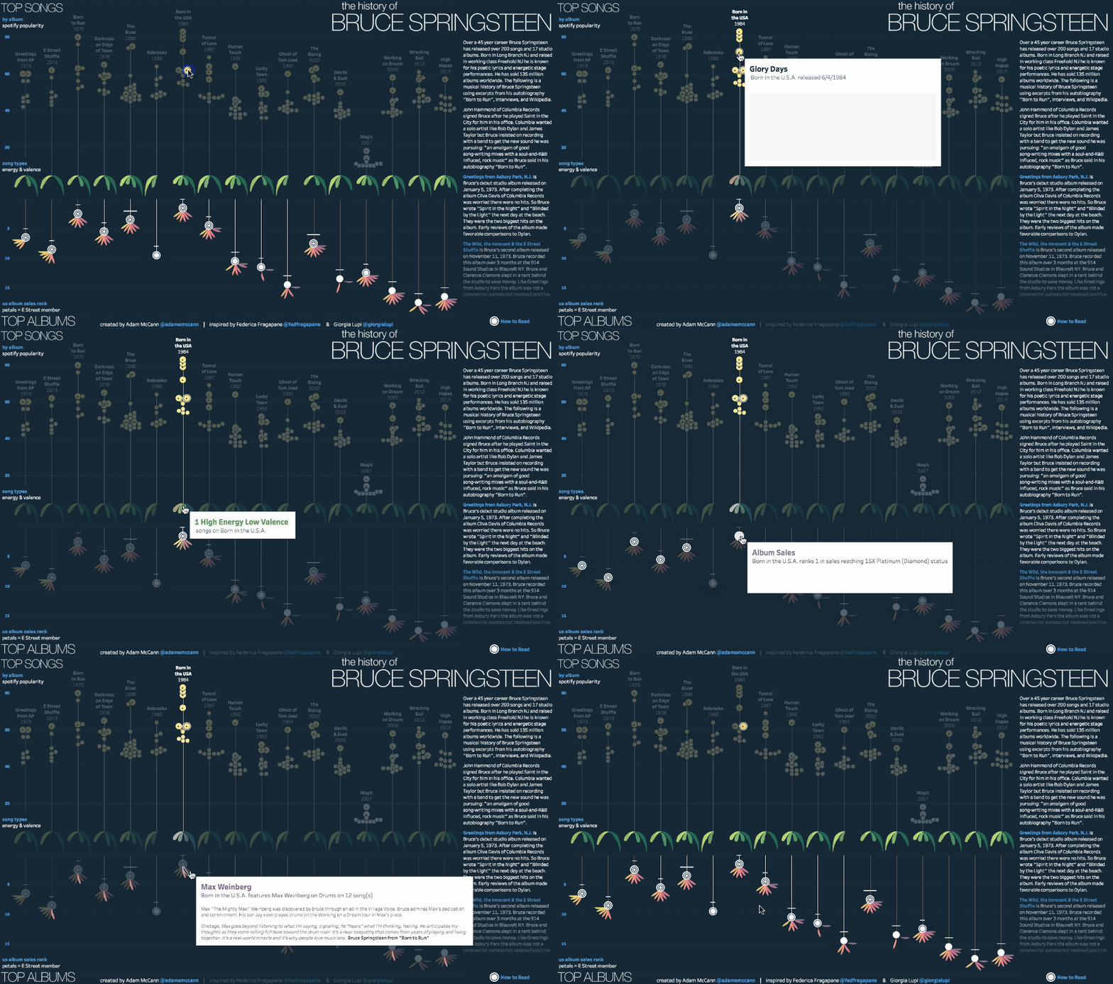
In this visualization, Adam McCann uses data from Spotify to analyse the songs of Bruce Springsteen. To find out further insight on the popularity, energy and valence of any Bruce Springsteen’s song, hover any part of the charts.
Hello Sun app by Small Multiples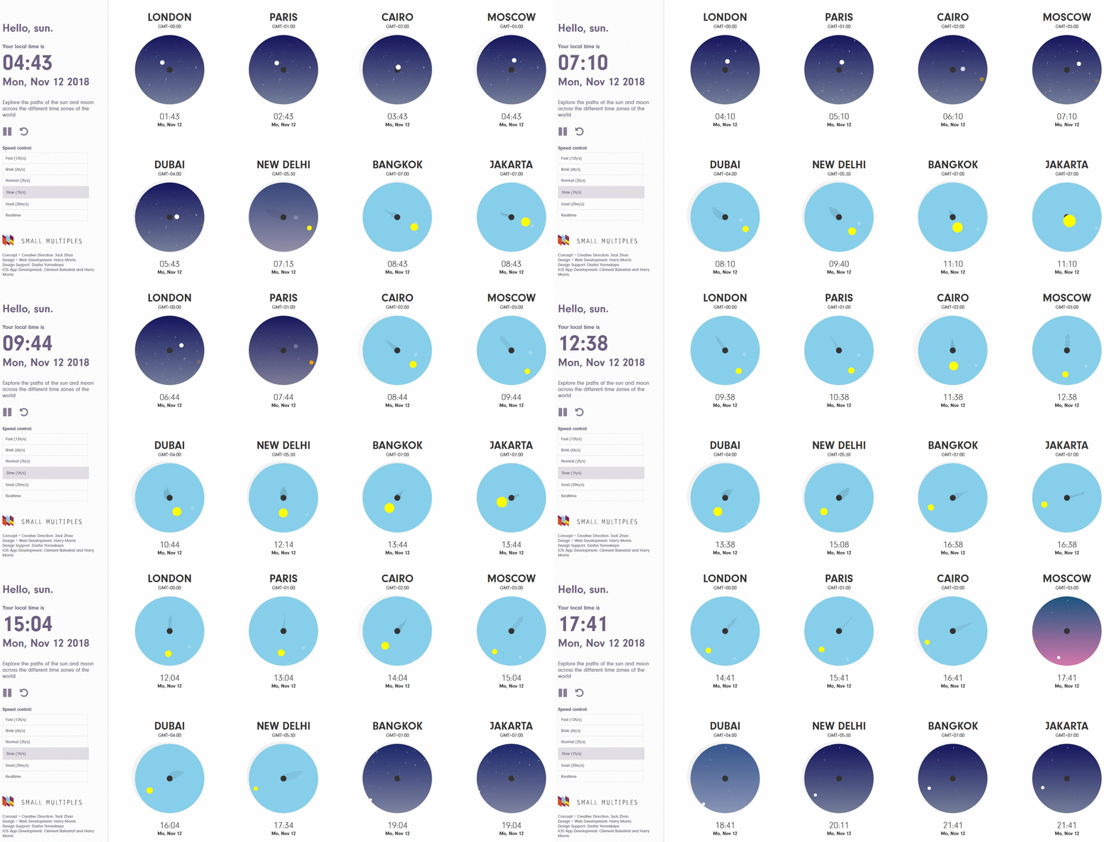
This sunny visualization enables exploring the paths of the sun and moon across the different time zones of the world and feeling the coming and going of day and night. It will place you amongst the unique landmarks of the world, allow you to observe the passing of time through the synchronized movement of the celestial bodies.
Wind & Words — an interactive Game of Thrones data visualization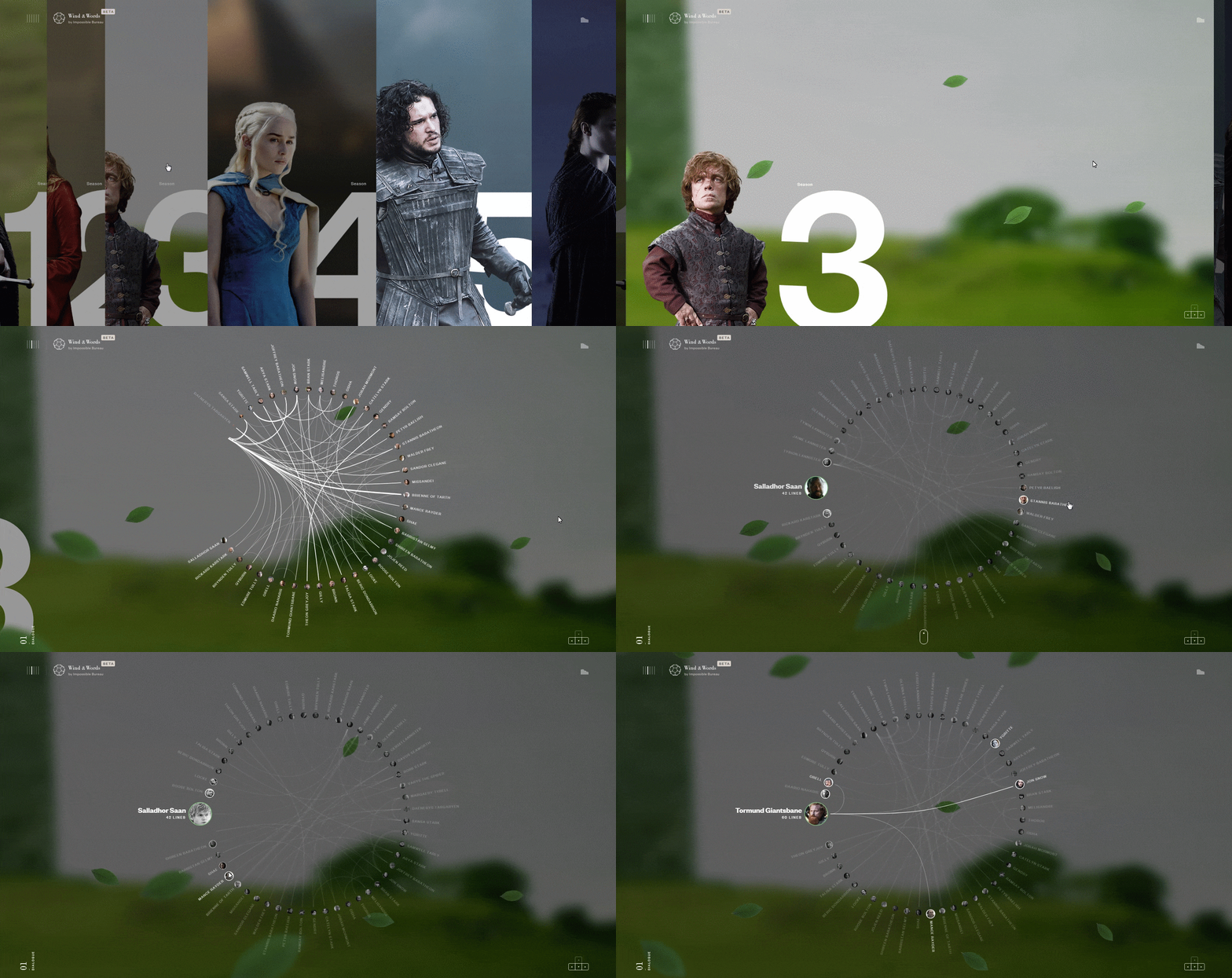
Using data collected from script dialogue and other sources, this experiment analyzes and visualizes characters’ words and interactions from the first six seasons of HBO’s Game of Thrones.
The Most Violent Cities in the World by Federica Fragapane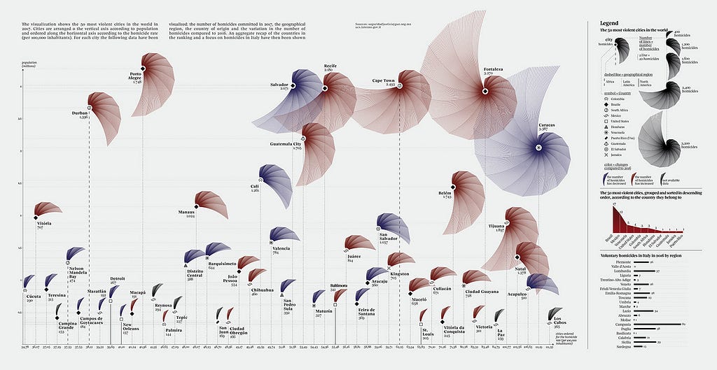
The visualization shows the 50 most violent cities in the world in 2017. Cities are arranged o the vertical axis according to population and ordered along the horizontal axis according to the homicide rate. For each city, the following data have been visualized: the number of homicides committed in 2017, the geographical region, the country of origin and the variation in the number of homicides compared to 2016. An aggregate recap of the countries in the ranking and a focus on homicides in Italy have then been shown.
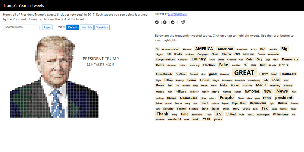
A Data Portrait Of Trump, Based On His Tweets by gramener.com
This visualization is a searchable database of all of Trump’s tweets in 2017. Each grid forming the image of Trump represents a tweet. The tweets can be arranged in order of weekday & month.
Keuzestress. Searching for the ‘correct’ mascara by Sonja Kuijpers from Studio Terp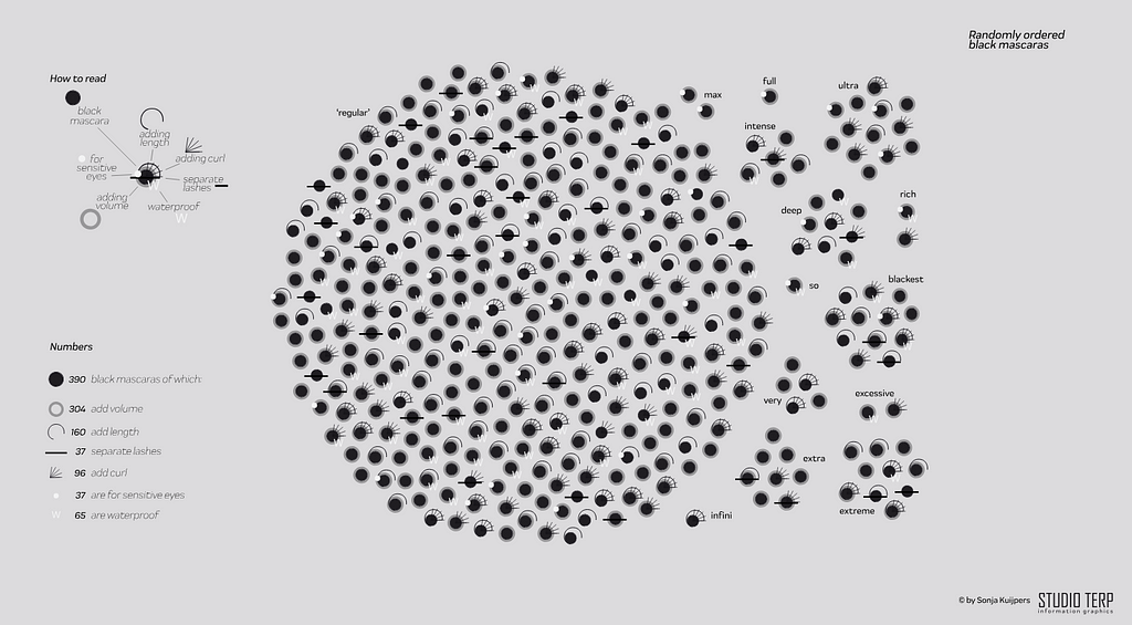
This randomly ordered data visualization contains 390 black mascaras. Not only ‘regular’ black but also the ‘most’ black described in various ways like max, very, extra, rich and yes, the blackest black. There are also various other blacks such as choral, espresso, leather, asphalt, onyx, etc. But they have been stacked under ‘regular’.
Fantastic voyages by beyondwordsstudio.com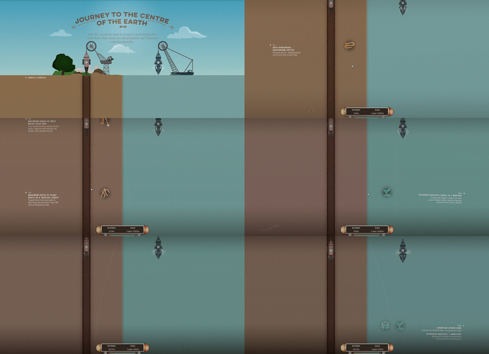
For ‘Journey to the Centre of the Earth’, the team has used a coastline split-screen to seamlessly tell land and sea stories together, winching down from the surface in a diving pod and a deep-earth drill.
Travel Visa Inequalities by Christian Laesser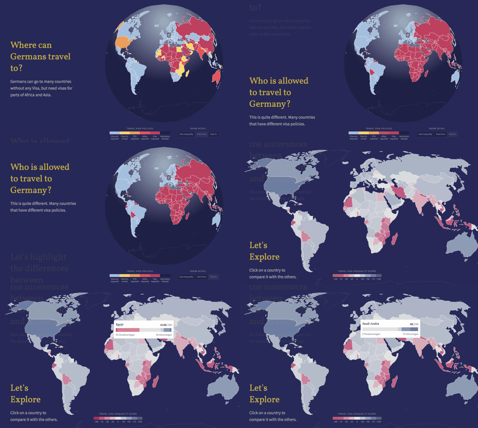
The visualization explores how equal citizens of different countries are treated in terms of traveling.
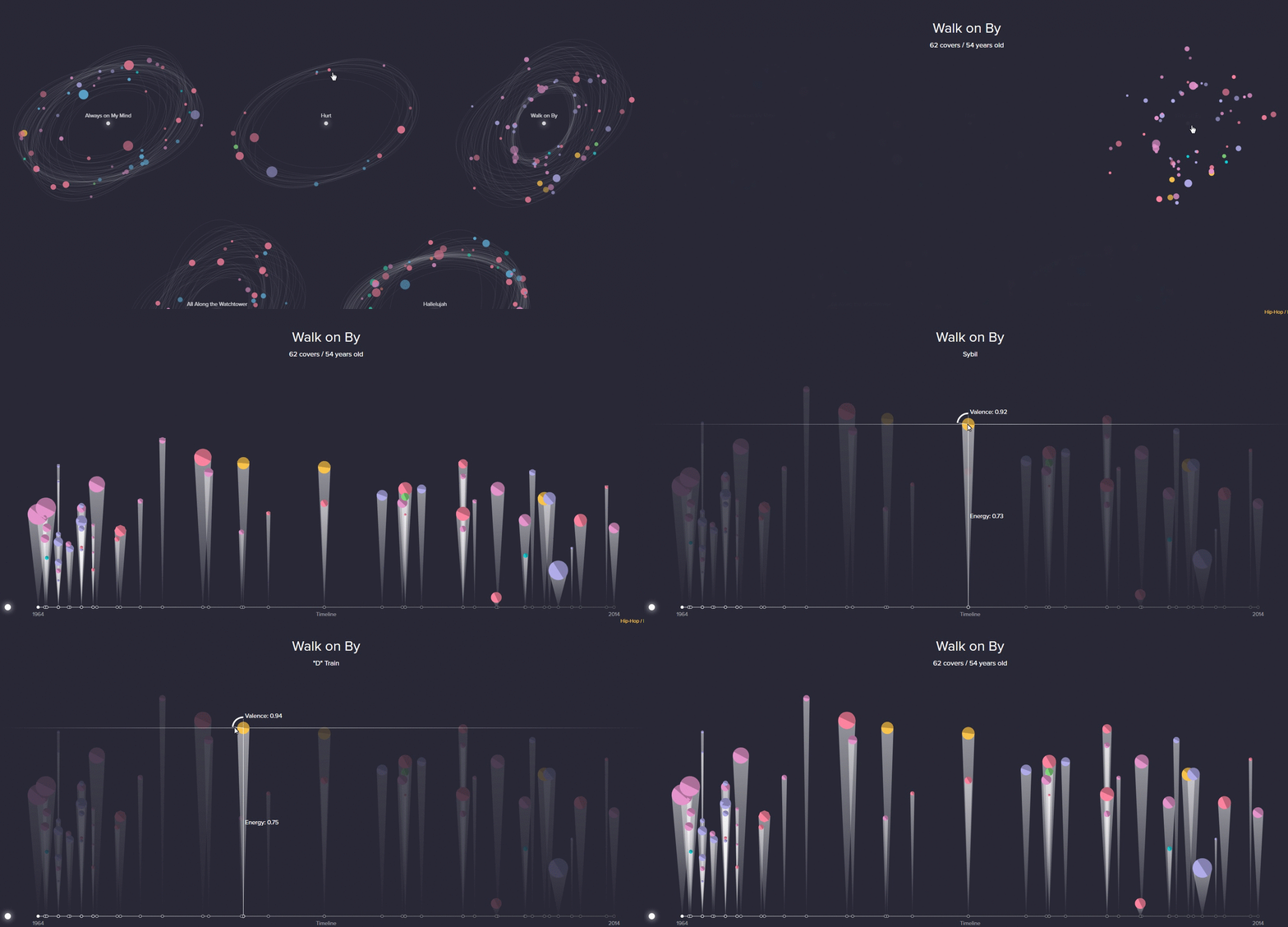
The visualization shows the 50 top songs as galaxies with the original work as the sun. Each planet orbiting the sun represents a version, the color representing the genre, the size representing the popularity, and the spend at which the planet orbits the sun representing the tempo. The radius of its orbit around the sun shows the years between the publication dates. The years between the original and the covers can be more easily seen once the user clicks the galaxy, where a timeline can be seen with all the covers.
Data Visualization Tools
Even if you have no experience with data visualization or web technologies, you can create your own engaging data visualization projects. Use one of this friendly and practical hands-on tools.
Data Visualization Books
Do you want to learn more about data visualization? Check this list of books I’ve found valuable over the last few years. In this list, you’ll find the information on everything: history lessons, theory, practical implementation, and etc.
The Big Book of Dashboards: Visualizing Your Data Using Real-World Business Scenarios by Steve Wexler and Jeffrey Shaffer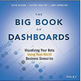
The Big Book of Dashboards covers dozens of examples that address different industries and branches and various platforms like print, desktop, tablet, smartphone, and conference room display.
Data Visualization with Python and JavaScript by Kyran Dale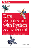
With this book, you will learn how to build a basic dataviz toolchain with best-of-breed Python and JavaScript libraries — including Scrappy, Matplotlib, Pandas, Flask, and D3 — for crafting engaging, browser-based visualizations.
Big Data Visualization by James Miller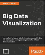
This book is for data analysts or those with a basic knowledge of big data analysis who want to learn big data visualization in order to make their analysis more useful. You need sufficient knowledge of big data platform tools such as Hadoop and also some experience with programming languages such as R. This book will be great for those who are familiar with conventional data visualizations and now want to widen their horizon by exploring big data visualizations.
With this book as a guide, you’ll learn basic visualization principles, how to choose the right kind of display for your purposes, and how to provide interactive features that will bring users to your site over and over. The book does not provide ready-made “visualizations” that can be plugged into any data set. Instead, with chapters divided by types of data rather than types of display, you’ll learn how each visualization conveys the unique properties of the data it represents — why the data was collected, what’s interesting about it, and what stories it can tell. Visualizing Data teaches you how to answer questions, not simply display information.
Interactive Data Visualization for the Web by Scott Murray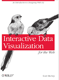
Ideal for designers with no coding experience, reporters exploring data journalism, and anyone who wants to visualize and share data, this step-by-step guide will also help you expand your web programming skills by teaching you the basics of HTML, CSS, JavaScript, and SVG.
Good Charts: The HBR Guide to Making Smarter, More Persuasive Data Visualizations by Scott Berinato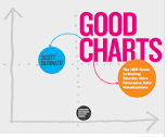
Good Charts is an essential guide to how visualization works and how to use this new language to impress and persuade. This book is not a set of static rules for making visualizations. It taps into both well-established and cutting-edge research in visual perception and neuroscience, as well as the emerging field of visualization science, to explore why good charts create “feelings behind our eyes.”Good Charts will help you turn plain, uninspiring charts that merely present information into smart, effective visualizations that powerfully convey ideas.
R Graphics Cookbook by Winston Chang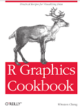
This practical guide provides more than 150 recipes to help you generate high-quality graphs without having to comb through all the details of R’s graphing systems. Each recipe tackles a specific problem with a solution you can apply to your own project and includes a discussion of how and why the recipe works.Most of the recipes use the ggplot2 package, a powerful and flexible way to make graphs in R. If you have a basic understanding of the R language, you’re ready to get started.
If you have seen any data visualizations that should be added to this list, then leave us a note in comments.
The Best Data Visualizations for Grabbing Readers’ Attention was originally published in Hacker Noon on Medium, where people are continuing the conversation by highlighting and responding to this story.
Disclaimer
The views and opinions expressed in this article are solely those of the authors and do not reflect the views of Bitcoin Insider. Every investment and trading move involves risk - this is especially true for cryptocurrencies given their volatility. We strongly advise our readers to conduct their own research when making a decision.
