Latest news about Bitcoin and all cryptocurrencies. Your daily crypto news habit.
Progressive Web Apps (PWAs) FTW — Pt. 1
 Progressive Web AppsIntroduction
Last month I had the pleasure of talking about Progressive Web Apps at the amazing Reversim Summit. This series will summarise the contents of that talk. If you prefer to watch the video you can see it here:
Why
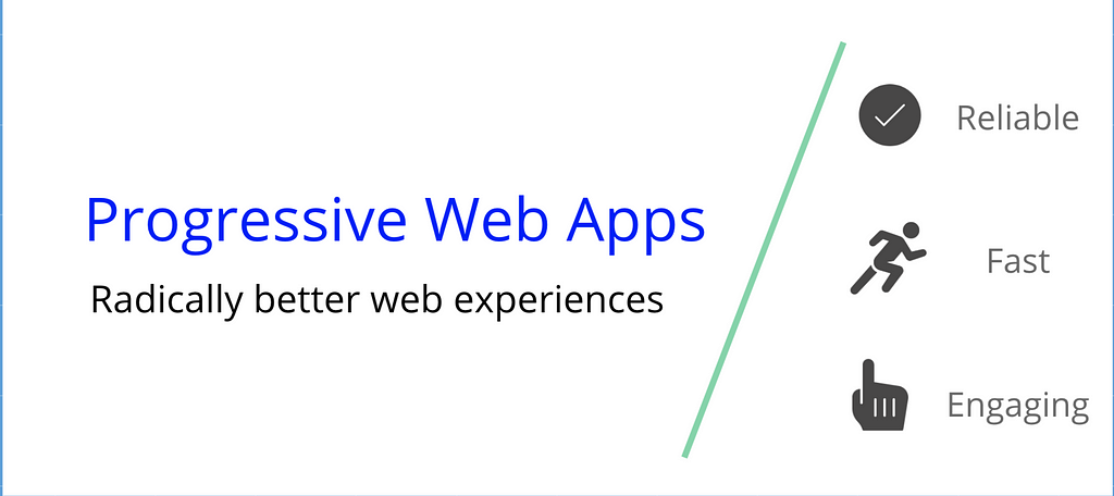
Progressive Web Apps are here to help us bridge UX between mobile websites and apps. But before we jump into how let’s understand why.
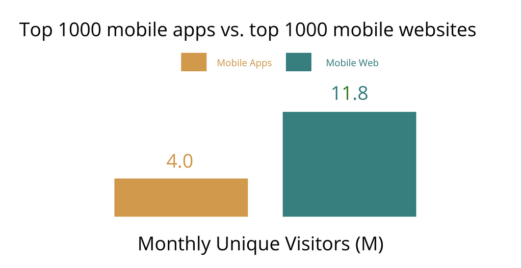
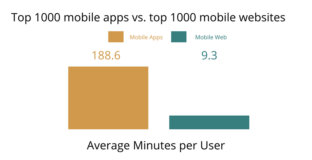
Last year Google published that there are nearly 3x more monthly unique visitors to mobile websites versus native applications. If this is the case then why do we bother developing mobile applications at all? The answer is user engagement. User engagement on native apps is nearly 10x larger than on mobile websites. That’s staggering!
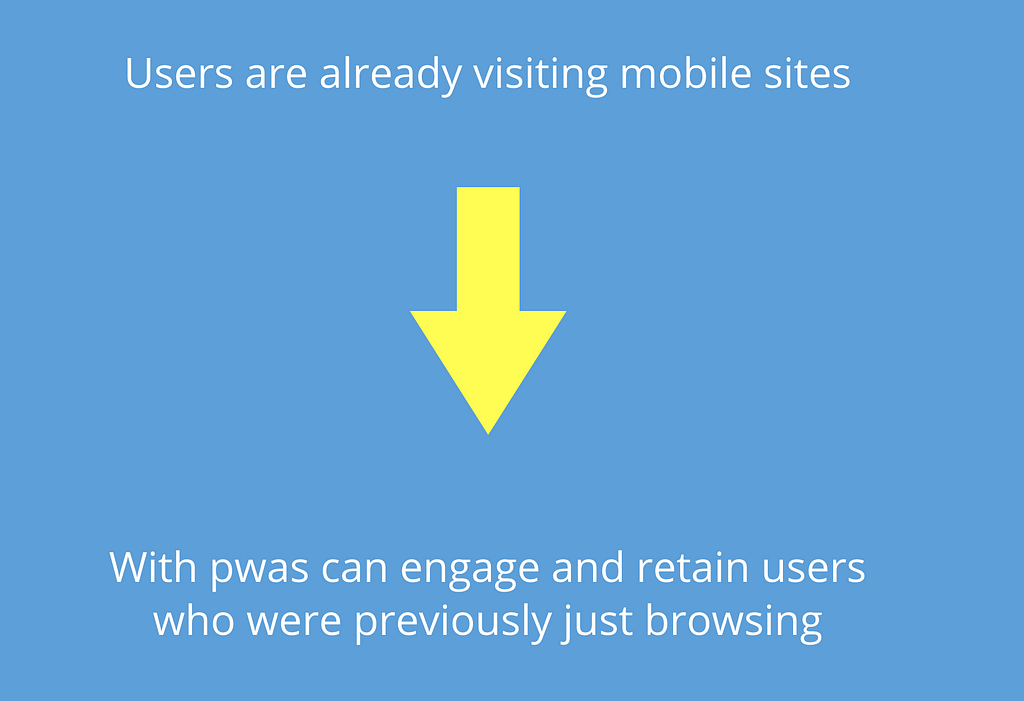
The reason for this is that native applications have better tooling for keeping users engaged thus increasing time spent within applications. Features such as push notifications, app icons on the user home screen and access to hardware APIs such as GPS, camera and the Wi-Fi manager are just some of the things that help create better, immersive experiences. But luckily for us, web UX is rapidly improving in the form of PWAs.
It is important to mention at this point that PWAs are non-binary. It’s not that you either have a PWA or don’t. Instead, PWAs describe a suite of new web APIs enabling web applications the ability to offer better experiences.
Additionally, you can opt-in to utilising specific PWA API’s. Furthermore, the use of such APIs is available such that if your users browser does not support the new API they continue receiving a completely normal experience. It is for these reasons that PWA’s are being rapidly adopted across the industry.
 Companies using PWA in production
Check out how the adoption of PWAs has improved UX for Forbes mobile users.
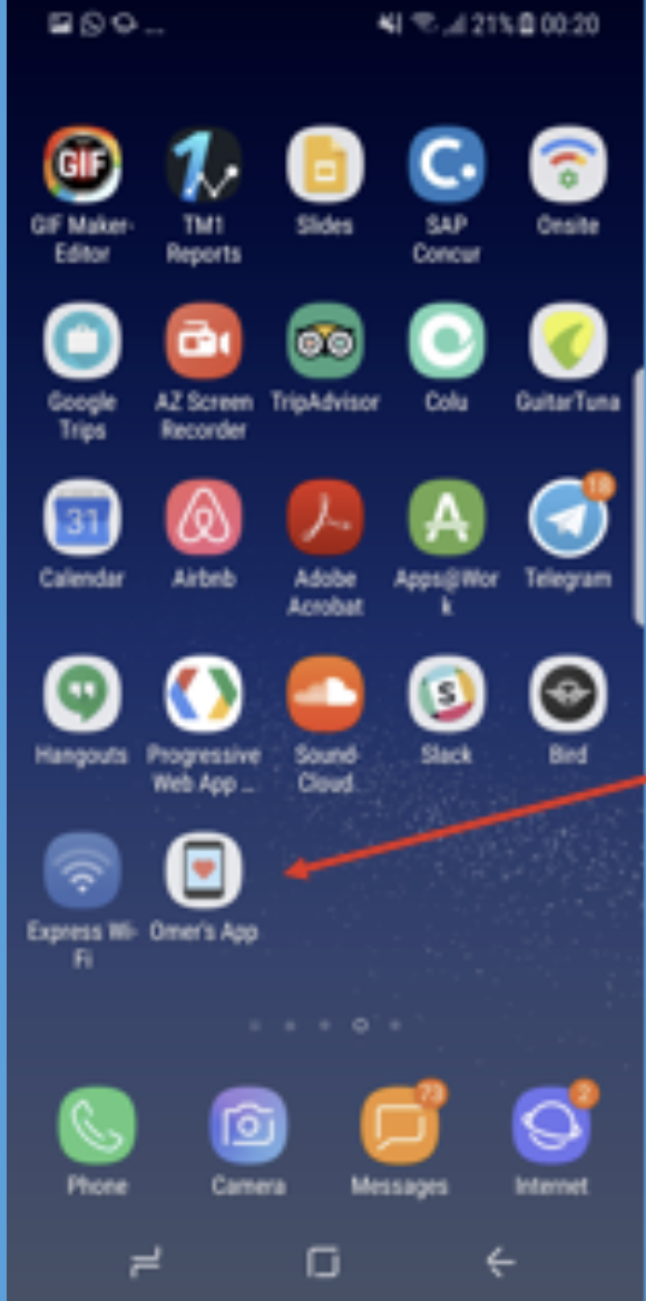
Let’s jump into how we can convert our existing websites into PWAs. We’ll go for a low hanging fruit first, adding an icon on the users home screen. For this article I’ll use my portfolio website as the example of the website we convert to a PWA. The icon will look like this on the home screen ultimately.
The website will prompt the user to add to home screen in two different ways as can be seen in the image below.
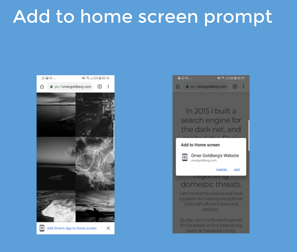 How to add icon to home screen
In order to get the browser to prompt the user to add an icon to the home screen we’ll need 3 things.
- include a web manifest
- serve our website over https
- register a service worker
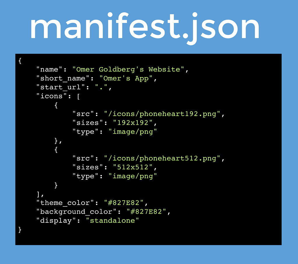
If you’ve ever developed a chrome extension or any type of node based app for that matter the manifest.json is going to look pretty familiar.
And of course we’re going to want to tell our web app’s main entry point (index.html for example) that our manifest exists.
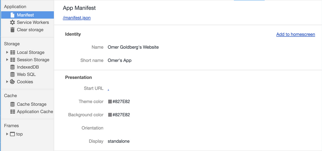
Let’s break down the manifest file. The display key describes how the user will see our web app when they launch it from their home screen.
standalone looks like a standalone app (amazing naming) and gives our web site a lot of screen real estate. Here are some of the other values the display key could take.
fullscreen -> All available display area is used (great for a game)standalone -> Look & feel like a standalone app (wide support)minimal-ui -> “light browser” UI. Doesn’t have own window. (when you click on a link on a website and see the minimal ui, like only the share button)browser -> Conventional web app in a browser (default value, if you specify nothing at all, wide support)
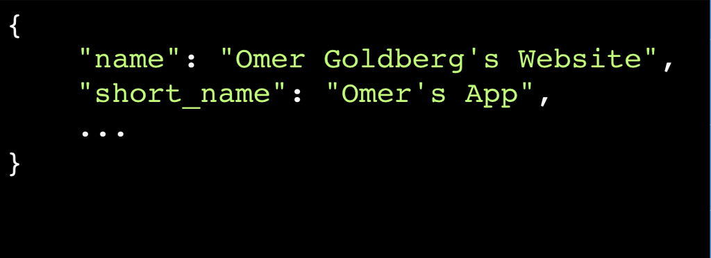
Now let’s look at the mandatory name field.
You must provide at least the short_name or name property. If both are provided, short_name is used on the user’s home screen, launcher, or other places where space may be limited. name is used on the app install prompt.
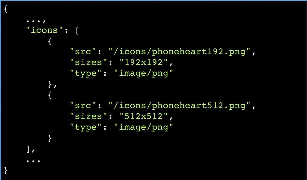
Now let’s look at the important icons keys in the manifest. We’ll need these if we want an icon on the users home screen :)
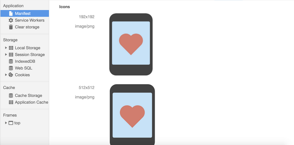
When a user adds your site to their home screen, you can define a set of icons for the OS to use. These icons are used in places like the home screen, app launcher, task switcher, splash screen, etc.icons is an array of image objects, each object should include the src, a sizes property, and the type of image. These size are mandatory for a PWA. For crisper icons we can provide icons sizes in between with increments of 40px. The OS will then decide when and where to show which sized icon for the best look and feel.
Lastly, let’s look at the background_color key value pair.
PWA’s generate a splash screen for us when then app is starting up. The splash screen is created by the app icon and the background colour.
Finally, we can test that our manifest.json is valid by checking out that the browser has loaded it and can read all the values. You can open dev tools, navigate to the application tab and click on manifest. It should look like this:
When the user taps the newly added icon from the home screen they will see the following:
This is just the tip of the iceberg for PWAs. The next article in this series will take an in-depth look at Service Workers, the core technology enabling many of the PWA APIs.
If this post was helpful, please subscribe and click the clap 👏 button below to show your support! ⬇⬇
You can follow me on Instagram, Linkedin , and Medium for more tech related content!
PWAs FTW — Pt. 1 was originally published in Hacker Noon on Medium, where people are continuing the conversation by highlighting and responding to this story.
Disclaimer
The views and opinions expressed in this article are solely those of the authors and do not reflect the views of Bitcoin Insider. Every investment and trading move involves risk - this is especially true for cryptocurrencies given their volatility. We strongly advise our readers to conduct their own research when making a decision.
