Latest news about Bitcoin and all cryptocurrencies. Your daily crypto news habit.
It’s incredible to think where we’ve come in the last 30 years. We’ve digitized much of our daily lives, including our interactions with each other and the tangible world.
As such, we’ve had to evolve and adapt how we consume technology: touch, voice, sound... taste? We’re having to transact increasingly complex information with more things with less time. It truly is chaos! Or.. at least it would be if we didn’t apply gestalt psychology to our interactive experiences.
Let’s take a look at this gourmet dessert.
Looks tasty? I’m honestly not sure exactly what it is, but it’s on the same plate right? So it must go together!
But, what if I take the plate away and the ingredients just lay on the table in the same exact position? Can the restaurant-goer still infer that this is one unified dish? Why or why not? What would I need to do to unify the dish so that the restaurant-goer knows what goes together? When I take away explicit boundaries, how does my brain know how to group things together?
This is the essence of gestalt psychology.
Gestalt
Gestalt psychology originated in the 1920’s and was first applied to the visual world in the 30’s and 40's. It attempts to understand how humans perceive, acquire, and maintain information in an inherently chaotic world. In essence, it is the science behind pattern perception: how we subconsciously and consciously group information to infer additional meaning. It’s how we recognize patterns and simplify the complex.
Gestaltism is a holistic philosophy that studies how humans recognize patterns and simplify complex, disparate information.
Now, let’s dig into how it works and how we can harness gestaltism to build more delightful experiences.
Principles
Over the years, new tenets have been added to gestaltism. We’ll cover a few of the main ones that you’ve most likely applied in your day-to-day work without even knowing it.
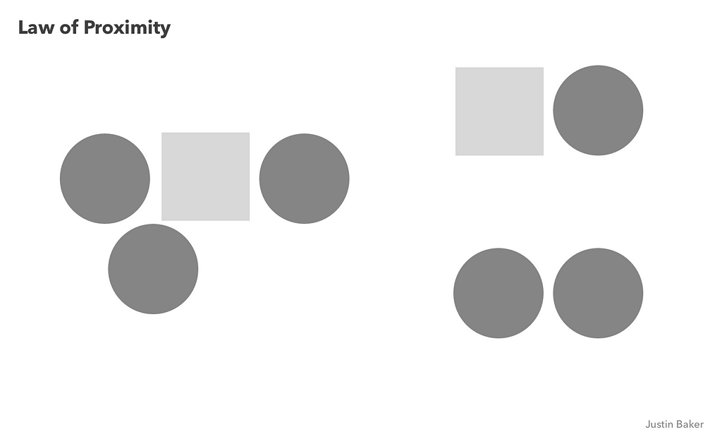
Proximity & Common Region
We perceive objects that are near each other as similar. Hence, we tend to group things that are proximal, even if they are different. This works so long as that proximate grouping has a defined boundary, either explicitly outlined or with margin/padding.
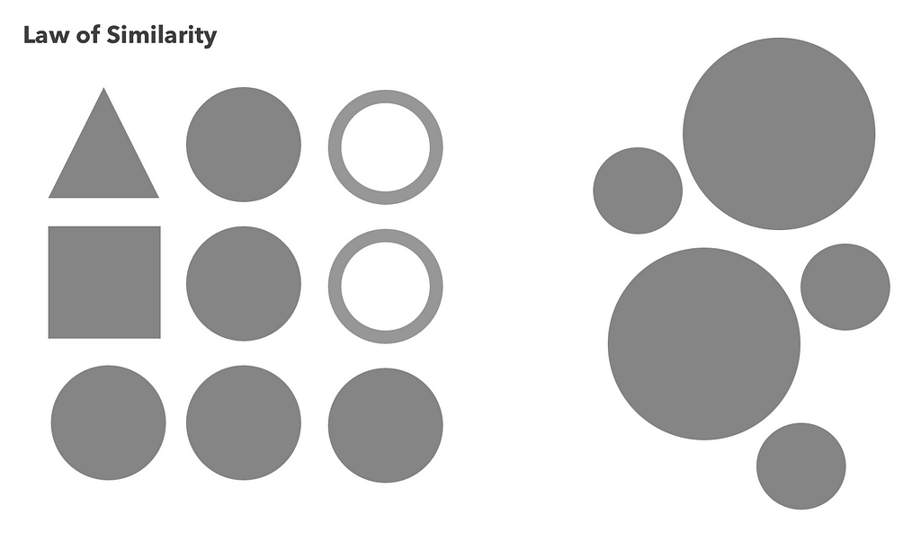
Similarity
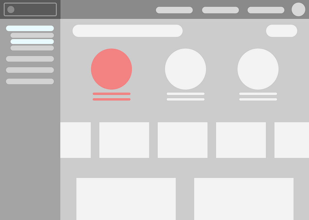
We perceive objects that share visual characteristics (size, color, texture, dimension, shape, or orientation) as belonging together. These objects do not need to be adjacent or near each other, but will typically consistently share one or more characteristics so as to be visually distinct from other object groupings. Basically, when we look at objects that are similar to each other, we tend to group them together.
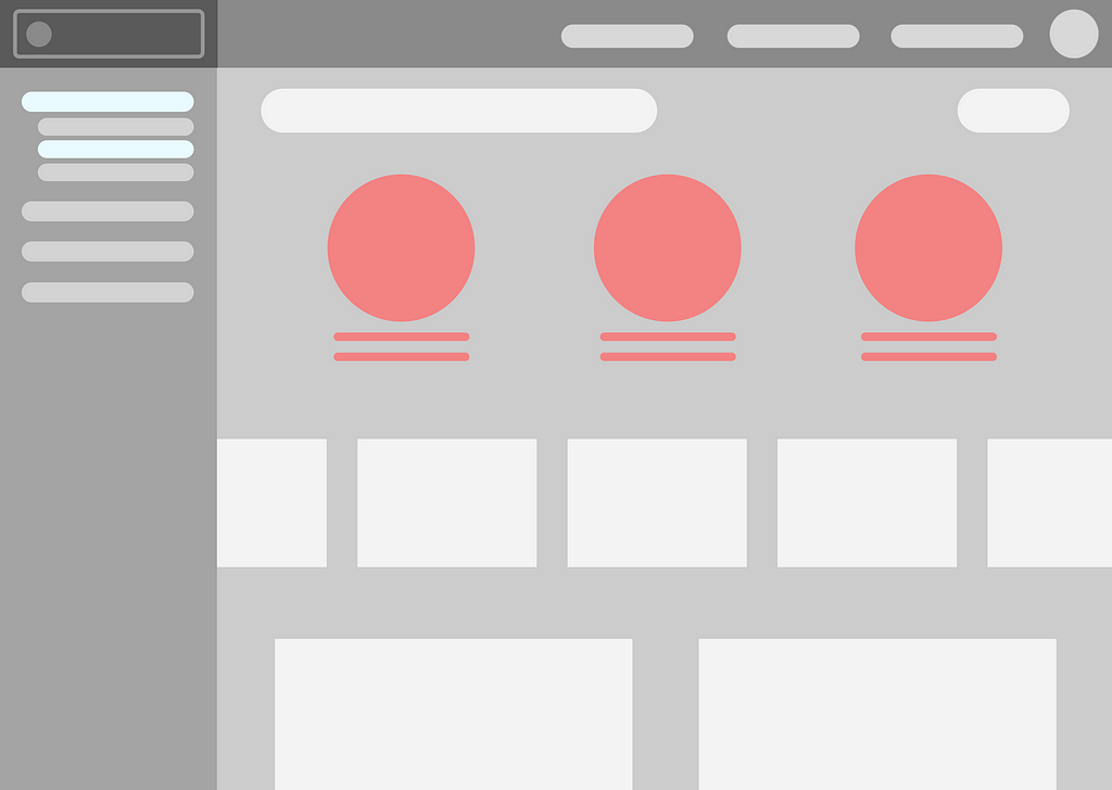
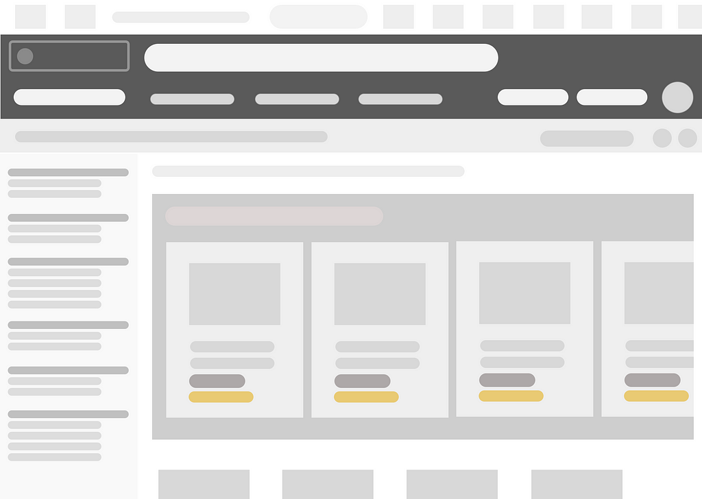
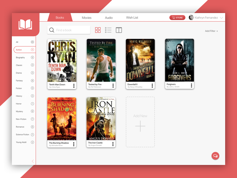 Gestalt Similarity — Repetition of Navigation, Alignment
Figure-Ground
Our eyes can visually separate objects from their backgrounds in either a stable, reversible, or ambiguous way. We can also think of this as a separation between foreground and background.

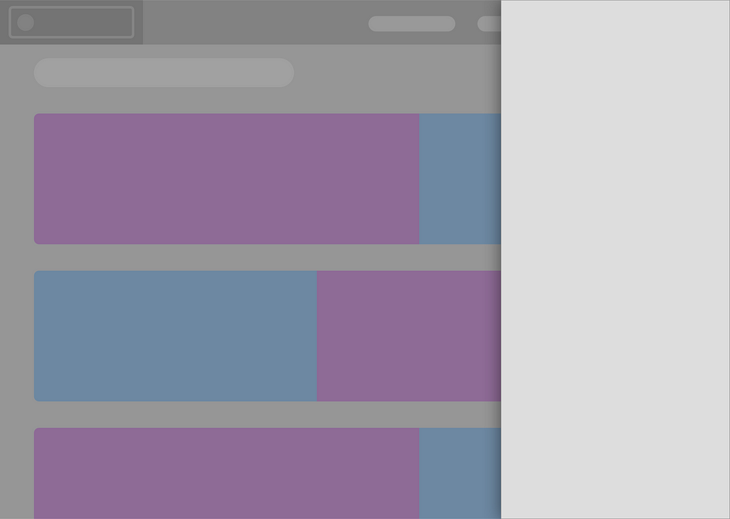
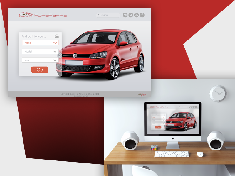 Gestalt Figure Ground — Layering
Symmetry
We perceive objects that are symmetrical with each other as more likely to be grouped together than objects that are not symmetrical with each other. We can infer patterns based on symmetry and apply those patterns to we group information. We can also make inferences that information contained within those symmetrical patterns share common attributes.
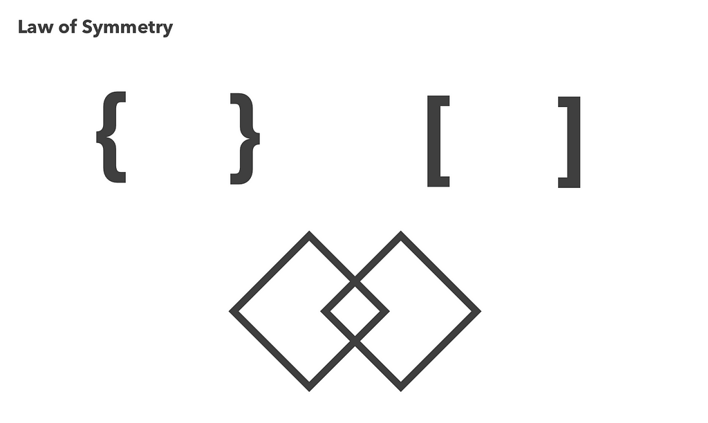
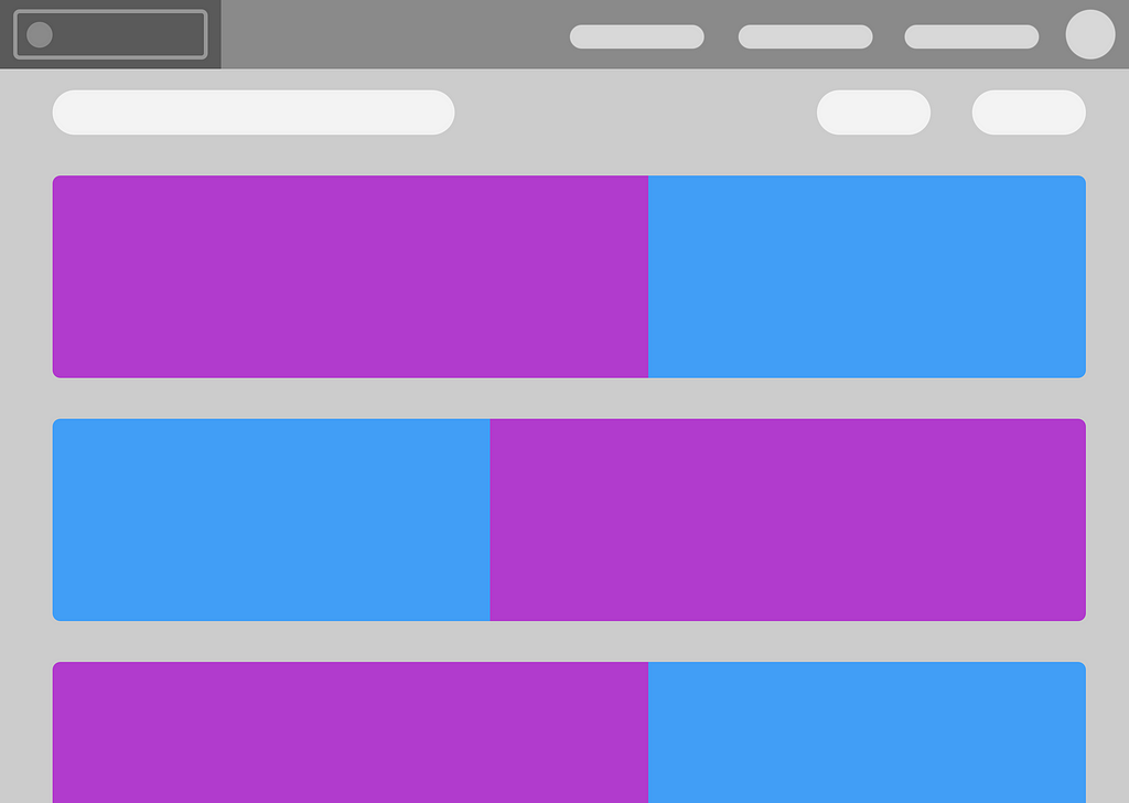
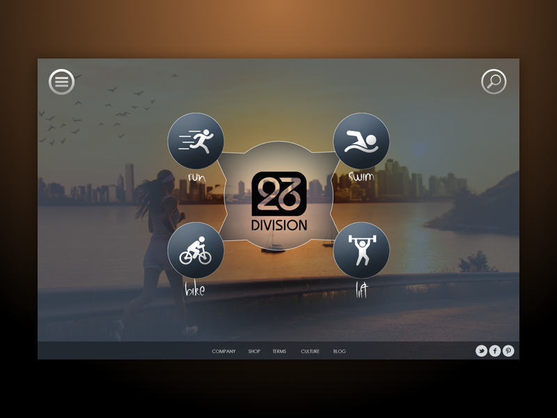 Gestalt Symmetry — Unification
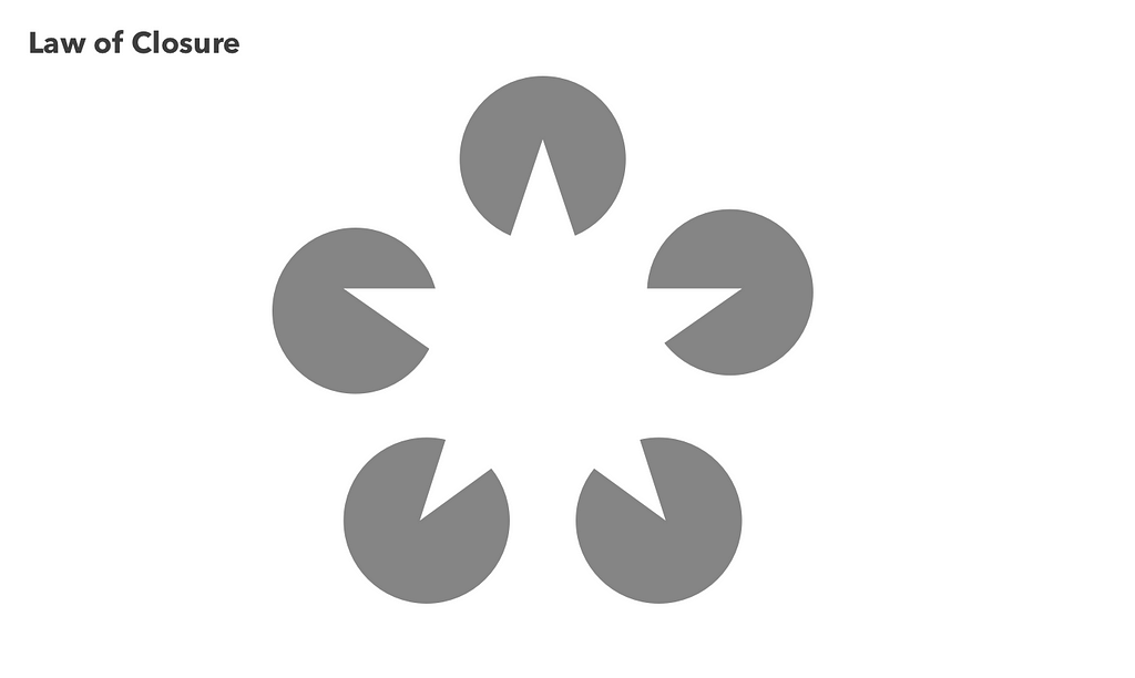
Closure
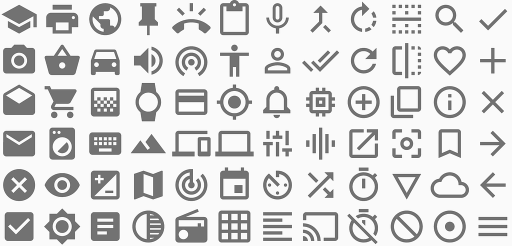
Our brains will perceive objects and figures in their complete form even if part of that object is missing or not explicitly apparent. We’ll see closure often applied to iconography, where our brains are tasked with making a quick sensory interpretation of an object.
Continuity
We determine the relationship between objects by following inherent visual patterns: lines, curves, waves, and sequences. We often see continuity applied with image slideshows or with apps where part of a feature/element is cut off by the viewport.
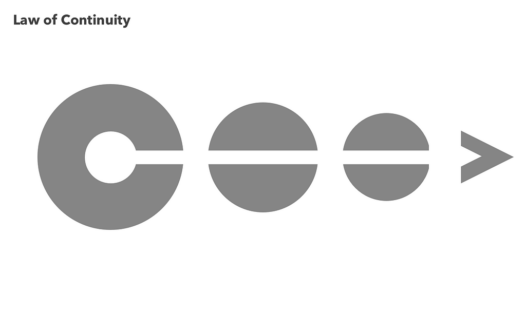
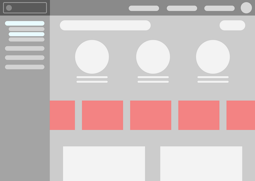
 Gestalt Continuity — Graphs with Scrollable X Axis
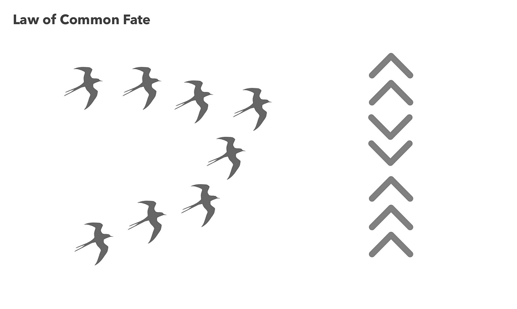
Common Fate
We will group objects together that are moving or point in the same direction. We unify these objects because we perceive them as having a singular stimulus. If you’ve ever used a step by step tutorial wizard, you will infer that each step is sequential because of similarities in pattern and direction.
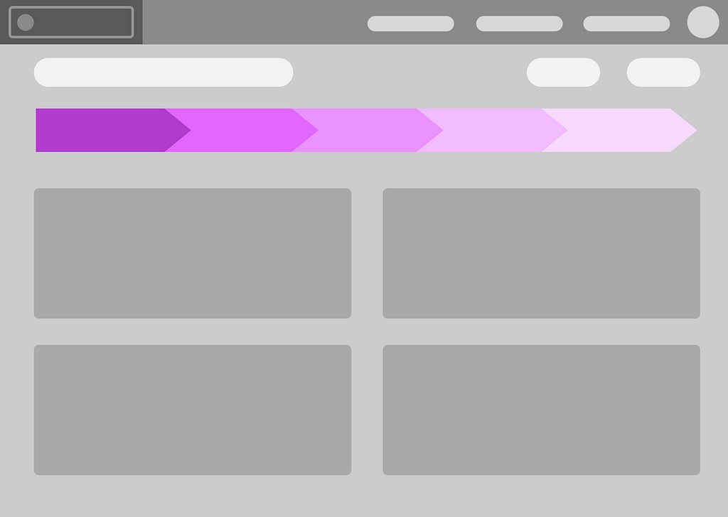
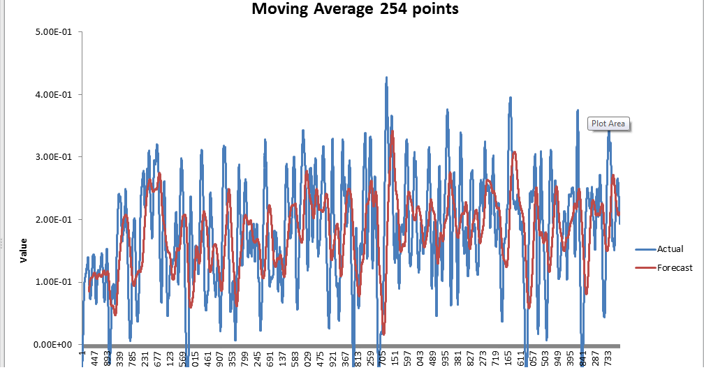
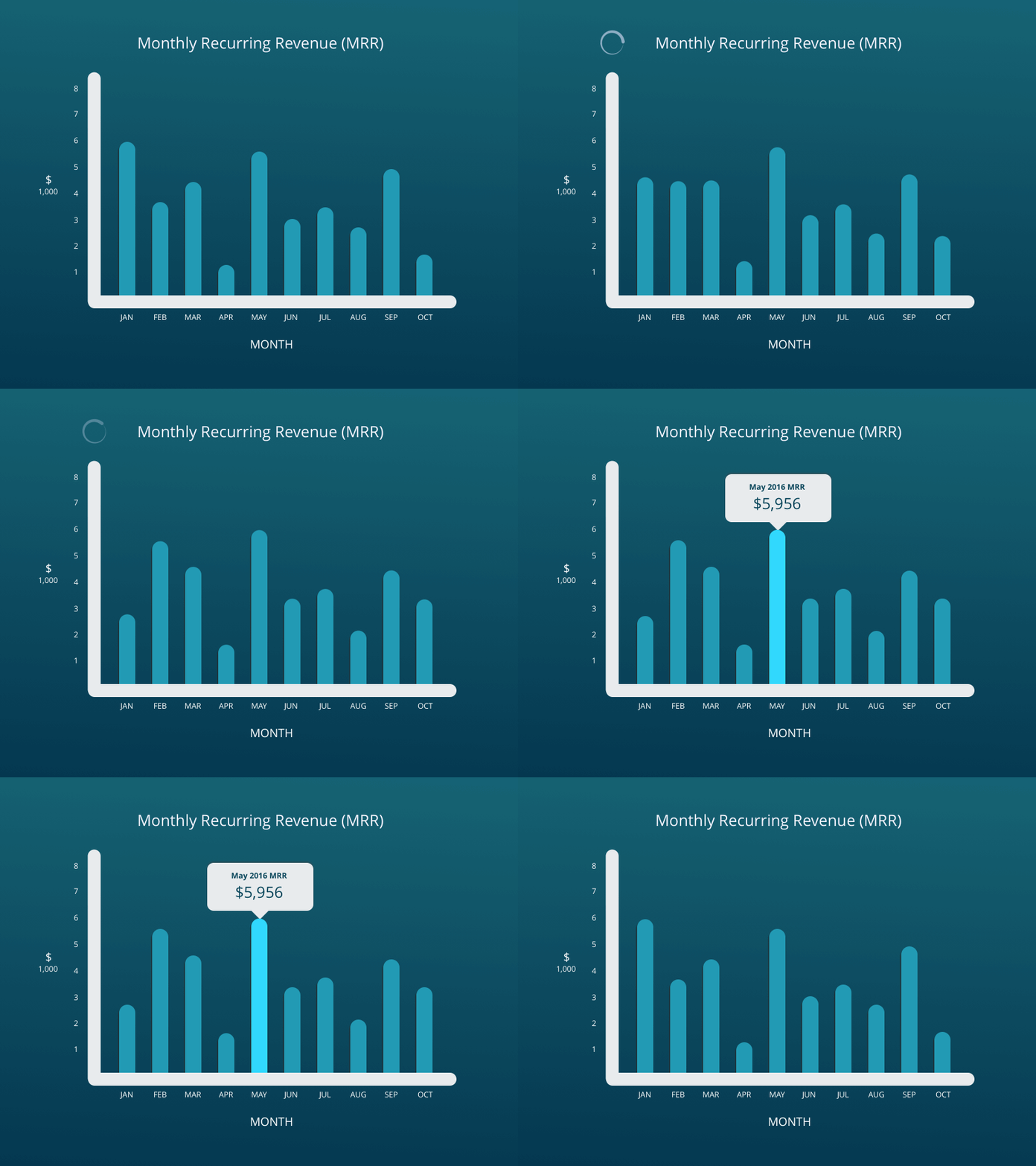 Gestalt Common Fate — Motion Trends in Graphs
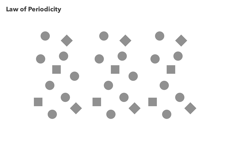
Periodicity
We prefer to see objects that periodically repeat. Think of this as a carpet pattern that may look complex, but exudes completeness when it covers the entirety of the floor. We can infer patterns based on complex trends, so long as the patterns are relatively repeatable and trend directionally over time.
Applying Gestaltism to UX Design
The way we perceive the world does not always match the real world. We develop perceptual hypotheses. Hence, gestalt principles underpin the educated guesses we make when interpreting sensory information.
Perceptual hypotheses are the educated guesses we use to make sense of sensory information (visual, auditory, and kinesthetic).
Consider your users. How are they developing their hypotheses? What is underpinning their sensory interpretation? The way we see the world is informed by numerous factors: our empirical experience, personality, upbringing, and expectations. These inform our perceptual baseline: the context that frames how we perceive and interact with our world.
Here are some UX tips that can help:
- Deconstruct your users perceptual baselines. Based on their empirical experiences, and the applications that they’re familiar with, how might these influence how they interpret your product’s interactions? What interaction patterns are they currently familiar with? Which patterns would they need to learn?
- Be wary of figure ground confusion. When you’re creating a complex interface with multiple layers, take extra care to intuitively organize your layers so that they are logically ordered. Make sure your users are not confusing the foreground content area with an inert background.
- Err on the side of ‘too much’ padding/margin than not enough. Be meticulous when it comes to alignment, pattern consistency, and spacing. It is always easier to reduce padding/margin than it is to add.
- Remove the details and look at the big picture. Look at your UIs from a 10,000 foot perspective. Examine the groupings. Examine the patterns. Examine the overall layout. Are elements and features grouped intuitively?
The Big Takeaway
The biggest takeaway for designers is to examine your UX from higher level sensory perspectives. Deconstruct your design into its most basic spatial elements — identify and examine the interaction between patterns.
Even for existing experiences, you can remove the details and just focus on general areas and patterns. What happens if you move elements around? What happens if you add a new feature? What happens if you modify your layout? Can your users understand the inherent patterns and relationships within your product if you removed all the detail?
A higher level sensory perspective can help you create an experience that meshes with a user’s cognitive assumptions and hypotheses — delivering truly delightful UX.
Gestalt-Driven UX: The Patterns That Drive Our World was originally published in Hacker Noon on Medium, where people are continuing the conversation by highlighting and responding to this story.
Disclaimer
The views and opinions expressed in this article are solely those of the authors and do not reflect the views of Bitcoin Insider. Every investment and trading move involves risk - this is especially true for cryptocurrencies given their volatility. We strongly advise our readers to conduct their own research when making a decision.

