Latest news about Bitcoin and all cryptocurrencies. Your daily crypto news habit.
Onboarding is a customer retention tool
How to build an effective user onboarding flow into your product.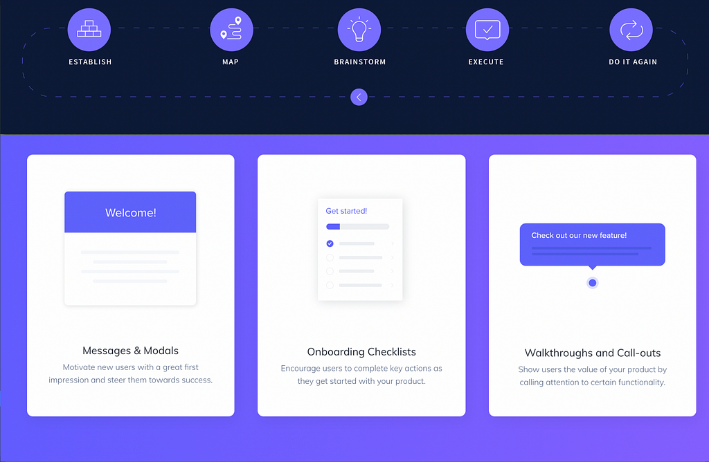
User retention happens via activation and onboarding, not notification spam or addition of new features that eventually leads to feature fatigue. How do you introduce your product to a new user for the first time? You use onboarding. Fairly self-explanatory, really.
But there is more to onboarding than just an introduction. If you are meeting a new person for the first, it’s okay to just stop at the “hi’s and hello’s” or even what they do for a living. But with digital product, it’s different. Customers want to know how your product is going to change their lives, deliver value and guarantee a return on investment and oh you have a very short window to inform your customers that your product can certainly live up to their expectations.
Consider you had a minute to explain “quantum computing” to a toddler, well before you go on with the explanation you might want to consider these common traits: toddlers have limited attention span, the current situation of the toddler (other activities around them), and cognitive load (comprehension).
Prioritizing customer satisfaction over delight
When thinking about the best way to implement an onboarding flow into your product, it’s best to focus on the core experience and value you are delivering and not the delighters. In essence, your onboarding should be lightweight as much as possible. The Kano model is a practical framework to leverage when prioritizing features that will help your customers get any sort of meaningful benefit on the first try.
Threshold/Basic features — Applying the Kano model focuses on your user’s basic expectations first. These features can either make or break your retention model, they make up the baseline that every product in the category offers. However, these features do not equally translate to customer satisfaction. It makes sense to couple performative features with basic features when implementing an onboarding flow.
Performance features vs benefits features — Performance features are the most straightforward to position when implementing onboarding. They are the ones where customers like having them and dislike not having. Building an effective retention model with your onboarding flow means your product is able to deliver value that meets a customers expectation in the shortest of time. Not too simple and not too complex. Strip away all the extra fancy stuff and make sure not to mix up excitement features with performance features.
In general, performance features combined together with basic features have a linear effect on customer satisfaction. They will bring satisfaction to end-users when present, and dissatisfaction when missing or unfulfilled.
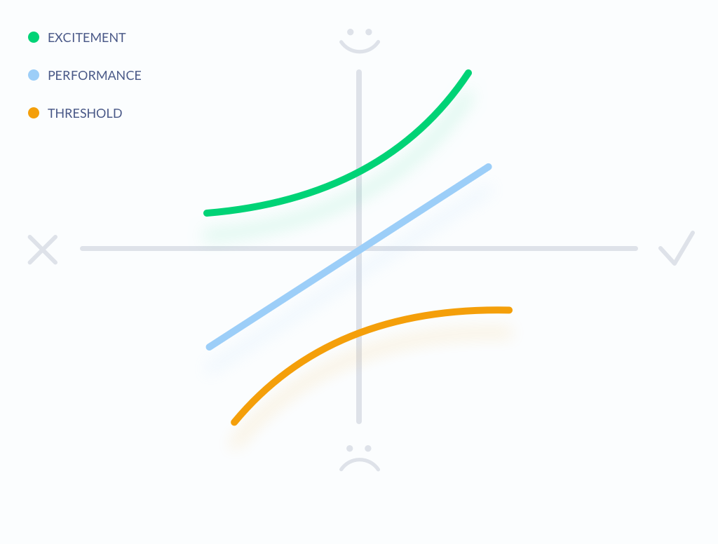 Kano Model Applied to Features by Aleksandra Bis
Choosing the Right Features with Kano Model
The case of Duolingo (Basic/Performance vs delighter features)
Duolingo does this so well with its onboarding. Of course, the total experience of a product covers much more than its usability or performance. It extends aesthetics, amusements, utility, and business goals which all play a critical role. Try as much as possible not to overcomplicate the onboarding journey with unnecessary feature delights. Your user preemptively holds an expectation and does not have all the time in the world to analyze your extravaganza’s. Duolingo focuses on one essential experience and makes everything around it the best.
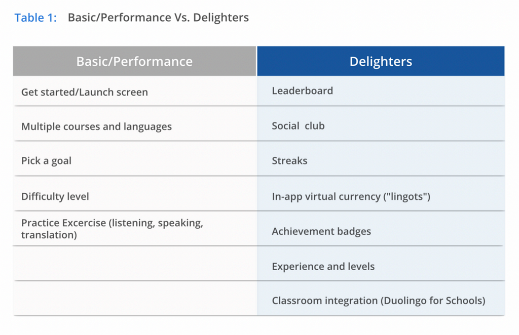 Classifying Duolingo’s features into performance features and delighters.
The rest of the fancy delighter(s) are attributes that provide satisfaction when achieved fully but do not cause dissatisfaction when not fulfilled.
In a 2015 report by Andrew Chen and Quettra, the average app on android play store loses 77% of its DAUs within the first 3 days after installation. Within 30 days, it lost 90% of DAUs. Within 90 days, it’s over 95%.
The most effective solutions recommended by Chen to leverage in improving retention happen to be; user-friendly product description, better onboarding flow, and what triggers user set up to drive ongoing retention.
So how do you provide value in your onboarding flow?
Guides to follow to build the perfect onboarding into your product
- Understanding the user — Leverage your user persona’s emotional state to design your onboarding flow. A practical way to go about this is by carrying out extensive user research to identify simple and complex nuances that influence the way users interact with your product. In recent times, product teams have pushed more for the integration of field research into product development. This is because attributes that can easily be identified by talking to the user are not causation, attributes do not cause users to do things. It’s context like physical, emotional, and social in which people engage with a product that triggers causality. So before implementing an onboarding mechanism, it’s important that you bring into perspective these different contexts and identify the best way to create a common workaround to fill in the gaps of different users workflow. Learning about your users beyond desktop research: This resource from Google explains how to plan, execute, and share insights from the field.
Beyond Desktop Research: The Immersion Trip - Library - Google Design
2. Identify your product category — How does your product deliver value to your customers? and what category does your product belong?. These defining question should be identified and answers matched with your product’s unique use case.
Regardless of the specifics of the onboarding flow implemented in-app, if users can’t find your product with a simple search within a certain category or your product description does not effectively explain what your product does then your onboarding is broken. Onboarding starts when a user searches for your product by name or within a category. An example is “Duolingo”, at the first search the user is presented with the product and a succinct description of what the value the product provides “Learn Languages for Free”. It’s simple and it effectively describes what Duolingo does.
Apple and Google make this easy by allowing you to match predefined categories with your product when uploading to the app store and if your product is browser-based a simple web search should describe what your product does and how it delivers value.
- Categories and Discoverability - App Store - Apple Developer
- Select a category for your app or game - Play Console Help
3. Identify an onboarding technique that fits your product — perhaps this is the most critical aspect of building an onboarding flow, before even designing or building you should identify the best onboarding technique that fits your product category or what techniques should be combined together.
These onboarding techniques include the following:
- Walkthroughs and tutorials — this technique is classified into static and dynamic onboarding. Dynamic walkthroughs are effective to walk users through your product’s features by providing a completely integrated and contextual experience. Static walkthroughs present a slideshow or static instruction before users get started and are non-interactive. Product categories like education, communication, travel, and photography often use such technique.
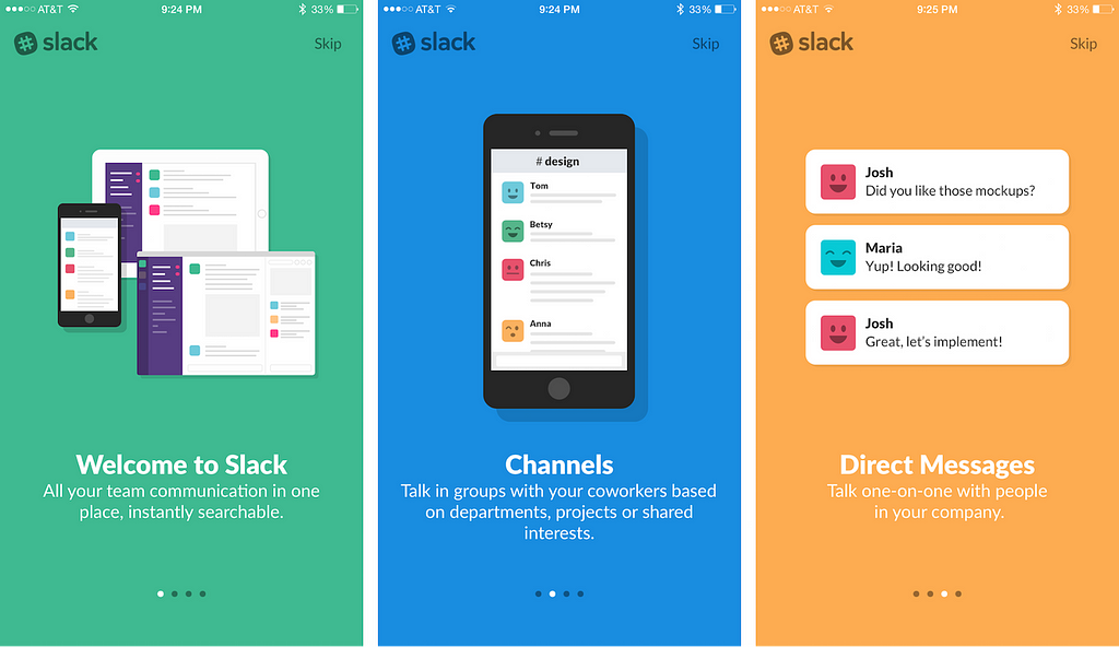 Slack App Walkthrough Technique
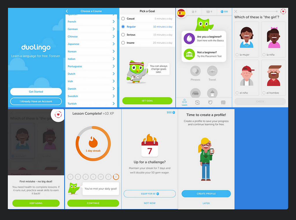 Tutorial Technique From Duolingo
- Visual hints or visual cues — Visual hints is an onboarding technique that assists users to better understand how to interact with a product’s interface. This technique is especially needed for designs that contain a lot of interactive objects, or a unique navigation method. Visual hints cater to a users emotion and When used irresponsibly, this technique can have adverse effects on users understanding of what your product does. There are do’s and don’t that are applicable to this technique.
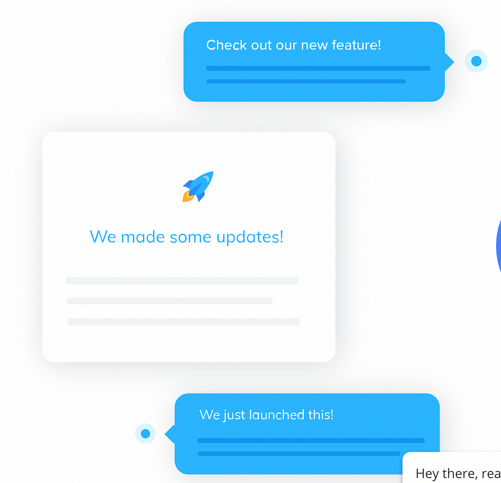 Visual hints and cue technique
- Using empty states and sample data — This technique is more suitable for a product that is heavy on user-generated content to create interaction and deliver value to users. Empty states onboarding create an experience where a user might not have created content yet. This could be because the user has just signed up, or the user has deleted their data themselves. In this case, an empty state is a natural point to inject the use of onboarding into your product and to continue guiding users along. Product categories like productivity, social network, and communication make use of this kind of onboarding.
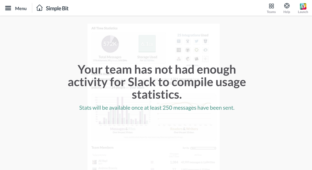
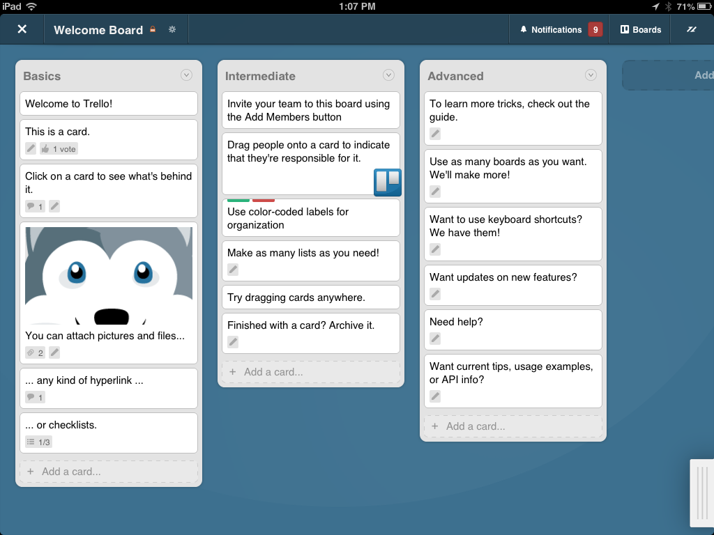 Empty state and sample data onboarding technique
4. Identify the fastest journey for delivering value to your users. — Your product’s onboarding journey map should certainly be different from a typical customer journey map that entails a customers entire lifecycle. Your product’s onboarding flow is a subset of your full user journey map. It starts by identifying a huge, painful problem to solve then proceeds to identify a simple solution to the user’s problem and effectively how your product can help achieve the user’s goal (the task). By identifying a simple path to onboard your users you will, in turn, create an effective onboarding flow that welcomes users, introduce them to your product and encourages retention.
Conclusion
Building an onboarding flow that is simple and intuitive is tasking and it is very easy to miss your one important chance to show a customer that your product can deliver value and help them solve a major hurdle. In essence, treat your onboarding flow as a major point of customer activation and retention.
Resources to leverage to help you build better onboarding flows
- Onboarding techniques: The do’s and don’ts when designing an onboarding flow from Shopify.
Mobile App Onboarding: The Do's and the Don'ts - Shopify
2. Appcues, a user onboarding software that allows you to experiment and Improve your user onboarding.
3. Create multiple immersive onboarding flows with Pageflows and view onboarding flows for other products.
Page Flows - user flow patterns
Sending a shitload of spammy email notifications with the subject line “We Miss You” is unlikely to bend your low retention curve significantly but with a better onboarding flow you can meet your customers half-way.
User onboarding is product management was originally published in Hacker Noon on Medium, where people are continuing the conversation by highlighting and responding to this story.
Disclaimer
The views and opinions expressed in this article are solely those of the authors and do not reflect the views of Bitcoin Insider. Every investment and trading move involves risk - this is especially true for cryptocurrencies given their volatility. We strongly advise our readers to conduct their own research when making a decision.
