Latest news about Bitcoin and all cryptocurrencies. Your daily crypto news habit.
There are a number of ways for an online shopper to find your brand, and, I’m sure you are spending hundreds and thousands of dollars in those marketing tactics to attract them.
Hence, you would not like to miss on any opportunities that come your way!Spotting their favorite products the customer will click on the product link that diverts them to the product landing page. Therefore, your product page will determine the engagement and conversion rates for your eCommerce business.
Key essentials and excellent display of product pages from leading brands
1. Product display
Visuals trigger a sense of inspiration to online shoppers, and today, many of them use image search to find their favorite products. The more value your product image will display, the higher chances of them being influenced to take further actions.
What you can do?
a- Relate them to your one’s daily routine
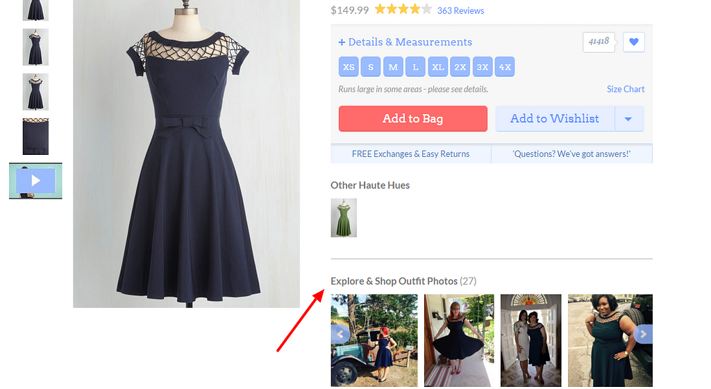
Modcloth’s “Explore & Shop Outfit Photos” section on their product page is surely enhancing a shopper’s purchasing experience. Displaying your happy customer’s photographs using your product will automatically trigger an excitement among online shoppers and encourage them to engage and make purchases from your eCommerce store.
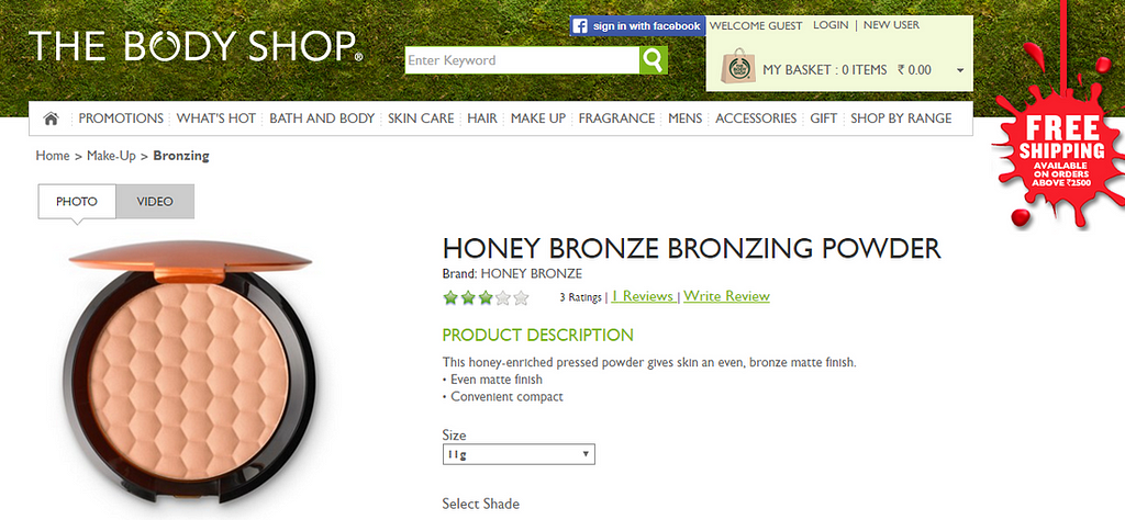
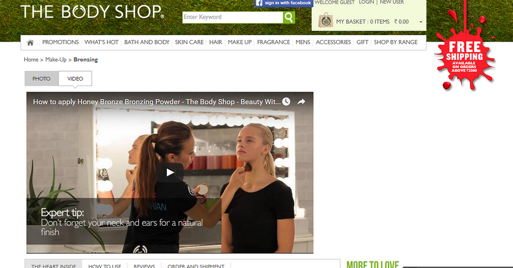
b- Get innovative, use videosBodyshop product page offers both great visuals, as well as, video. Dealing with organic beauty and cosmetic product, this brand allows it’s customers to gain better insights on the use of their products. Ensuring a demo video showcasing the use of your products, will increase engagement level and enhance your customer’s shopping experience.
2. Product InformationAfter your products visual does the game of making the shopper cling to your site, they would like to know more about the product.
What you can do?
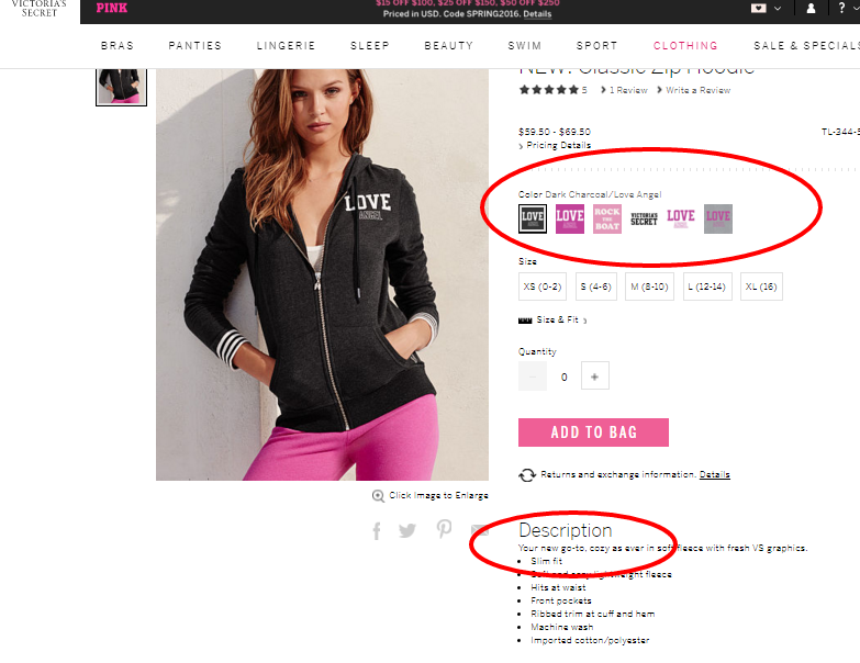
a- Ensure easy to spot features and color optionsVictoria’s Secret offers a crisp feature description making it easy and quick for customers to know everything about their product. Also, their innovative color selection options make the customer’s shopping experience even more fun.
Allowing your customers an ability to choose for their favorite color is important; however, being innovative with unique prints for each will increase the shopper’s excitement for your products and make better purchases.
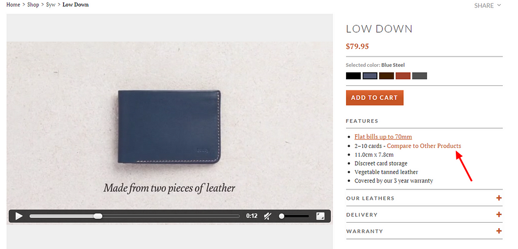
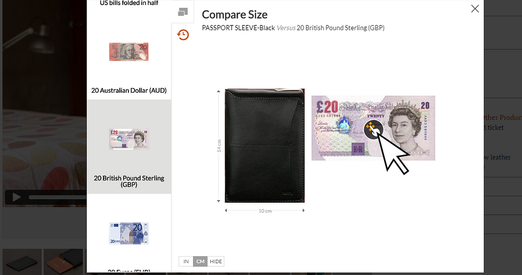
b- Engaging size comparisonBellroy’s“Compare to Other Products” feature on its product page is surely helping their customers to eliminate the risk of shopping for a wrong size product. Allowing your customers to compare the product size with other products will offer a unique shopping experience and your customers will feel safe shopping from your eCommerce store.
3. Purchase decision informationOnce the shopper is happy with the product information, they will immediately spot for the product price and security for their purchase orders your store has to offer. Making it difficult for them such details will hamper them from proceeding with the purchase.
What you can do?
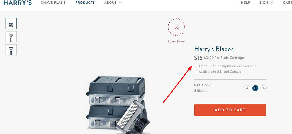
a- Clear priceHarry’s make it easy for their customer’s to spot the product price by highlighting it. Also, it offers price breakdown, ensuring customers know that they are not paying more. Keeping product price clear and simple to understand will stop your customers from making incomplete purchases.
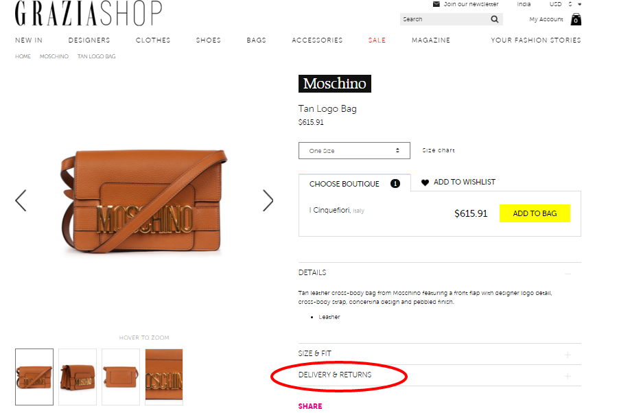
b- Other important informationGraziashop allows its customers to gain insights about the product shipping and returns information for the product page itself. This way, customers will not have to switch over pages to find such important information that is needed to make a purchase decision.
4. Call-to-action buttonOnce the shopper is happy with the product, it’s important they are able to easily proceed further. Unable to offer clear prompts of purchase steps, can lose you a number of opportunities that made your way.
What you can do?
a- Clear add to cart and Add to wishlist option
Aritzia product page offers crucial call-to-action button in the simplest way to avoid distraction and keep customer focused in placing their purchase order. It is not necessary to use vibrant colors, as many feel it quickly diverts attention, instead, focusing on the placement of your call-to-action will matter the most to your customers.
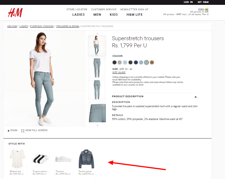
b- Up sellH&M product page performs one of the best up selling tactic that will automatically encourage their customers to make purchases in order to complete that look. Similar to H&M allowing customers with prompts of the most relevant match will immediately help you increase order value for your eCommmerce store.
5. Customer’s experienceWhether they are making a purchase for themselves or planning to send a gift to their dear ones, shopping online really makes one happy. So, would you not like to take an opportunity of your customer’s joyful mood?
What you can do?
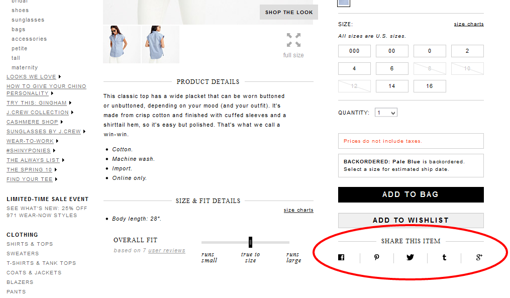
a- Allow social sharing buttonsJ.Crew makes it easy for customers to quickly share their wonderful experience by allowing them to easily log on to their favorite social networking sites from their product page itself. Integrating popular social share buttons on your product page will allow your happy customers share their purchase experience while increasing visibility for your eCommerce brand.
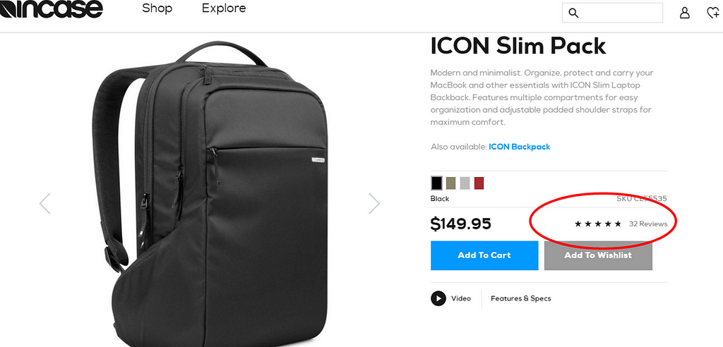
b- ReviewsIncase.com’s product page does not only allow customers to share reviews but also, helps them make better purchase decisions by highlighting reviews that are already provided. Displaying a success indicator on your eCommerce product page will enhance your customer’s decision and will always trust your brand for making purchases.
Closing adviceWith the above, you can ensure your product page has the most important elements to encourage customer, as well as, make them stick with your brand. However, playing around with the placements and integrating a tool to test the performance of each element, will ensure you land-up with an excellent product page for your eCommerce business.
A successful product page will enhance the online shopper’s experience; however, not being able to deliver products as per customer’s order will make all your efforts go in vain. Therefore equally important, is to adopt a cloud-based inventory management system that will help you automate product updates and ensure accurate inventory levels, always.
GoodLuck!!
Originally published at orderhive.weebly.com.
10 best product pages you can gain inspiration from was originally published in Hacker Noon on Medium, where people are continuing the conversation by highlighting and responding to this story.
Disclaimer
The views and opinions expressed in this article are solely those of the authors and do not reflect the views of Bitcoin Insider. Every investment and trading move involves risk - this is especially true for cryptocurrencies given their volatility. We strongly advise our readers to conduct their own research when making a decision.
