Latest news about Bitcoin and all cryptocurrencies. Your daily crypto news habit.
- Chart structure
- Splitting grid and traces
- Grid Color Detection
- Trace Pixel Classification
- Chart template detection
- Text Extraction
- Text recognition
- Template matching
- Axis Matching
- Pen Trajectory Evaluation
- Shear compensation
- Improving envelope
- Outlier removal
- Pen trajectory evaluation
- Conclusion
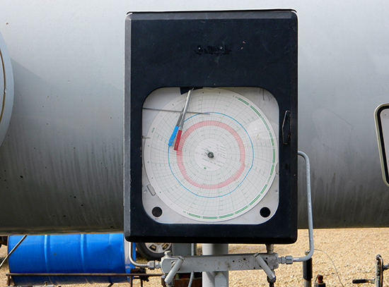
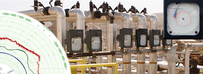
Flow charts are widely used in gas industry. They record parameters of a gas flow (like pressure) on a paper disc. This data is then used to calculate gas volume passed through a pipe.
The chart recorder contains two or three pens driven by sensors. These pens plot traces on a rotating paper disk. The disk performs one revolution per day or week, rarely per month. The disk is replaced after one revolution.
Currently disks are processed manually. The operator uses the vector graphics editor to convert the scanned bitmap to contours and then to tabular data. This approach relies heavily on the operator’s attention and experience. There is a high probability of mistakes. After all, such job is really boring!
We have developed an algorithm that performs this job automatically. Given a bitmap with a scanned chart, it produces tabular representation of chart data.
Chart structure
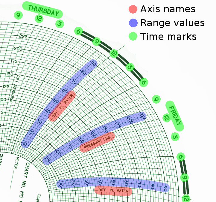
The template on the disc (usually green) is pre-drawn. It contains:
- Radial arcs for time;
- Concentric circles for quantity levels;
- Names of quantities (axes);
- Quantity values for concentric lines (ranges);
- Time marks: hours and week day names.
Note that the same concentric line has different values for different axes.
Splitting grid and traces
Grid Color Detection
The first task to solve is to separate trace pixels and pixels belonging to the blank area. This blank area contains two dominant colors: white and green. In theory, knowing this we could use simple thresholding to detect these two colors. But in practice this approach drops pixels on the edge between the grid and the blank paper. This happens because boundary pixels aren’t strictly white or green — they are somewhere between.
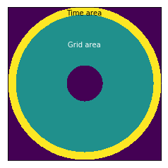
To deal with it, a linear model is used. To build such model, we need an area where no trace appears. Such area is the outer ring of the chart, named “Time area” on the image.
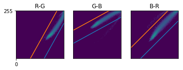
We take histograms for red-green, green-blue and blue-red correspondence and then build linear models for each. After that we evaluate the residual threshold for every pair using triple standard deviation.
All pixels passing this threshold are labeled as non-trace pixels.
Trace Pixel Classification
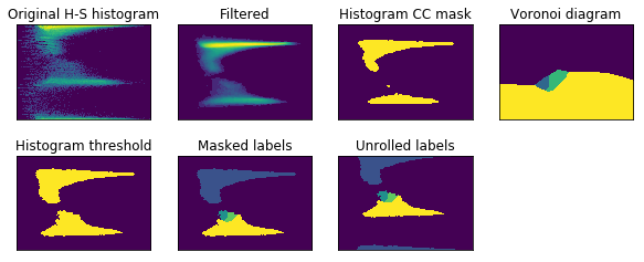
The next step is to determine what trace every trace pixel belongs to. This is done using histograms of hue-saturation space. We perform clustering of h-s blobs and then the back-project result to pixels.
To improve the result, we build the histogram using pixels whose bottom-right neighbours have similar color.
Since we need the hue difference between pixels, all pixels with similar color should have a similar hue. This is not true for red pixels because they have hue values near both 0 and 180. To tackle this issue, we roll hue values to shift the significant part of the hue histogram to the center. The shift value is found as a minima of the convolution between the hue histogram and the kernel shown below. The idea behind is to “penalize” cases when large histogram values are near 0 or 180.
After the histogram is shifted, we find trace pixels whose neighbours have similar hue. This step makes blobs’ edges on the h-s histogram sharper, because pixels near the trace edges are excluded.
Similar pixels are found in the next way:
- Get all trace pixels whose bottom-right pixels are in trace too;
- Find the 95% percentile of the hue difference;
- Keep pairs with the hue difference below this level.
Then, the mean hue and saturation values are taken for every neighbour pair. The obtained set of the hue and saturation values is used to build ‘filtered’ hue-saturation histogram. This histogram contains less noise produced by the ‘edge’ pixels.
After that, the histogram is thresholded by the median value and connected components are found. We build Voronoi diagram and assign its labels to the source histogram.
To make the result more robust, we mark the histogram bins below the 10% percentile as unlabeled.
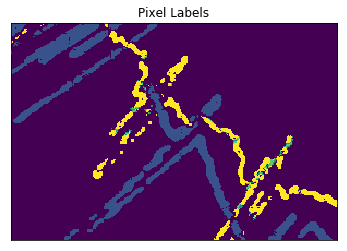
Now we get labeled trace pixels like this:
There are some mislabeled pixels. To fix them, we perform the following steps:
- For every possible label we create a binary mask of pixels marked with this label;
- Gaussian blur is applied to every mask;
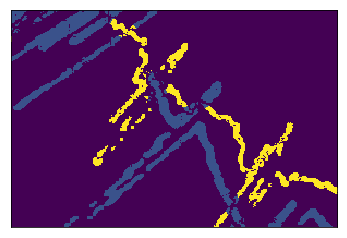
- For every trace pixel we take the index of the mask with the largest value.
These steps change labels for the outlier pixels replacing them with the label of surrounding pixels:
Chart template detection
To determine the chart template we perform the following steps:
- Recognize all the text presented on the image;
- Detect axes names, level marks and time marks;
- Choose the template matching the obtained set of labels.
Text Extraction
First, we extract all the text char by char, group character images to labels and recognize them.
In depth, the next steps are performed:
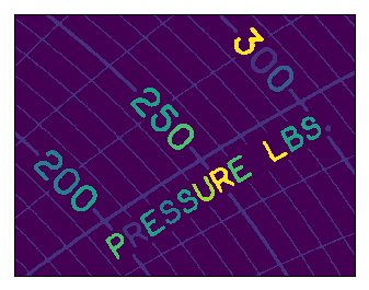
The image is binarized using Otsu method. All trace pixels are made black. So, only the grid and text remain.
Connected components are found.
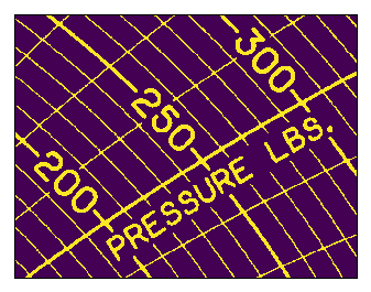
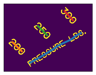
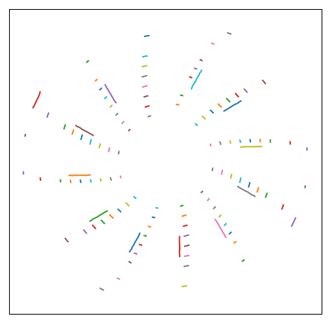
Characters are detected using the area and density (the ratio between the area and bounding box area) thresholds and then grouped to text instances.
Here is a plot of all text instances found on a typical chart:
Text recognition
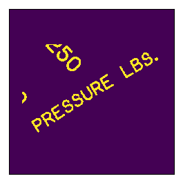
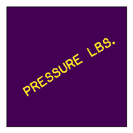
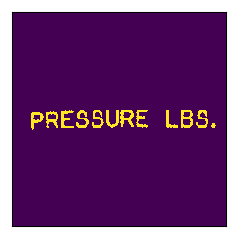
Every text instance is rotated to the horizontal position and passed to Tesseract.
First, apply the mask based on the text instance geometry.
Then we rotate the image to the horizontal position.
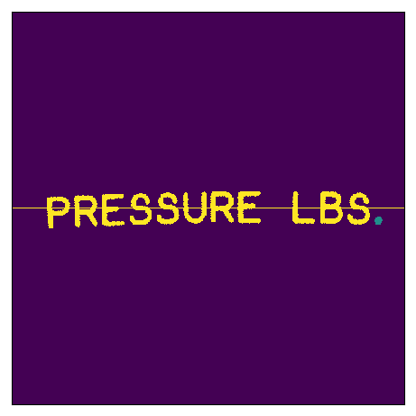
To remove the redundant blobs near the text, we draw a line through the middle and use the flood fill to remove the redundant parts.
Then we restore the middle row, invert the image and pass it to Tesseract.
Template matching
Having all text recognized, we find a chart template with the best matching.
First, we define a list of all known chart templates. Every template is described by:
- The number of hours it contains (24 for day, 168 for week, etc.);
- Text marks appearing on the outer ring;
- A list of axes; every axis contains:
a. Text label;
b. Values presented on a chart;
c. Possible pen colors.
To find the template used on the given image, we check matching of the axis names and range labels in the next way:
- Group all range labels found on the image by the nearest (by angle) axis name label;
- Cyclically shift groups to handle combinations with a different starting group. This allows us to handle non-periodical axis sets like ABCABCAB. For every shift:
a. Form strings “<axis_name><range_label_1><range_label_2>…” for every group;
b. Form a similar string for every axis in the candidate template;
c. Calculate string similarity for every pair group-axis;
d. Get mean similarity through all pairs;
3. Resulting matching quality is a maximum among all shift values;
4. Take the template with the best quality.
After the template is detected, its rotation angle on the image is found by the following steps:
- Take all labels found in the outer ring of the image;
- Take the same labels from the detected template;
- For every found label, expected label and rotation angle, find label-to-label matching quality as a product of string matching ratio and negated angular distance between the expected label and found label, rotated on a given angle. Negation makes the second part of the product increase when the angular distance tends to zero;
- For every found label and rotation angle, get the best matching expected label;
- Find a rotation angle with the maximum sum of matching qualities.
Axis Matching
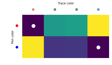
After template matching we need to find the trace-to-axis correspondence. This is done by color matching. For every trace found a mean color is taken. Then for every possible pair (trace, axis) we find Cartesian distance in RGB space between the mean trace color and the known axis color. Some axes might have two possible pen colors. In this case, the minimal value is taken.
Having such distances for all trace-to-axis pairs, we find the best matching by simply iterating all possible correspondences.
Pen Trajectory Evaluation
So, we have trace points classified by trace. We also know what template was used. This allows us to convert the image coordinates (in pixels) of every point to time and value (in hours and appropriate units: kPa, ℃, etc.). As a result, we get a set of points. If we arrange them in order by time, we have our task solved, right?
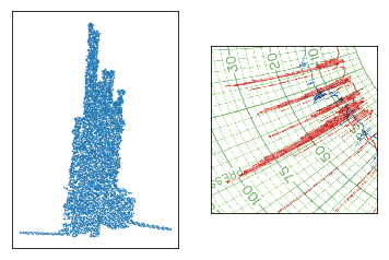
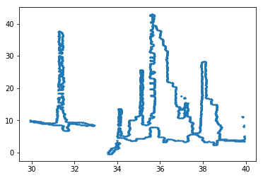
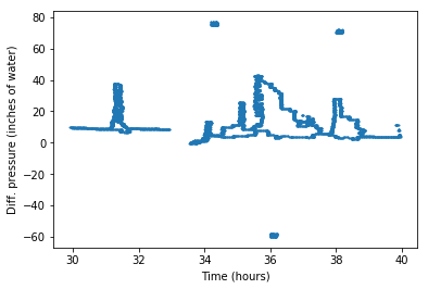
No… Because now we have tons of points that tell us nothing about the pen’s movement. Let’s look at pixels in time-value plane and a corresponding chart fragment:
It is easy to tell how the pen moved on the left and right ends of this excerpt, because we clearly see the line. But what about the middle part? How did the pen travel here?
Intuitively, we can say that the pen moved up and down, shifting right a little every time. But how to restore this movement?
To solve this task, the next steps are performed.
Shear compensation
First, we remove inner-points. Only border points are kept. This dramatically decreases the number of points for further processing.
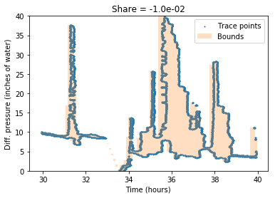
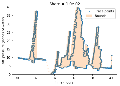
After that, we compensate the trace shear. This shear happens when the pen is placed incorrectly or is not fixed in the plotting head. To tackle it, we iterate over possible shear coefficients. For each one, we find an area of min-max envelope. The coefficient with the smallest result is chosen and applied to trace points.
The image below shows the bounding area for shearing coefficients -0.01 and 0.01.
Here is the result of shearing with the optimal coefficient:
Improving envelope
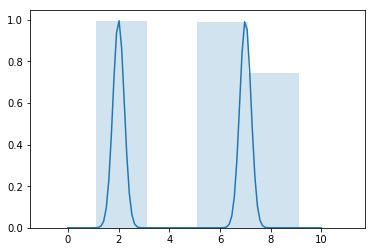
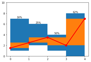
Next, we improve the obtained min-max envelope. Initially, all bins are uniformly distributed. Sometimes thin point “columns” appear on the edge between the bins, producing two bins instead of one. Simple movement of all bins won’t help us, because having one “column” aligned, we might get another one on an edge. Below is an example of two peaks and the envelope with step 2.
To solve this issue, we improve the position of the bins by means of the next steps:
- Generate 10 envelopes for different bin offsets;
- Get max-to-min differences for each one;
- Apply three-item sliding mean;
- Having 10xN matrix and treating it as cost, we use forward-backward algorithm to obtain the sequence of indices (“path”) that minimizes the total area of the envelope.
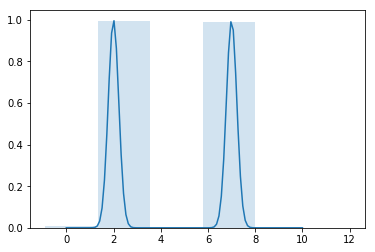
After these steps, we get the envelope with a smaller area than the initial one:
Outlier removal
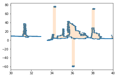
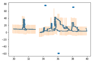
Next, we remove the outliers. Sometimes grid pixels, hand marks or other things are mislabeled as trace points. For example, here we have added three outlier blobs:
Applying the min-max envelope gives us an inadequate result:
To fix this, we split high blocks into vertical “chunks” with a limited height. Now for every bin more than one chunk can exist. For example, here are three such cases:
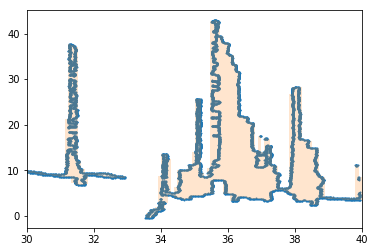
After that we find optimal indices of chunks for every vertical block. We use forward-backward algorithm with a vertical distance between the neighbouring chunks as cost function. This gives us a sequence of chunks covering inlier points.
Next, we get an optimal envelope for inliers:
Pen trajectory evaluation
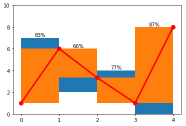
Having done this, we are ready to evaluate the pen trajectory. We assume the linear pen motion inside every bin, changing the movement direction between the bins. The goal is to maximize the area of the bin covered by the pen motion.
For example, here is a possible envelope, pen path and coverage ratio for every bin:
To maximize the coverage area, we use forward-backward algorithm with ten points per bin edge as possible states and one minus bin coverage as the cost of step. Here is the result applied to the example above:
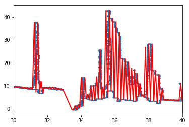
And to the real-world example:
The red line on the image above shows the evaluated pen trajectory. It follows the thin line where needed and covers dense point areas using the up-down movement.
Conclusion
The algorithm described above successfully handles a wide range of input data from thin lines to dense “hatching”. The produced data allows us to calculate the gas flow characteristics without any human interaction, increasing the robustness of the whole chart handling process.
By Ilya Sivkov
ChartRecorder: Computer Vision for Gas Flow Charts was originally published in Hacker Noon on Medium, where people are continuing the conversation by highlighting and responding to this story.
Disclaimer
The views and opinions expressed in this article are solely those of the authors and do not reflect the views of Bitcoin Insider. Every investment and trading move involves risk - this is especially true for cryptocurrencies given their volatility. We strongly advise our readers to conduct their own research when making a decision.
