Latest news about Bitcoin and all cryptocurrencies. Your daily crypto news habit.
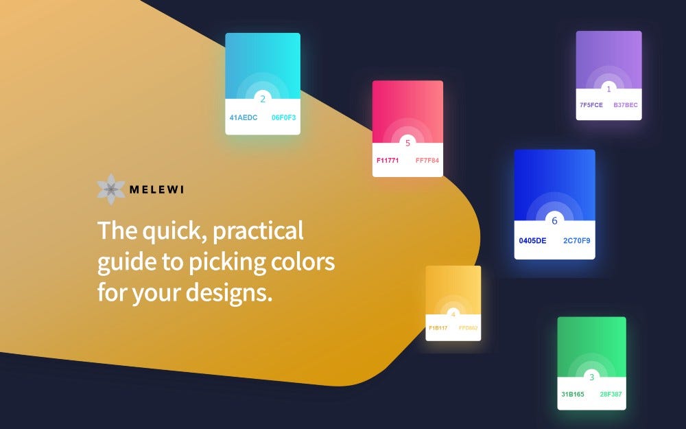
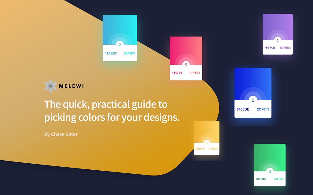
Having a beautiful color palette doesn’t matter if people can’t figure out how to navigate your design.
Anyone can pick great colors, but using colors to guide users through a new experience is an art in itself. As a designer, color is one of the most powerful tools in your belt.
Anytime you’re picking colors, your main goal should always be to increase the usability, and understandability, of your design. Here’s a quick guide on how to create color palettes that not only look good, but also make your designs easier for first time users to understand.
1. Define your purpose
We all know what happens when you start to add features without a purpose…
The same goes for colors.
Just like wireframing, you can’t start creating color palettes for a design until you’ve established a purpose.
Fortunately, it can easily be accomplished by asking yourself three simple questions with a pad and paper in hand.
What’s your key message?Why are you creating this design?How do you want your users to feel?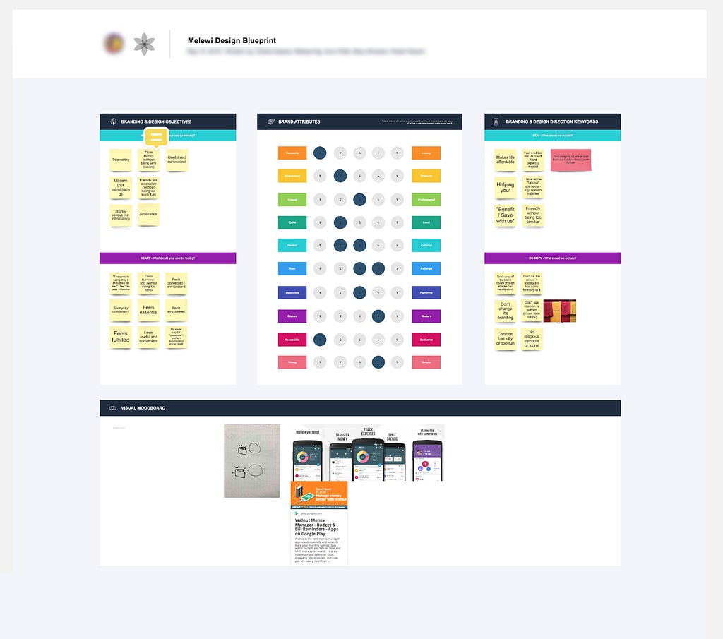
Use the answers to these questions as a loose framework for your color selection process. Waiting around for random inspiration to fill your brain with perfect palettes doesn’t pay well.
Having a system to create great palettes consistently is much more effective.
And guess what, you’ve just completed the first part of the system.
2. Identify your users
Color is almost a universal language.
The key word being almost.
Working with clients all over the globe has really opened our eyes to how users from different regions respond to different color palettes.
While many colors have universal meanings regardless of where you are in the world, others mean different things depending on cultural upbringing and location.
This can be particularly important depending on what regions you’re designing for.
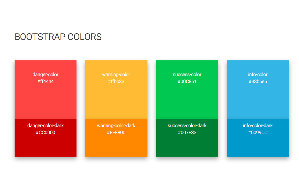
For example, the color green is pretty much universally accepted as a form of verification, a state of success, or a signal to proceed.
Red, on the other hand, varies greatly in meaning depending on where you’re located.
The important part here is research. In the United States, red is commonly associated with a state of emergency, failure, and passion. In China, people associate red with prosperity, happiness, and luck.
They’re small differences most of the time, but just a few colors can mean the world when you’re designing for multiple regions.
3. Get inspired
You can’t wait around for inspiration to hit you. You need to find inspiration.
And if you’re looking in the right places, it’s actually pretty easy.
At Melewi, we’re all big fans of creating moodboards using sites like Dribbble, Behance, Pinterest, and WebGradients prior to starting any design work.
Looking at other designers’ work helps you see which colors work well together and which ones clash. It also helps you pick up on any popular color trends for the industry you’re designing in.
When we’re picking colors, we’re not constantly trying to reinvent the wheel. We’re just trying to make the wheel as usable as possible.
And don’t be afraid to step out of the UI design world for inspiration. Looking at local architecture, visiting your city’s art museum, and taking a walk in nature are arguably the best ways to get inspired and create truly unique color palettes.
4. Pick your palette
Creating a dynamic palette is easiest when you’ve already established a basic foundation for your design.
In other words, always start your designs with a style guide.
All interfaces and products will end up being different, but you’ll almost always end up needing the same basic assets.
At a minimum, this means picking your typefaces, button designs, nav bars, and you guessed it, your color palette.
For most designs, you’ll need to pick a:
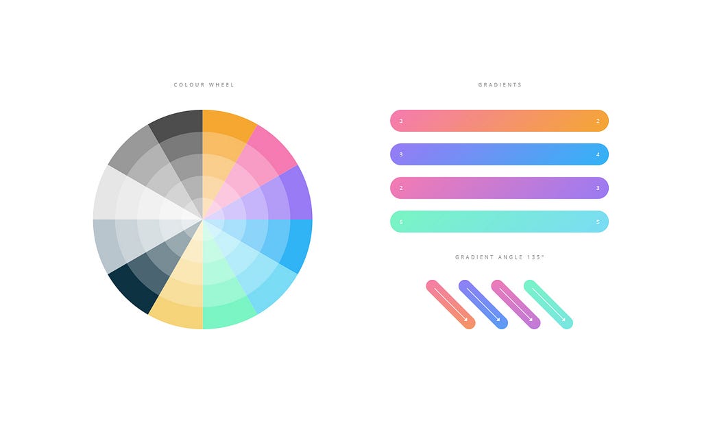
Primary accent colorSecondary accent colorBackground colorError colorSuccess color
The primary accent of your design should typically be the brand’s most identifiable color, so keep this in mind when picking the rest of your palette.
For CTAs, error states, and success states, it’s less about the actual color and more about clarity. As long as there’s clear contrast between your CTAs and different button states, you should be fine.
Green doesn’t necessarily have to be your go-to success color.
Don’t be afraid to play around, but don’t pick colors that make your interface hard to navigate in any way.
Sometimes the best designs are the ones that disrupt their industry by challenging all current trends — including color palettes. If you haven’t already, take a look at Robinhood when you get a minute.
They’ve become the fastest growing stock trading platform by appealing to millennials with a unique color palette and minimalistic design. Both of their trading platforms boast colors and designs that you won’t find any of their competitors using.
With just four colors used throughout almost the entire interface, Robinhood relies on their palette to communicate key messages throughout the user experience.
And that’s really the main component of any successful color palette. It’s easy to pair colors that look good together, but picking colors that guide your users through a new interface is a whole different ballgame.
Like this article? Check our blog for more — http://melewi.net/blog
The quick, practical guide to picking colors for your designs was originally published in Hacker Noon on Medium, where people are continuing the conversation by highlighting and responding to this story.
Disclaimer
The views and opinions expressed in this article are solely those of the authors and do not reflect the views of Bitcoin Insider. Every investment and trading move involves risk - this is especially true for cryptocurrencies given their volatility. We strongly advise our readers to conduct their own research when making a decision.
