Latest news about Bitcoin and all cryptocurrencies. Your daily crypto news habit.
 Voice UI Input (visualization with CSS)Demo: Mobile Friendly, Alternative Style
Github: code samples
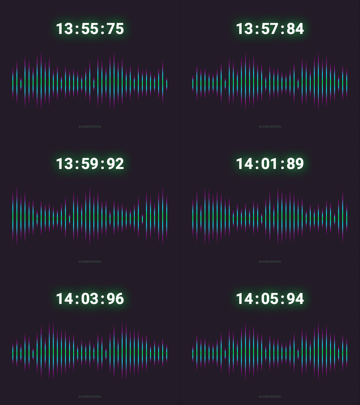
Recently, I did an exploration into what “voice input” could look and feel like. I’d thought I’d share a technique of pairing CSS animations and display: grid to achieve a suitable visual effect.
If you’re looking for ideas or a starting point for similar explorations, I hope this helps you :)
Feel free to take the code you need from here: https://github.com/jessekorzan/voice-visualizer
A working knowledge of SASS, SASS loops, CSS animations and display: grid would be helpful. If you know basic CSS, you can totally figure this out.
The Skinny
The markup is very straight forward.
https://github.com/jessekorzan/voice-visualizer/blob/master/index.html
Just wrap as many <span/>’s as you like inside a container. I called mine “.voice-coder”. Inside, I added 45 <span/>’s.
CSS in two parts
First, we look at the container and how CSS grids makes laying this out very easy.
Refer to this file, starting at line #70:https://github.com/jessekorzan/voice-visualizer/blob/master/styles.scss
Learn more about display:grid here: https://css-tricks.com/snippets/css/complete-guide-grid/The vertical centring is an opportunity to have a little fun
Line #78, align-items, has a few variants… in my examples, one is aligned centre and the other at the bottom (flex-end).
Secondly, we need some cool looking bars. This is done by styling and animating the 45 <span/>’s.
Jumping in at line #87, we establish a sweet gradient (using background liner-gradient).
At line #110, to make it more “digital”, I’ve added a transparent PNG with some scan lines to the container (.voice-coder). This isn’t necessary, but it’s another opportunity to score some style points. You can try changing the opacity, rotating, using a different PNG, etc.
Animations
The final touch is adding the animations in CSS. Using SASS makes this is a breeze and keeps things readable.
The core idea here is changing up an animation slightly for every second and third <span/>. You can see I am alerting the <span/> heights to create bounciness at lines #88 and again at #100.
To complete the effect, we need to stagger the animations. A simple SASS loop to stagger the <span/> animation-delay does this nicely here (refer to line #93)
You can add more complexity here and change any of the values. It’s fun to mess around until you achieve something appropriate for your needs.
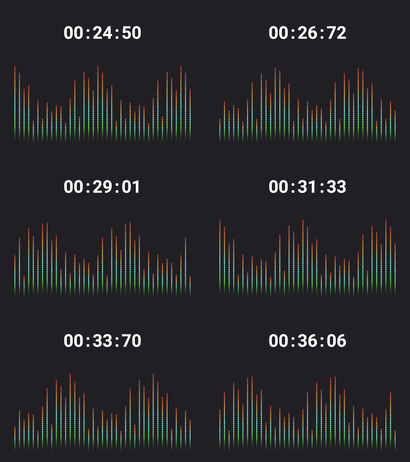
 Variation by messing around with the CSS animation and grid values
Conclusion
Yes, I could make a GIF if we needed a “voice” visualization. But having some simple markup, I found I was able to experiment broadly and quickly.
It’s fun seeing what’s possible vs. mocking stuff up. And I find I get “better” design work having a prototype I can actually see in the browser (or hold in my hand). With some JS (and math) jazz hands, the effect could be much more realistic. If not 100% simulated from real voice input.
You can follow the story here: https://dribbble.com/jessekorzan
Voice UI Visualizer in Pure CSS was originally published in Hacker Noon on Medium, where people are continuing the conversation by highlighting and responding to this story.
Disclaimer
The views and opinions expressed in this article are solely those of the authors and do not reflect the views of Bitcoin Insider. Every investment and trading move involves risk - this is especially true for cryptocurrencies given their volatility. We strongly advise our readers to conduct their own research when making a decision.
