Latest news about Bitcoin and all cryptocurrencies. Your daily crypto news habit.
lessons from the journey of increasing in-app conversions by 1.6 times in 2.5 months using A/B testing for “Travel Triangle” App.
[Originally published on LinkedIn]
Role of A/B Testing in building a great product
It’s fun when changing the pixels on the app dramatically alters user behaviour and helps the individual on the other side achieve his/her goal better. Every product feature that you send out to the users yields valuable data. A product manager experiments different variations of the product on users and compares their relative impact on key business metric — this is A/B testing in a nutshell.
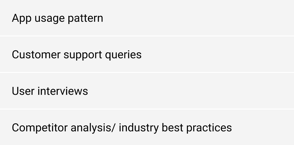
The art of building a great product boils down to prioritising and shipping the most impactful sets of A/B experiments based on insights generated from:
Knowing what and where to look for and the potential pitfalls in running A/B tests can be the difference between a good and a great product. I will share some lessons on identifying and executing the 3 most impactful A/B tests on Travel Triangles’s Android App and then dive into the fundamental principles of A/B testing. These 3 experiments majorly led to the 1.6x increase in the in-app lead submissions during my 2.5 months stint as a Product Consultant at the company.
Context:
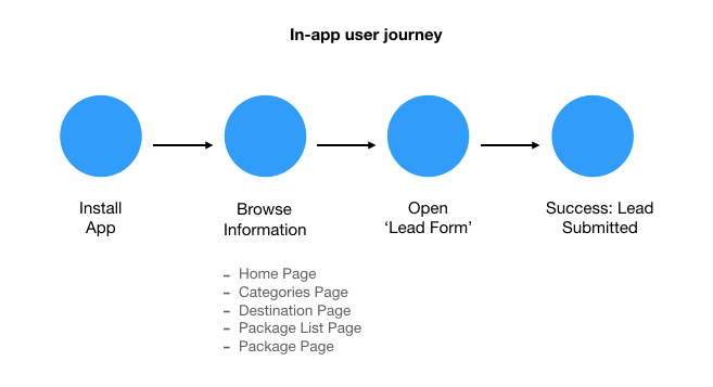
With $32+ M funding, Travel Triangle is a leading travel startup that helps people book their dream holiday packages. On the app, the user browses 100+ destinations, submits a request for customised travel packages and is matched with best travel agent on the platform. I was tasked to ensure that more users submit the package request (lead) on the app. Hence, every experiment was aimed at increasing the core metric of — Install to Lead conversions.
THE 3 EXPERIMENTS:
1. De-bottlenecking Choke Points:
When it comes to the in-app user journey, increasing conversions further down the path gives the highest bang for the buck.
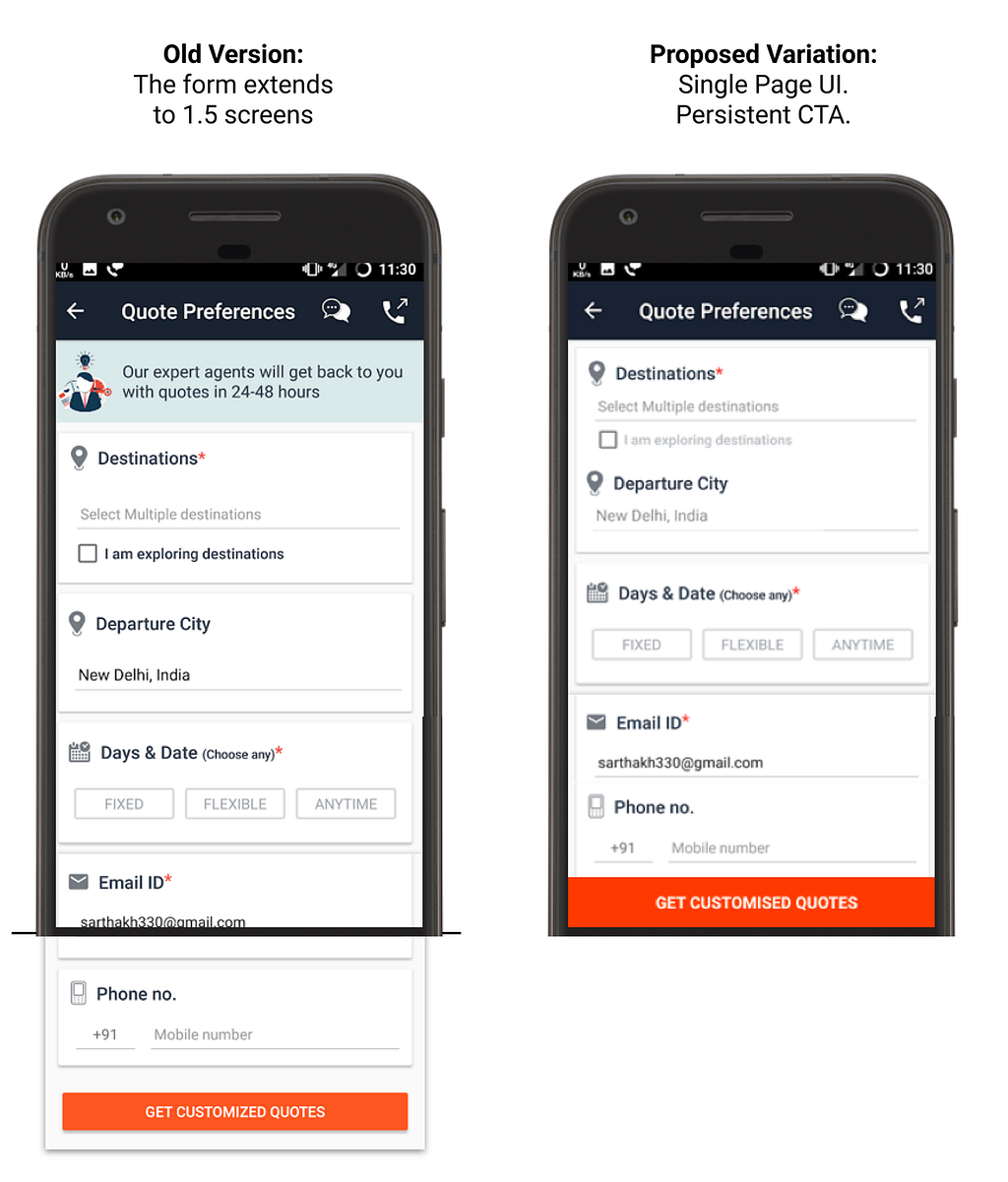
The obvious target for checking optimisation potential was the final stage: converting users who open the “Lead Form” to ones who successfully submit the Lead. The “Lead Form” UI, in its current implementation, was 1.5 screen length long, so the users had to scroll to get to the CTA (Call-To-Action). There was a clear scope of turning the “Lead Form” UI into a single page and giving it a persistent CTA (i.e., fixing actionable button at the bottom so that it is hard to miss).
Result: 4 hours of development effort and 7% increase in Install to Lead conversions!
The experiment was run on 3100 users, achieving a p-value of 0.05 (i.e. a less than 5% chance of the observed trend being a fluke). It’s important to gather enough data points to achieve statistical significance and ensure that the trend is definitive and not just random variation.
The key to spotting this experiment was to look for the implementation of best design principles. Clear upfront CTA reduces the friction in moving users to the next stage.
2. In-app coachmark:
For features/action items in app that might be less clear, improving CTA or adding coach-mark can significantly improve click-through-rate (CTR).
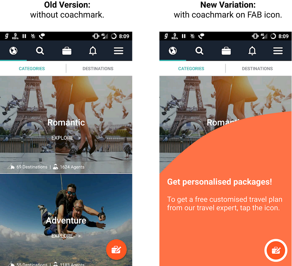
The purpose of the entire in-app browsing experience was to entice the user to submit the lead. But, data showed that a disproportionate set of app users were not even clicking on the FAB icon (Floating Action Button) that is supposed to open the “Lead Form”. Since, the purpose of the FAB icon was not super-obvious to the users in its current implementation, educating them about ‘what it does’ by using a coach-mark could significantly increase CTR.
Result: Adding coach-mark took 1 day of development effort and yielded 25% increase in CTR. We further experimented with different FAB icon designs, which increased the CTR by another 4%.
Overall, the experiment increased the core business metric — install to lead submission — by 15%.
Note: FAB icon was intentionally checked for optimization potential as it serves the critical step that leads users from Browsing stage to Lead Form open stage.
3. Optimising Information Density:
Up to a certain level, adding more (meaningful) Call-to-Action (CTA) options on an app screen proportionally increases its Click-through-Rate (CTR).
Home page is seen by 100% of the app opening users. Ensuring that the user smoothly navigates to the next relevant sections in the app (i.e. increasing CTR of the Home Page) can dramatically improve engagement and have a follow-on impact on lead submissions.
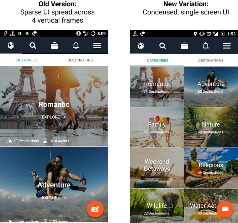
In its current implementation, Home Page had a very sparse UI with 8 destination categories shown in 4 vertical screens. All 8 categories could easily be condensed to a single vertical frame, which will eliminate the need for the user to scroll and yet not add any extra cognitive load.
Result: 60% increase in CTR. 40% increase in app open rate. 15% increase in the install to lead submission metric.
The Principles of A/B Testing:
1. Rake in and rank continuously:
While everything can be tested, one needs to thoroughly evaluate and prioritize experiments that have a high potential impact on the key business metric in order to accelerate product optimization.
Experiment’s Impact = Users Impacted x Needle Moved
The potential impact, along with the development effort, together drives the decision of picking experiments. The more objective the process the better.
2. Refine and repeat:
Insights from most experiments drive newer hypothesis and further testing. The success of the new FAB icon can incite further testing of different icons, colors, button type, communication mechanisms, etc. Which ones do we prioritize depends solely on strength of hypothesis and implementation effort.
3. Run Controlled Experiment:
The outside world often has a much larger effect on metrics than product changes do. Users can behave differently depending on the day of the week, season of the year, or even the source of the app install. Controlled experiments isolate the impact of product change while controlling the influence of external factors. It’s important to run the experiment on users under identical conditions until sufficient number of data points are attained to gain statistical significance (p-value < 0.05).
4. Put Mission in Perspective:
While A/B testing is the path to product optimization, the only thing that trumps metrics is Mission. Keeping a view of the long-term mission and direction of the company prevents the product roadmap and optimizations to move in a direction that could inevitably require future course correction.
Beyond that, though, cracking the code of A/B testing is synonymous with building a world-class product.
A big shoutout to Suhaas for giving me the opportunity to tinker with the product at Travel Triangle and Parth Tripathi for sharing his feedback on this article.
Thanks for reading! :) If you liked it, please support by clapping 👏🏻 and sharing the post.Feel free to leave a comment or connect with me on LinkedIn.
Cracking A/B Testing in Your Product was originally published in Hacker Noon on Medium, where people are continuing the conversation by highlighting and responding to this story.
Disclaimer
The views and opinions expressed in this article are solely those of the authors and do not reflect the views of Bitcoin Insider. Every investment and trading move involves risk - this is especially true for cryptocurrencies given their volatility. We strongly advise our readers to conduct their own research when making a decision.

