Latest news about Bitcoin and all cryptocurrencies. Your daily crypto news habit.

Whether you want to launch a new travel site or improve the existing, user experience (UX) is the first thing to consider. Attractive and easy-to-use sites achieve better user behavior metrics, which results in a higher conversion rate. That’s why successful travel agencies pay much attention to UX practices. We have analyzed them and share the most important with you.
Localization and Personalization
Localization and personalization are the first UX issues your client encounters on the site. When applied properly, they can garner users’ engagement and loyalty. By Epsilon’s research, nearly 80% of customers prefer companies which offer personalized experiences.
Language and Currency. It is but a commonplace that people like to be addressed in their native language. The best travel sites propose clients to choose between at least several language and currency options. Based on the user’s geolocation, language and currency selection can be automatic. This practice is well-illustrated by Booking.com. Other sites, like TripAdvisor, propose local site versions (e.g. Tripadvisor.de or Tripadvisor.com.tr).
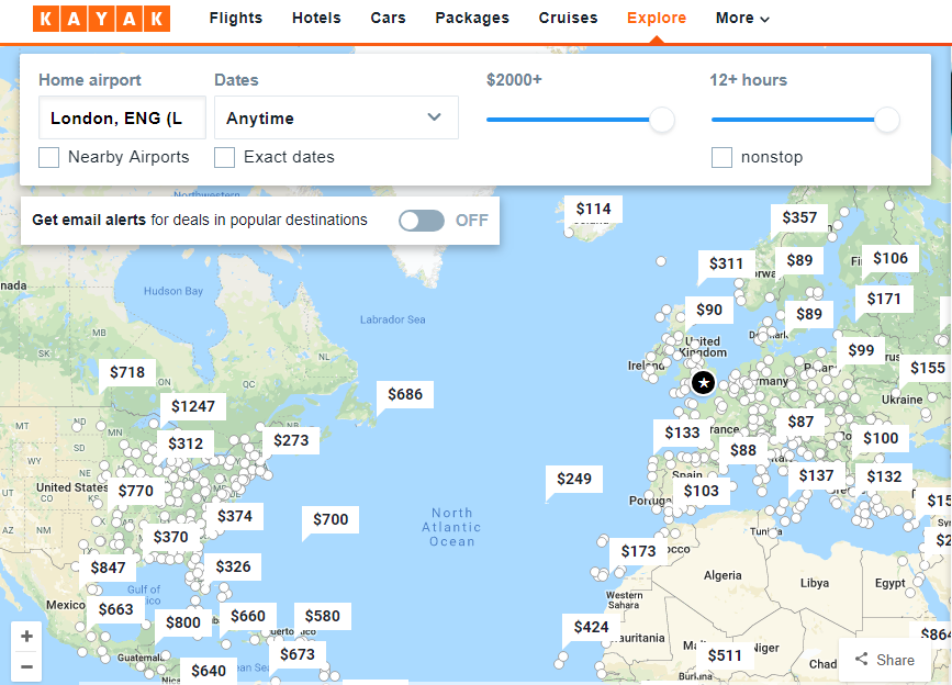
Nearest Tours. Another way to use geolocation is to propose customers the best travel options based on where they are at the moment. It is especially useful for impulsive travelers willing to spend weekends somewhere not far from home or for those already on the journey. An interesting example is Kayak’s interactive map with flight options and prices calculated from the airport nearest to your location.
New VS Returning Users. Apply different approaches to new and returning visitors. Show recommendations and popular destinations to inspire newcomers. And use cookies and tracking scripts to offer returning visitors content based on their search history and preferences. This is the practice Airbnb uses to provide personalized recommendations to the registered users. And Expedia goes even further proposing completely different user-site interaction depending upon the channel through which the visitor enters the site.
Intuitive Search and Simple Navigation
User-friendly search and navigation is another priority UX option for travel websites. The search and discovery process across your site should be intuitive, frictionless, and agile. Here, the most important things to consider are the handy calendar, elaborate filters and hints.
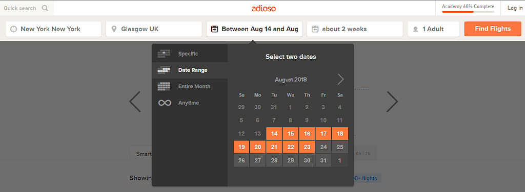
Calendar. Today, smart calendars are a must-have for any travel site. An important UX point is to include the days from the previous and following month. Flexible date tool is also useful, especially when customers search for the bargain vacation options and are not tethered to specific dates. People love to compare prices if they left for vacation a day earlier or came back a day later. Look how nice this option is realized on Adioso website:
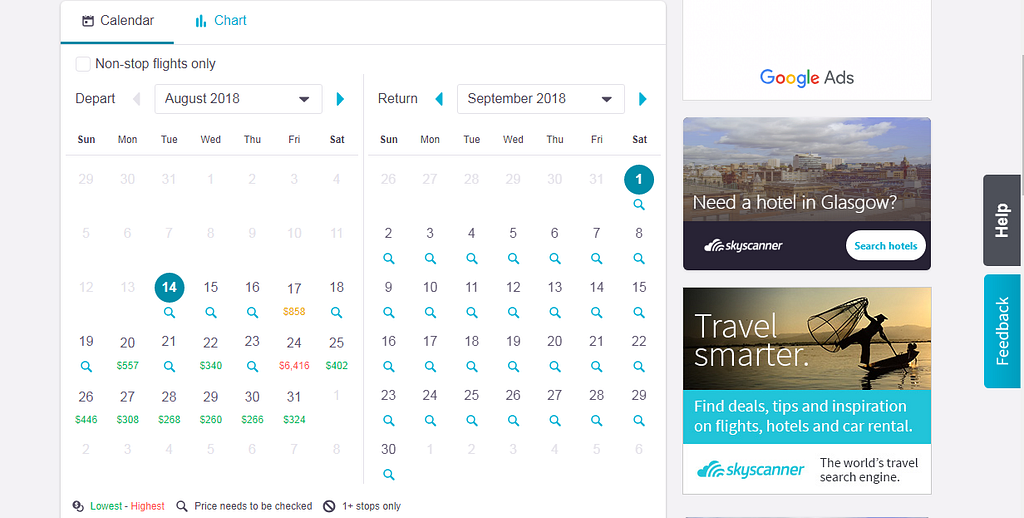
Though, flex search isn’t the simplest feature to implement in terms of UX. Skyscanner solved this problem in a simpler way. For flexible dates, they use ‘choose the month’ option. It is convenient to see all range of prices and quickly choose the option that suits you best:
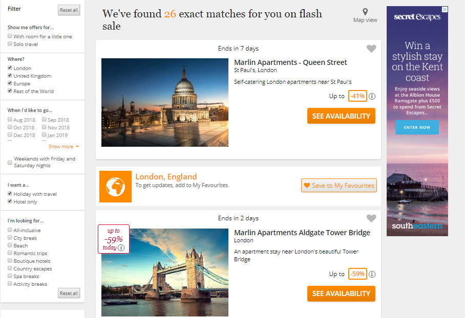
Filters. A search process is easier when there are filters. Here, we want to mention two approaches, each having their advantages. The first one can be illustrated by Airbnb. In the beginning, the site encourages users to enter minimal information. And as the search process goes on, more filtering options appear. So, the user continuously moves from the wider set of options to the narrower one. Another approach is used on such sites as Booking.com and Secret Escapes. Here users are shown all possible filters at once. The filters are placed vertically on the left side of the page where they easily attract attention. Destination results update in real time based on the boxes you tick:
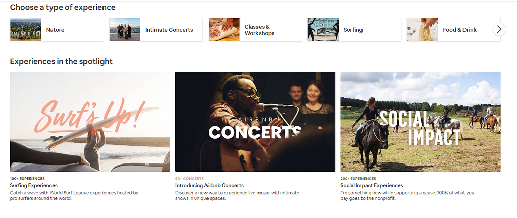
Search Options. A set of options proposed to the customers on the main page may also help them in the search process and even plant some ideas. The most widespread options for travel websites include popular destinations, bargains, and most visited pages. Taking into account recent research, it’s useful to make emphasis on experiences rather than material staff. This is one of the main reasons Airbnb and some other leading sites have launched experiences among choice options. Through experiences, travelers can sign up for exclusive and customizable tours which closer introduce them to the life of locals, including activities, food, nature exploration, etc.:
Easy Check-Out
One of the top causes of travel site abandonment is a lack of simplicity and clearness in the checkout process. Make sure that the information is ordered logically, all the instructions are clear and the progress is obvious. For users, this stage of dealing with a travel site is the most stressful, since they need much concentration to fill in all the fields correctly. So, try to avoid anything that distracts or causes tension.
Sign-in. Customers hate to sign in. We recommend making it optional so that it does not get in the way of booking. And ask the clients about signing in as early as possible, don’t break the booking flow somewhere in the middle. Provide clear reasons why sign-in is beneficial.
Booking Form. The booking forms are often confusing because of different standards from country to country as for what this or that term means (‘title’, for example) or in what order dates should be written. To avoid misunderstanding, try to be as precise as possible. Mention variants from which to choose wherever it is possible. Use short but clear instructions and avoid everything that can dispel attention.
Timeline. Make it easy to track users’ booking progress with the visual timeline, a kind of a progress bar at the top of the page which shows what has already been done and how many more steps are to be taken to complete the deal:
Mobile Friendliness
Mobile is increasingly crucial for travel agencies to keep the power. From 45 to 87% smartphone users worldwide prefer to use mobile more and more within the whole travel experience: from browsing and booking to searching for necessary information whilst on holiday. Here, we propose to consider two options: the mobile version of a site and the mobile application.
Mobile Version of a Site. Be sure that your website is responsive on mobile while providing the same functionality as a desktop site version. It will certainly please those customers who prefer to use mobile when searching for trip options. But it will also please Google, as well, and will help your site get a mobile-friendly label.
Mobile App. Apps have lots of business advantages: from better personalization to offline mode option and simplified transactions. People find travel apps useful, and businesses try to make use of them, too. Almost all leading travel agencies have their branded apps. Users like them for convenience and additional options, like digital check-in and keyless entry in Hilton Honors app or geofencing for finding the nearest hotel in the neighborhood in the Hostelworld app:
Final Word
Traveling industry is the most promising and prosperous, yet most competitive. Relevant customer experience helps to distinguish your brand from others in the market. Industry leaders set high standards for the travel agency website UX design. Learn from them — and let yours take its place in the best travel sites list!
Stfalcon.com is glad to serve you in the development of a highly efficient and user-friendly travel website or a travel mobile app. We are proud of being mentioned second among top 15 lifestyle and travel app development companies by Clutch.co.
Originally published at stfalcon.com.
UX Practices from Best Travel Sites: Functionality and Usability was originally published in Hacker Noon on Medium, where people are continuing the conversation by highlighting and responding to this story.
Disclaimer
The views and opinions expressed in this article are solely those of the authors and do not reflect the views of Bitcoin Insider. Every investment and trading move involves risk - this is especially true for cryptocurrencies given their volatility. We strongly advise our readers to conduct their own research when making a decision.
