Latest news about Bitcoin and all cryptocurrencies. Your daily crypto news habit.

🌐 Code Library, Style, and Links
Useful LINKS:
📡 Pima Indians and Diabetes video
📡 Pima Indians and Diabetes research paper
📘 Introduction of Pima Indians and Diabetes
Diabetes, is a group of metabolic disorders in which there are high blood sugar levels over a prolonged period. Symptoms of high blood sugar include frequent urination, increased thirst, and increased hunger. If left untreated, diabetes can cause many complications. Acute complications can include diabetic ketoacidosis, hyperosmolar hyperglycemic state, or death. Serious long-term complications include cardiovascular disease, stroke, chronic kidney disease, foot ulcers, and damage to the eyes.
This dataset is originally from the National Institute of Diabetes and Digestive and Kidney Diseases. The objective of the dataset is to diagnostically predict whether or not a patient has diabetes, based on certain diagnostic measurements included in the dataset. Several constraints were placed on the selection of these instances from a larger database. In particular, all patients here are females at least 21 years old of Pima Indian heritage.
📘 Objective
We will try to build a machine learning model to accurately predict whether or not the patients in the dataset have diabetes or not?
🌐 Data
The datasets consists of several medical predictor variables and one target variable, Outcome. Predictor variables includes the number of pregnancies the patient has had, their BMI, insulin level, age, and so on.
- Pregnancies: Number of times pregnant
- Glucose: Plasma glucose concentration a 2 hours in an oral glucose tolerance test
- BloodPressure: Diastolic blood pressure (mm Hg)
- SkinThickness: Triceps skin fold thickness (mm)
- Insulin: 2-Hour serum insulin (mu U/ml)
- BMI: Body mass index (weight in kg/(height in m)²)
- DiabetesPedigreeFunction: Diabetes pedigree function
- Age: Age (years)
- Outcome: Class variable (0 or 1)
%%html<style> @import url('https://fonts.googleapis.com/css?family=Orbitron|Roboto');body {background-color: gainsboro;} a {color: #37c9e1; font-family: 'Roboto';} h1 {color: #37c9e1; font-family: 'Orbitron'; text-shadow: 4px 4px 4px #aaa;} h2, h3 {color: slategray; font-family: 'Orbitron'; text-shadow: 4px 4px 4px #aaa;}h4 {color: #818286; font-family: 'Roboto';}span {text-shadow: 4px 4px 4px #aaa;}div.output_prompt, div.output_area pre {color: slategray;}div.input_prompt, div.output_subarea {color: #37c9e1;} div.output_stderr pre {background-color: gainsboro;} div.output_stderr {background-color: slategrey;} </style>🌐 Load library
import numpy as np import pandas as pd import matplotlib.pyplot as plt%matplotlib inlineimport itertoolsplt.style.use('fivethirtyeight')import warningswarnings.filterwarnings("ignore", category=UserWarning)style_dict = {'background-color':'slategray', 'color':'#37c9e1', 'border-color': 'white', 'font-family':'Roboto'}🌐 Load the Data
diabetes = pd.read_csv('../input/diabetes.csv')print(diabetes.columns)diabetes.head().style.set_properties(**style_dict)
 Dataset Head output🌐 The diabetes dataset consists of 768 data points, with 9 features each
print("dimension of diabetes data: {}".format(diabetes.shape))output:dimension of diabetes data: (768, 9)
🌐 Outcome 0 means No diabetes, outcome 1 means diabetes
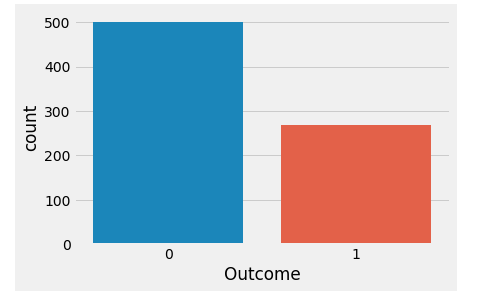
Of these 768 data points, 500 are labeled as 0 and 268 as 1:
print(diabetes.groupby('Outcome').size())Outcome0 5001 268dtype: int64
🌐 Basic EDA
import seaborn as snssns.countplot(diabetes['Outcome'],label="Count")
🌐 Brief Analysis of the data
diabetes.info()
#Output:<class 'pandas.core.frame.DataFrame'>RangeIndex: 768 entries, 0 to 767Data columns (total 9 columns):Pregnancies 768 non-null int64Glucose 768 non-null int64BloodPressure 768 non-null int64SkinThickness 768 non-null int64Insulin 768 non-null int64BMI 768 non-null float64DiabetesPedigreeFunction 768 non-null float64Age 768 non-null int64Outcome 768 non-null int64dtypes: float64(2), int64(7)memory usage: 54.1 KB
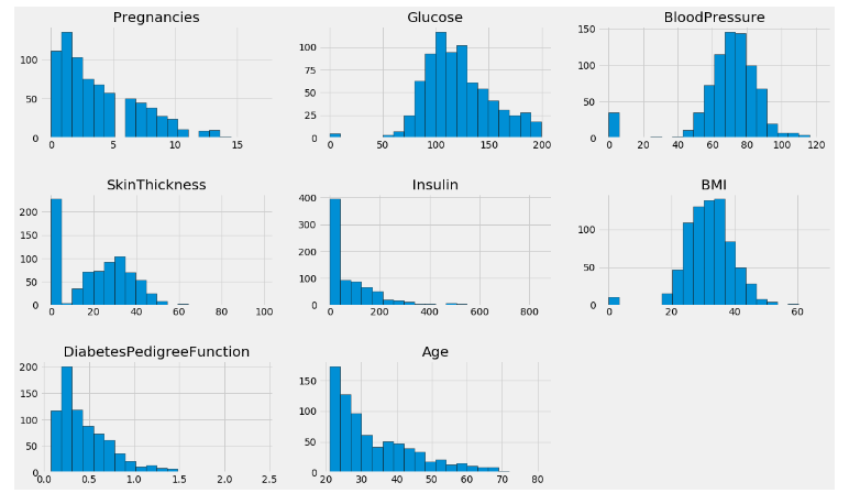
Now Show plot:
columns=diabetes.columns[:8]plt.subplots(figsize=(18,15))length=len(columns)for i,j in itertools.zip_longest(columns,range(length)): plt.subplot((length/2),3,j+1) plt.subplots_adjust(wspace=0.2,hspace=0.5) diabetes[i].hist(bins=20,edgecolor='black') plt.title(i)plt.show()
🌐 PairPlots:
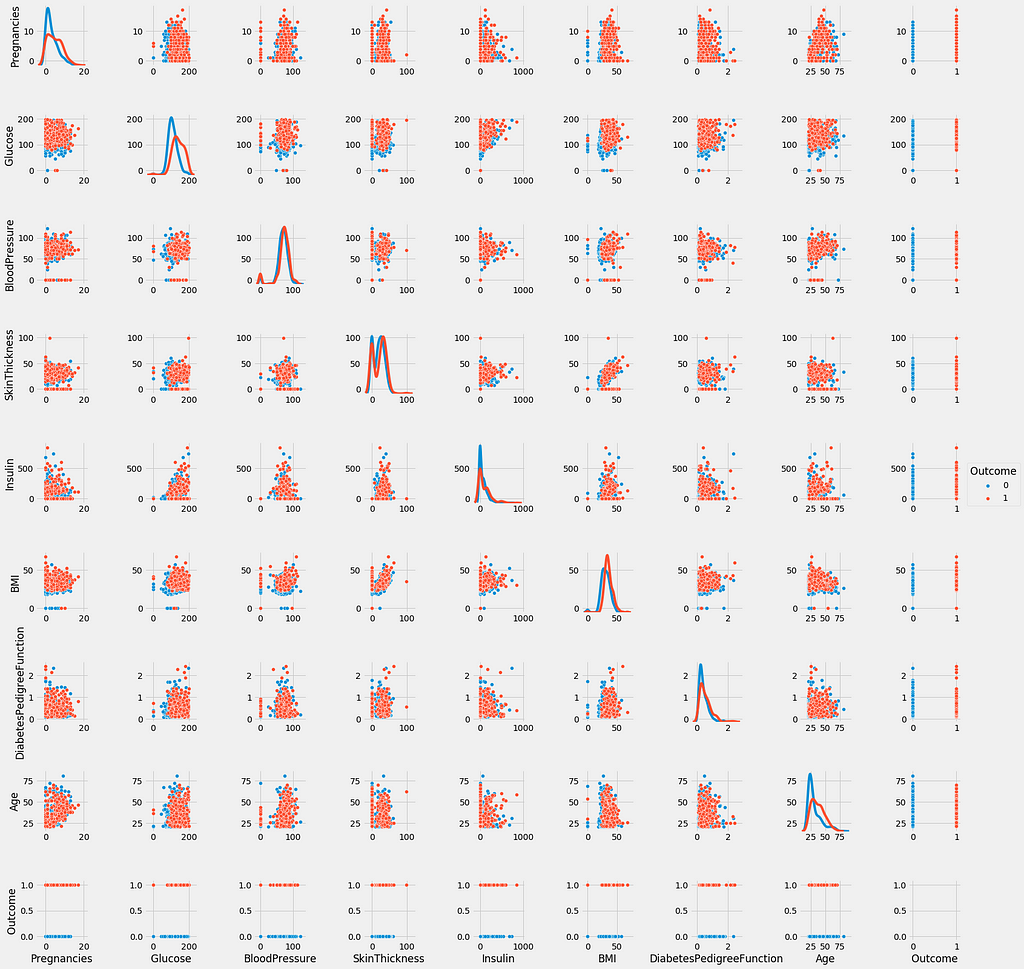
sns.pairplot(data=diabetes,hue='Outcome',diag_kind='kde')plt.show()
1)The diagonal shows the distribution of the the dataset with the kernel density plots.
2)The scatter-plots shows the relation between each and every attribute or features taken pairwise. Looking at the scatter-plots, we can say that no two attributes are able to clearly seperate the two outcome
🌐 Predictive ML Modeling with Visualization
🌐1. k-Nearest Neighbors
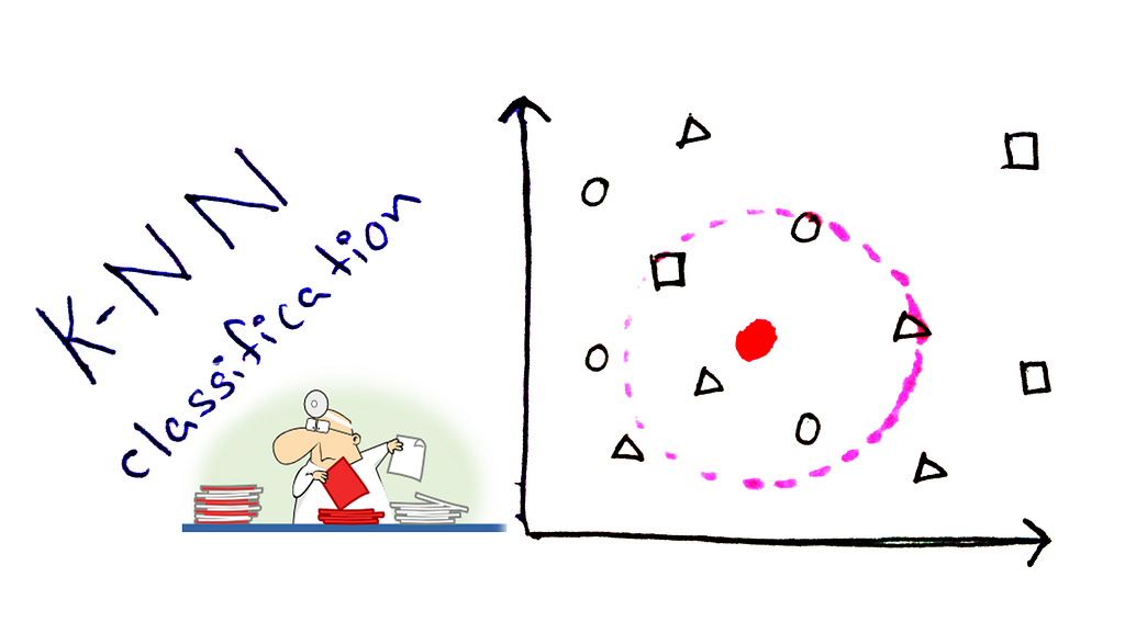
The k-NN algorithm is arguably the simplest machine learning algorithm. Building the model consists only of storing the training dataset. To make a prediction for a new data point, the algorithm finds the closest data points in the training dataset — its “nearest neighbors.”
🌐 Let’s investigate whether we can confirm the connection between model complexity and accuracy
from sklearn.model_selection import train_test_splitX_train, X_test, y_train, y_test = train_test_split(diabetes.loc[:, diabetes.columns != 'Outcome'], diabetes['Outcome'], stratify=diabetes['Outcome'], random_state=66)
🌐 Visualization of model and accuracy
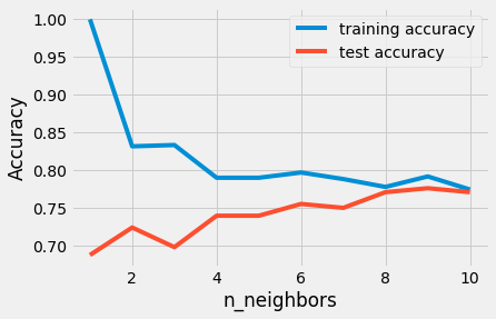
from sklearn.neighbors import KNeighborsClassifiertraining_accuracy = []test_accuracy = []# try n_neighbors from 1 to 10neighbors_settings = range(1, 11)for n_neighbors in neighbors_settings:# build the model knn = KNeighborsClassifier(n_neighbors=n_neighbors) knn.fit(X_train, y_train)# record training set accuracy training_accuracy.append(knn.score(X_train, y_train))# record test set accuracy test_accuracy.append(knn.score(X_test, y_test))plt.plot(neighbors_settings, training_accuracy, label="training accuracy")plt.plot(neighbors_settings, test_accuracy, label="test accuracy")plt.ylabel("Accuracy")plt.xlabel("n_neighbors")plt.legend()The plot shows the training and test set accuracy on the y-axis against the setting of n_neighbors on the x-axis.
The above plot suggests that we should choose n_neighbors=9. Here we are:
knn = KNeighborsClassifier(n_neighbors=9)knn.fit(X_train, y_train)print('Accuracy of K-NN classifier on training set: {:.2f}'.format(knn.score(X_train, y_train)))print('Accuracy of K-NN classifier on test set: {:.2f}'.format(knn.score(X_test, y_test)))🌐 Output:
Accuracy of K-NN classifier on training set: 0.79Accuracy of K-NN classifier on test set: 0.78
🌐2. Logistic Regression
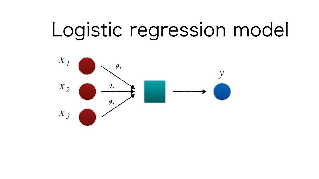
🌐 Logistic regression is one of the most common classification algorithms.
from sklearn.linear_model import LogisticRegressionlogreg = LogisticRegression().fit(X_train, y_train)print("Training set accuracy: {:.3f}".format(logreg.score(X_train, y_train)))print("Test set accuracy: {:.3f}".format(logreg.score(X_test, y_test)))🌐 Output:
Training set accuracy: 0.781Test set accuracy: 0.771
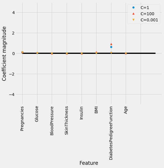
🌐 The default value of C=1 provides with 78% accuracy on training and 77% accuracy on test set.
logreg1 = LogisticRegression(C=0.01).fit(X_train, y_train)print("Training set accuracy: {:.3f}".format(logreg1.score(X_train, y_train)))print("Test set accuracy: {:.3f}".format(logreg1.score(X_test, y_test)))🌐 Output:
Training set accuracy: 0.700Test set accuracy: 0.703
🌐 Using C=0.01 results in lower accuracy on both the training and the test sets.
logreg100 = LogisticRegression(C=100).fit(X_train, y_train)print("Training set accuracy: {:.3f}".format(logreg100.score(X_train, y_train)))print("Test set accuracy: {:.3f}".format(logreg100.score(X_test, y_test)))🌐 Output:
Training set accuracy: 0.785Test set accuracy: 0.766
🌐 Visualization of Logistic Regression
diabetes_features = [x for i,x in enumerate(diabetes.columns) if i!=8]plt.figure(figsize=(8,6))plt.plot(logreg.coef_.T, 'o', label="C=1")plt.plot(logreg100.coef_.T, '^', label="C=100")plt.plot(logreg1.coef_.T, 'v', label="C=0.001")plt.xticks(range(diabetes.shape[1]), diabetes_features, rotation=90)plt.hlines(0, 0, diabetes.shape[1])plt.ylim(-5, 5)plt.xlabel("Feature")plt.ylabel("Coefficient magnitude")plt.legend()🌐3. Decision Tree
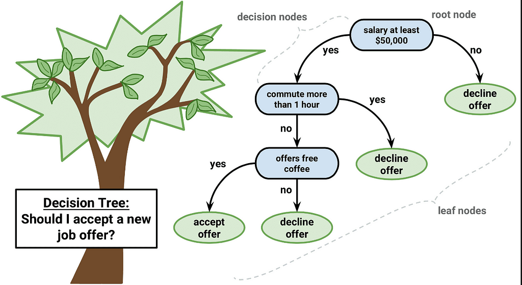
A decision tree is a decision support tool that uses a tree-like graph or model of decisions and their possible consequences, including chance event outcomes, resource costs, and utility. It is one way to display an algorithm that only contains conditional control statements.
from sklearn.tree import DecisionTreeClassifiertree = DecisionTreeClassifier(random_state=0)tree.fit(X_train, y_train)print("Accuracy on training set: {:.3f}".format(tree.score(X_train, y_train)))print("Accuracy on test set: {:.3f}".format(tree.score(X_test, y_test)))🌐 Output:
Accuracy on training set: 1.000Accuracy on test set: 0.714
🌐 Observations:
The accuracy on the training set is 100%, while the test set accuracy is much worse. This is an indicative that the tree is overfitting and not generalizing well to new data. Therefore, we need to apply pre-pruning to the tree.
We set max_depth=3, limiting the depth of the tree decreases overfitting. This leads to a lower accuracy on the training set, but an improvement on the test set.
tree = DecisionTreeClassifier(max_depth=3, random_state=0)tree.fit(X_train, y_train)print("Accuracy on training set: {:.3f}".format(tree.score(X_train, y_train)))print("Accuracy on test set: {:.3f}".format(tree.score(X_test, y_test)))🌐 Output:
Accuracy on training set: 0.773Accuracy on test set: 0.740
🌐 Feature importance in Decision trees
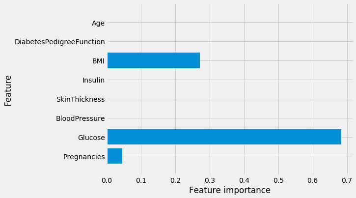
Feature importance rates how important each feature is for the decision a tree makes. It is a number between 0 and 1 for each feature, where 0 means “not used at all” and 1 means “perfectly predicts the target.” The feature importances always sum to 1:
print("Feature importances:\n{}".format(tree.feature_importances_))🌐 Output:
Feature importances:[0.04554275 0.6830362 0. 0. 0. 0.27142106 0. 0. ]
🌐 Visualization of Feature importance
def plot_feature_importances_diabetes(model): plt.figure(figsize=(8,6)) n_features = 8 plt.barh(range(n_features), model.feature_importances_, align='center') plt.yticks(np.arange(n_features), diabetes_features) plt.xlabel("Feature importance") plt.ylabel("Feature") plt.ylim(-1, n_features)plot_feature_importances_diabetes(tree)🌐 Observations: Feature “Glucose” is by far the most important feature.
🌐4. Random Forest
Random Forest is a flexible, easy to use machine learning algorithm that produces, even without hyper-parameter tuning, a great result most of the time. It is also one of the most used algorithms, because it’s simplicity and the fact that it can be used for both classification and regression tasks.
let’s apply a random forest consisting of 100 trees on the diabetes dataset:
from sklearn.ensemble import RandomForestClassifierrf = RandomForestClassifier(n_estimators=100, random_state=0)rf.fit(X_train, y_train)print("Accuracy on training set: {:.3f}".format(rf.score(X_train, y_train)))print("Accuracy on test set: {:.3f}".format(rf.score(X_test, y_test)))🌐 Output:
Accuracy on training set: 1.000Accuracy on test set: 0.786
Observations: The random forest gives us an accuracy of 78.6%, better than the logistic regression model or a single decision tree.
rf1 = RandomForestClassifier(max_depth=3, n_estimators=100, random_state=0)rf1.fit(X_train, y_train)print("Accuracy on training set: {:.3f}".format(rf1.score(X_train, y_train)))print("Accuracy on test set: {:.3f}".format(rf1.score(X_test, y_test)))🌐 Output:
Accuracy on training set: 0.800Accuracy on test set: 0.755
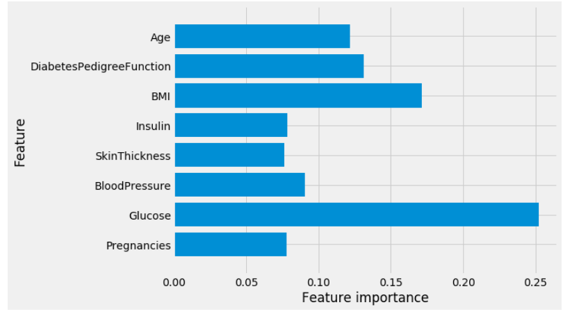
🌐 Vizualization of Feature importance in Random Forest
plot_feature_importances_diabetes(rf)
🌐Observations: Similarly to the single decision tree, the random forest also gives a lot of importance to the “Glucose” feature, but it also chooses “BMI” to be the 2nd most informative feature overall. The randomness in building the random forest forces the algorithm to consider many possible explanations, the result being that the random forest captures a much broader picture of the data than a single tree.
🌐5. Gradient Boosting
Gradient boosting is a machine learning technique for regression and classification problems, which produces a prediction model in the form of an ensemble of weak prediction models, typically decision trees. It builds the model in a stage-wise fashion like other boosting methods do, and it generalizes them by allowing optimization of an arbitrary differentiable loss function.
let’s apply Gradient boosting:
from sklearn.ensemble import GradientBoostingClassifiergb = GradientBoostingClassifier(random_state=0)gb.fit(X_train, y_train)print("Accuracy on training set: {:.3f}".format(gb.score(X_train, y_train)))print("Accuracy on test set: {:.3f}".format(gb.score(X_test, y_test)))🌐 Output:
Accuracy on training set: 0.917Accuracy on test set: 0.792
Again apply Gradient boosting with max_depth=1:
gb1 = GradientBoostingClassifier(random_state=0, max_depth=1)gb1.fit(X_train, y_train)print("Accuracy on training set: {:.3f}".format(gb1.score(X_train, y_train)))print("Accuracy on test set: {:.3f}".format(gb1.score(X_test, y_test)))🌐 Output:
Accuracy on training set: 0.804Accuracy on test set: 0.781
Again apply Gradient boosting with learning_rate=0.01:
gb2 = GradientBoostingClassifier(random_state=0, learning_rate=0.01)gb2.fit(X_train, y_train)print("Accuracy on training set: {:.3f}".format(gb2.score(X_train, y_train)))print("Accuracy on test set: {:.3f}".format(gb2.score(X_test, y_test)))🌐 Output:
Accuracy on training set: 0.802Accuracy on test set: 0.776
🌐Observations: Both methods of decreasing the model complexity reduced the training set accuracy, as expected. In this case, none of these methods increased the generalization performance of the test set.
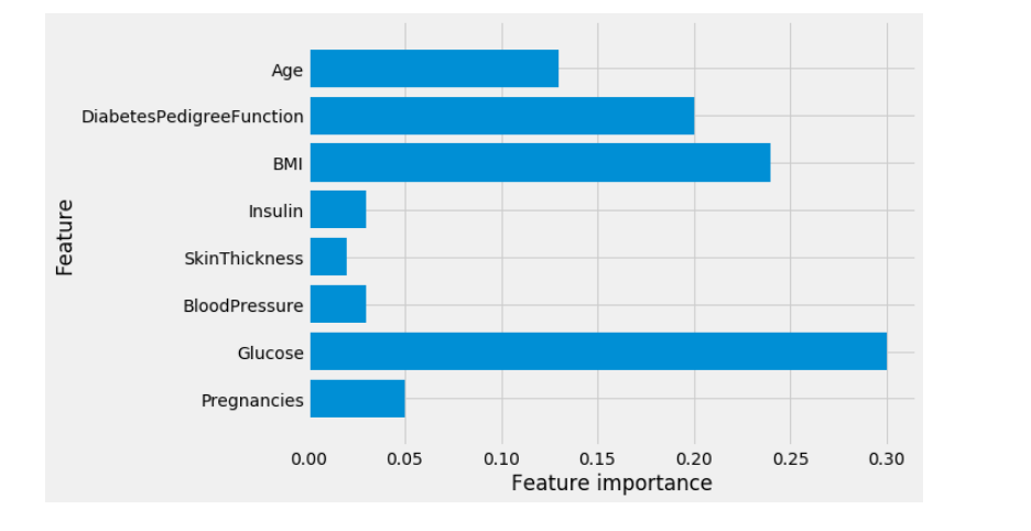
🌐 Vizualization of Feature importance in Gradient Boosting
Short note: We can visualize the feature importances to get more insight into our model even though we are not really happy with the model.
plot_feature_importances_diabetes(gb1)
🌐 Predictive Deep Learning Modeling with Visualization
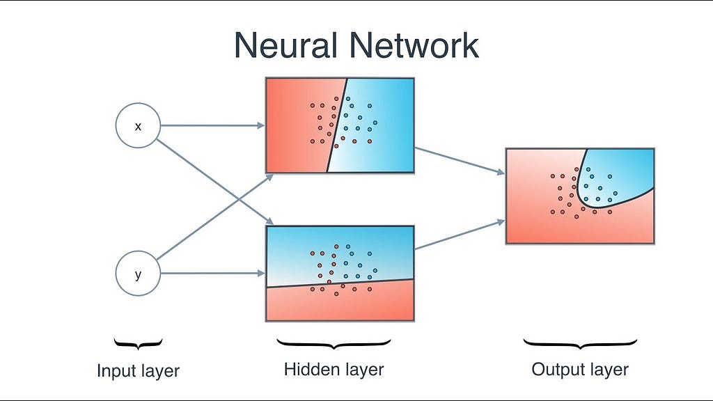
🌐 Neural Networks
Neural Network uses the processing of the brain as a basis to develop algorithms that can be used to model complex patterns and prediction problems.
Lets start apply:
from sklearn.neural_network import MLPClassifiermlp = MLPClassifier(random_state=42)mlp.fit(X_train, y_train)print("Accuracy on training set: {:.2f}".format(mlp.score(X_train, y_train)))print("Accuracy on test set: {:.2f}".format(mlp.score(X_test, y_test)))🌐 Output:
Accuracy on training set: 0.71Accuracy on test set: 0.67
🌐Observations:The accuracy of the MLP is not as good as the other models at all, this is likely due to scaling of the data. Neural networks also expect all input features to vary in a similar way, and ideally to have a mean of 0, and a variance of 1.
Now apply ‘StandardScaler’ from Neural Network :
from sklearn.preprocessing import StandardScalerscaler = StandardScaler()X_train_scaled = scaler.fit_transform(X_train)X_test_scaled = scaler.fit_transform(X_test)mlp = MLPClassifier(random_state=0)mlp.fit(X_train_scaled, y_train)print("Accuracy on training set: {:.3f}".format( mlp.score(X_train_scaled, y_train)))print("Accuracy on test set: {:.3f}".format(mlp.score(X_test_scaled, y_test)))🌐 Output:
Accuracy on training set: 0.823Accuracy on test set: 0.802
Now again apply “MLPClassifier” with “max_iter=1000” :
mlp = MLPClassifier(max_iter=1000, random_state=0)mlp.fit(X_train_scaled, y_train)print("Accuracy on training set: {:.3f}".format( mlp.score(X_train_scaled, y_train)))print("Accuracy on test set: {:.3f}".format(mlp.score(X_test_scaled, y_test)))🌐 Output:
Accuracy on training set: 0.877Accuracy on test set: 0.755
Again apply “MLPClassifier” with “alpha=1” :
mlp = MLPClassifier(max_iter=1000, alpha=1, random_state=0)mlp.fit(X_train_scaled, y_train)print("Accuracy on training set: {:.3f}".format( mlp.score(X_train_scaled, y_train)))print("Accuracy on test set: {:.3f}".format(mlp.score(X_test_scaled, y_test)))🌐 Output:
Accuracy on training set: 0.795Accuracy on test set: 0.792
🌐 Vizualization of Neural Networks
plt.figure(figsize=(20, 5))plt.imshow(mlp.coefs_[0], interpolation='none', cmap='viridis')plt.yticks(range(8), diabetes_features)plt.xlabel("Columns in weight matrix")plt.ylabel("Input feature")plt.colorbar()Observations:
From the heat map, it is not easy to point out quickly that which feature (features) have relatively low weights compared to the other features.
📘 Summary
Thats All. Thanks for reading. :)
For the full code visit Kaggle .
If you like this article then give 👏 clap. Happy Analysis!
ML for Diabetes from Bangladesh was originally published in Hacker Noon on Medium, where people are continuing the conversation by highlighting and responding to this story.
Disclaimer
The views and opinions expressed in this article are solely those of the authors and do not reflect the views of Bitcoin Insider. Every investment and trading move involves risk - this is especially true for cryptocurrencies given their volatility. We strongly advise our readers to conduct their own research when making a decision.

