Latest news about Bitcoin and all cryptocurrencies. Your daily crypto news habit.
If you are a developer and want to integrate data manipulation or science into your product or starting your journey in data science, here are the Python libraries you need to know.
- NumPy
- Pandas
- Matplotlib
- Scikit-Learn
The goal of this series is to provide introductions, highlights, and demonstrations of how to use the must-have libraries so you can pick what to explore more in depth.
Scikit-Learn
Scikit-Learn is built on top of NumPy, SciPy, and matplotlib. It contains an extensive collection of ready-to-use Machine Learning algorithms. All the algorithms are well documented and easy to use for all experience levels.
Focus of the Library
This library contains many powerful algorithms, each are their own objects with certain parameters and methods.
Installation
Open a command line and type in
pip install scikit-learn
Windows: in the past I have found installing NumPy & other scientific packages to be a headache, so I encourage all you Windows users to download Anaconda’s distribution of Python which already comes with all the mathematical and scientific libraries installed.Details
You can see on their homepage, Scikit-Learn is split into a couple of subjects: Classification, Regression, Clustering, Dimensionality Reduction, Model Selection, and Preprocessing.
The first three subjects (Classification, Regression, and Clustering) are all types of algorithms. While the last three (Dimensionality Reduction, Model Selection, and Preprocessing) are subjects that alter and analyze your data so it works better when fed to an algorithm. This article focuses on the first three subjects.
Supervised Learning
Both Classification and Regression algorithms fall under a section of Machine Learning called “Supervised Learning”. What this means is these two types of algorithms have something in common: the data fed into the algorithms has observational data and targets (or a results or ‘answers’).
A standard example of this is home data and their sale prices. The observational data is the features of each home. The target is the price the home got on the market.
We then can use Supervised Learning to predict the price of any home as long as we have features about it.
- Classification data means the target values are discrete (such as labeling a house as either expensive or inexpensive)
- Regression means the results are continuous (the actual price of the home in dollars which could be any positive number).
Unsupervised Learning
The Clustering section is also known as “Unsupervised Learning”. This means that we have observational data but no targets. Instead we want to use an algorithm to find groups inside the observational data and create labels. A common example is user segmentation in sales or traffic data.
Creation
First, you need to examine if your data fits a Classification, Regression, or Clustering scenario. Then go to the corresponding section of Scikit-Learn and select an algorithm. As mentioned before, each algorithm is its own object.
We will start with a very simple example in order to get a feel for the library: Linear Regression.
We are going to use one of the Scikit-Learn’s built-in datasets as a walk-through in creating, fitting, and predicting using this model.
Note: this is not intended to be an in-depth analysis of Linear Regression, just a quick example.
from sklearn import datasetsimport pandas as pdfrom sklearn.linear_model import LinearRegressionfrom sklearn.metrics import mean_squared_error, r2_score
# Load the data (as NumPy arrays)observations, target = datasets.load_diabetes(return_X_y=True)
# Initialize the algorithm objectregression_model = LinearRegression()
Normally, you will initialize the algorithm object with the parameters you want. There are defaults for many just like we see here. However I recommend researching what each of the parameters mean to make sure you have made the right choice.
We are going to put the data into a pandas DataFrame to make separating the data into training and testing sets straightforward.
# Make pandas DataFramesobservational_data = pd.DataFrame(data=observations)target_data = pd.DataFrame(data=target)
# Separate out training and testing sets of datatest_index = 400train_X = observational_data.iloc[:test_index]test_X = observational_data.iloc[test_index:]train_Y = target_data.iloc[:test_index]test_Y = target_data.iloc[test_index:]
Now we are ready to fit the model.
.fit Method
I’m going to take the training data and put it into the Linear Regression algorithm by using the .fit method. This method will calculate the underlying linear equation that best fits the data.
regression_model.fit(train_X, train_Y)
That’s it! Nice, so how did we do?
.predict Method
In order to evaluate how well our algorithm is able to make a prediction based only on observational data, we use the .predict method. We will use the test set of observational data to make predictions.
predictions = regression_model.predict(test_X)
Then see how those predictions compare to the actual targets by looking at the R2 and MSE metrics.
print "R2 is", r2_score(test_Y, predictions)>>> R2 is 0.69857490094
print "Mean Square Error is", mean_squared_error(test_Y, predictions)>>> Mean Square Error is 1668.74966759
We will skip over checking the plot of the residuals and just look at these metrics. The metrics tell us this model is ok. We were able to explain about 70% variance in the target with our model. If we were to run this model with different combinations of columns in our observational data, the mean squared error metric would help us compare between models.
Applications
Cool! So you have seen that this library has algorithm objects and each will have a fit method. If the algorithm you are using is a Regression or Classification algorithm it will also have a predict method.
Each algorithm may differ so be sure to read the documentation.
Let’s apply the walkthrough we just did to our real-life Bitcoin scenario. In my article on pandas, we acquired data on Bitcoin and created a signal for when Bitcoin’s price had dipped below it’s rolling 30 day average. In my last article, we used matplotlib to plot the data.
Say we are a cautious investors and therefore watching the 30 day rolling average is not a good enough analysis. Is there a better way to examine market behavior?
I once came across a financial product that utilized Clustering to help traders visualize groups of similar market behavior. I thought this was intriguing because building accurate models using Supervised Learning often require data out of the average person’s reach. Clustering allows anyone to find patterns in what they have available.
So let’s see if we can leverage Clustering to discover patterns in Bitcoin prices. I procured a small Bitcoin dataset from Quandl (you’ll need a account). This dataset includes about 3 months worth of Bitcoin prices. I picked this dataset because it has market open and close prices.
Let’s see if there are groups of market highs and lows based on the Bitcoin price when the market opens. If yes, perhaps we have a market strategy on our hands!
Here are the libraries we need:
import quandlimport pandas as pdimport matplotlib.pyplot as pltfrom sklearn.cluster import DBSCAN
Here’s my code to set up the data:
# Set up the Quandl connectionapi_key = 'GETYOURAPIKEY'quandl.ApiConfig.api_key = api_keyquandl_code = "BCHARTS/BITFLYERUSD"# Get the bitcoin databitcoin_data = quandl.get(quandl_code, returns="numpy", end_date="2018-08-23")
# Put bitcoin data into pandas DataFramecolumns = ['Date','Open','High','Low','Close','Volume (BTC)','Volume (Currency)','Weighted Price']bitcoin = pd.DataFrame(data=bitcoin_data, columns=columns)bitcoin = bitcoin.dropna() # drop blanks!
Here is a function for making the visualizations we need to examine the data:
def make_jpg(color, filename, y_column_name): # make figure fig = plt.figure(figsize=(8,5), dpi=100) # add axes at specific position position = [0.1, 0.1, 0.8, 0.8] axes = fig.add_axes(position)
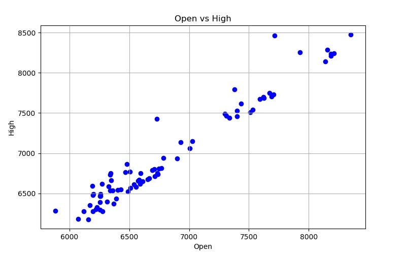
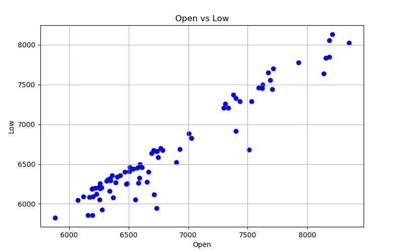
# scatter plot x_column_name = "Open" X = bitcoin[x_column_name] Y = bitcoin[y_column_name] axes.scatter(X, Y, color=color) axes.set_xlabel(x_column_name) axes.set_ylabel(y_column_name) axes.set_title("{0} vs {1}".format(x_column_name, y_column_name)) axes.grid(b=True) fig.savefig(filename)Here’s what our data looks like:
Now that’s a linear relationship if I’ve ever seen one. But my sense is that a quite a few other data points would be needed to build a super accurate Regression model with this data, so let’s stick to what a Clustering algorithm can tell us.
Scikit-Learn has many Clustering algorithms available. We will use DBSCAN because we don’t know how many clusters there should be and we want to focus on areas with a concentration of data points. There are other clustering algorithms that you could use based on how you want to structure your strategy.
Here’s the code for building a Clustering algorithm for both Open vs High and Open vs Low data.
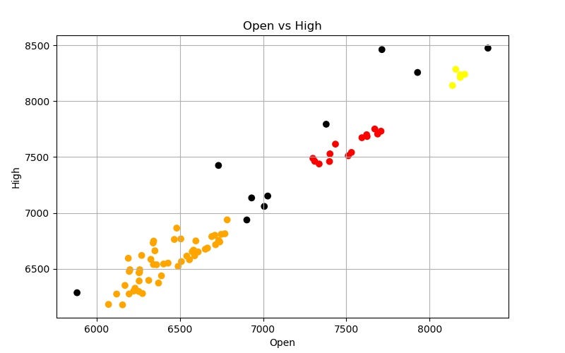
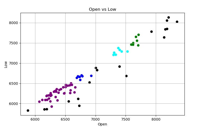
def learn(y_column_name): # make visualization before learning process filename1 = "Bitcoin Open v {0}.jpg".format(y_column_name) make_jpg("blue", filename1, y_column_name) # ML algorithm dbscan = DBSCAN(eps=150) dbscan.fit(bitcoin.loc[:, ["Open", y_column_name]]) # take out the lables labels = dbscan.labels_ # make visualizations if y_column_name == 'High': color_map = {-1: "k", 0: "r", 1: "orange", 2: "y"} else: color_map = {-1: "k", 0: "g", 1: "b", 2: "purple", 3: "cyan"} colors = [color_map[l] for l in labels] # store the labels colors bitcoin['vs {0} Labels'.format(y_column_name)] = colors filename2 = "Bitcoin Open v {0} Learn.jpg".format(y_column_name) make_jpg(colors, filename2, y_column_name) return dbscanhigh_dbscan = learn("High")low_dbscan = learn("Low")Epsilon: what is the maximum distance between two data points in order for them to still be in the same cluster. I picked $150 for this value.
So what did we find?
Our clusters are groups of similar market behavior. The black dots are outliers that do not belong to a cluster.
Let’s look at each cluster and find the average difference between the High/Low price and Open price.
bitcoin["Open vs High Diff"] = bitcoin['High'] - bitcoin['Open']print bitcoin.groupby('vs High Labels')["Open vs High Diff"].mean()>>> vs High Labelsblack 312.500000orange 139.954200red 82.933571yellow 48.316000
bitcoin["Open vs Low Diff"] = bitcoin['Open'] - bitcoin['Low']print bitcoin.groupby('vs Low Labels')["Open vs Low Diff"].mean()>>> vs Low Labelsblack 359.137222blue 104.825000cyan 107.212857green 124.174286purple 113.181282
The results above tell us is that if one day the market opens with a Bitcoin price around $6,500, similar data points saw an average High price +$139 and an Low price -$113 from Open in the day.
So now what? The next step is to put what we learned into a system that tests and executes trading strategies automatically. Next steps are on you! Good luck!
Thanks for reading! My name is Lauren Glass. I am an entrepreneur & engineer living in Tel Aviv.
Connect with me on Instagram @ljglass
Connect with me on LinkedIn
Fundamental Python Data Science Libraries: A Cheatsheet (Part 4/4) was originally published in Hacker Noon on Medium, where people are continuing the conversation by highlighting and responding to this story.
Disclaimer
The views and opinions expressed in this article are solely those of the authors and do not reflect the views of Bitcoin Insider. Every investment and trading move involves risk - this is especially true for cryptocurrencies given their volatility. We strongly advise our readers to conduct their own research when making a decision.
