Latest news about Bitcoin and all cryptocurrencies. Your daily crypto news habit.
If you are a developer and want to integrate data manipulation or science into your product or starting your journey in data science, here are the Python libraries you need to know.
- NumPy
- Pandas
- Matplotlib
- Scikit-Learn
The goal of this series is to provide introductions, highlights, and demonstrations of how to use the must-have libraries so you can pick what to explore more in depth.
Matplotlib
This library is the go-to Python visualization package (except for Plotly which is paid)! It allows you to create rich images displaying your data with Python code.
Focus of the Library
This library is extensive, but this article will focus on two objects: the Figure and the Axes.
Installation
Open a command line and type in
pip install matplotlib
Windows: in the past I have found installing NumPy & other scientific packages to be a headache, so I encourage all you Windows users to download Anaconda’s distribution of Python which already comes with all the mathematical and scientific libraries installed.Details
Matplotlib is split into two main sections: the Pyplot API (visualization functions for fast production) and the Object Oriented API (more flexible and robust).
We will focus on the latter.
Let’s dive in!
import matplotlib.pyplot as pltimport numpy as np
Creation
In order to make a visualization, you need to create 2 objects one right after the other. First create a Figure object and then from that, create an Axes object. After that, all visualization details are created by calling methods.
# Figure is a blank canvasfig = plt.figure(figsize=(8,5), dpi=100) # 800x500 pixel image
# Add axes at specific position (fractions of fig width and height)position = [0.1, 0.1, 0.8, 0.8] # left, bottom, width, heightaxes = fig.add_axes(position)
Some things to note about the Figure object:
- The figsize & dpi parameters are optional
- figsize is the width and height of the figure in inches
- dpi: is the dots-per-inch (pixel per inch)
Some things to note about the add_axes method:
- The position of the axes can only be specified in fractions of the figure size
- There are many other parameters that you can pass to this method
Plotting
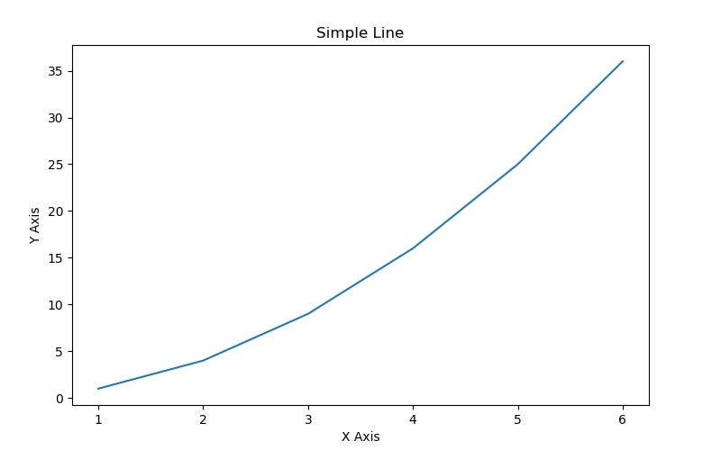
Now we are going to create some simple data, plot it, label the graph, and save it to the same directory as where our code lives.
# Create datax = np.array([1,2,3,4,5,6])y = np.array([1,4,9,16,25,36])
# Plot a lineaxes.plot(x, y, label="growth") # label keyword used later!axes.set_xlabel('X Axis')axes.set_ylabel('Y Axis')axes.set_title("Simple Line")# Save the imagefig.savefig("file1.jpg")Here is the resulting image:
Legends
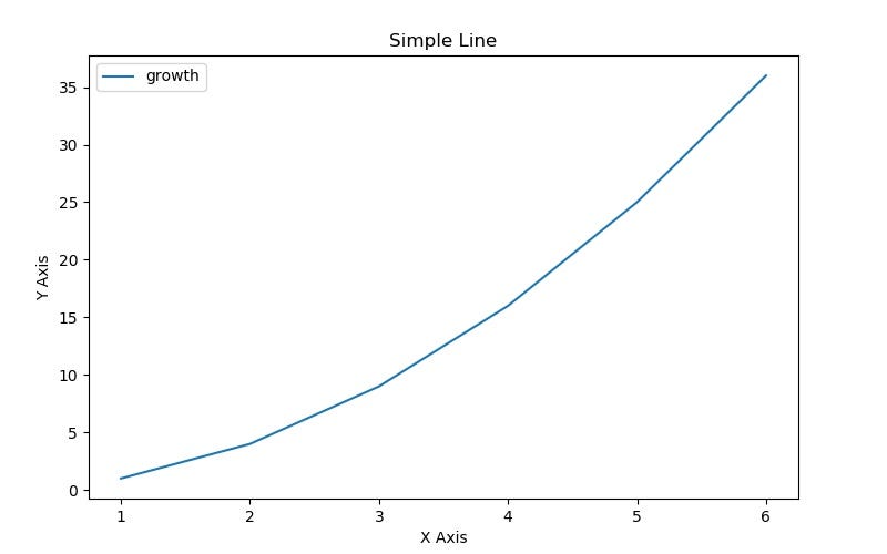
The best way to add a legend is to include the label keyword when you call the plot method on the Axes object (as we saw in the code above). Then you can make a legend and choose its location by calling another method.
# Location options: 0 = Auto Best Fit, 1 = Upper Right, 2 = Lower Right, # 3 = Lower Left, 4 = Lower Rightaxes.legend(loc=0)
# Save the imagefig.savefig("file2.jpg")Here is the resulting image:
Colors & Lines
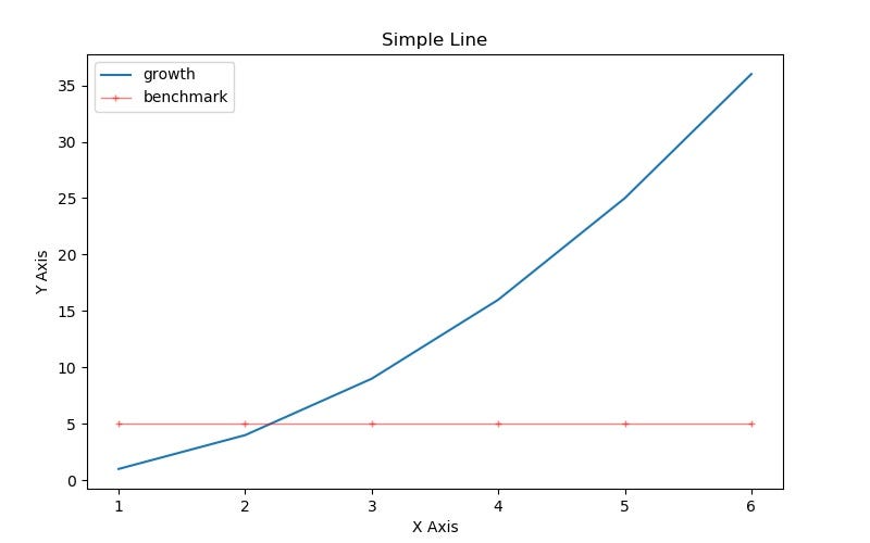
You can control features of the lines by passing certain keyword arguments into the plot method. Some of the most commonly used keywords are:
- color: either passing the name (“b”, “blue”, “r”, “red”, etc) or a hex code (“#1155dd”, “15cc55”)
- alpha: transparency of the line
- linewidth
- linestyle: pattern of the line (‘-’, ‘-.’, ‘:’, ‘steps’)
- marker: pattern for each data point on the line (‘+’, ‘o’, ‘*’, ‘s’, ‘,’, ‘.’)
- markersize
# Use the keywords in the plot methodbenchmark_data = [5,5,5,5,5,5]axes.plot(x, benchmark_data, label="benchmark", color="r", alpha=.5, linewidth=1, linestyle ='-', marker='+', markersize=4)
axes.legend(loc=0)
# Save the imagefig.savefig("file3.jpg")Here is the resulting image:
Axes Range & Tick Marks
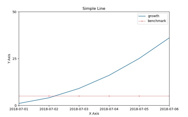
You can also control the range of the axes and override the tick lines of your graph.
# Control the range of the axesaxes.set_xlim([1, 6])axes.set_ylim([1, 50]) # increasing y axis maximum to 50, instead of 35#axes.axis("tight") # to get auto tight fitted axes, do this# Control the tick linesaxes.set_xticks([1, 2, 3, 4, 5, 6])axes.set_yticks([0, 25, 50])
# Control the labels of the tick linesaxes.set_xticklabels(["2018-07-0{0}".format(d) for d in range(1,7)])axes.set_yticklabels([0, 25, 50])axes.legend(loc=0)fig.savefig("file4.jpg")Here is the resulting image:
Subplots
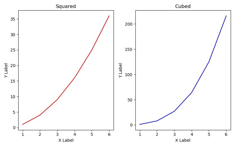
So far we have created a Figure object with only one graph on it. It is possible to create multiple graphs on one Figure all in one go. We can do this using the subplots function.
# 2 graphs side by sidefig1, axes1 = plt.subplots(nrows=1, ncols=2, figsize=(8,5), dpi=100))
# Set up first graphaxes1[0].plot(x, x**2, color='r')axes1[0].set_xlabel("x")axes1[0].set_ylabel("y")axes1[0].set_title("Squared")# Set up second graphaxes1[1].plot(x, x**3, color='b')axes1[1].set_xlabel("x")axes1[1].set_ylabel("y")axes1[1].set_title("Cubed")# Automatically adjust the positions of the axes so there is no overlapfig1.tight_layout()
fig1.savefig("file5.jpg")Here is the resulting image:
I’m providing here a link to download my Matplotlib walkthrough using a Jupyter Notebook!
Never used Jupyter notebooks before? Visit their website here.
Applications
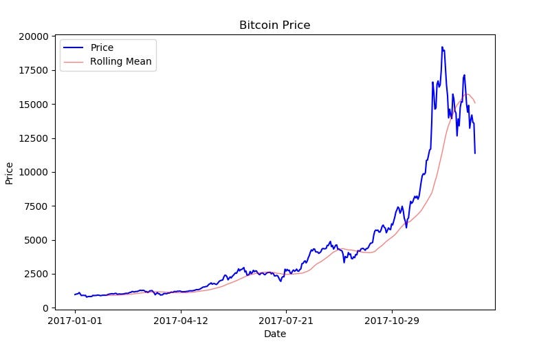
In my last article on pandas, we acquired data on Bitcoin and created a signal for when to buy and trade based on the rolling 30 day average price. We can use our new knowledge in Matplotlib to visualize this data.
You’ll need a Quandl account and the python Quandl library.
pip install quandl
Code from last time:
import quandlimport pandas as pd# set up the Quandl connectionapi_key = 'GETYOURAPIKEY'quandl.ApiConfig.api_key = api_keyquandl_code = "BITSTAMP/USD"# get the data from the APIbitcoin_data = quandl.get(quandl_code, start_date="2017-01-01", end_date="2018-01-17", returns="numpy")# set up the data in pandasdf = pd.DataFrame(data=bitcoin_data, columns=['Date', 'High', 'Low', 'Last', 'Bid', 'Ask', 'Volume', 'VWAP'])# make the 'Date' column the indexdf.set_index('Date', inplace=True)# find a rolling 30 day averagedf['RollingMean'] = df['Last'].rolling(window=30).mean().shift(1)# label when the last price is less than L30D averagedf['Buy'] = df['Last'] < df['RollingMean']# create a strategic trading DataFrametrading_info = df.loc[:,['Last', 'RollingMean', 'Buy']]New code to visualize bitcoin data:
import matplotlib.pyplot as plt
# make figurefig = plt.figure(figsize=(8,5), dpi=100)# add axes at specific positionposition = [0.1, 0.1, 0.8, 0.8]axes = fig.add_axes(position)# plot the bitcoin datanum_days = trading_info.index.sizex = range(num_days)y = trading_info['Last']axes.plot(x, y, label="Price", color="b") # label keyword used later!axes.set_xlabel('Date')axes.set_ylabel('Price')axes.set_title("Bitcoin Price")# plot the rolling meanaxes.plot(x, trading_info['RollingMean'], label="Rolling Mean", color="r", alpha=.5, linewidth=1, linestyle ='-')# set up the legendaxes.legend(loc=0)# set up the date tick marksx_ticks_index = range(0, num_days, 100)x_ticks_labels = [str(trading_info.index[indx])[0:10] for indx in x_ticks_index]axes.set_xticks(x_ticks_index)axes.set_xticklabels(x_ticks_labels)# save the imagefig.savefig("Bitcoin.jpg")Here is the resulting image:
That’s Matplotlib! Fast, flexible, and easy visualizations with real data. But what if we wanted to analyze the data with something more sophisticated than a rolling 30 day average? The last library every Python data-oriented programmer needs to know is Scikit-Learn. Coming soon.
Thanks for reading! My name is Lauren Glass. I am an entrepreneur & engineer living in Tel Aviv.
Connect with me on Instagram @ljglass
Connect with me on LinkedIn
Fundamental Python Data Science Libraries: A Cheatsheet (Part 3/4) was originally published in Hacker Noon on Medium, where people are continuing the conversation by highlighting and responding to this story.
Disclaimer
The views and opinions expressed in this article are solely those of the authors and do not reflect the views of Bitcoin Insider. Every investment and trading move involves risk - this is especially true for cryptocurrencies given their volatility. We strongly advise our readers to conduct their own research when making a decision.
