Latest news about Bitcoin and all cryptocurrencies. Your daily crypto news habit.
For a community app or a website, a landing page that entices users to visit every day, explore the content, and stay longer is the key for engagement and retention. They key is to show personalized content relevant to each user as soon as he or she lands on the page. Most popular apps like LinkedIn, Facebook, Snapchat, Instagram, Amazon, Twitter, FlipBoard, achieve such personalization by showing content in a timeline, personalized for each individual user. Such a hyper-personalization is achieved based on the large amount of data gathered from the user over time from his interactions with the app.
The founders and product managers of new community-based apps or websites wish to emulate such a landing page design right from the first version of the product assuming this will increase the overall retention rate and subsequently the lifetime value per user. But for the community that is newly forming, this approach comes with its own challenges.
Challenges of personalization in the new app
- All users are new and there is no data about their behavioral history collected form the app that can be used to segment and target users with the relevant content.
- You can know more about users by asking them to fill up long forms during the sign-up. But this can result in users abandoning sign-up process mid-way due to frustration affecting your acquisition.
- Even if, based on the limited data, you could segment the users, generating useful content continuously for each segment requires a huge investment in the content team.
Based on our work of designing several community-based mobile apps, I suggest to incorporate personalization slowly as you iteratively build newer versions of the app.
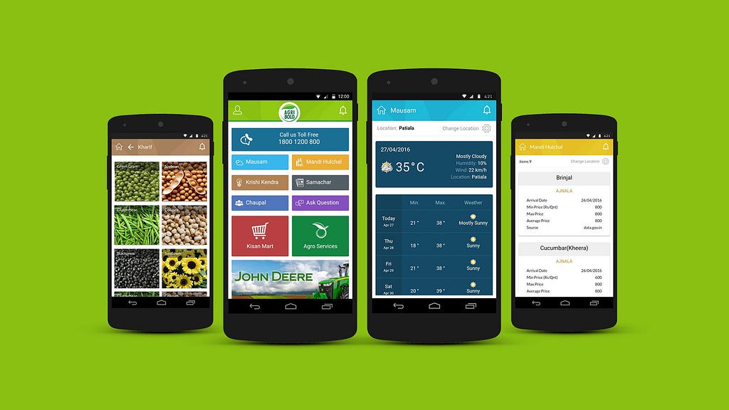
Gradual progress towards personalization A typical category-based drill-down landing page
- Start with landing page that shows your services or categories in easy to navigate card layout. Any content should not be more than 2-clicks away from the landing page.
- Keep registration simple and quick. You can focus on capturing one or two key user profile fields useful to your domain like gender or location.
- Tag your content with keywords.
- Add search button to the page for tags and content so user can skip tedious drill-downs.
- Start collecting more data about your users by periodically asking them questions related to new profile attributes and additional context. This can be achieved by sending InApp notifications at the relevant transitions. You can show users percent complete for their profiles and reward them with badges for providing additional information (for example, All Star in LinkedIn).
- Build each user persona over time based on collected data and their interaction within app.
- Segment all your user personas on 5 dimensions: Demographics, interests, location, context, and time.
- Build a content team with domain knowledge to generate useful content for each segment.
- Keep track of your analytics. Figure out most frequently accessed content and their relationships with customer segments.
- Start with push notifications campaigns targeting each segment with notifications that deep link to relevant pages within app.
- Surface most popular or most recommended on a separate section of your landing page.
- Based on the analytics, redesign your landing page to bring forth most frequently accessed content on landing page for each segment.
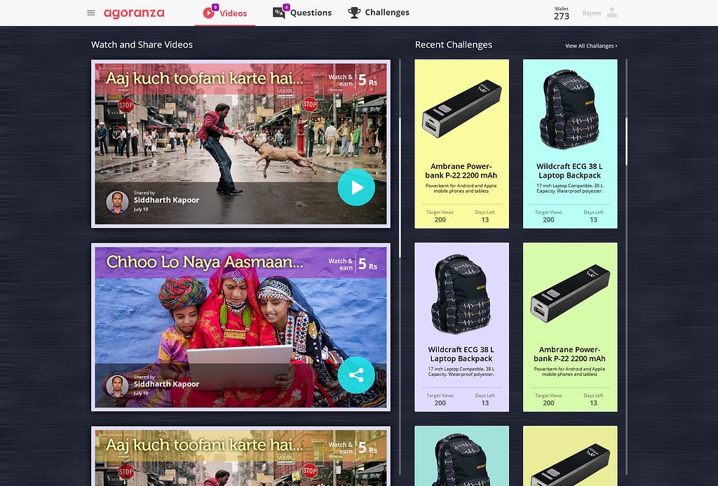
- Once you see higher engagement, redesign landing page completely based on streaming timeline. Show targeted content on the timeline on landing page.
- Keep it easy to transition between timeline page and categories page in initial versions so user can still navigate through categories.
- For generating content, focus on most valuable segments first. Increase your content team to generate new content every day based on segments.
- Use feedback from user behavior and history in your app to tune and refine segments. Extreme personalization is similar to ad targeting. Surface content within you app based on the user’s history of interaction.
- Growing content team to continuously generate targeted content for large number of segments is not scalable. Crowd-source content from your users and surface it on landing page.
- Beware of extreme personalization. Make sure to surface content to your users outside their interests which leaves room for them to explore.
 Personalized timeline based landing pageConclusion
For every app and website, ideally, each user is a unique individual and a separate segment. Only highly popular apps can achieve high-level personalization because of access to user data based on their history, resources to scale their content team and access to a large amount of user-generated content. For smaller companies, it is a gradual process involving data gathering, analytics and quality content generation. As you go through this journey, you will see your users frequently visiting and spending more time in your app. You are then ready to start thinking about your monetization strategies.
Thanks for reading. If you enjoyed this article, feel free to hit that clap button 👏 to help others find it.
This article is a part of series of articles related to Design Thinking and User Experiences. At 47Billion, we specialize in helping companies build awesome products. If you are looking for a an experienced team to build your solutions, please contact us at info@47billion.com.
How to design a landing page to maximize engagement and retention was originally published in Hacker Noon on Medium, where people are continuing the conversation by highlighting and responding to this story.
Disclaimer
The views and opinions expressed in this article are solely those of the authors and do not reflect the views of Bitcoin Insider. Every investment and trading move involves risk - this is especially true for cryptocurrencies given their volatility. We strongly advise our readers to conduct their own research when making a decision.