Latest news about Bitcoin and all cryptocurrencies. Your daily crypto news habit.
One of the open problems in the procedural generation of fiction is how to maintain reader interest at scale. Fiction generation is very good at producing short-form work that makes sense and is evocative, but when existing techniques for it are scaled up, works start to seem repetitive (showing the limits of their templates or corpora), meandering (showing failure to adhere to a large-scale pattern the way that they adhere to small-scale patterns), or overly inaccessible (because the generator, unable to determine how much information is ideal, has erred on the side of being too dense — becoming boring from inaccessibility rather than from repetition).
My favorite way to attack this problem is to make use of the Eliza Effect: people tend to be more willing to put up with flaws in generated output if those flaws are given context that would excuse or explain them if produced by humans. Because of this, computer-generated poetry is a lot more readable than computer-generated prose — the onus is much more heavily on readers to make sense of poetry than on authors to ensure their poetry is easily understood. There are prose forms that are associated with experimentation and vagueness, and mimicing these forms can make it easier for readers to put up with machine-generated prose.
In 2014, Greg Borenstein wrote a comic generator called Generative Detective, producing comics from public-domain detective novels & creative commons licensed Flickr images. He used a semi-manual process, tagging sentences with keywords which he then used to search for associated images. The result: a surreal but compelling comic composed of juxtapositions.
 The first frame of the first page of Generated Detective
Initially, the panel layout was simple, but it became slightly more complex with page 4, which introduced the use of rows of panels.
The entire thing is worth reading. Once again, as with earlier NaNoGenMo entries that experimented with piggybacking off existing forms, the illusion of an unintended narrative emerged, phantasmagorical, from the ruins of theme and style.
At the time, I asked how far this could be taken. Juxtapositions often worked best when the image was a poor match for the keywords, rather than a good one. The long history of experimental comics, for those familiar with them, invited readers to project narrative onto these pages quite intensely. So, I wondered: could we get more bang for our buck with less work by dropping the use of keywords, dropping flickr searches, and simply associating arbitrary images with arbitrary pieces of text?
In 2017, I answered my own question with an unrelated project. I wrote a juxtaposition machine called Holzertron: a script that combined the work of the feminist experimental artists Barbara Kreuger (best known for superimposing slogans, in white Helvetical on a red stripe, on top of black and white photographs) and Jenny Holzer (best known for projecting slogans on buildings). I desaturated random photographs, then superimposed random slogans taken from a database of those used by Holzer, formatted in the style of Kreuger’s work, and posted the result on twitter automatically with the tags #barbaraholzer and #jennykreuger.
The resulting images were often arresting, and many became popular. Of course, the juxtaposition was entirely random. Non-resonant images were ignored; resonant ones got retweeted extensively.
Having only rarely worked with image processing before, this project gave me the confidence to attempt my own take on Greg’s work, and answer the questions he hadn’t addressed. At the same time, I decided to mimic attributes of comics that Greg’s system didn’t duplicate, like the use of color and complex panel layouts. This was one of several projects I did for NaNoGenMo 2017.
In high-profile manga, because of the details of manga distribution, it is often the case that multiple coloring & shading styles will be used: full-color with outlines for the first few pages, followed by a few pages of less distinct watercolor work, followed by outlines + smooth shading for most of the remainder of the tankoban & unshaded outlines for omake and sketches in the back. I decided to write filters for each of these stages.
First, I create a ‘sketch’ by finding the edges in a copy of the image that has had its contrast adjusted. These are the outlines. If I am producing an outline-only version, I simply return this image; otherwise, I produce either a posterized (for color) or greyscale copy and blend the outline with this second layer.
 Posterization & outline blending for an already-drawn image (a screenshot from Studio SHAFT’s Denpa Onna To Seishun Otoko (2011))
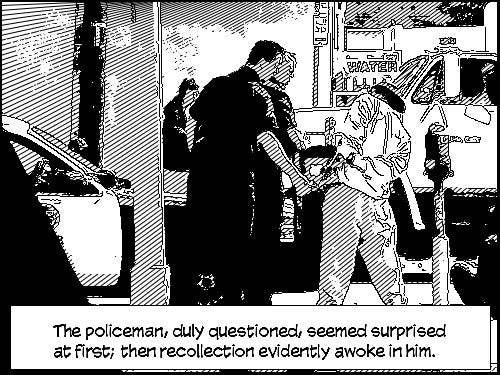
 Posterization & outline blending for a photograph (a screenshot from John Carpenter’s Prince of Darkness)
The resulting images were not necessarily reliably reminiscent of traditionally-drawn comics (and I didn’t make an effort to simulate hatching-based shading as Greg did), but they reminded me of Dave McKean’s digital work on Millenium, and this satisfied me, since I wanted to evoke more experimental works.
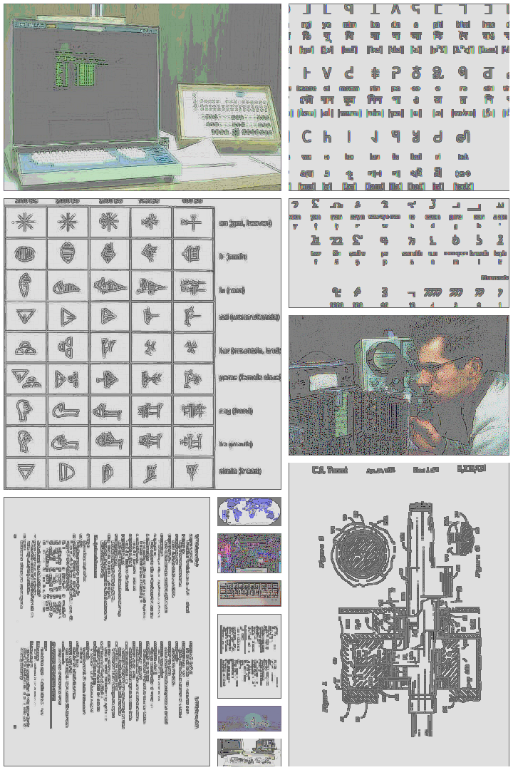
I was also able to get interesting panel layouts with a simple algorithm. I wanted to pick random images & make them align but maintain their aspect ratio as much as possible, so I decided on a few rules: I would only shrink the images (never growing them), and only stretch an image if the difference between its current size and its stretched size would be smaller than the size of the gutter (in other words, small enough that I couldn’t fit another image in the left-over space). Given these rules, I simply laid out images from left to right and from top to bottom, shrinking each image so that it fit within square-shaped leftover regions of space along both dimensions. The result was a page with a mix of tall columns and smaller square panels arranged in rows — a structure interesting but familiar to comic readers, varied but with a clear sense of reading order.
Once an image had its target position and size, I shrank it to that size, applied the appropriate filter chain, drew a black box around it, then shrank it again and placed it on a white background — producing gutters through the white border aorund each frame.
 A laid-out page without text. These images were chosen randomly a folder on my machine.
Text layout was done in the most straightforward way possible: I aligned the upper-left-hand corner of each text block with the upper left hand corner of any panel, at an offset. I used black text in a yellow box — the standard Marvel convention for narration.
I generated several comics: one with scrambled Raymond Chandler works, one with Jenny Holzer slogans, and one with a database of ‘dad jokes’. I think the ‘dad joke’ version is the most effective, since the jokes, when juxtaposed with largely technical or imposing imagery, produce an uneasy feeling — the result borders on experimental horror.
Actual reader review: “It feels like someone injected laundry detergent into my eyes and forced me to scroll through Google Image Search.”
The biggest problem with this output is actually that the lines tended to be too long — going off the page, or off the end of the panel, or obscuring the panel entirely. This is not a problem with the comic generator per-se (though I could reject assignment of lines to panels that are too small for them), and the appropriate solution is probably to use small, fragmentary phrases or break lines into small fragments before passing them into the comic generator.
Fiction generator post-mortem: comic book generation was originally published in Hacker Noon on Medium, where people are continuing the conversation by highlighting and responding to this story.
Disclaimer
The views and opinions expressed in this article are solely those of the authors and do not reflect the views of Bitcoin Insider. Every investment and trading move involves risk - this is especially true for cryptocurrencies given their volatility. We strongly advise our readers to conduct their own research when making a decision.