Latest news about Bitcoin and all cryptocurrencies. Your daily crypto news habit.
 Preview themes from the VSCode marketplace.
About 5 months ago I posted a side project to r/vscode that got relatively popular, and since then I’ve been working on making it useful.
VSCodeThemes started as an excuse to learn some new tech and challenge myself across the full stack. I knew I wanted to build a web scrapper with AWS Lambda / SQS and try out Algolia, a search-as-a-service platform.
I was probably browsing themes around the same time.
Browsing the Visual Studio Marketplace for themes can be painful. The site is optimized for browsing extensions so you rely on theme publishers adding screenshots to the readme.
The search results aren’t super useful either. The name, thumbnail and number of installs of an extension are poor indicators of a theme’s quality. Browsing results one by one, hoping there’s screenshot, is a slow and frustrating experience.
I’m happy to announce that I’ve pushed some big updates to the site over the last few months that will help you discover some new awesome themes.
Read on for details on some of the more notable updates or see them in action at https://vscodethemes.com.
Accurate previews
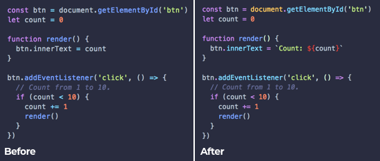
The first version had a major flaw — the syntax highlighting was horribly inaccurate. A pretty essential feature for a site who’s only purpose is showing theme previews.
I originally used the react-syntax-highlighter component for displaying code previews but it uses PrismJS under the hood — which is not what VSCode uses for it’s syntax highlighting.
This meant I had to translate VSCode themes to PrismJS themes and resulted in widely inaccurate previews (in addition to some pretty nasty code).
After digging around the VSCode source, I found the vscode-textmate package that’s responsible for outputting color tokens for a given theme, language and template.
This library depends on native modules so I couldn’t simply add it to the front-end. The latest update now pre-renders each language preview for a theme before saving the result to Algolia.
 Syntax highlighting before and after
Check out this PR for more details on how this works.
“Wasted space”
Since I was primarily focused on the back-end at the start of the project, the front-end was a bit of an afterthought. It looked pretty and worked well on mobile but the overall experience needed some love.
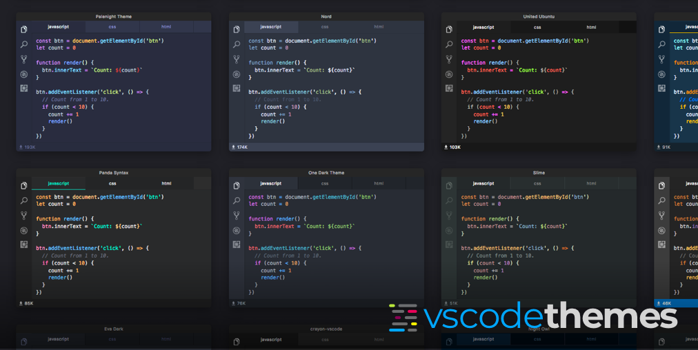
One complaint was all the “wasted space” on desktop because of the single column layout. Switching to a responsive grid layout creates a faster, more enjoyable browsing experience.
 Search results before and after
Extension pages
As a frequent r/vscode lurker, you will see the occasional “what theme is this?” post, requests for theme suggestions and new theme announcement.
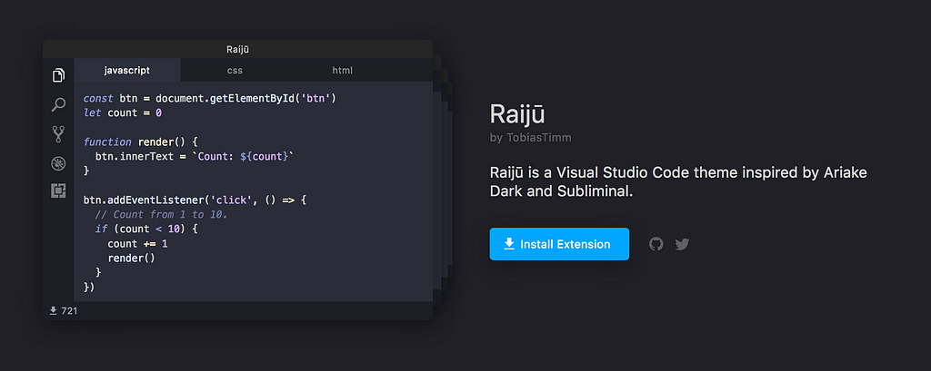
It became clear that a unique extension page would allow users to easily link to and share any theme on VSCodeThemes — like one of my personal favorites Raijū by TobiasTimm.
 Extension page with theme rotator
Check out this PR for more details on front-end rewrite.
Other updates
In addition to some cool new features, there have been some major updates to the stack such as:
- Ported front-end to NextJS for improved SEO.
- Added a CloudFront CDN to improve page-speed and scalability.
- Setup yarn workspaces for shared packages between the back-end and front-end.
… and a bunch of bug fixes.
What’s next?
A few possible features that are at the top of my mind right now:
If you would like to see these features built or have other suggestions feel free to contribute on Github.
Announcing VSCodeThemes was originally published in Hacker Noon on Medium, where people are continuing the conversation by highlighting and responding to this story.
Disclaimer
The views and opinions expressed in this article are solely those of the authors and do not reflect the views of Bitcoin Insider. Every investment and trading move involves risk - this is especially true for cryptocurrencies given their volatility. We strongly advise our readers to conduct their own research when making a decision.