Latest news about Bitcoin and all cryptocurrencies. Your daily crypto news habit.
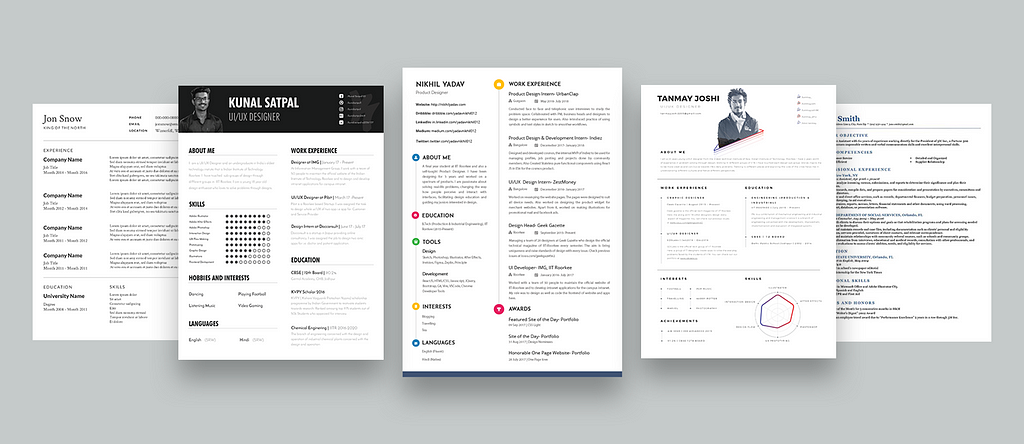
Designing resume have always been a difficult process for me. There is too much information to show in a smaller area. Also, we need to consider too many factors while designing our resume. Search on the internet and you’re flooded with multiple guidelines for designing your resume. If you have been thinking about applying for a job or an internship and thinking to update your resume or build one from scratch, You might want to take a look at this article. I have compiled all my research about the things to consider while designing your resume. I hope you like this article.
Disclaimer: I neither have been a part of the recruiting process nor I have any experience in resume shortlisting. I am still a student. All tips and advice are mine or collected from the different sources all over the internet. If you’ve any suggestion, do comment right below this article and let others benefit from your feedback.
1. Keep it short (one-page preferably)
Recruiters generally spend 2–3 minutes while going through your resume. You neither want them to waste their time on a long 2–3 page resume nor do you want irrelevant information in your resume.
Tailor down your resume to a single page. You can include a short summary about you, your education, your work experience, projects, skills, interests or hobbies, awards (if any) and your social links to get to know more about you.
Some of you may argue that if you have a portfolio then why do you need a resume? While portfolios are able to show the depth of your skills, Resumes help to know the breadth of your skills. A resume is a short crisp tailored version of your portfolio. First, Recruiters would want to know that the candidate can do the job and has necessary skill sets required for the job then he would want to know how the candidate approaches the problem, his passion, and values. Therefore, Resume screening is the first stage in the recruiting process.
Show your work history across different companies or any freelancing projects you did and provide a way for the recruiter to dig more by providing relevant links separately such as your personal website, LinkedIn profile, dribbble or medium (any link that can show a unique side of you).
2. Be specific to the role you’re applying
It’s very important to show relevant experience to the job you’re applying. You might have work experience in print media but it would be of less value when applying for a UX role. It’s true that any kind of professional experience does matter. It surely improves your soft skills. But remember, recruiters would only care for itin the second stage of your recruiting process. First, They need to know your relevant skills for the role.
Being specific to the role also prevents any kind of confusion at the recruiter’s end otherwise, he will have a hard time figuring it out. You also don’t want to portray yourself confused about the role you’re applying. Tailoring your resume to the role clears your purpose. It also makes it clear that the candidate knows the job he has to perform.
3. Use available templates (Beware of ATS)
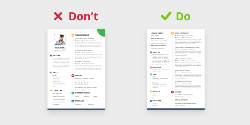
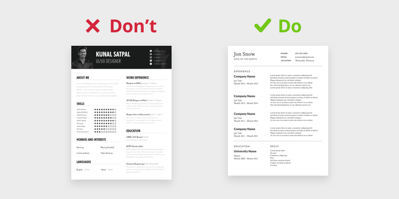 Don’t use designed resumes while uploading online
You may be thinking why would I say this? What about being creative? I am a designer, Why should I use old templates which anyone can use? With the dawn of Applicant Tracking System (ATS), You may need to hold your creative juices here. Some companies use ATS for handling resumes. These systems let companies to automatically filter candidates based on some criteria.
According to ATS guidelines, your resumes should not contain any graphic element. This means no images, icons, tables or any shapes. If any of these are present, ATS could jumble up your information while reading your resumes and you could lose a potential job opportunity. There are other guidelines too around using font type, bullets etc. For full list of guidelines, read this article.
In order to save yourselves from the trouble of guidelines, it’s better to use available templates. A resume is mostly about its content. After all, you cannot show all your creativity in your resume, We should preserve that for our portfolios. You can use free templates of google docs and latex resume templates(https://latexresu.me/). Latex is very good and simple coding language to learn to create documents easily. You can create well formatted documents with its simple code.
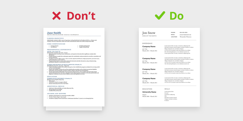
But try to be creative while selecting these available templates. Don’t use free resume templates when they especially look like this.
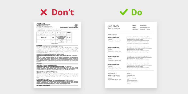 Don’t use college resumes while applying
So next time, take care whenever you are uploading your resume online, it can be a ATS. Upload a ATS friendly resume. I usually prefer to have 2 resumes-a well designed resume(to be sent while sending mails or messages) and one template resume(for online uploading).
Also these systems generally store your resumes in their database, It’s better to name them as <firstname>_<lastname>_resume.pdf(For eg- nikhil_yadav_resume.pdf). It will help your recruiters to easily search between saved resume files.
4. Say no to your photo (It’s a cultural thing)
This is the highly debated topic on the internet about adding a photo in your resume. Countries like US or UK don’t prefer to have photos on the resume. Photos reveal a lot about candidates like his caste, color, creed etc. Labor and anti-discrimination laws in these countries prevent employers from requesting a good deal of personal information. As a result, organizations rarely request a photo as part of a job application nor do they expect one, particularly for professional positions.
Photos are generally available on the applicant’s social accounts too. I didn’t understand why they have such laws. But laws are laws. We need to abide by them.
It’s so different how the resume should look like depending on the country. It’s a cultural thing. In countries like Germany, Japan, and China, it’s generally preferred with a professional photo. It’s easier to remember the applicant. Therefore, I recommend researching the company well before sending your resumes.
I prefer to generally remove the photo from the resume. Removing photos would also give you more real estate to show more information. Remember space utilisation is utmost crucial in a resume.
5. Prefer not to show generic interests
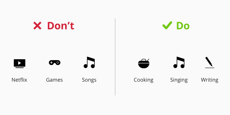
Interests/Hobbies add a unique trait to the personality of the individual. It surely adds a value to the profile of the candidate. Suppose you are a good singer, You can make party times even better. After all, Jobs are not only about work. If you could add a unique value to the team, You would always be preferred. Singing, Cooking, Instruments, Writing, etc., are unique traits and if you have them, you should definitely mention them.
Avoid writing binge-watching Netflix, traveling, playing games or listening to music. Everybody does that and love them. Prefer to exclude these generic interests from your resume. You don’t want to sound dumb.
6. Write in first person but remove pronouns
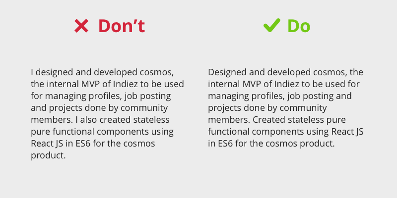
As there are guidelines around using your photo in the resume, there are guidelines for the language you should use in your resume. Some prefer to write resumes in the third person but everybody knows that you’re writing your resume by yourself. Therefore always write in the first person but remove pronouns. Pronouns are extra words you would be adding in descriptions. Remove them and save space.
Also, take care of the grammar. If you’ve bad grammar like me, do get it to proofread from someone proficient in grammar. You don’t want to create a bad impression by using bad grammar in your resume.
7. Structuring your work experience
Researching about companies and roles you’re applying before also helps to figure out what skills recruiters are looking for in the candidate. Don’t forget to mention these specific keywords which they are looking for. Mention a short description of your work experience including these keywords.
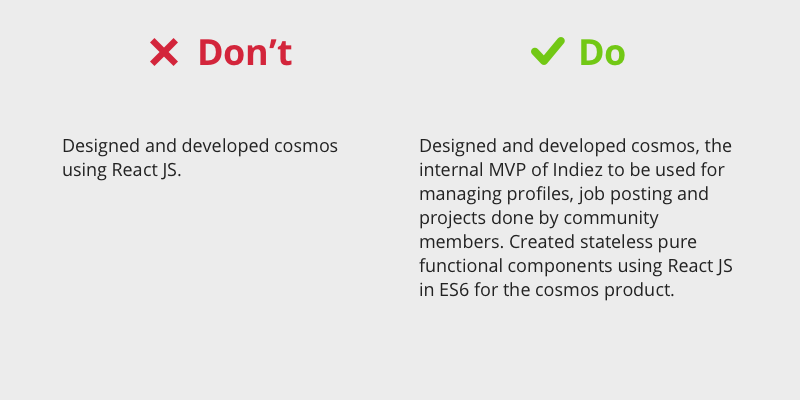
You should also mention the value added by you in the business (like % conversion increased). Recruiters would rather read about your accomplishments than your job description. For example, They know what a UX designer does, but what specifically did you do? Did you design and help launch an app? Did you design 50 wireframes? Did you build a design system? Did you drive utilisation up by 50 or 200%? What was your impact on the company (product, culture, bottom line)? Mentioning metrics also give a quantitative measure to judge your skills better.
Also, write each work experience in a reverse chronological order. When presenting work history on a resume, the recruiter is more interested in what the candidate has done recently than in the distant past. It also presents the recruiter with the most recent work experience first and then allows them to read back in time to see how the candidate’s career has progressed.
8. Exclude references
Every recruiter knows you’re going to provide references if they request it, so there’s no reason for you to include them in your resume. Remember that space on your resume is crucial. Don’t waste it.
Well above information is easily available on the internet but it’s half-baked. As I researched more and asked some of my friends about the importance of adding references in your resumes, They said, “When you’re applying for research internships programs, It’s highly mandatory. Even when applying for PhDs, references and recommendations play a crucial role.” Therefore, you cannot entirely skip adding references when applying for research internships or PhDs.
That’s all folks
Designing resume is a difficult job. Many factors like company, job, role type, keywords, country, etc., highly influence resume designing. A properly tailored down resume can save recruiter’s time. Use the space wisely. Also, proper research before applying to a company can really increase your chances of clearing the resume shortlisting stage.
Other external links
- Should you put a photo on your CV?
- 5 things you should never put on resume
- 22 resume mistakes that are way too common
- How to beat Applicant Tracking system
My recent articles
- What’s wrong in following other’s path to success
- Summarising my Design Story #2
- What I learned from my Google UX internship interview process
- Making of my portfolio website
Thanks for reading this so far. If you like this article, please hit the 👏 button and let others too know about this. If you have any feedback, do comment below. I am currently posting freebies on Dribbble. Check out fast and download them. Keep following me on Medium and twitter for such updates. 🔥 🔥 🔥
PS: Thanks Shashank PM for helping me out with the editing. Thanks kidhack for your thoughts on this article.
How to: Design your Resume was originally published in Hacker Noon on Medium, where people are continuing the conversation by highlighting and responding to this story.
Disclaimer
The views and opinions expressed in this article are solely those of the authors and do not reflect the views of Bitcoin Insider. Every investment and trading move involves risk - this is especially true for cryptocurrencies given their volatility. We strongly advise our readers to conduct their own research when making a decision.
