Latest news about Bitcoin and all cryptocurrencies. Your daily crypto news habit.
 Suggested vs Improved
In this article, I will be showing the problems Find Better Questions’ website has that are keeping it from getting many more free trials/downloads and customers as well as what I believe the solution should look like.
What’s Find Better Questions?
Find Better Questions is a tool that enables you to create lists of questions from Quora, filter them and only answer the ones that will get you the most traffic. It makes all the work of making lists and sorts the best questions. It’s a great tool, check it out :)
The process
This will be specific to Find Better Questions, if you want to learn my 5 step process to turn visitors into customers that you can apply to your website, here’s my 100% free email course.
Things to keep in mind
- This product is for Quora only.
- It’s targeting people that already use Quora to get traffic and leads so they are more aware of how much time the tool could save and how valuable using Quora is.
- The website doesn’t have social proof yet as this launched recently but I added it in so when he has some awesome testimonials to show he knows where and how to use them to get the best result possible.
Every problem is different I will do my best to make it actionable to as many people as possible. If you want something that could apply to every website, checkout my 5 step email course (it’s 100% free btw).
The key to getting more free trials
You’ll need to:
- Explain what your product/service does properly.
- Show how your product can get results for your potential customers.
- Answer the biggest objections people have about your product (Step #2 and #3 of my free email course).
- Make the free trial obvious to reduce the commitment of trying it out.
I covered all of these requirements and how your website can achieve on my free email course.
Problems and their solution (current vs suggested version)
The Header
This is the first impression your company will have on a potential customer and in a world of super low attention spans, you really need to introduce the “big picture” of the problem you will be solving, a small paragraph describing what the solution could be and hopefully an image to show what the solution might look like.
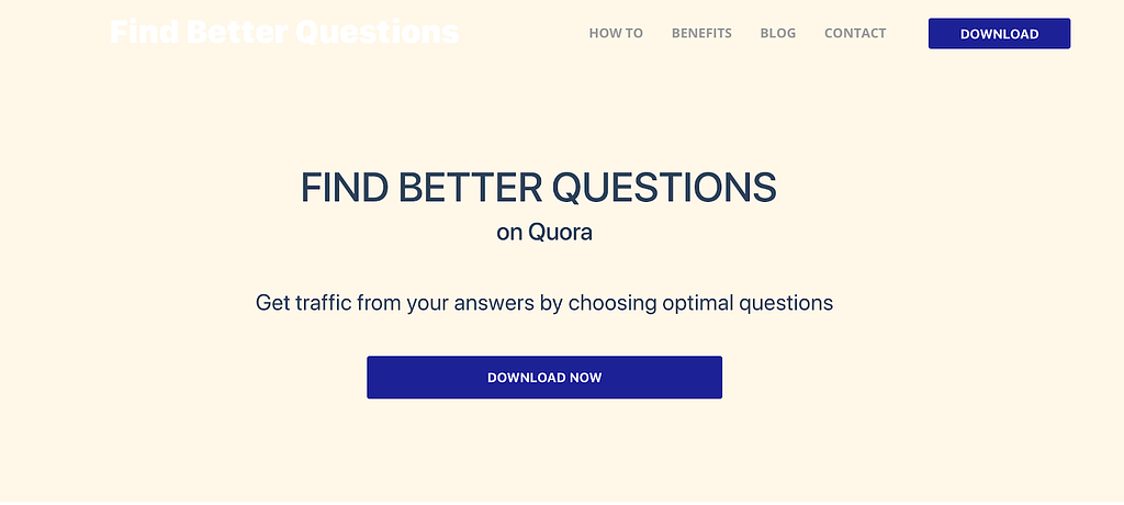
- A white logo on a very light background makes it nearly invisible.
- The title is good but using all caps makes it harder to read as the letters lose the big differences in shape and height they normally have between them.
- The download button doesn’t suggest this is an app available for Windows and Mac.
- There is no hint that there is a free trial available.
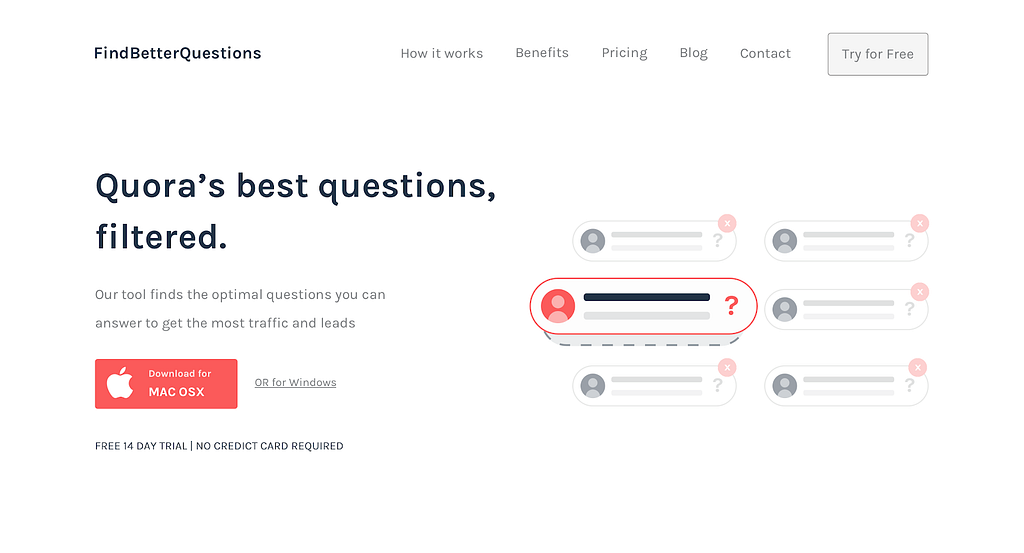
- The title makes it easy to instantly tell this is to find questions on Quora but creates enough curiosity for people to read the line below if they need more context.
- The CTA now shows this is an app available for both Mac OS and Windows
- The CTA only shows Mac because it should detect automatically which OS the visitor is using so we don’t have to showcase 2 CTA with the same importance which is rarely a good idea!
- Notice how I mentioned the free trial right away so it makes the download seem like a 0 commitment kind of thing throughout the entire pitch.
- I added that illustration on the side just to provide a little bit more context but if the text was centered aligned it would still get almost 80% of the functionality of this example regardless.
- I didn’t use the same colors as the current version uses because we should keep colors to a minimum and the current ones weren’t enabling me to reuse them properly and have the great level of contrast it needs for the CTA’s. The only reason I chose red is to help show this is made for Quora (their main color is red).
Introduce the problem!
This is super important, it’s makes understanding the problem you are solving much easier (as a result the solution is easier to understand too) but also to remind them of how painful that problem could be and how much they would want to fix it (hopefully they see your product/service as the solution).
It’s very rare to see Landing pages that describe properly what problem they are solving before they explain how they can fix it.
No wonder potential customers quickly come up with objections like “I don’t understand how it works” or “I don’t know if it can fix our problems” … This is such an easy way to avoid those!
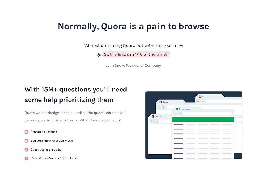
- The website jumps right into the solution which is a lost opportunity to remind visitors how much of a pain getting this questions is in order to make them properly aware of how much time this can save and how valuable the tool really his.
- Noticed I started by saying how Quora is a pain to browse the way these Marketers want to use it since it wasn’t designed for that in mind.
- I added a testimonial to help showcase this. If you keep in contact with your customers (which you should) it isn’t that hard to get them to give you a similar testimonial. Keep in mind to give them a couple of examples of what it could say just so you can have more control over how effective they could be.
Explaining how it works
After introducing the problem you can fix, it’s time to show exactly how you would fix it and what are the benefits of fixing that problem by using your product/service in particular.
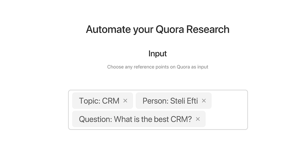
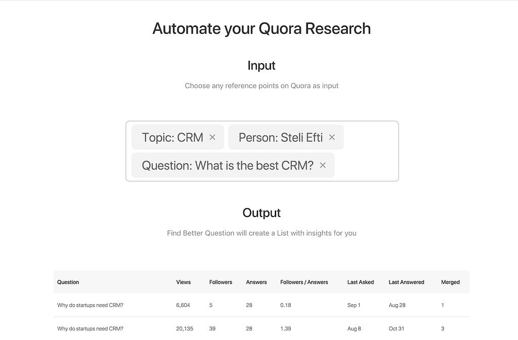
- The screenshots are at least visible and you could get some context on how it works but the hole Input vs Output thing isn’t very effective since as I found out this tool has more features than this and a slightly different process than what you see here.
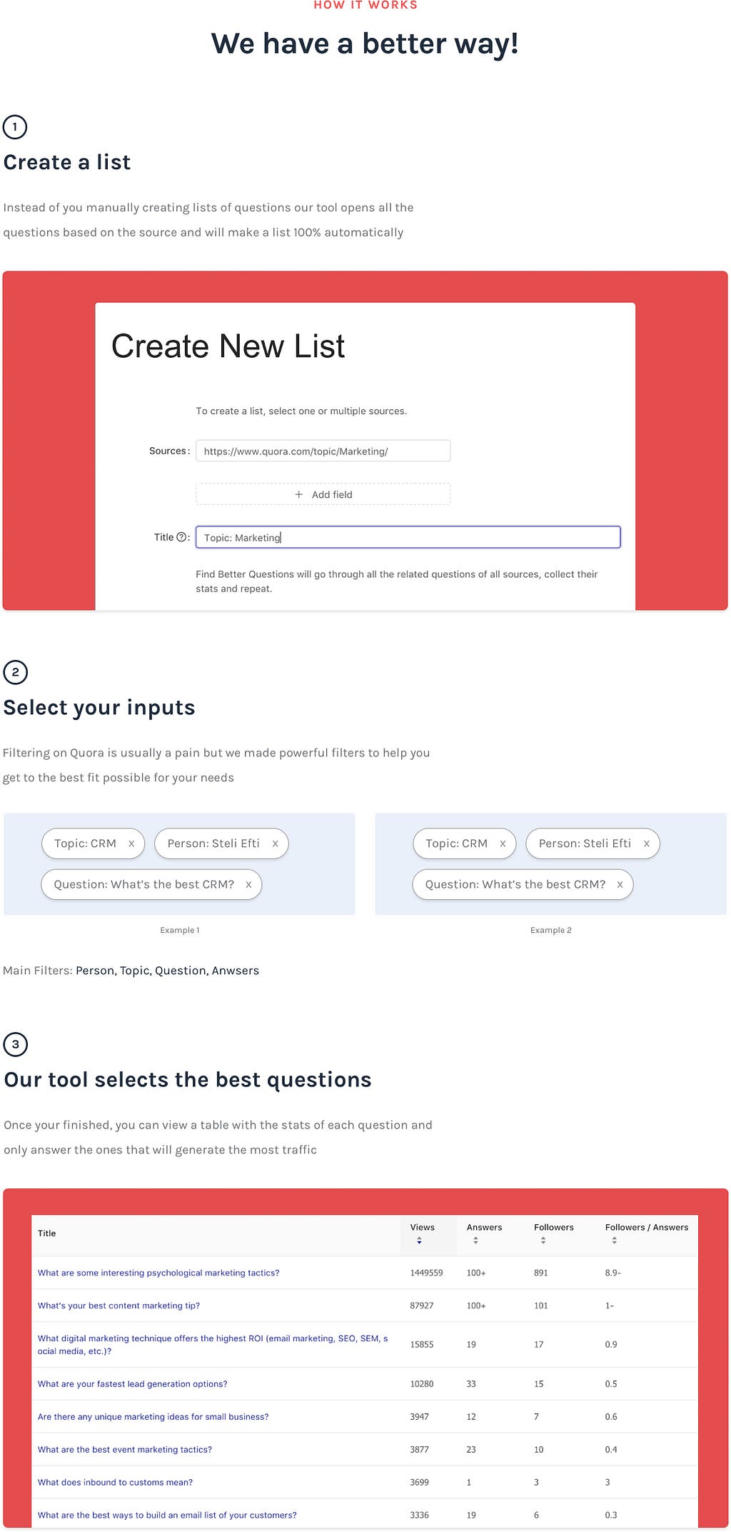
- This needs to be step by step to create the right expectations if you want people to sign up.
- This is easier to follow along as it’s divided into the exact steps they would go through if they get this tool.
- Another great benefit of this kind of structure is that, as potential customers read this, they can compare it to the way they are finding questions currently and how much faster this tool really his.
- This might seem too tall but it’s fairly easy to browse through and makes everything visible, the best part of this is that they are MUCH less likely to ignore this because they won’t get the context if they don’t follow it along properly (you can’t skip the steps and there’s nowhere else to look at).
The “Benefits”
People buy Benefits not Features, so it’s extremely important to demonstrate how the features you have can create really good results and benefits.
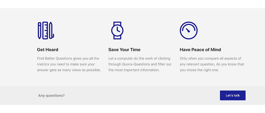
- This doesn’t really say much because these terms are very vague and people see this all the time in most SaaS websites which makes even less effective.
- Because the “How it works” section I showed you above is more detailed it’s still evident the benefits of time-saving so instead of using the website to try to convince these benefits are good, the visitor will realize it by himself (or herself) which is 10x more powerful!
Testimonials
Now that people understand which problems you are fixing and how you can fix them, this is the time when they start to wonder if you can actually get the results they want, it’s the most effective time to bring testimonials and case studies up.
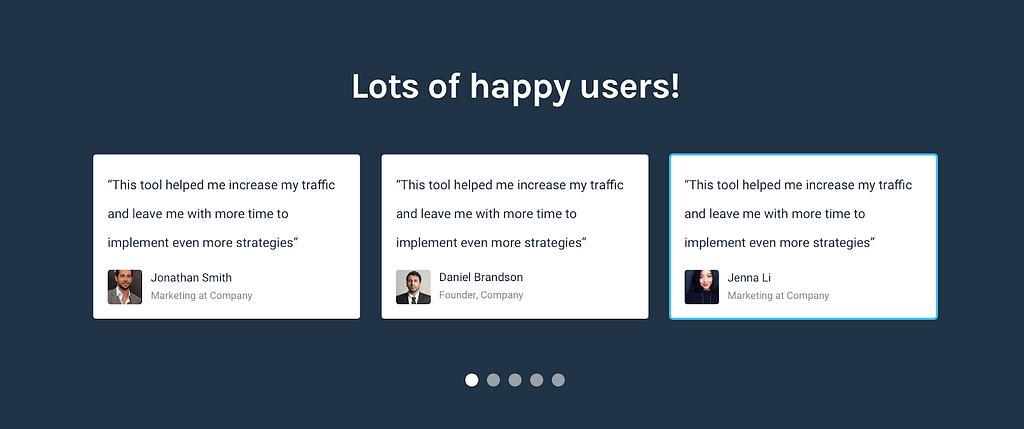
- This is just a very simple layout to have testimonials since usually the early or easiest ones to get come from Twitter this has a similar design or you can just use their embedded tool to display them here and show what people are saying about your product.
Pricing
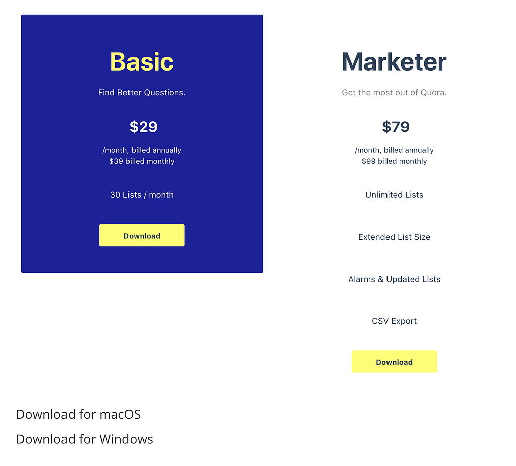
- The free trial is again not visible anywhere.
- The list of what’s included isn’t at the same level so you can’t compare them properly.
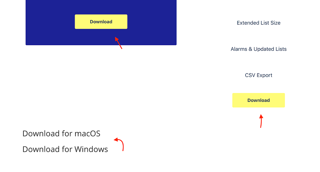
- Those download buttons are very generic they don’t communicate what you will be downloading and why.
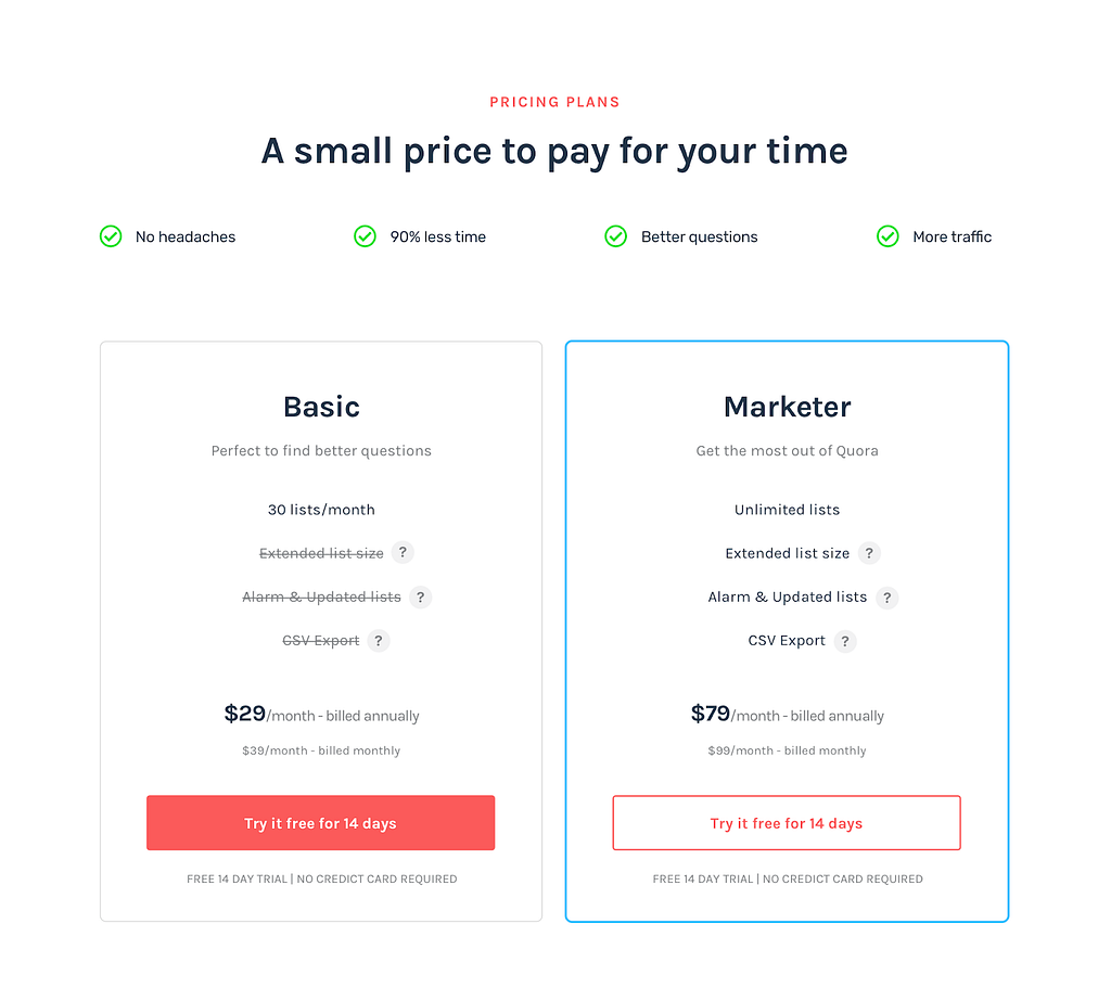
- I suggest that the price to be at the end so people can read the benefits first before they start raising more objections about the price.
- Notice how I always make sure to use reference to make the pricing seem much cheaper. I use the amount of time it can free up to try other marketing strategies as the main benefit.
- This time you can easily compare what’s included in each plan and see that the Basic plan doesn’t include many of the features the other plan includes.
- As a good practice, you should usually include those questions marks to explain what that plan includes, greatly reducing unnecessary objections around pricing or features.
Final CTA
Since you went through all this effort to explain how good your product/service is some people will be ready to convert, give them an easy way to do so before you lose the chance the grab them making that potential customer click away, never coming back…
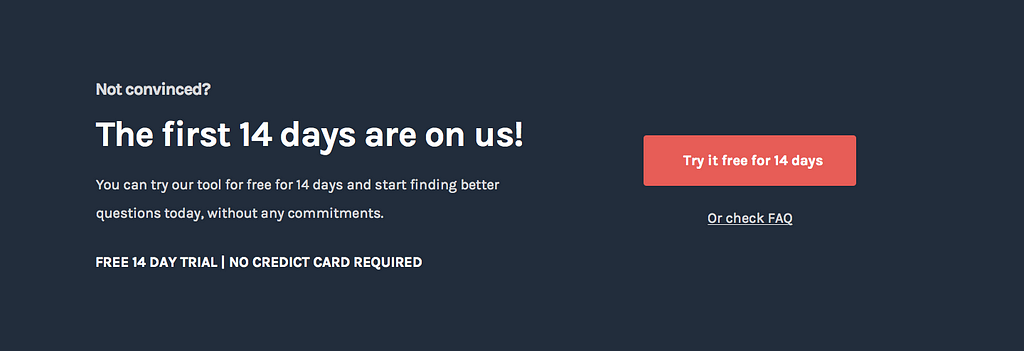
- There is no incentive to sign up, especially since they are after seen how much it costs and not seeing a way to try it out.
- Where’s the free trial? The website has one it’s not visible at the moment :P
- Very clear no-risk incentive to try the application out.
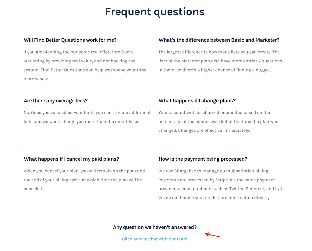
- Using the FAQ as another alternative CTA in case they have more things they need to know about the product.
The FAQ
- Nothing special here but make sure there’s always an easy way for people to get their questions/objections answered before they leave the page as that could be a lead you will never get otherwise.
- Remember…whenever a person asks a question they are around 20 people that had the same question but didn’t bother. Keep this in mind if you don’t want to lose leads for no good reason.
Want to know how I do it? 👇
This article was a deep dive on one of the steps from my 5 step process to help SaaS startups improve their conversion and revenue. Sign up from my free email course to go from very little leads to a website that converts potential customers!
 Get my free email course to learn more
Need help with your conversion?
Would love to discuss your problems so feel free to tell me about your current situation, needs or goals in the comments 👇 or …
I designed this section in less than 3 hours, imagine what I can do for your company with more time ;) 👇
Email: pedro@cortes.design
Further reading:
- How To Make a Conversion-driven SaaS Landing Page [2017 edition]
- Anatomy of a great Landing Page
- Design Landing Pages around Objections!
- The Biggest Landing Page Mistakes and How to Fix Them
- Breaking down a Conversion driven SaaS Landing Page (Designed to capture more leads)
How to get More Free Trials from SaaS Landing pages (+ real example) was originally published in Hacker Noon on Medium, where people are continuing the conversation by highlighting and responding to this story.
Disclaimer
The views and opinions expressed in this article are solely those of the authors and do not reflect the views of Bitcoin Insider. Every investment and trading move involves risk - this is especially true for cryptocurrencies given their volatility. We strongly advise our readers to conduct their own research when making a decision.
