Latest news about Bitcoin and all cryptocurrencies. Your daily crypto news habit.
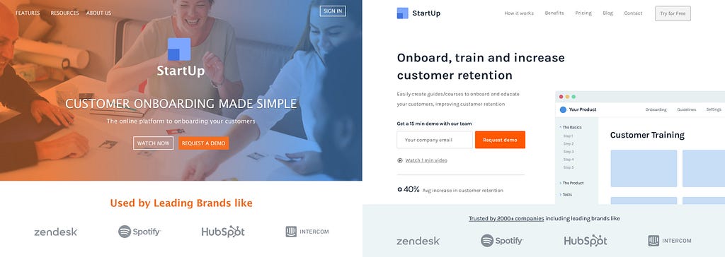 Normal vs Improved example
You only have 5(ish) seconds!! 😬
Let’s face it attention spans have never been so low plus people have never had these many choices in terms of software to use or companies to buy from, that means, that if you can’t get your potential customers to understand what it does and how it could provide them value at the top of the page you are hugely increasing the risk of not converting them at all.
Why fix the top of the page?
This is the first impression your company will have on a potential customer and if you don’t get it right you will lose up to 90% of people here, so explaining how you could improve this could increase how well the website converts overall. I also want to keep this article short and actionable so I’m focusing on one section at the time.
The company from this example
I’m using a fake company as an example based on the most common mistakes I’ve noticed with SaaS Landing pages and trust me this is still better than average…
What this “company” does
This company offers a tool where you can create courses or guides to help companies that require some training to use their tools and make sure their customers are getting the most out of the product, as a result, it helps to reduce the high churn rates this type of companies usually experience.
The problems with the current version
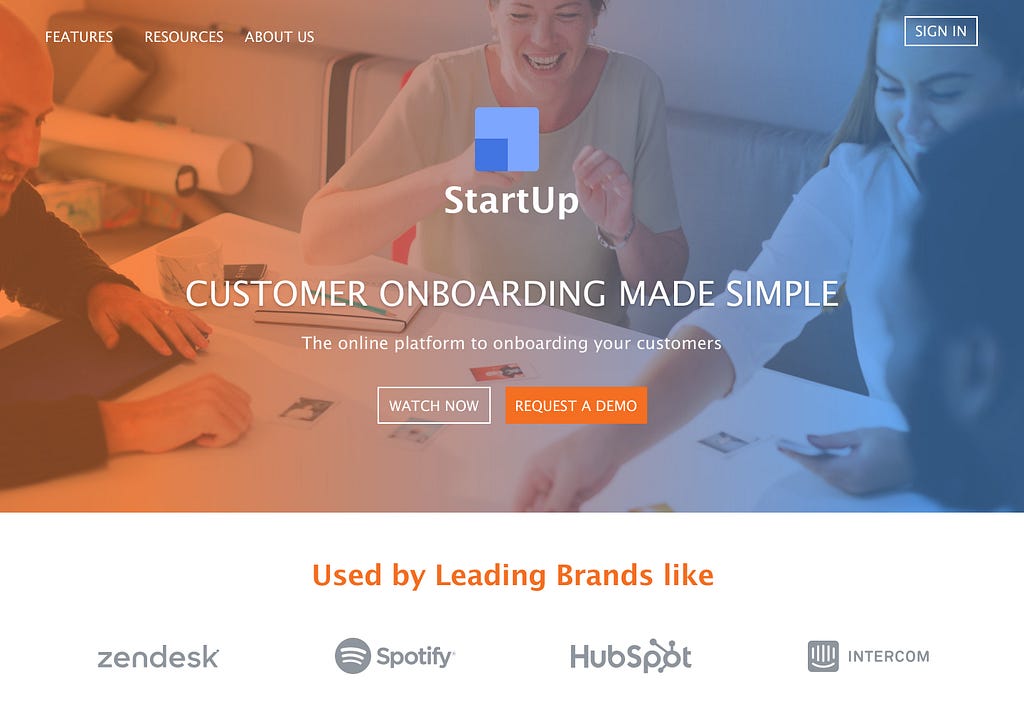 Your typical SaaS Landing page (A bit better than average actually)
- Due to the colors and the background image the headlines and CTA’s become way less readable and therefore less effective.
- The stock photo doesn’t create a very professional impression since those are used in tons of different templates and could make it seem like this company is not very established.
- I’d advise to never use ALL CAPS! It removes the big differences between the shape and height of the letters and just makes everything harder to read.
- The headline is very vague, we need to get a glimpse of what it does if we ever want people to keep scrolling (and not lose those leads FOREVER).
The formula to a killer impression
Don’t get me wrong, every single case is different but besides identifying the unique objections or selling points of each product service (step #2 and #3 of my free email course).
- Introduction/Headline — this title is supposed to start answering the first objection that comes up “What is this?”.
- Supporting text — take advantage of this paragraph (below the headline) to support and briefly explain how the solution works or what problem it will be fixing.
- CTA’s — some people might be ready to try it out either because they are more open to trying things out or because the problem you are solving is a HUGE pain point for them. Regardless, you should always have clear and visible CTA so if people are interested in trying/buying they won’t have to look for the CTA and trust me, this is more common than you might think …
- Preview — you can’t trust that people will read your copy (and trust me they won’t) so you need to show what the problem or your solution could look like to provide more context and support the other three key points of this section
Requirements for a good header:
- Briefly answers the questions “What it is?” and “What does it do?
- Creates interest to keep browsing the page so you can continue to pitch them
- Have clear CTA’s that have a lot of contrast and stand out in case people want to convert.
- Showcases what the solution or the problem might look like. As you can see from the fourth point with the image of the tool as an example.
How I would fix this
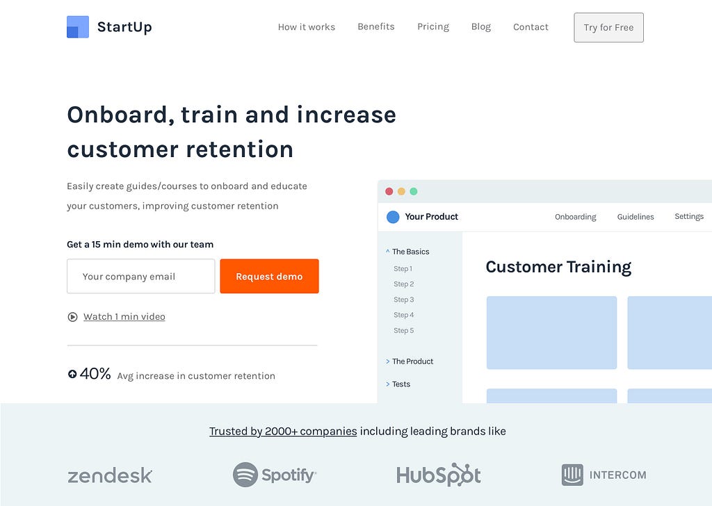
- This big and bold headline communicates what the software is used for and briefly mentions that the goal is increasing customer retention.
- To support the message of the headline, this paragraph below explains briefly how the tool can improve customer retention.
- Notice that this time I mentioned how long the demo would be to make it seem like it’s a lower commitment and give the control back to the potential customer. Normally, if you don’t add this type of incentives you can get some objections for not knowing exactly what this step his, in this case, potential customers usually fear that the demo can be a huge waste of time and that they will get spammed by the sales team afterwards which can cause them to hesitate otherwise.
- I used the same technique with the video by saying “Watch 1 min video” and make it seem like it’s shorter and/or the easiest way to understand the product.
- It’s important to showcase what you are offering either by showing an image of the product (like you see here) or by having an illustration/image to provide some more context.
- There are two forms of social proof here, like the statistic mentioning the avg increase in retention (aka the results their current customers are getting) and the logos of well-known companies. Their main function is to create authority around the product/service and improve the perceived value of anything that’s explained further down on the page.
Want to know how I do it? 👇
This article was a deep dive on one of the steps from my 5 step process to help SaaS startups improve their conversion and revenue. Sign up from my free email course to go from very little leads to a website that converts potential customers!
 Get my free email course to learn more
Need help with your conversion?
Would love to discuss your problems so feel free to tell me about your current situation, needs or goals in the comments 👇 or …
I designed this section in less than 3 hours, imagine what I can do for your company with more time ;) 👇
Email: pedro@cortes.design
Further reading:
- How To Make a Conversion-driven SaaS Landing Page [2017 edition]
- Anatomy of a great Landing Page
- Design Landing Pages around Objections!
- The Biggest Landing Page Mistakes and How to Fix Them
- Breaking down a Conversion driven SaaS Landing Page (Designed to capture more leads)
How SaaS Landing pages can create a killer impression in seconds was originally published in Hacker Noon on Medium, where people are continuing the conversation by highlighting and responding to this story.
Disclaimer
The views and opinions expressed in this article are solely those of the authors and do not reflect the views of Bitcoin Insider. Every investment and trading move involves risk - this is especially true for cryptocurrencies given their volatility. We strongly advise our readers to conduct their own research when making a decision.
