Latest news about Bitcoin and all cryptocurrencies. Your daily crypto news habit.
 Paul Gauguin, Pastorales Tahitiennes, oil on canvas, 87.5 × 113.7cm
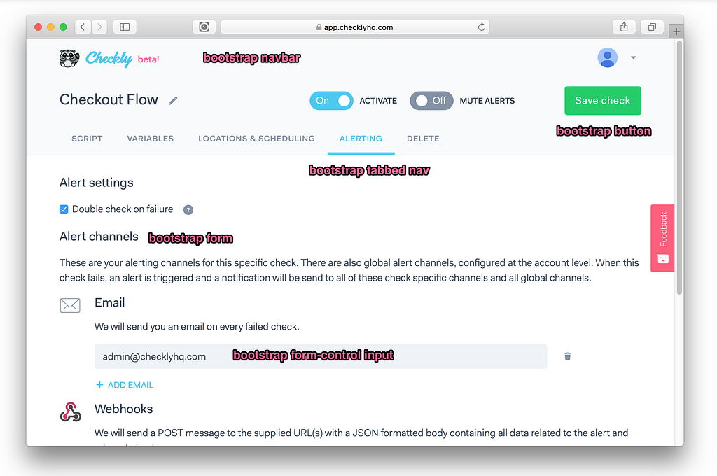
Getting a nice UI/UX on a SaaS app can be a real challenge for developers that know how to code, but struggle with design. I come from a software engineering background and while building https://checklyhq.com and blogging about it, I got a lot of questions about the UI framework I was using.
Spoiler: It’s just Bootstrap and some Vue.js 😱!
Here are my tips on getting the spit & shine on your UI. Regretfully, this will not be easy. Life is pain 😥. Entries are listed in order of (very) subjective importance.
1. The eye is more important than math or code
All your developer synapses will be firing at this one. But sometimes the exact grid and the equal divisions on margin and font sizes just plain look bad.
Trust me , I studied Computer Sciences but also Art History 😇 (actually true!). On a 12px grid? Header looks better with a 13.7px margin? Do it. For my brand logo I tweaked the heights and widths of its various parts until it “felt right”, screw what the CSS says.
 The Checkly racoon mascot, logo text and beta callout are all slightly bumped up, in or out a few pixels to make them look aligned in the center
What works mathematically doesn’t always work optically. This video is also enlightening.
2. Forms, modals & tabs solve 99% of your use cases
Using sites like Github, Travis, Stripe, Digital Ocean and even AWS should drive home one important lesson: Form based pages with tabs for sections and modals for the more complex and context sensitive interactions solve 99% of your issues. Even in 2018.
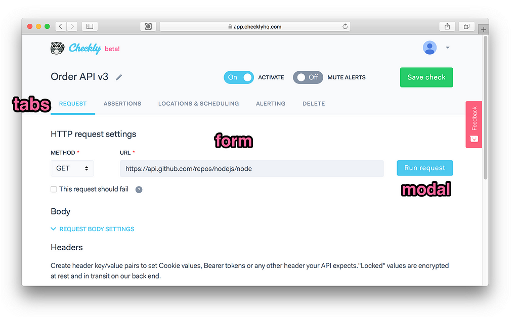 Edit page using tabs, a form an a button that triggers a modal.
When trying to create a screen, I always fall back to this pattern. Rarely does it not solve the issue in the most simple and elegant way.
3. Double your white space everywhere
My number one tweak to my CSS is adding more white space where there already was quite some white space. White space solves a ton of your information ordering and visual hierarchy issues. On vertical white space you can go totally nuts because people don’t mind scrolling. Landing pages are a good example where you can ladle on the white space.
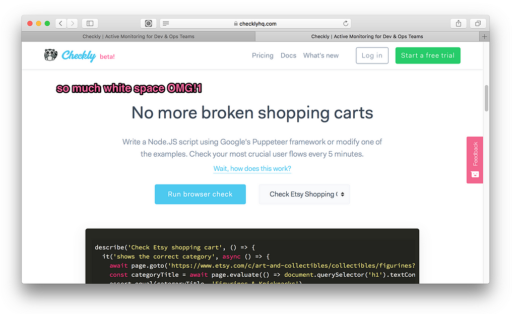 Checkly landing page with a lot of vertical white space
To not get lost in padding and margin jungle, use these simple rules.
- Create a $spacer variable in your SCSS, SASS, Stylus or whatever CSS preprocessor you are using. Bootstrap uses 1rem by default.
- Use multiples of that $spacer in you margin and padding definitions. Again, don’t be afraid to mix up the divisions between even or uneven. If it looks better it is better, i.e
margin-bottom: 1.5 * $spacer;padding-top: 1.2 * $spacer;
4. Just use Bootstrap and customize it a bit
Maybe this tip should have been at number one. Most of the advice above and the next tips in this post are solved in Twitter’s Bootstrap. Bootstrap gets a lot of crap about sites looking samey and still using jQuery.
These criticisms are easy to work around and they distract from the incredible amount of well made decisions in the framework due to its age and the experience of the people working on it for years.
So how to dodge jQuery if you’re building an SPA? Simple, just use something like (the awesome) https://bootstrap-vue.js.org/ if you are using Vue like me, or https://reactstrap.github.io/ if you’re in React land.
And how to dodge that canned Bootstrap look? Two options:
- The real way: start customizing by editing the metric tonne of Bootstrap variables. Small tweaks go a long way — more on that below. The docs on the Bootstrap site give you all you need to get going.
- The lazy way: buy a theme and reuse the(S)CSS. There’s some pretty decent theme’s on Themeforest’s Admin Template section.
Other frameworks like Bulma, Semantic UI are also great and look shiny and “modern”. However, I found they rarely offer the same cross browser compatibility and robustness once you start prodding around. I might be wrong.
5. Colours matter more than you think
Many developers completely underestimate how much colour determines the identity of a site/brand/product.
Medium is a great example. It is mostly white, has a very specific font — more on that later — and a very recognisable green brand colour (#018f69). Used consistently, it makes Medium instantly recognisable among the zillion other blog sites. Then there is Heroku purple (#79589F), Amazon orange (#FF9900)…you get it.
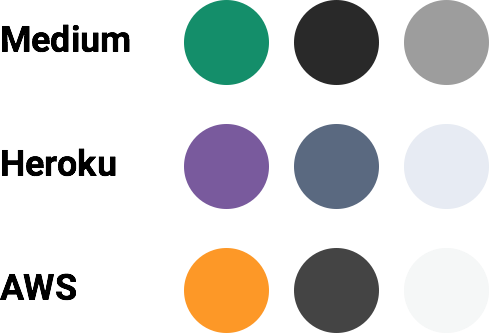 Medium, Heroku and AWS in three colours.
Notice the pattern: A high visibility brand colour, coupled with a high contrast dark colour for text and a low contrast gray tone for borders, backgrounds etc.
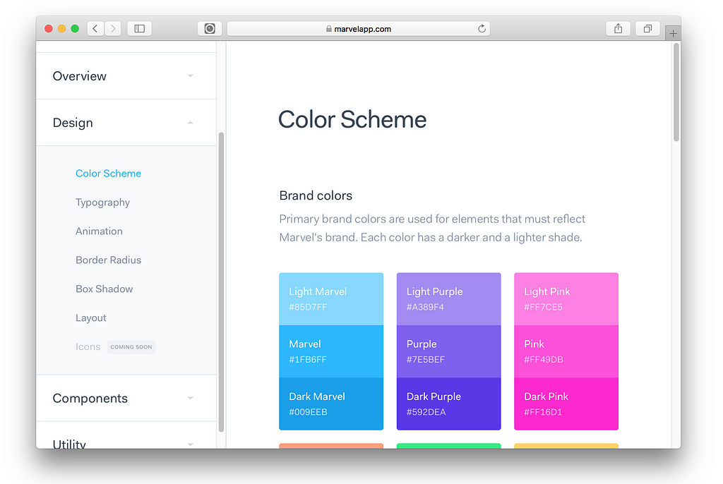
Tweaking the colour pallet is so easy and immediately sets you apart from all the non-customized Bootstrap sites. Here’s is Checkly’s _colors.scss file. Notice the brand-primary and the various gray tones.
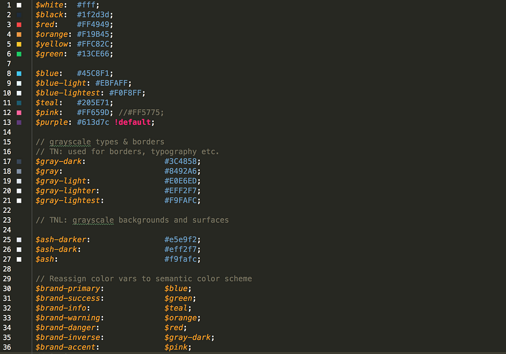 A modified Bootstrap colour scheme. The purple is still the default.
Not sure what colour fit with all the others? I found Adobe’s colour wheel a pretty handy tool to find nice complimentary hues.
6. Fonts matter more than you think
Fonts are like music in films. They come with a ton of character, intent and emotion even when they are rarely in the main feature. A bog standard scene of a man walking along some grassy field can convey victory, sadness or suspense just based on the soundtrack. Similarly, your site can be serious, business-casual or leisurely just based on the font. Try sticking Comic Sans on a banking site and watch the world burn.
Google Fonts is hard to beat to start exploring how fonts resonate with what you are trying to say with your design. Small tip: use the “custom” text option to use any text that is relevant to your project.
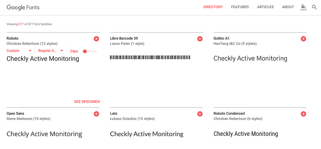 Google Fonts with custom text option
For Checkly I chose a somewhat popular, non-free, font called Fakt Soft Pro. This font straddles the middle of the serious/leisure divide: exactly what I tend to express in Checkly’s product marketing: easy and friendly to use, but very serious in its application and problem solving ability.
7. TEXT EVERYWHERE
In a typical SaaS site, you can never really have too much text. Not the long copy “War and Peace” type text, but more the right words in the right format dotted around your page.
This can get messy, so getting a “visual hierarchy” for all your text elements is SUPER important. And you have WAY more text elements than you think. Let’s break down a typical screen:
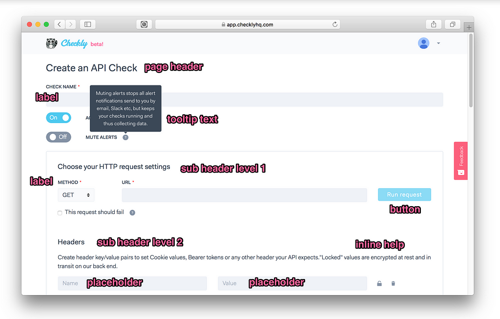 Different text types on a typical screen
- Headers & sub headers chop the page up into digestible sections. Think h1 to h6 .
- Labels tell people what specific input type they are dealing with. Normally small, handle uppercase pretty well.
- Inline help or just a paragraph (with p element) tells people what something does when it is not immediately clear. This should be your “normal” baseline font.
- Tooltips are just a sneaky way to get more inline help in without turning every page into a declaration of independence. Use liberally against a contrasting background.
- Placeholders kinda only work on text field inputs, but are again ways to sneak in more help text without cluttering up the place. Lower contrast is fine to offset the actually text the user types in.
- Buttons can take icons, or can be uppercased. Depends on your style. I personally tend to go light on the icons. Also see https://grumpy.website/post/0Px1O7Ukl
Rule of thumb #1: The larger a font, the skinnier it should be, the smaller the fatter.
Rule of thumb #2: HTML already has a visual hierarchy built in: h1 h2 h3 up to h6 and then p. For each element, change up at least two of the following attributes: font-size, font-weight, margin-bottom, letter-spacing, text-transform: uppercasein such a way that each element is at least different in two ways from its neighbours. Then just consistently use h1 to h6 . Also good for SEO!
8. Steal
So you thought I came up with these pages of wisdom by myself? Ha ha ha…sniff…No. I stole most of it from the insanely generous open style guides from some great SaaS companies. “Good artists copy; great artists steal” goes the (totally overused) saying…but REALLY great artists tell you whom to steal from! Here are my favourites:
Need more research? Here is a site that collects all of ‘m Styleguide.io. It’s just nuts that you get to benefit from all the insights, learning and design talent at these companies. Learn, observe and maybe steal a little bit of inspiration and best practices.
9. HTML emails are terrible
Probably worth a full post, but making nice HTML emails is way harder than it should be. It’s HTML tables all the way down. No way around it. In general HTML emails fall into two categories:
- Mostly anonymous: Newsletters, welcome messages, promotions etc. They have some level of personalisation, but the content is 99% the same for everyone.
- Mostly data driven: transactional messages based on specific user accounts and user’s actions in your app. For Checkly these are for instance the alert messages for checks with specific response times and error messages and a weekly summary email on how each check for each account did in the last seven days.
For the first category, try to just use Mailchimp or similar services. You can add a bunch of personalised data items and it will serve you well. You will age less.
For the second category, I went on a wild goose chase to find the one framework or tool that allowed me to code HTML emails similar to how I build web app screens. This is what I ended up with:
- I use the pretty great mjml.io and its pseudo HTML markup.
- I use the also pretty great html-templates.js to actually code the templates so I can use pug. All Checkly HTML is actually coded with Pug templates.
In my Webstorm editor, this looks as follows:
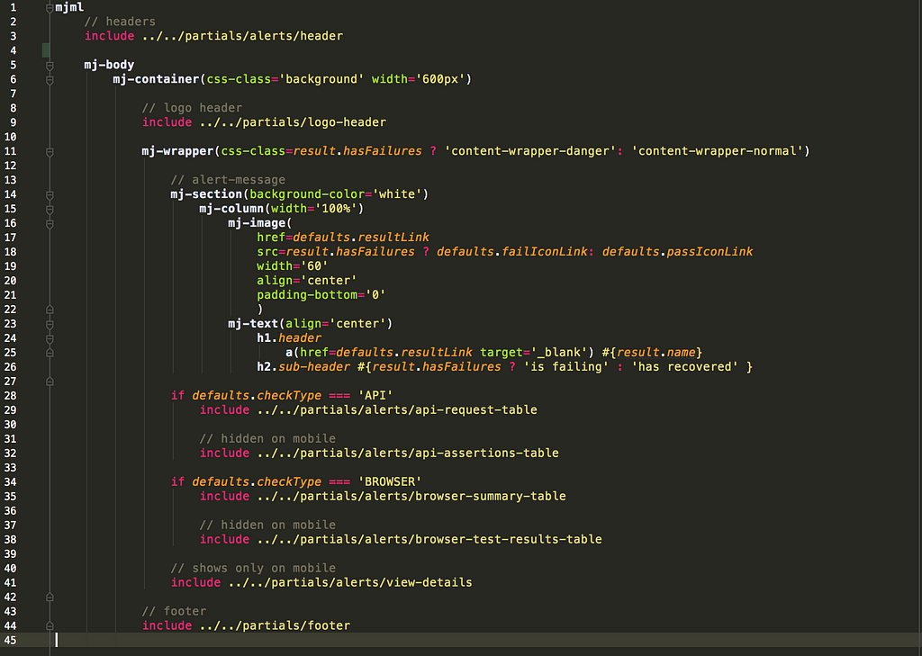 An HTML email template WITH NO TABLES IN SIGHT
The awesome thing is that it makes designing and editing these types of emails a lot easier. You can use the Pug logic functions like if statements together with partials and the mjml.io tags that hide all of the nested HTML tables.
10. From mock to code
At former jobs I had Real Designers™ and Real Front End Developers™ and we had people worrying about brand and copy and style guides. Most customer facing web stuff went through the following process:
- Brand/Marketing sets identity
- Designer designs web & mobile screens in Sketch
- Sketch is further developed in Framer and/or Zeplin
- Front end developer turns designs into code
Not all of these steps are always necessary for each iteration or each project. However, if you are somewhat handy with Sketch or a similar tool, I would recommend at least FULLY designing one or two screens before you start coding. Not ALL screens. Not every modal or interaction.
Just use the correct brand colours, the correct font and try to get the margins and white space right. Consider it your poor man’s version of the full blown UI style guides mentions earlier. Doing this will considerably cut down on your development time and give you a guideline for all other screens.
I’m building an active monitoring solution for dev & ops team at https://checklyhq.com. Sign up for a free trial! Not sure yet? Try just clapping 👏 below! or…
Cray cray! 🍍
10 UI & UX tips for developers building SaaS apps was originally published in Hacker Noon on Medium, where people are continuing the conversation by highlighting and responding to this story.
Disclaimer
The views and opinions expressed in this article are solely those of the authors and do not reflect the views of Bitcoin Insider. Every investment and trading move involves risk - this is especially true for cryptocurrencies given their volatility. We strongly advise our readers to conduct their own research when making a decision.
