Latest news about Bitcoin and all cryptocurrencies. Your daily crypto news habit.
Hotel website design should be beautiful and attractive to establish brand and improve selling. Here are 9 best hotel website design examples stand out in a crowd.
A comfortable accommodation experience will be a bonus during a nice trip. So it becomes a trend to book hotels on the Internet through the hotel websites. It’s a guaranteed way to obtain a favorable impression and increase sales by make a smart hotel website design.
9 Best Niche Hotel Website Designs You Should Have a Look
1. Hotel Risveglio Akasaka
Location: Japan
Hotel Website Design Features:
- Dynamic weather icons
- Hotel interior background
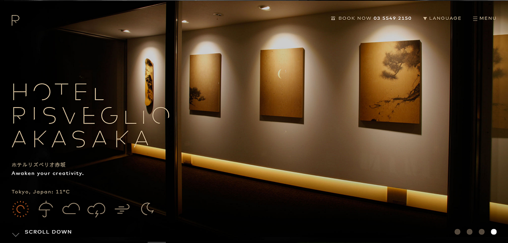
Hotel Risveglio Akasaka is a hotel that opened in 2015. Based on user feedback, it is a hotel reflecting design in all aspect such as the furniture, interior decoration. Both the design of the hotel room and the hotel lobby have won praise from users.
The overall UI design style of the website is concise and clear. The homepage of the hotel website uses the hotel interior decoration as a background. With simple fonts and icons, the interface is clean and elegant.
The display of the carousel diagram provides the user with a multi-dimensional sense of space experience. The colors of the architectural design and lighting are very comfortable and not monotonous.
Dynamic weather icon at the bottom of the website looks eye-catching and sweet. It’s too easy to be ignored for other hotel websites. But Hotel Risveglio Akasaka did it very well from the terms of user experience. Besides, the scroll navigation naturally leads the user to the booking page and improves the web page conversation rate and order quantity.
2. Casangelina
Location: Italy
Hotel Website Design Features:
- Page animation
- Page background music
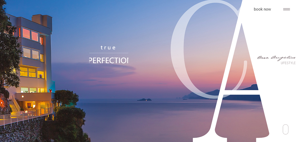
Hotel Casangelina, one of the top ten cliff hotels in the world, is located on the cliffs of the Amalfi Coast. Guests can relax in the panoramic outdoor pool on the hotel’s terrace. There is a Moroccan-style bar where guests can enjoy a glass of champagne. Of course, private kitchen and butler service are included. The elevator descends 200 steps to the beach and can take a private cruise on the hotel to other islands to enjoy the sunshine.
With a minimalism UI design, the fusion of the pictures and fonts in the scrolling area enhances the immersion of web browsing. That is a good combination of UI design and user experience. The background music and dynamic hotel panorama videos added the visual reality, which allows users to feel the elegance of the entire hotel from its web design.
3. Harbor Suites
Location: Greece
Hotel Website Design Features:
Responsive design
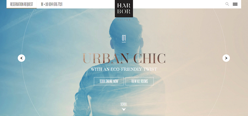
The navigation design of the website reflected that it is a hotel designed for business and leisure travelers. The excellent location provides great convenience for business people or leisure tourists.
The responsive layout of the website keeps the CTA in user’s visual focus on PC as well as mobile devices. The online booking, room preview, and site navigation always be noticeable for users which can guide the user to open the web conveniently and quickly.
The evolutionary page animation and card design are good examples of website introduction and conversation increase.
4. NISEKO HAKUUNSO
Location: Japan
Hotel Website Design Features:
UI design for seasons
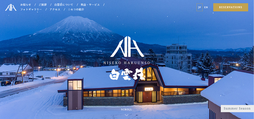
Different UI design sets for winter and summer is a creative design for hotel websites. The wafting snowflakes and distant Mt. Fuji echoed the hotel’s theme of ‘white clouds’. Although Snow’s dynamic UI design is eye-catching, it does not prevent users from noticing the white navigation bar on a dark background.
5. Swissotel
Location: Swiss
Hotel Website Design Features:
Banner design
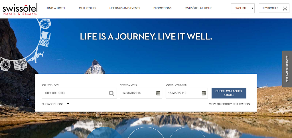
Swissotel is an international hotel chain with white backgrounds and dark shades. Banners are neatly separated, making the site as a whole look neat and clean. Please note that, the blankness of the CTA position makes your web page layout clearly contrasted, and also a good way to cater for users’ reading habits.
Some of the resort hotel website designs:
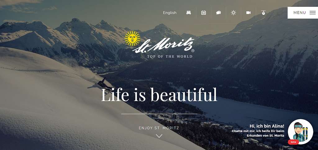
6. Stmoritz — Top of the world
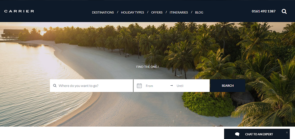
7. Carrier- Enjoy the luxury customization holiday
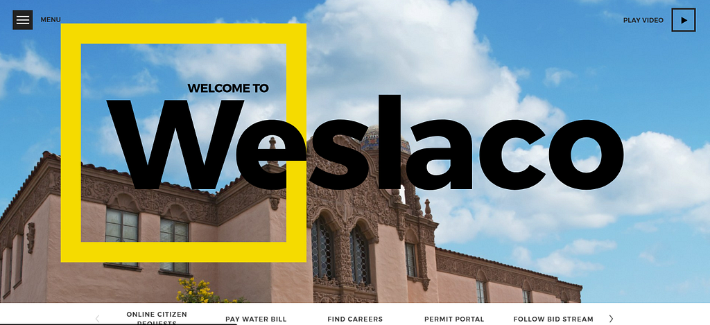
8. Weslaco- City of Weslaco. TX
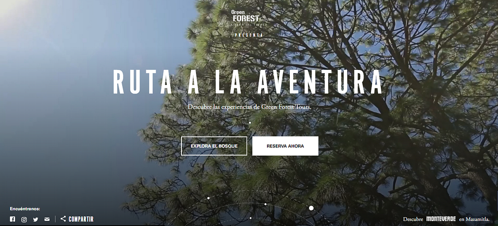
9. Ruta a la Aventura- Website for forest adventure
How to create a modernized hotel website design?
Maybe you can follow the 5 rules from my point of view:
1. Responsive design: The hotel websites should be well supported on all devices.
2. Excellent user experience: Simplified website browsing process can bring a good user experience. Because if it is difficult to find a common page or arrive at the reservation page to complete the purchase, it is likely to lose many potential users.
3. Storytelling: Does your website understand what’s the next step once a guest checks into the hotel? Can it be smart to guide the next trip?
4. Convenient booking: Make the booking process as simple as possible for a maximum return. The tedious user information and payment information filling may result in the loss of users.
5. Visual reality: The best and most effective website is a website that attracts visitors to spend time exploring. Professional photography and video are great media for storytelling, especially for hotels and resorts.
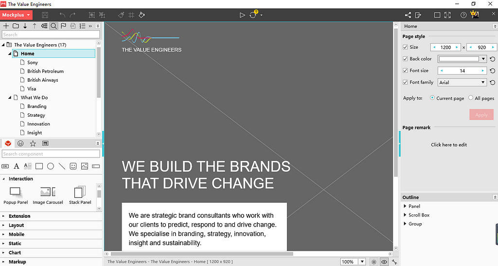
The molding of a hotel website design generally goes through a lot of design processes. From the very beginning, at the stage of prototyping design, it decides the page layout of the site. Good tools will help you to do more with less. I’ll take the example of a website prototype produced by Mockplus as an example to show you the charm of this rapid prototyping tool.
How to make your own hotel website design by Mockplus from the prototyping stage?
Before getting started, let’s see what in common of the 9 best hotel website design examples listed above:
- Large picture background
- Hotel Name or Hotel Theme Logo Centered
- Navigation bar information is displayed on the edge of the site
- Feature icons
- GIF dynamic pictures
After summing up these common points, we can start to make the hotel website design or other types of website design with Mockplus.
Tips: If you are an individual user who likes to prototype freely and quickly, you can choose Mockplus Personal Edition. If you are a small team of about 5 people and need teamwork and project management, you can use the Mockplus 3.3 Team Edition feature. (New in Mockplus3.3, experience team management and all professional features for free!)
Okay, let’s do it! Oops, you have to handle the Mockplus account and software in advance. (If you have, log in it. If not, you can register an account for free.)
Step 1. Open the software and choose to create a web project.
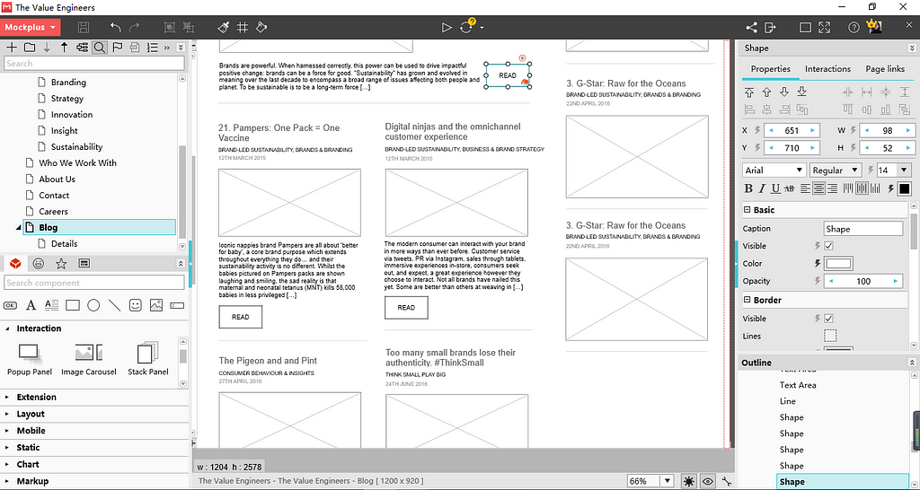
Step 2. Be familiar with the software interface:
From left to right, the left side is the common tools menu bar, hidden project tree, icon library, component library, and its subdivisions.
The middle area of the software is the prototype design interface
On the right, it is a combined panel of component properties, the interactive parameter properties, and the page properties.
Step 3: Use the “Image” component to import the logo image and the large page image as the background of the web page
Step 4: Use the Mockplus Quick Functions to make fast design:
Grid and AutoFill functions to quickly create pages in similar formats.
The component style function can simultaneously set styles for multiple components of the same type, saving time and convenience
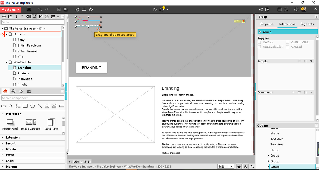
Step 5: Add interactions: Interactions between pages, or interactions between components. (How to set interactions in Mockplus)
Step 6: Click F5 to preview or export demo package preview in real time.
Conclusion:
The 9 best hotel website design cases above are very beautiful and inspirational. Hope these website design examples will motivate you to make more great designs. You can find more web design inspiration in TheHotSkills. Practice makes perfect. It’s not bad to practice your design principle and skills with Mockplus, no matter the website prototyping design or mobile app prototyping design.
Originally published at www.mockplus.com.
9 Examples of The Best Hotel Website Design You Cannot Miss Out! was originally published in Hacker Noon on Medium, where people are continuing the conversation by highlighting and responding to this story.
Disclaimer
The views and opinions expressed in this article are solely those of the authors and do not reflect the views of Bitcoin Insider. Every investment and trading move involves risk - this is especially true for cryptocurrencies given their volatility. We strongly advise our readers to conduct their own research when making a decision.
