Latest news about Bitcoin and all cryptocurrencies. Your daily crypto news habit.

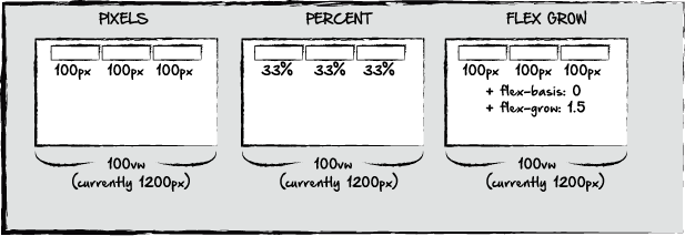
Let’s face it, laying out a website can sometimes be challenging, especially when some of the content may be dynamic. At times, we may need to add or remove content based on user input, or other conditions. Let’s take for example, the following:
Here, we have the same window, and we want buttons evenly spaced across a section of the page. It could be a navigation bar, or some other content block. Typically, an easy way to do this is by defining the pixel width of each button, as in the first example. If we know the width we want our page to be, we can simply measure out the pixels we want each button to be.
A second option, as in example #2, is with percentages. If we had 3 buttons that we wanted to extend the width of the screen, if our window is set to 100vw, we could set each button to roughly 33% to accomplish this. This would also work if the container or window were set to pixels instead.
The third option would be to add flex basis and flex grow. If our dimensions are set to 100px, or whatever the case is, we can add a flex basis. Flex basis is similar to min-width. It basically says, 100px is the base width for our content. But with flexbox, that width will change depending on what additional content is added or taken away. The flex basis and flex grow is determined on what negative space is available in the container of the buttons. if there are three buttons with 100px widths and a flex basis of 0, we could then set the flex grow to 1.5. This simply means that if any of the three buttons are removed, the two remaining buttons will adjust their width to account for the extra space, but using 100px as the basis for their adjusted widths. Let’s look at how this content might change if we add or take away content.
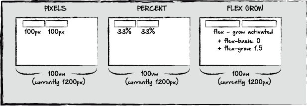
Here, we’v taken away one of the buttons in each example. The elements defined by pixels or percentages would remain the same. Depending on our alignment settings, the content might shift towards the middle of the screen, and of course the percentage defined elements may change if the container they are in is defined by viewport width, but the consistency of both examples would not always be great.
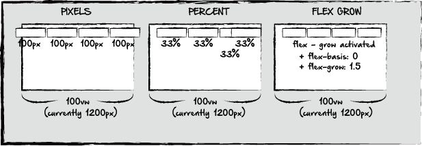
In the third example, when we remove an element, the other two would adjust based on the 1.5 flex grow. If our flex grow were set to 0, the elements would behave exactly like the elements in the first example, and would remain 100px in width. We could also change the flex grow of each component individually. If our first element were a 1.2 flex grow, and our second element were a 1.7 flex grow, then when the third element is removed, the second element would be larger than the first, as it would take up more of the remaining space on the screen. Let’s look at what would happen if an element is added:
In the first example, an additional element on the screen would mean that the existing elements would run off the viewing window, or container. Percentages would be even trickier. As each element still wants to take a percentage of the screen, they would either overlap, or react just like the first example, depending on any z-index values we have set. In either case, the outcome is less than desirable. In our third example, the additional element creates no problem, as the remaining elements adjust to accompany the extra element.
A word of caution here, although this seems great, imagine if we added 5 extra elements. At that point, we would either need a row wrap feature, to create a new row, or come up with an alternative solution, as buttons that are 2px wide, may not be the most aesthetically pleasing.
To illustrate some of these examples, here’s a test page I created:
http://taboo-carpenter.surge.sh/
In the navigation menu across the top, the flex grow function is not activated on the element itself, but rather it’s pseudo class, or hover state in CSS. Each element is given a min width, and the container is set to flex with a row wrap feature, so that it wraps if the window is scaled down.
This same effect could also be accomplished with something like the css transform: scale property. However, the big difference here is that on the mouseover event, the size of the active button is increased, but the size of all the other buttons is decreased at the same time, so the total amount of space being taken up is the same.
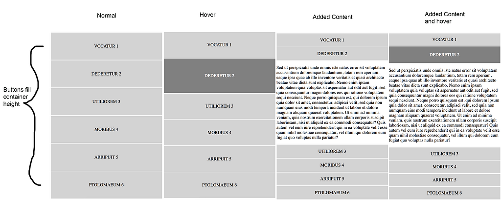
In the menu buttons to the right, in column format, this container is set to take up the same width as the content to the left, with each button taking up just enough space to fill that content. Here, you can see how the flex grow feature works if content is added or taken away. On it’s hover state, the flex grow feature is activated, making that element larger than the other elements in the same column.
On click, content is added below the element. The new element has a much larger flex grow, of about 2.5, than all of the other elements. The new content is still in the same container, and so all of the additional content scales to fit in the container, but the new content takes up the most space.
When another element is clicked, the content is removed from the first element, and new content is added to the clicked button. Both of these elements also have a flex wrap feature that allows them to normally exist as row elements, but flip to column view if the window is too small.
In summary, flexbox is a fantastic feature that allows for unparalleled flexibility in web layouts. Let me know if you have any feedback. Thanks!
The Power of Flex-Grow was originally published in Hacker Noon on Medium, where people are continuing the conversation by highlighting and responding to this story.
Disclaimer
The views and opinions expressed in this article are solely those of the authors and do not reflect the views of Bitcoin Insider. Every investment and trading move involves risk - this is especially true for cryptocurrencies given their volatility. We strongly advise our readers to conduct their own research when making a decision.


