Latest news about Bitcoin and all cryptocurrencies. Your daily crypto news habit.
I’ve been toying with two threads of thought since week 3:
- My confidence in bitcoin as a long term investment is growing stronger.
- I’ve decided that I want to prove to myself the validity of various indicators and patterns.
So I guess I’m a mix of optimistic and sceptical, much like I am about my life in general.
Bitcoin as a long-term thing
A small part of my increased optimism this week came from hearing that a dude called Tim Draper (not the famous curtain magnate) predicts that bitcoin will hit $250,000 by 2022.
Now, I’m not a sucker, and first predictions ain’t worth the tweet they’re written in, but this is a chap who — way back in 2014 — predicted bitcoin would hit $10,000 in 2017 (at the time, when it was only a few hundred bucks, that must have seemed as silly as a quarter-million does today).
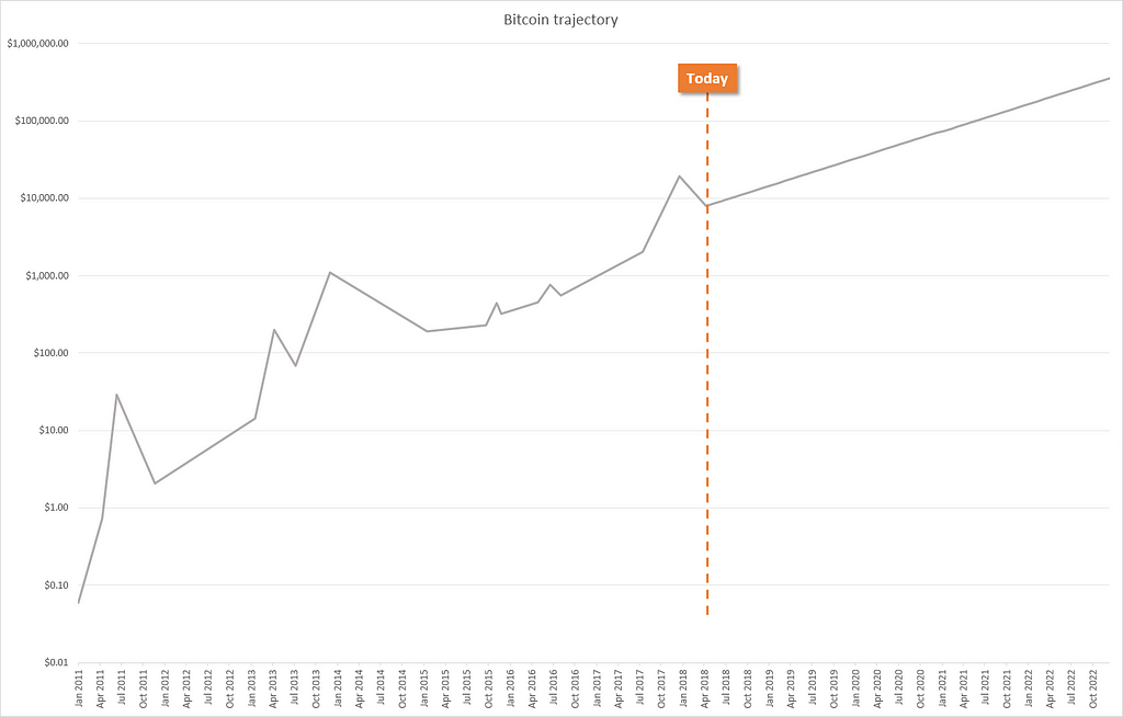
I extended one of the charts that I made last week to see what a journey to a $250,000 would look like.
This is the chart that plots the start, high, and low of each of the six big bubbles, extended out to a quarter-mil by the end of 2022.
This is wildly speculative (on my part, Tim probably thought about it intelligently), but there’s nothing outrageous about that chart. On the face of it, there’s nothing wrong with the way that line has been extended.
Here’s my plan that will probably morph into something else…
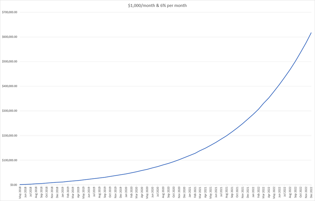
I reckon I’ve got about $1,000 a month that I don’t really need (it’s just wasted on things like charity and paying off my home loan at the moment). I’d be happy to throw this money into bitcoin for the long term (many years).
Assuming that each month the value of bitcoin increases by 6% and I buy another thousand bucks worth of bitcoin, that ought to grow to a shade over $600,000 in a smidge under 4 years.
And here’s an interesting thing, by the end of this chart I would have 1.75 bitcoins (not a typo). And if things proceeded consistently through to the end of 2025, I would have 1.78 bitcoins (and 7.2 million dollars).
Maths is weird (as is dollar cost averaging).
Of course, this is all childish make believe, but at least I’ve got an idea in my head. If I put away $1,000/month I’m not going to be retiring on the returns any time soon (and I still have to get up and go to work tomorrow) but if all goes according to plan I’ll have a nice comfy pile of money.
OK that’s enough dreaming, on to something a bit more down to earth.
Support and resistance
I started my week by resetting my assumption that support and resistance lines were useful. If they are never useful as a way to select buy and sell points, then I can get way ahead of the curve by knowing that I can ignore them.
But if they’re a useful tool, then it shouldn’t be difficult for me to find plenty of examples in bitcoin’s history that demonstrate their ability to predict upcoming price movements.
What I found
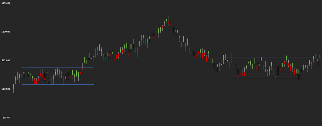
It took me all of 5 minutes to come across a pretty clear example of support and resistance lines:
You can see the price bumping up and down between the ranges before ‘breaking out’, but then settling back into a range a little while later.
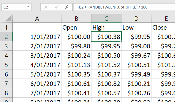
I made this chart by randomly generating some numbers in Excel like so:
I had to regenerate the random numbers three times before they created a chart where my stupid, excitable mind yelled “hey, there’s some support and resistance lines!”.
I made this chart so that I can remind myself that my caveman brain really wants to see patterns where they don’t exist. And that my big ol’ lump of head meat is especially keen to see patterns when they can be backed up with some armchair crowd psychology.
I even 2D printed the chart and hung it on me wall. I will refer to it any time I think I’ve seen a support or resistance line in the bitcoin chart — to keep myself in check.
I should note that even though I’ve gone through every day since the start of 2014, I’ve only looked at the daily chart. No hourly, weekly, etc charts.
A brief history of resistance lines
Below, I’ve made a note of every place where the price of bitcoin saw ‘resistance’ (there were nine such occasions). This is defined (by me) as having highs from 3 or more days landing within a 1% range.
The examples are not cherry picked; I’m out to disprove this charting nonsense and save myself hours of headaches and thousands of dollars by not being a sucker.
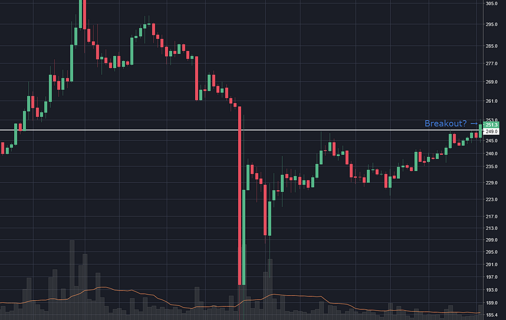
I’m going to do a screenshot of the point in time where I would need to make a decision. (Surely it’s important to be able to pick the pattern at the time it’s happening, right?) For most of them, I legitimately didn’t know what would happen next at the point when I took the screenshot.
Then for each instance I’ll do another shot to reveal what happened next. It will be fun.
Website idea: flashcard style tests of technical analysis skillz. It would show a screenshot of a pattern, with no context of date or what stock it is, and you have to guess what will happen next. On the ‘answer’ card, you’ll have commentary from an expert on what happened and why. (And the occasional “we don’t know” to just keep it real.)
Let’s look at some charts.
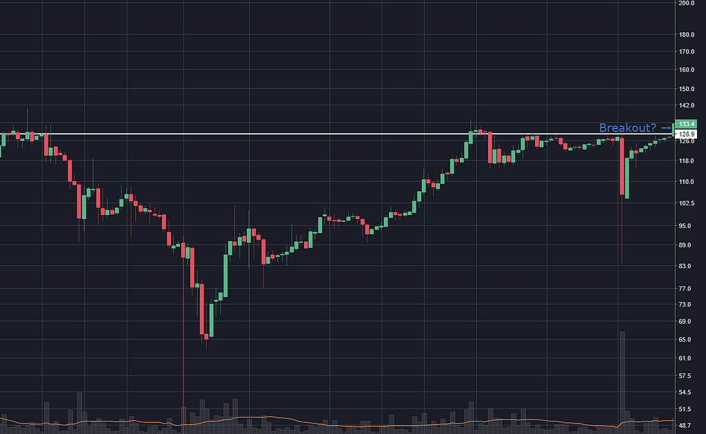
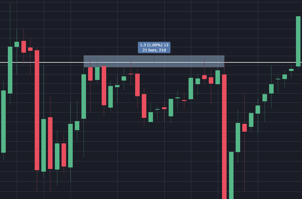
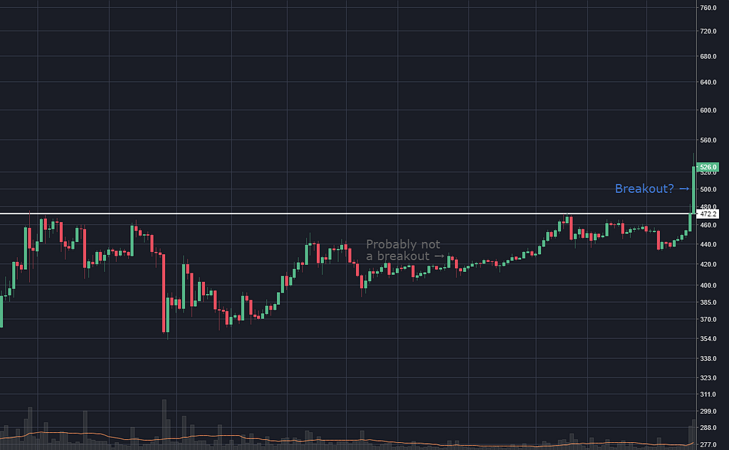
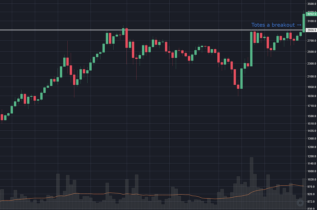
This chart shows 10 days with similar tops in a three week range, then one more a week later. Just for this first chart, let me zoom right in and show you the bit I’m considering to be a zone of resistance:
So, the theory goes that the last bar in the chart has shown that the price can break through that barrier (even though it wasn’t much of a barrier 6 weeks earlier — four bars closed above it) and now it is free from its shackles and will reach for the stars.
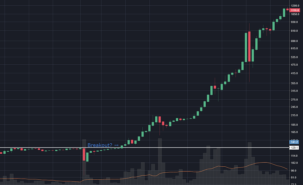
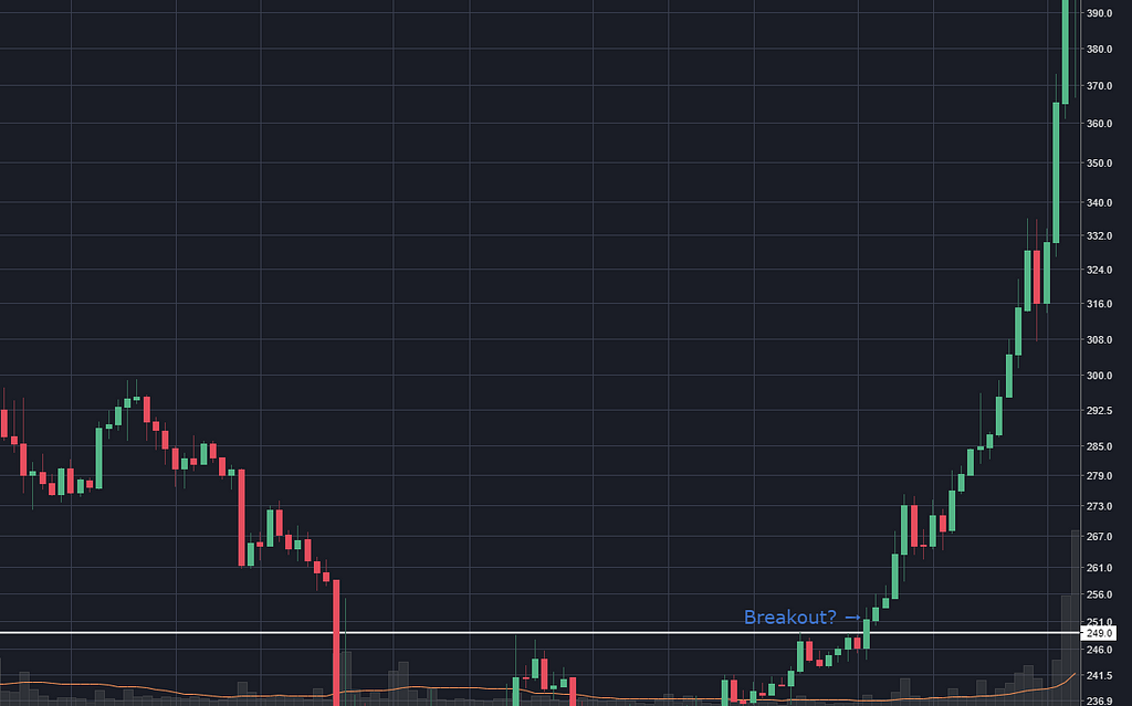
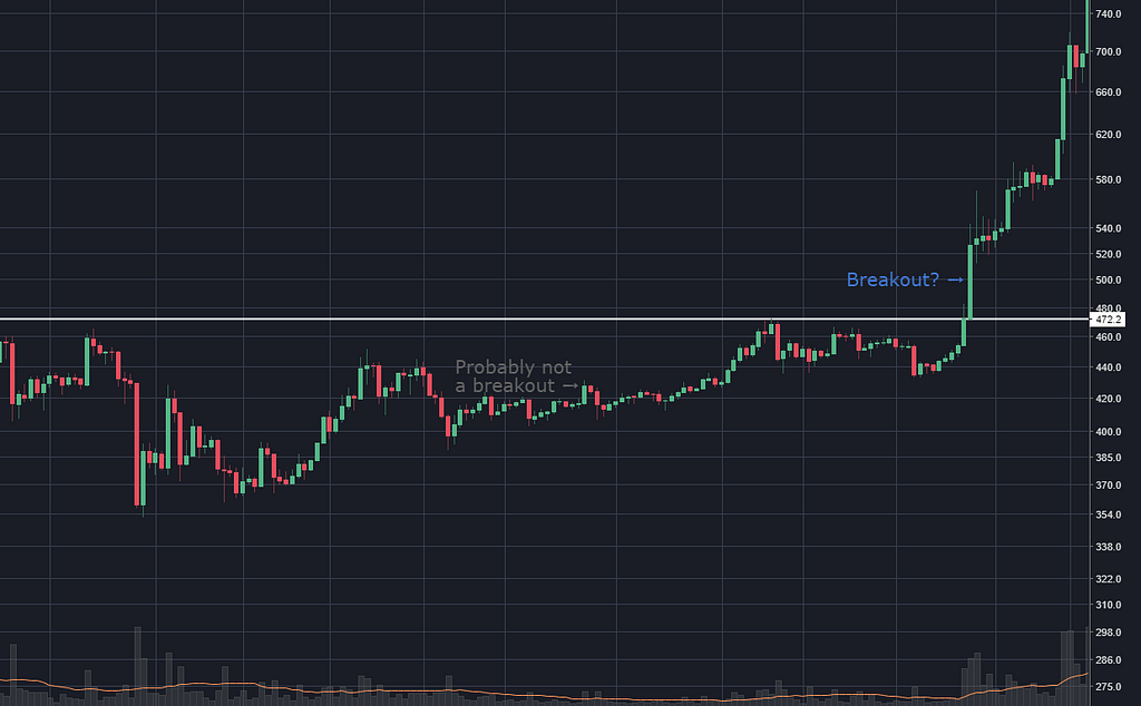
Which, as it turns out, is just what it did…
A jump of 10% over the next two days (and then 800% over the next 6 weeks, but I don’t care about that, it just looks cool).
I’m still not at all clear on how I’m supposed to know when to sell. I’m hoping to see some sort of consistency like, there’s always a 5% jump within a few days. Or, if I always get out, say, two days later, it’s a winning strategy.
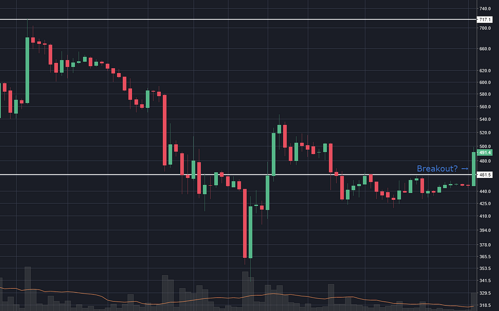
20 May 2014
OK before I type this I have to say I’m listening to the new Perfect Circle album, Eat The Elephant and it’s great.
I would be cautious about this as a signal (I’m typing this without knowing what happens next).
- It’s in a downtrend, that’s swimming against the current
- It’s a ceiling that the price was above just a few weeks before
- The price only hits it 4 times (give or take half a percent). That’s the sort of thing I can see in my chart of fake numbers.
I’m literally dying to know….
Yeah OK. So my concerns were baseless.
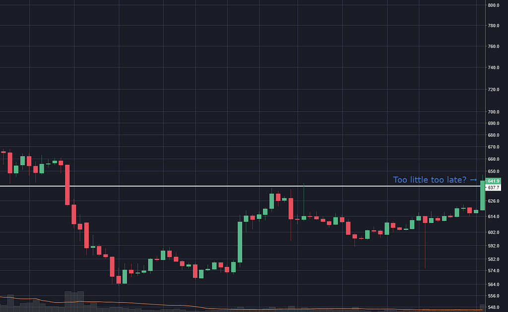
30 May 2014
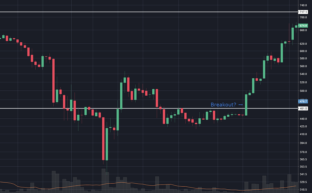
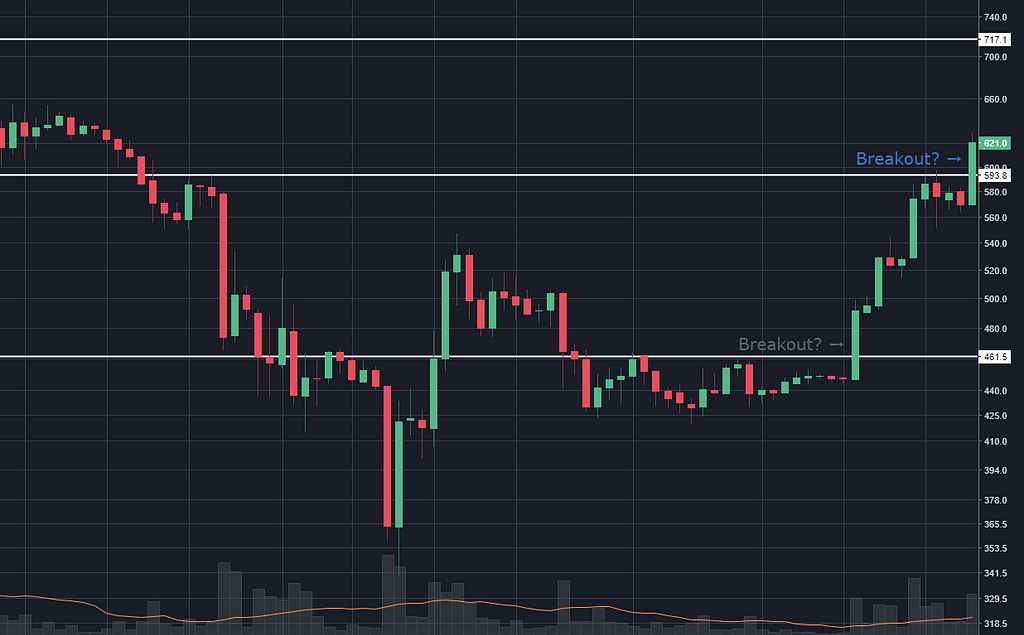
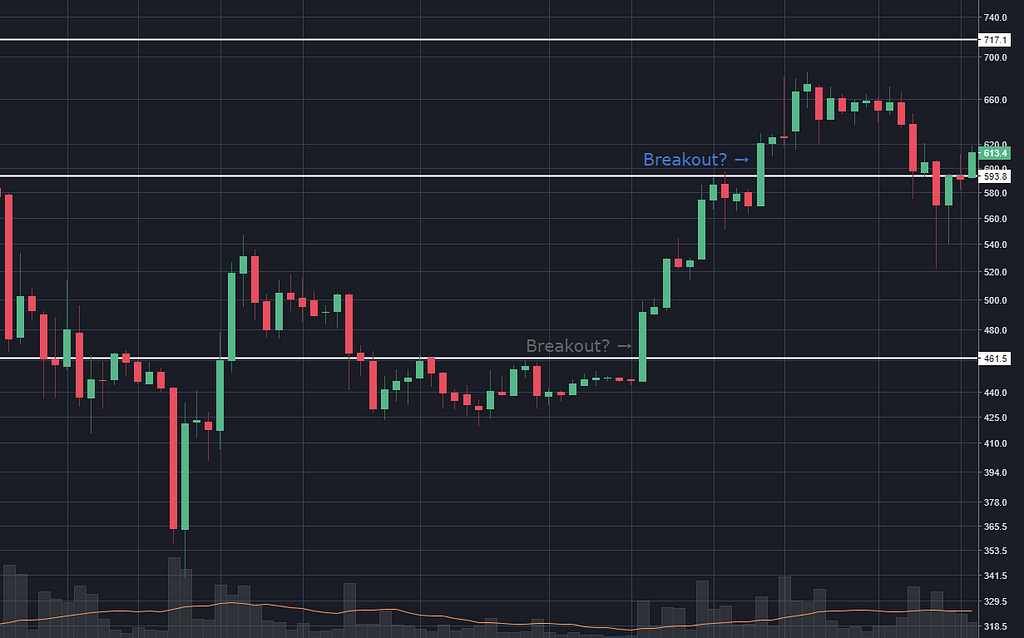
Only 10 days after the above, another weak (in this guy’s opinion) signal occurred.
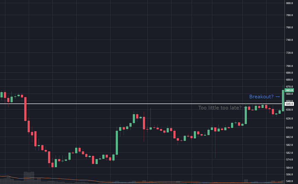
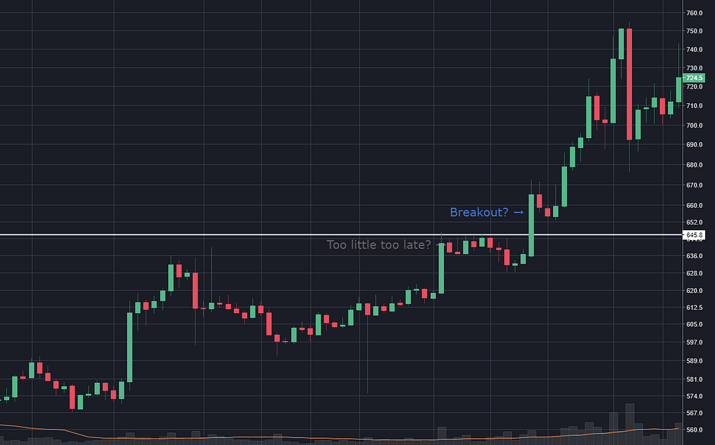
The price twice nudged up against that white line (at $593.80) two months ago. Then twice more in the last 5 days. I feel like this is searching for a pattern more than I should be. But it’s not just the tops touching the white line, it’s the big green bar going right above it, too.
Let’s find out together.
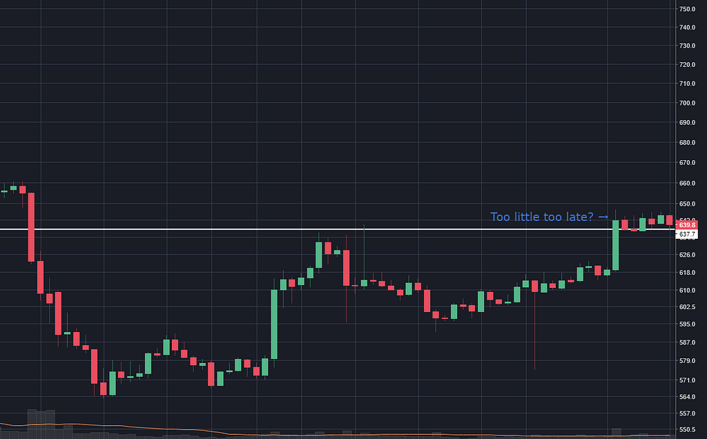
The price jumped up 8% in three days then flailed about and fell over. Is there a correlation between the ‘strength’ of the signal and the strength of the action afterwards?
Common sense says yes, we will see what the data says.
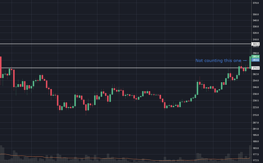
Non-example: 10 July 2015
For what it’s worth, this is something I’d consider close-but-not-quite:
The price touched the white line at $270 twice, months ago, then once more a week ago, but then kinda walked all over it for a bit and then showed a spike. So I would not have considered this a good signal to buy.
As time unwound, the price made me feel dumb for two days then all sorts of righteous.
This is the fascinating stuff to me. Does that mean that some traders considered this line to be resistance, and started buying when it was broken, but not enough of them? Or is the spike a result of a news story and the pattern had no impact at all?
13 October 2015
This one is pretty borderline to me. (Edit: in fact, I’ve twice gone through the whole bitcoin chart day-by-day, and I missed this the second time.)
The price hit resistance six times. But, it wasn’t trying to break through some new high, it had quite recently been way above it. And the ‘breakout’ went a puny 1% above the resistance line.
With all I know now I wouldn’t have treated that as a buy signal.
And then this happened:
So, what do I know.
It doesn’t seem to matter much if the price was recently above the resistance line. I guess that was a preconception that I accidentally let in.
This looks pretty weak. Although there were 6 days within a 1% zone that could be referred to as resistance, it doesn’t look very resistant — each is lower than the last. The last day closed 1.3% above the line which is not bad, but still, I wouldn’t act on this.
And guess what!
Hey I’m frikken great at this!
Here was a resistance line that had been rubbed up against once, then 136 days later there were two days that got within 0.6% of the line (and actually there was one peak — about 400 days before — that hit the line too).
So, buy time? Or is 10% too much, is the trend already exhausted?
I swear I’m not cherry picking these, they’re much more predictive than I was expecting them to be (yet I make no apologies for my scepticism).
If I’d wanted to, say, hold on for 5%, that would have happened the next day.
Another non-example
Here’s one where a few days hit the same resistance line, then the price fell away. Then a month later, the price came from below and broke right thought the resistance, but only closed a little bit above.
I’d say this looks like a different thing to all the other ones. I can’t quantify that though, let’s see…
It just did a whole lotta nuthin’.
But say, pal, is that resistance forming?
22 October 2016
Here’s seven days straight bumping up against resistance, then a day closing 2.8% above the line. Again, I haven’t nudged forward yet and I’d guess that this one doesn’t mean anything.
Well, whaddaya know, it actually stumbled up 16%.
So if I’d wanted to hold on for 5%, I would have got there in 6 days.
23 February 2017
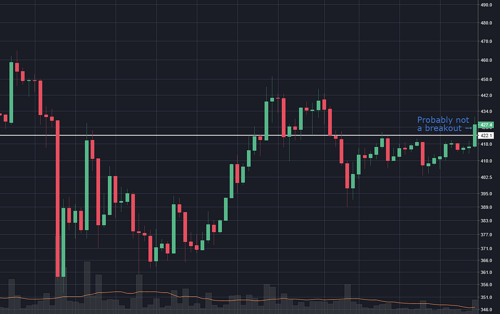
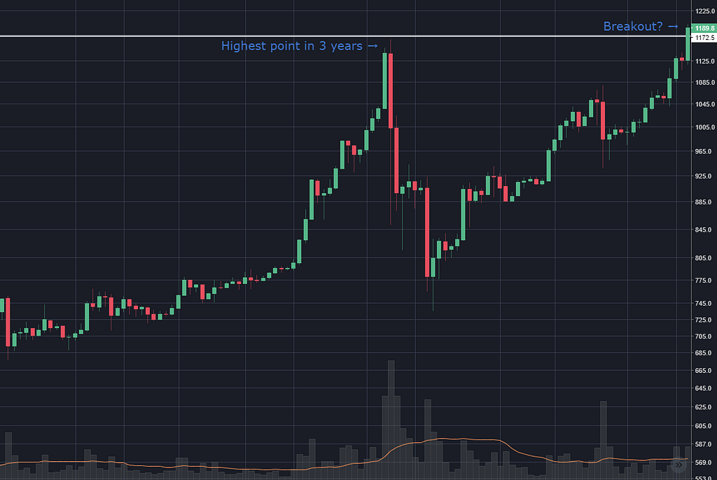
For this one, let me set some context. Bitcoin hit a high of $1,170 way back in November 2013.
Fast forward three years and the price plays knock and run with $1,170 again.
I imagine at the time everyone was quite cognisant of this all-time-high price looming above.
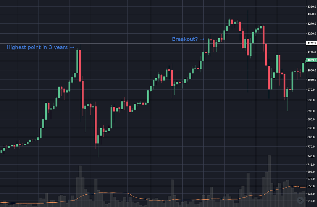
Six weeks after the knock-and-run, there’s a tiny little breakout above this price.
Unfortunately I already know what happens next so I can’t truly know what I would have expected at this point, but you can still place your mental bets.
I’m pretty sure I would have expected a big explosion.
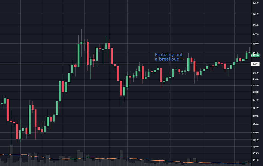
And I would have been wrong.
So there you have it, long-standing all time highs aren’t necessarily broken though with unrestrained vigour and verve.
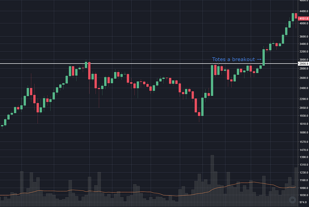
5 August 2017
Three out of 16 days touched this line, and then one day the price closed 10% above. At this point the price is the highest it’s ever been (after coming out of a three year slump).
So, in theory I buy the next morning, put a stop loss at the white line, and an automatic sell at 5%…
Nailed it, this shit’s easy.
Who wants Ferraris!?
This exercise has pleased me; I’m slowly growing less cynical about the predictive power of technical analysis, and this pattern in particular. (Can one grow less something?)
I see it as promising that — with as little skill as I have — I still managed to take a screenshot of a few places that would have proven to be good spots to buy.
It’s a far cry from being a grown up trader, but it’s an awkward roll in the right direction, I think.
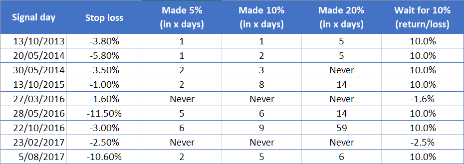
Here’s the scorecard, for the curious:
This is imagining that I would place a stop loss at the resistance line, since, in all successful cases, the price never dropped below that line before advancing (so from a risk-management perspective, this is a great pattern).
In all cases where the price increased by 5%, it also went on to reach 10% in a reasonable amount of time. Sometimes it didn’t reach 20% (before hitting the stop loss) or sometimes it just took a long time. So I figured 10% makes a sensible sell target (of course, this would be smaller on an smaller time-frame chart).
So, for each of these nine instances, one of two things could happen:
- The price could go up 10% (which it did seven times)
- The price could falter and hit my stop loss (which it did twice)
That’s about an 80% return all told which seems pretty solid, but considering these only happen a few times a year, and bitcoin has grown, like, 20,000% in that time it’s actually rubbish — you’d be better off just buying and holding.
So on the daily chart, it would seem that the smart money remains in not trying to be smart about it.
So that was a big-ass waste of time.
I made myself laugh! No, it’s not really a waste of time. The interesting stuff will be the shorter time frames, then it will boil down to how often this pattern occurs, how big the movements are, and how much the transfer fees eat out of each one.
What about support lines?
I had started to look at support lines too, and also all the cases where one (allegedly) becomes the other, and diagonal trend lines, and MA lines. But I’ve quite enjoyed this super-deep-dive into one very specific pattern.
I want to master this one, because if I can, then I know that I might have what it takes to make money, and can then improve by learning other tools.
I have begun to form an opinion that all these lagging indicators (RSI, MACD, EMA, etc) might be snake oil, or might be useful, but I’m quite sure shouldn’t be part of my learning curriculum for the first few months.
For my web developer friends, I think it’s like learning jQuery before you learn real JavaScript. I would rather these abstractions be a tool, not a crutch.
I’m getting awfully opinionated now I’ve got 4 weeks’ experience, aren’t I. I promise I’ll try and keep a lid on it.
What have I learned
This pattern isn’t the mess I was ready to accept that it would be. The breakouts were far more consistent than I would have expected.
So I now consider this whole ‘crypto-trader’ endeavour a little bit more promising than I did at the start of the week. So, that’s kinda cool!
Next week
I’m going to stay with resistance lines, and dive deeper into a) different time frames and b) different assets. Not so much because I want to get distracted with altcoins, but because I think the difference between bitcion and ether and coffee will be informative.
Will each have its own unique behaviour? Maybe I’ll be able to rely on 4% jumps on the hourly chart of BTC/ETH but never see the pattern bear fruit on the USD/LTC 5 minute chart. Maybe it happens frequently and just like in the textbooks for cotton on the 5 minute chart.
So I’ll do little Excel tables, similar to the above, for all of these. Maybe even a pivot table! It’s going to be gruelling, which is my kinda fun.
As always, if I’ve said something dumb or missed something interesting in a chart, I’d be stoked to be corrected in the comments.
Thanks for reading, you’re tops!
A crypto-trader’s diary — week 4 was originally published in Hacker Noon on Medium, where people are continuing the conversation by highlighting and responding to this story.
Disclaimer
The views and opinions expressed in this article are solely those of the authors and do not reflect the views of Bitcoin Insider. Every investment and trading move involves risk - this is especially true for cryptocurrencies given their volatility. We strongly advise our readers to conduct their own research when making a decision.
