Latest news about Bitcoin and all cryptocurrencies. Your daily crypto news habit.

After reading the guide, you will know how to evaluate a Keras classifier by ROC and AUC:
- Produce ROC plots for binary classification classifiers; apply cross-validation in doing so.
- Calculate AUC and use that to compare classifiers performance.
- Apply ROC analysis to multi-class classification. Create ROC for evaluating individual class and the overall classification performance.
What are ROC and AUC and what can they do?
What are they?
From Wikipedia: Receiver operating characteristic curve a.k.a ROC is a graphic plot illustrates the diagnostic ability of a binary classifier system as its discrimination threshold is varied. The critical point here is “binary classifier” and “varying threshold”. I will show you how to plot ROC for multi-label classifier by the one-vs-all approach as well.
Area Under the Curve, a.k.a. AUC is the percentage of this area that is under this ROC curve, ranging between 0~1. It
What can they do?
ROC is a great way to visualize the performance of a binary classifier, and AUC is one single number to summarize a classifier’s performance by assessing the ranking regarding separation of the two classes. The higher, the better.
In the following two sections, I will show you how to plot the ROC and calculate the AUC for Keras classifiers, both binary and multi-label ones.
ROC, AUC for binary classifiers
First, let’s use Sklearn’s make_classification() function to generate some train/test data.
Next, let’s build and train a Keras classifier model as usual.
We then call model.predict on the reserved test data to generate the probability values. After that, use the probabilities and ground true labels to generate two data array pairs necessary to plot ROC curve:
- fpr: False positive rates for each possible threshold
- tpr: True positive rates for each possible threshold
We can call sklearn’s roc_curve() function to generate the two. Here is the code to make them happen.
AUC value can also be calculated like this.
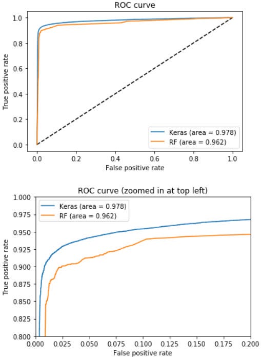
To make the plot looks more meaningful, let’s train another binary classifier and compare it with our Keras classifier later in the same plot.
Now, let’s plot the ROC for the two classifiers.
Here is the result:
As you can see, given the AUC metric, Keras classifier outperforms the other classifier.
ROC, AUC for a categorical classifier
ROC curve extends to problems with three or more classes with what is known as the one-vs-all approach.
For instance, if we have three classes, we will create three ROC curves,
For each class, we take it as the positive class and group the rest classes jointly as the negative class.
- Class 1 vs classes 2&3
- Class 2 vs classes 1&3
- Class 3 vs classes 1&2
Let’s started by creating some train/test data with 3 class outputs.
Then we build and train a categorical Keras classifier like before.
After training the model we can use it to make predictions for test inputs and plot ROC for each of the 3 classes.
Before doing that, let’s define the metric to evaluate the overall performance across all classes. There are two slightly different metrics, micro and macro averaging.
In “micro averaging”, we’d calculate the performance, e.g., precision, from the individual true positives, true negatives, false positives, and false negatives of the k-class model:
And in macro-averaging, we average the performances of each individual class:
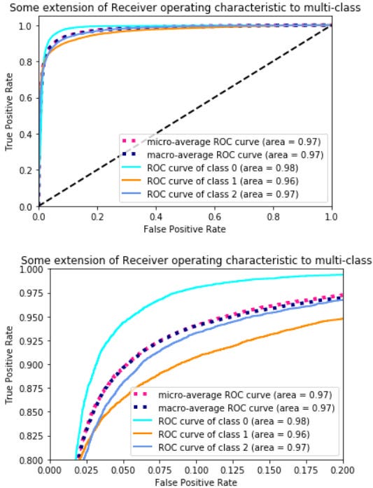
Here is the code to plot those ROC curves along with AUC values.
Here is the result, the second plot is a zoom-in view of the upper left corner of the graph.
You can see for each class, their ROC and AUC values are slightly different, that gives us a good indication of how good our model is at classifying individual class.
Summary and Further reading
In this tutorial, we walked through how to evaluate binary and categorical Keras classifiers with ROC curve and AUC value.
The ROC curve visualizes the quality of the ranker or probabilistic model on a test set, without committing to a classification threshold. We also learned how to compute the AUC value to help us access the performance of a classifier.
If you want to know more about ROC, you can read its Wikipedia page, Receiver operating characteristic, it shows you how the curve is plotted by iterating different thresholds.
Also, it is helpful to check out Sklearn’s API document on computing ROC to further understand how to use that function.
You can find the source code for this tutorial in my GitHub repo.
Originally published at www.dlology.com.
Simple guide on how to generate ROC plot for Keras classifier was originally published in Hacker Noon on Medium, where people are continuing the conversation by highlighting and responding to this story.
Disclaimer
The views and opinions expressed in this article are solely those of the authors and do not reflect the views of Bitcoin Insider. Every investment and trading move involves risk - this is especially true for cryptocurrencies given their volatility. We strongly advise our readers to conduct their own research when making a decision.


