Latest news about Bitcoin and all cryptocurrencies. Your daily crypto news habit.
 By Billy Hathorn [CC BY-SA 3.0], from Wikimedia CommonsBugs in the Wild is a case study series where I identify live internet bugs and propose product redesigns.
The Bug
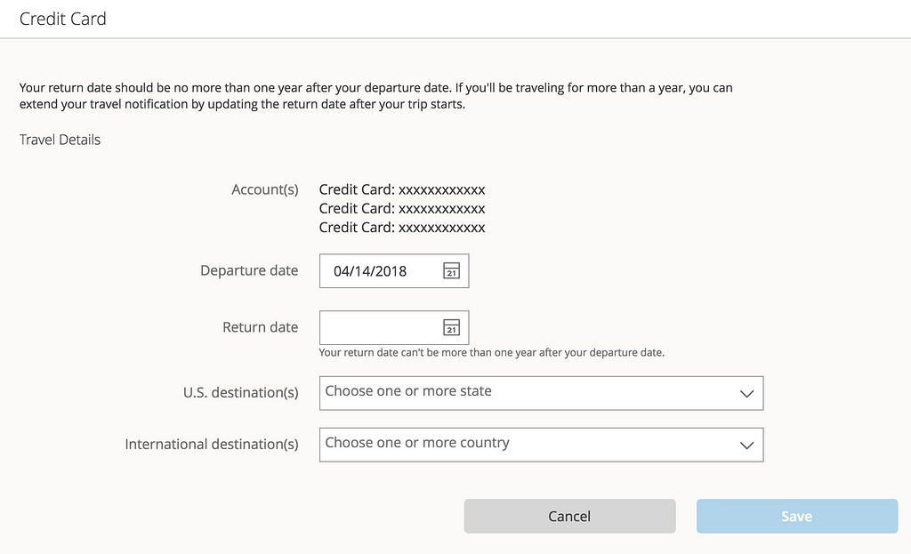
Chase, like many banks, records user travel notices to prevent falsely detected credit card fraud. Chase offers a feature where users can set a travel notice online, without having to phone in to customer service.
I recently traveled to South Korea, and attempted to enter my information into the form fields shown above. However, for some reason I couldn’t find South Korea in the list of options! I first tried typing “Korea”:
When that failed, I assumed the field required me to type “South Korea”:
But still no South Korea! Now I was really confused. How else am I supposed to type in South Korea? I just checked all the countries for “K”:
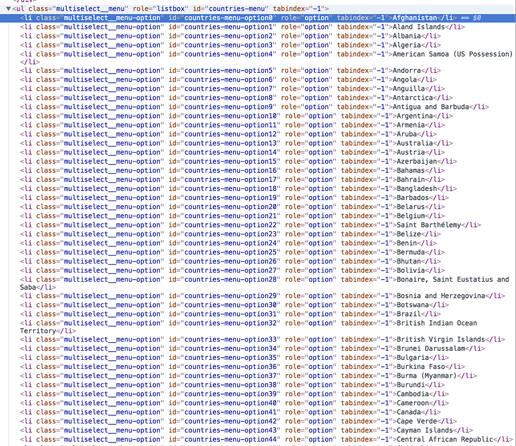
Nothing. At this point, I was curious what could possibly be happening. I launched the Chrome Inspection Tool and found the country list in the HTML code.
I hit CMD+F “Korea.” And then I found it.
Sure enough, when I returned to the text field and typed “Republic of,” I saw the result I was after.
Not only did I find the issue with South Korea, but several other entities were hidden because of a similar issue. I tried typing “Washington, D.C.” in the US destination box, and nothing came up until I typed “District of…”.
The Solution
Currently, the typed entry only matches the prefix of the country name as entered into the database. If a user typed in “Amer,” they wouldn’t get United States of America as an autocomplete result.
There are a few key use cases that this open text box needs to get right to fix this issue:
- It should map to common alternate names of countries. Typing “USA” should still show “United States of America”
- It should implement approximate string matching (referred to as fuzzy string searching). Typing “Uited States” should still show “United States of America.
- It should implement partial string and substring matching. For instance, typing “Den” should show Denmark ranked first, then Sweden ranked second. Or in this case, if I type “Ko,” it should show both North Korea and South Korea.
In general, when implementing an open text box, it’s important to anticipate all possible user inputs and expected outcomes.
Even More Edge Cases
As a product manager or software engineer, you can help steer a feature like this in the right direction by considering the various possible edge cases. Performing this simple exercise is an effective way to avoid bugs and create a more robust feature. A short list of edge cases below demonstrates how the tool could be even more robust:
- Holland: a common nickname for Denmark.
- U.S.A.: the periods may throw off the autocomplete.
- S Korea: this abbreviation may not be detected without approximate string and partial matching.
- Côte d’Ivoire: the non-ASCII character may throw off the autocomplete.
- Palestine: this one brings up a question of what the actual list of countries are. Choosing the country list depends on the tool in question, but in many cases the ISO 3166, an international standard, is suitable. The ISO 3166 does include Palestine, listed as “State of Palestine.”
Catching Future Bugs
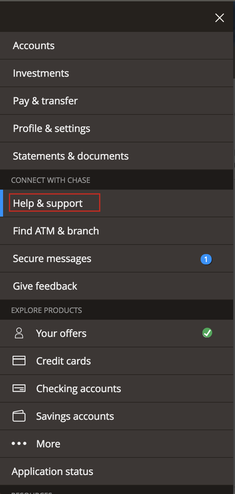
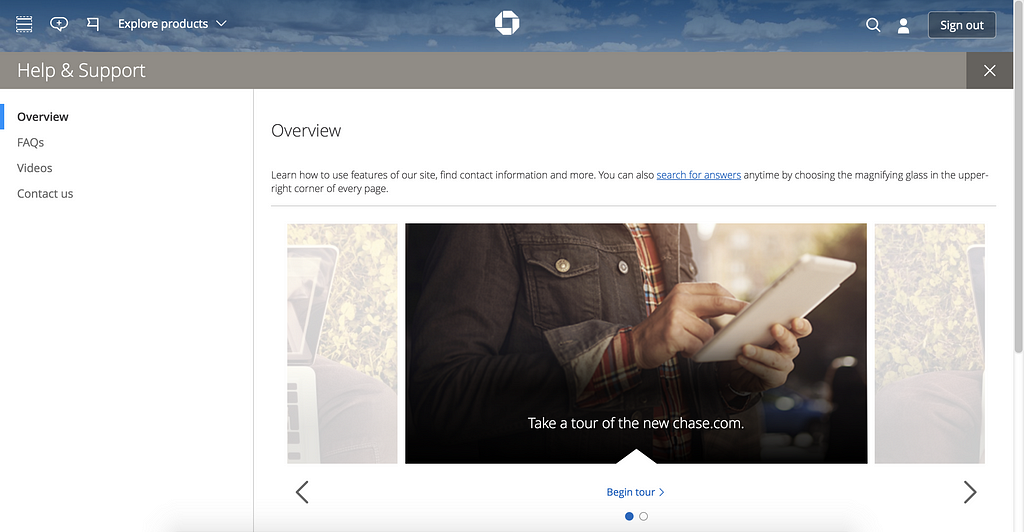
As with any feature, there will be bugs that you don’t anticipate. That’s why it’s critical to include a pipeline for users to report feedback and issues. Currently, in order to report feedback for the travel notice feature, I needed to click the “Help & Support” sidebar, then go to the Chase Help Center.
At this point, a user might give up on trying to report the issue, and forsake setting a travel notice in the first place.
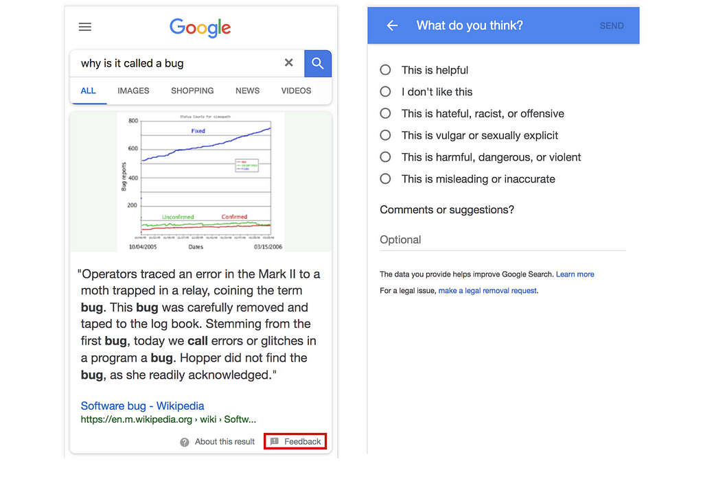
In-line feedback systems are better, more intuitive ways to capture user feedback issues. Take a look at how Google designs it:
Chase bank could implement a small “feedback” link below every page, and offer a text box for users to type in their feedback. Of course, this sort of tool requires setting up a pipeline for reviewing and handling this feedback. This involves significant additional work, and may be worth deprioritizing at this time.
To Chase — I hope my blog post is useful for identifying and proposing a fix to this user-facing issue. To others — I hope this simple example can demonstrate some of the work and thought that goes into product management and user experience decisions.
If you’re interested in careers in product management, reach out to me via my website, PMprep.xyz. If you found this article useful, please clap 👏 to show your appreciation.
Know a bug you want me to review? DM me on Twitter.
Dear Chase: Your Travel Notice Is Broken. Here’s How To Fix It. was originally published in Hacker Noon on Medium, where people are continuing the conversation by highlighting and responding to this story.
Disclaimer
The views and opinions expressed in this article are solely those of the authors and do not reflect the views of Bitcoin Insider. Every investment and trading move involves risk - this is especially true for cryptocurrencies given their volatility. We strongly advise our readers to conduct their own research when making a decision.
