Latest news about Bitcoin and all cryptocurrencies. Your daily crypto news habit.
Let me share with you but a small sample of all the obstacles that stood between me and my content within a span of just twenty minutes (not all on the same website).
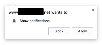
First, I need to dismiss this dialog box by clicking “Block”:
 Lest every website I ever visit starts feeling entitled to a slice of my daily attention pie
Then, I wait for the web page to load and scan the page for the start of the content, a task easier said than done, what with the large number of widgets such as navigation links and share buttons screaming for my attention before I have even read the first letter of the first sentence:
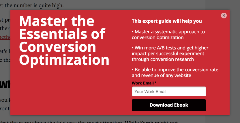
Then, just as I finish reading the first sentence, hoping to get into a good rhythm, the content is cruelly occluded with a dark transparency, on top of which appears a garish overlay that is clearly the creation of minds that believe I will subscribe to a newsletter or download an ebook without first having had the opportunity to be impressed by the content they provide:
 Yes, the choice of example was intentional
Others are a bit more subtle. They wait till you start scrolling down to artfully slide up a sign-up panel which they no doubt believe is unobtrusive:
 The dismiss button can be a challenge for all but those blessed with perfect eyesight and a steady finger
I have thus far had to squint and click three tiny “x” buttons to dismiss things that entice me away from the very content that brought me to the website. And I have yet to read beyond the first few sentences.
And finally, a message from well-meaning regulators:
 A job best left to the web browser
At this point, either I leave the website with a sigh, or if I really want to read the content, I fire up a distraction free reader I keep handy just for such occasions. Either way, the creators of the website have lost me.
Most of my acquaintances in the web design/UX domain tell me that prominent “call to action” buttons are proven to improve “conversion rates”. While I do understand the jargon and the statistics behind them, I cannot help but wonder about the long term viability of a website that starts its interaction with a new reader by doing its very best to exasperate him.
I have begun to long for the spartan web designs of yesteryear, free of registrations, sharing buttons, “recommended for you” lists and comment sections that appear to be specially designed to bring out the keyboard warrior within even the best of us. The occasional banner and popup ad now seem only mildly intrusive by comparison.
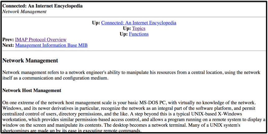
 If a website such as this came with a banner ad or two, it wouldn’t be the worst thing in the world.
Understandably, this is difficult to do in an era of monetized websites. If one must have these calls to action, can we not place them at the bottom of the article, the point which readers will reach if the content performs as expected? I, and perhaps a good percentage of readers, are not so heartless as to ignore an unobtrusive, and genuine appeal such as this, at the bottom of an article:
Or better yet, can we not place all navigation and action elements at the bottom of web pages?
Calls-to-action are the new pop-up ads was originally published in Hacker Noon on Medium, where people are continuing the conversation by highlighting and responding to this story.
Disclaimer
The views and opinions expressed in this article are solely those of the authors and do not reflect the views of Bitcoin Insider. Every investment and trading move involves risk - this is especially true for cryptocurrencies given their volatility. We strongly advise our readers to conduct their own research when making a decision.

