Latest news about Bitcoin and all cryptocurrencies. Your daily crypto news habit.

The trends in mobile UI keep changing constantly. What was popular this year will definitely become an old story the next year. A successful developer has to keep in touch with the latest trends in both UI (User Interface) and UX (User Experience) because they have the user in mind, and user requirements keep changing.
According to User Experience Professionals Association (UXPA), UX design is an important discipline that’s related to all the elements that create the interface — layout, brand, text, sound, visual design, interaction and layout. Of course, it is understandable that one of the main components is usability, meaning, how the user navigates your app. Do they find it easy? Or do they have to perform several taps to download something?
Users like to access an app that instantly gives them what they want. If they don’t find it immediately, they need a search function that will help them find it. You have to provide these functions, irrespective of whether your user is tech savvy or not. Ultimately, when you release your app after the latest update, ask yourself these questions — Were you able to incorporate new user experiences? Or wasn’t there much of a difference?
Sometimes, substantial differences can also be a little annoying to the user. So it would be good for you to keep in touch with the latest UI/UX trends to know you are indeed delivering as per customer demand.
Latest Trends in Mobile User Interface (UI)
Vibrant Colors
One of the most important trends would be in the usage of colors. Colors should be incorporated to ensure readability, so intense, contrasting colors with nice fonts are always in demand. You can make the interface vibrant and attractive, with fonts and colors in different styles and intensity.
Instagram is one of the first apps to put up a modified logo. They initially had flat, full-muted tones and later, changed it to multi-colors. In 2018, you can see this trend shifting to colors that promote warmth and energy to your home screen. The right use of colors can lift the mood, and influence actions and emotions. Colors improve the aesthetic value of your app, and the functional aspect as well.
Video Content Format
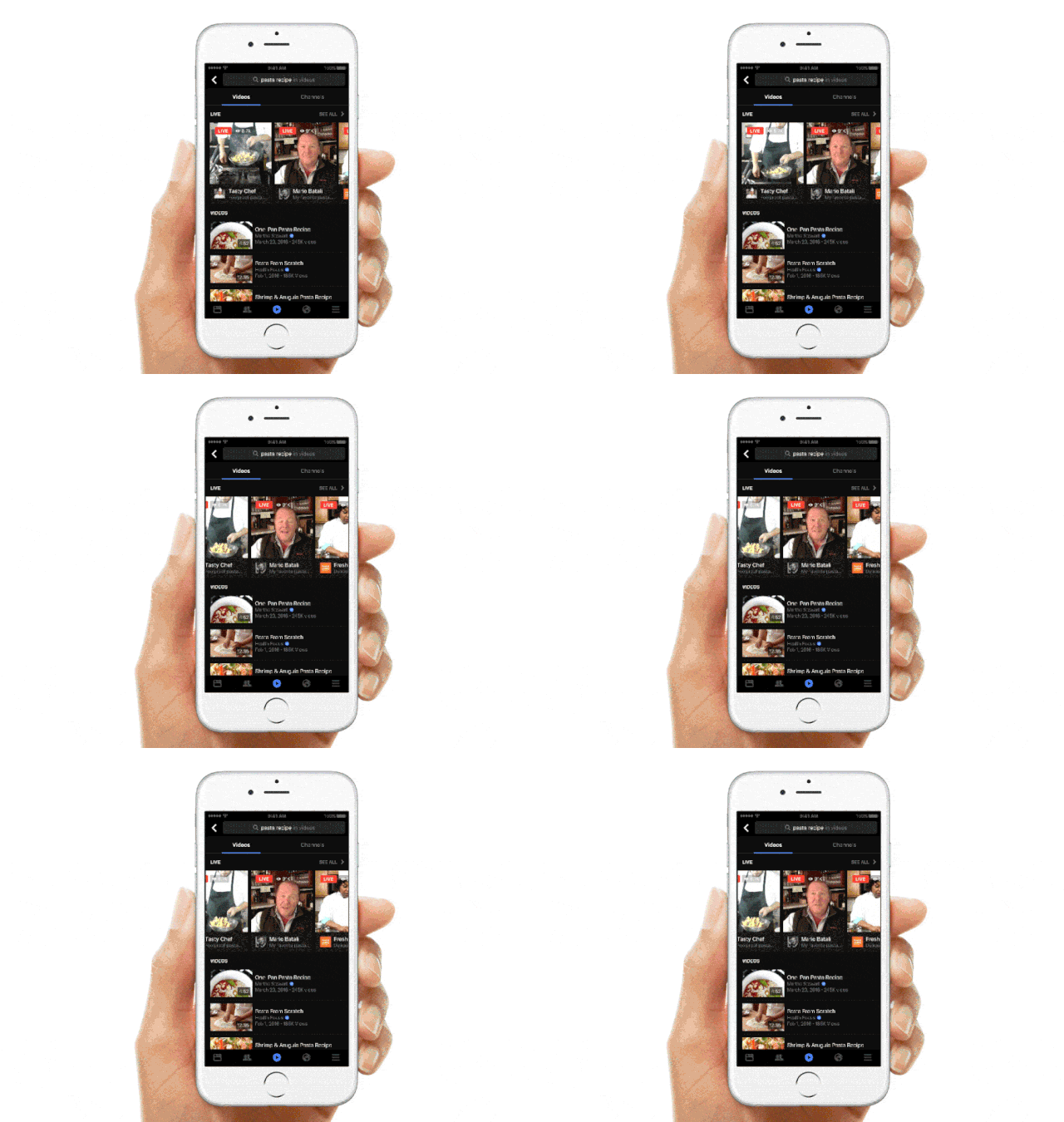 Image Credit: appinventiv.com
Online videos are in huge demand. According to Hubspot, 78% of the people watch online videos almost every week. About 55% of them view videos every day! So, imagine the amount of coverage you will be getting if you release a video. With people getting fidgety, they want something that catches their attention instantly. The average attention span has reduced drastically from 12 seconds to 8 seconds. So, that’s all the time you have to capture their wandering attention.
The year 2018 will witness more video based content, and new platforms will come up for companies to host their video blogs.
Video clips are definitely more appealing usually, as they are dynamic and unexpected. Full-screen video content is in high demand. You will have to devise new ways of creating online videos, like Facebook Live for example. 360-degree videos are perfect if you are in the real estate business or selling products. Learn the trick of creating short videos that capture the viewer’s’ attention in the first few seconds so it’ll remain in their memory. Video should be adapted for portrait orientation rather than horizontal orientation because that is the most popular format of viewing videos.
Interaction through Animations
Animations never fail to appease the user. People are always attracted to cartoons; perhaps it triggers memories of a long-forgotten childhood. Anyway, if you can generate interactions through animated photos, fonts, buttons and GIFs, it can promote a pleasant experience. This trend was started in 2017 and will continue to be huge in 2018 as well.
However, iPhone X designers are faced with a new challenge. There is no physical home button in the phone, so when they are creating an app for iPhone X, they have to provide clear and animated hints, and pair them with in-app gestures to make the app user friendly.
Micro-Interaction
Users like to be engaged with their app so they can have an enjoyable experience. Micro-interactions are instances where the design and the user communicate with each other. Cleverly created designs can enhance user interaction. The typing indicator in the chat button, the Like button in Facebook, the pull-to-refresh action are all micro-interactions.
Micro-interactions from the screen that show how to use the app optimally will keep users engaged and happy. The term micro-interaction was initially introduced by Dan Staffer, and ever since then, it has been continuously used by developers. To make the user aware of the interactions that are available, you have to provide animated hints. These can also help in getting feedback on the interactions, because you can add more helpful interaction designs on the mobile app interface. This allows users to communicate with their apps without a hitch.
Voice Enabled Interfaces
The UX of Voice or the Invisible Interface is a crucial component in any UX design. Voice interactions enable the use of voice to help the user understand the app, and act accordingly. It can ease customer experience, and has evolved to be either an alternative or a full replacement to traditional visual interfaces. In fact, it has evolved to be the new pinnacle of intuitive interfaces, where voice generates a direct brain-to-brain communication.
However, the shift to voice interaction must take into account the accessibility considerations of people who have temporarily lost their voice, are mute, sick or deaf. Instead of clicking the username and password, these voice activated mobile apps can take voice orders.
Overlapping
If you want to create an illusion of open space, with a lot of white space, then overlapping is a good idea. Through this feature, you can use graphics, colors and fonts to make a distinctive and eye-catching UI. For a mobile app, you can incorporate other features like “shadow” to make the design more appealing. It creates an illusion of open space in the device.
Color or Font Contrast
Having strong and contrasting colors will help in better readability, apart from delivering a sense of hierarchy and space. One look at the design of the app, and the user will grasp the layout and style, and understand the structure of importance. Playing with fonts and colors in different shapes, styles can create striking contrasts, making the interface colorful, unique and eye-catching.
Users can often identify the work of an amateur and a professional designer by looking at the use of colors and their placement. The emotion that the developer seeks to create from his usage of colors, must be the same as that of the user. The perfect palette can actually make the user relax, so be aware of the colors arsenal in your kitty before you throw them about.
Opacity
Opacity can bring about wonderful changes in the design. Even the same components can be made to look different when you adjust their transparency levels. You can create a number of different designs to create a distinction between the different components in the app interface. Depending on how you add opacity to interface design, you can make your app look and feel so different. For example, you can put in colorful glass-like texture for the app elements by adjusting the opacity of the graphics and colors.
Biometric Authentication
Biometrics authentication is not a new concept, but it is getting a definite boost in 2018, with several financial and banking institutions adopting the technology globally. Password authentication has been a major stumbling block in mobile banking, this is going to change with this feature. The limitations with biometrics will be identified and the concept will be made beneficial for both the enterprise and the user. Users expect effortless authentication along with other advanced features in their apps, so biometric authentication has to be done successfully.
Fingerprint biometrics is the most widely used authentication modality because of its various features like ability to deter hackers and imposters, ease of use, interoperability and accuracy. But as the adoption becomes wider, it is very important to realize that the deployed solutions might become a target for attack, and they must be secured strongly.
Full Screen Experience
Frameless designs have become a trend, and the popularity of Galaxy S8 and iPhone X proves this. As users get exposed to more screen space, they love to enjoy full-screen experiences, and if possible, in HD quality. The quality of the images is very, very important. The images should be in full, with absolutely no pixelation.
Linear User Flow
A linear user flow can make an app physically appealing, because there will be a beginning, middle and an end. It also makes it easier for the user to finish a particular task, and then, move on to the next. This is a great help because it helps them understand how much time it will take to complete a task before moving on to the next. It definitely makes user journey simple. Designing linear user flows will make it easier both for the user and the business.
Progressive Disclosure
One of the challenges of interactive design is that you are walking a thin line between information overload and a lack of sufficient information. Progressive disclosure means everything in the user interface should progress naturally, starting from simple to complex. So only what is necessary is revealed, only what the user has asked for will be displayed at any given time. This eliminates the noise, i.e. information the user doesn’t require at the current juncture. Whatever the user doesn’t need right now is considered a distraction.
Augmented Reality
The improved version of Augmented Reality aims to provide context-driven content to the user, making it personalized and more useful. Contextual computing is mixed with things like artificial intelligence, big data, sensors and machine-learning to ensure highly relevant information is delivered to the user.
UX designers will take the latest trends in this emerging medium to change the way people see and experience reality, by diminishing the lines between physical and digital environment. So, it is both challenging and opportunistic, and that’s what makes it exciting.
Image Revolution
The year 2018 is going to see a major change in the way images are displayed in apps. We are already seeing the replacement of PNGs and JPGs with high quality images and SVGs or Scalable Vector Graphics. Now, even small-scale apps have bid adieu to the designs of old, where content is displayed in a more appealing manner with less number of images, and practically no videos. With highly advanced typography, designers now aim to provide exceptional user experience.
Color Gradients
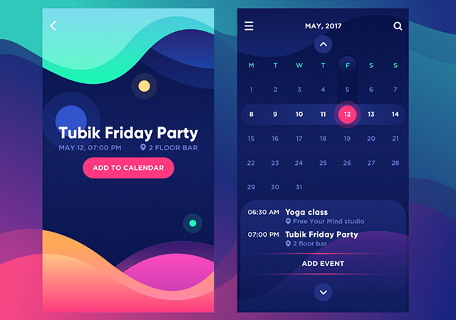 Image Credits:LinkedIn
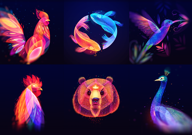
Gradients, the gradual blending from one color to another, were a huge success in mobile design trends in the past. Then they went low for a while, but not anymore. Gradients are making a huge comeback, and multi-tone designs are getting a great boost. The reason why gradients are making a comeback is because they add realism and depth. When used correctly, they can mimic distance too. After all, in real life, you don’t have flat colors.
Gradients are used in illustrations, typography, branding and of course, UI. Gradients are going to be hot this year because they can create awesome graphics. Gradients can be made with a number of colors, or with a single color to depict a rich sense of hierarchy and supremacy. Check out Instagram’s logo or websites like Spotify to experience this.
Mixing of Different Trends will also Become a New Trend: This year, you might also see a mix and match of different trends from the previous years. Designers will be using their ingenuity and skill to combine opacity, AI, overlapping, font and color contrast, etc. depending on the end result they are looking to achieve.
Conclusion
One thing we have not mentioned here, but worth noting is the integration with Face recognition elements that can provide a plethora of emotions and reactions. A perfect example would be Animoji, the animated emoji in iPhone X that works with the phone’s camera and facial expressions.
Robust and interactive app design will keep users hooked to your app for a long time. User-friendly interfaces can improve their mobile experience a great deal. Nevertheless, it is worth saying that mobile app UI designs will keep on changing as per user needs. As a UI/UX designer, you have to remain innovative and creative to the core, understand and grasp their changing needs.
Need help? Get in touch with us…
Originally published in Cabot Solutions Blog on March 12, 2018
Major Mobile UI/UX Trends that Will Dominate in 2018 was originally published in Hacker Noon on Medium, where people are continuing the conversation by highlighting and responding to this story.
Disclaimer
The views and opinions expressed in this article are solely those of the authors and do not reflect the views of Bitcoin Insider. Every investment and trading move involves risk - this is especially true for cryptocurrencies given their volatility. We strongly advise our readers to conduct their own research when making a decision.
