Latest news about Bitcoin and all cryptocurrencies. Your daily crypto news habit.
Featured: interpolation, t-SNE projection (with gifs & examples!)
In the “Deep Learning bits” series, we will not see how to use deep learning to solve complex problems end-to-end as we do in A.I. Odyssey. We will rather look at different techniques, along with some examples and applications. Don’t forget to check out Deep Learning bits #1!
If you like Artificial Intelligence, make sure to subscribe to the newsletter to receive updates on articles and much more!
Introduction
Last time, we have seen what autoencoders are, and how they work. Today, we will see how they can help us visualize the data in some very cool ways. For that, we will work on images, using the Convolutional Autoencoder architecture (CAE).
What’s the latent space again?
An autoencoder is made of two components, here’s a quick reminder. The encoder brings the data from a high dimensional input to a bottleneck layer, where the number of neurons is the smallest. Then, the decoder takes this encoded input and converts it back to the original input shape — in our case an image. The latent space is the space in which the data lies in the bottleneck layer.
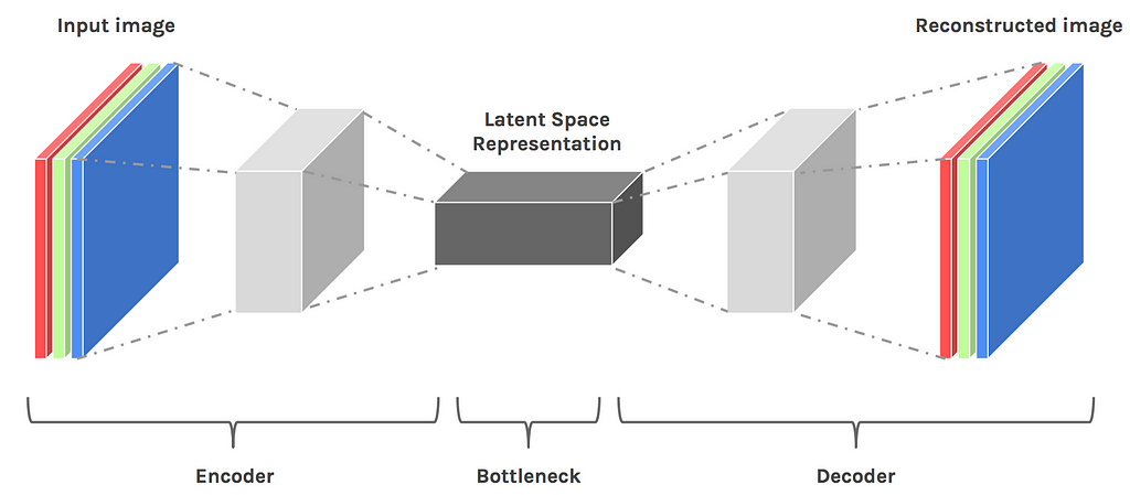 Convolutional Encoder-Decoder architecture
The latent space contains a compressed representation of the image, which is the only information the decoder is allowed to use to try to reconstruct the input as faithfully as possible. To perform well, the network has to learn to extract the most relevant features in the bottleneck.
Let’s see what we can do!
The dataset
We’ll change from the datasets of last time. Instead of looking at my eyes or blue squares, we will work on probably the most famous for computer vision: the MNIST dataset of handwritten digits. I usually prefer to work with less conventional datasets just for diversity, but MNIST is really convenient for what we will do today.
Note: Although MNIST visualizations are pretty common on the internet, the images in this post are 100% generated from the code, so you can use these techniques with your own models.
 MNIST is a labelled dataset of 28x28 images of handwritten digits
Baseline — Performance of the autoencoder
To understand what kind of features the encoder is capable of extracting from the inputs, we can first look at reconstructed of images. If this sounds familiar, it’s normal, we already did that last time. However, this step is necessary because it sets the baseline for our expectations of the model.
Note: For this post, the bottleneck layer has only 32 units, which is some really, really brutal dimensionality reduction. If it was an image, it wouldn’t even be 6x6 pixels.
 Each digit is displayed next to its blurry reconstruction
We can see that the autoencoder successfully reconstructs the digits. The reconstruction is blurry because the input is compressed at the bottleneck layer. The reason we need to take a look at validation samples is to be sure we are not overfitting the training set.
Bonus: Here’s the training process animation
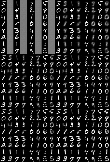 Reconstruction of training(left) and validation(right) samples at each step
t-SNE visualization
What’s t-SNE?
The first thing we want to do when working with a dataset is to visualize the data in a meaningful way. In our case, the image (or pixel) space has 784 dimensions (28*28*1), and we clearly cannot plot that. The challenge is to squeeze all this dimensionality into something we can grasp, in 2D or 3D.
Here comes t-SNE, an algorithm that maps a high dimensional space to a 2D or 3D space, while trying to keep the distance between the points the same. We will use this technique to plot embeddings of our dataset, first directly from the image space, and then from the smaller latent space.
Note: t-SNE is better for visualization than it’s cousins PCA and ICA.
Projecting the pixel space
Let’s start by plotting the t-SNE embedding of our dataset (from image space) and see what it looks like.
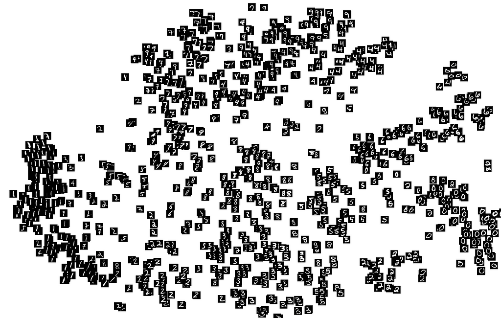 t-SNE projection of image space representations from the validation set
We can already see that some numbers are roughly clustered together. That’s because the dataset is really simple*, and we can use simple heuristics on pixels to classify the samples. Look how there’s no cluster for the digits 8, 5, 7 and 3, that’s because they are all made of the same pixels, and only minor changes differentiates them.
*On more complex data, such as RGB images, the only clusters would be of images of the same general color.
Projecting the latent space
We know that the latent space contains a simpler representation of our images than the pixel space, so we can hope that t-SNE will give us an interesting 2-D projection of the latent space.
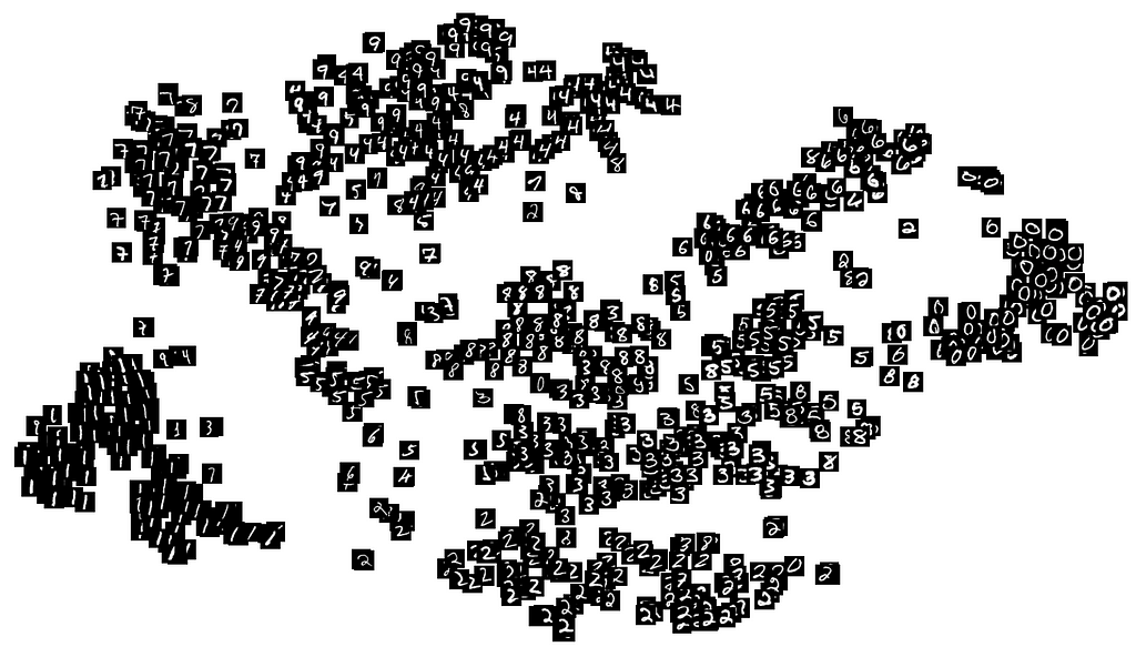 t-SNE projection of latent space representations from the validation set
Although not perfect, the projection shows denser clusters. This shows that in the latent space, the same digits are close to one another. We can see that the digits 8, 7, 5 and 3 are now easier to distinguish, and appear in small clusters.
Interpolation
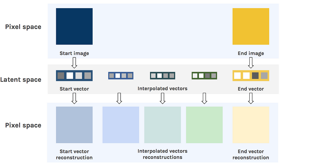
Now that we know what level of detail the model is capable of extracting, we can probe the structure of the latent space. To do that, we will compare how interpolation looks in the image space, versus latent space.
Linear interpolation in image space
We start off by taking two images from the dataset, and linearly interpolate between them. Effectively, this blends the images in a kind of ghostly way.
The reason for this messy transition is the structure of the pixel space itself. It’s simply not possible to go smoothly from one image to another in the image space. This is the reason why blending the image of an empty glass and the image of an full glass will not give the image of a half-full glass.
Linear interpolation in latent space
Now, let’s do the same in the latent space. We take the same start and end images and feed them to the encoder to obtain their latent space representation. We then interpolate between the two latent vectors, and feed these to the decoder.
The result is much more convincing. Instead of having a fading overlay of the two digits, we clearly see the shape slowly transform from one to the other. This shows how well the latent space understands the structure of the images.
Bonus: here’s a few animations of the interpolation in both spaces


 Linear interpolation in image space (left) and latent space (right)
More techniques & examples
Interpolation examples
On richer datasets, and with better model, we can get incredible visuals.
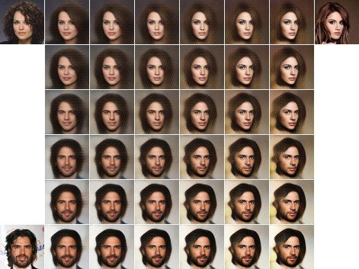 3-way Latent space interpolation for faces
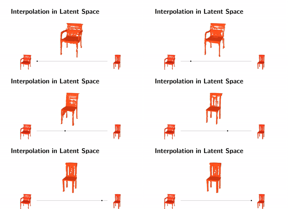 Interpolation of 3D shapesLatent space arithmetics
We can also do arithmetics in the latent space. This means that instead of interpolating, we can add or subtract latent space representations.
For example with faces, man with glasses - man without glasses + woman without glasses = woman with glasses. This technique gives mind-blowing results.
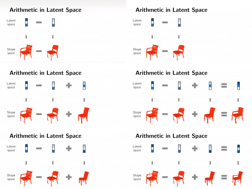 Arithmetics on 3D shapes
Note: I’ve put a function for that in the code, but it looks terrible on MNIST.
Conclusions
In this post, we have seen several techniques to visualize the learned features embedded in the latent space of an autoencoder neural network. These visualizations help understand what the network is learning. From there, we can exploit the latent space for clustering, compression, and many other applications.
If you like Artificial Intelligence, make sure to subscribe to the newsletter to receive updates on articles and much more!
You can play with the code over there:
Thanks for reading this post, stay tuned for more !
Latent space visualization — Deep Learning bits #2 was originally published in Hacker Noon on Medium, where people are continuing the conversation by highlighting and responding to this story.
Disclaimer
The views and opinions expressed in this article are solely those of the authors and do not reflect the views of Bitcoin Insider. Every investment and trading move involves risk - this is especially true for cryptocurrencies given their volatility. We strongly advise our readers to conduct their own research when making a decision.


