Latest news about Bitcoin and all cryptocurrencies. Your daily crypto news habit.
User-centered design principle works like magic— i.e. how to delight the user and deliver the right message
User-centered design is an approach which helps you shape your product or service in a form that users need, want and desire. Every consumer group has a certain level of social inertia which is basically a resistance to change their behavior. So don't try to persuade and talk them into using what you think is a state of the art product. Rather, make it familiar to them, present it as a "this is exactly what I need" kind of product — from their point of view. And here's how you can do it…
Note: I'm writing about the design in general. It could be website design, website copy, product package, product brochure, facebook ad cover, instagram story or whatever includes visual communication between the seller and the buyer. In further text, I'll refer to this assembly as a "design".
It's not about who you are, it's about the value you provide
I tend to start almost every project on the wrong note — with the introduction: Hello, We are ____ and we love ____. Then I remember that whoever found this piece of design was looking for something else. Something of their own interest. So restrain yourself from writing about your awesomeness, and focus on the target customers' needs (except if you're writing a recruiting copy, then bring out the bean bags and free snack).
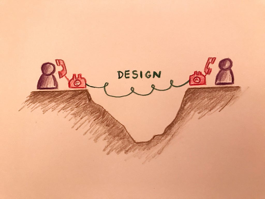
The gap
Creating a product is hard. It takes time, money and effort. Going through the process of creating it, you get emotionally attached. So it is natural to market it as the best product ever. Because it is yours and you believe so. But unfortunately, you'll have to do better than that to persuade the customer to buy it.
Any business is a relationship between the seller and the buyer. It has two sides involved, each with their own point of view. It is a give & take relationship. Not give & receive, because you don't want to receive just anything, you have a specific prize on your mind. In order for a relationship to work properly, each side should clearly communicate what they give and what they want to take in return. This way, the expectations are met for both sides, and the relationship (business) will grow.
The design is a medium between the seller and the buyer. And it should be used to visually communicate between two parties, close the gap and seal this give & take relationship.
Persona
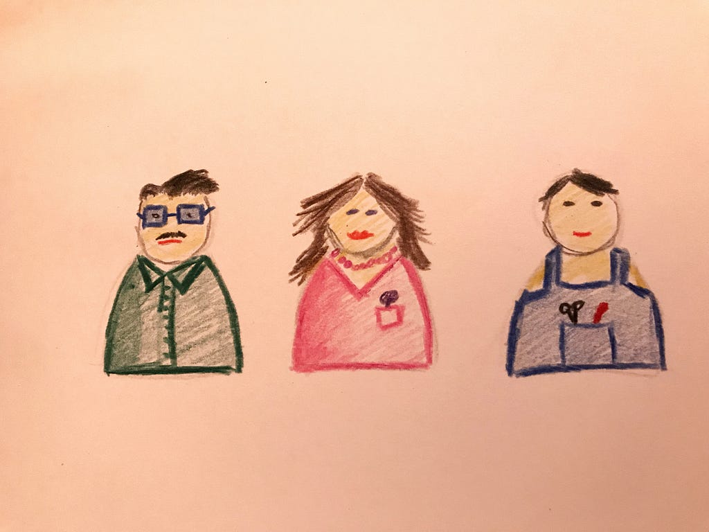
The first step to closing the gap is getting to know the other side. You can't meet all the people, but you can do a market segmentation and create a persona within the segments you want to tackle. Use a pen and paper and draw that person. Pay attention to the age, education, clothes, haircut, glasses, interests and as many personal details you can think of. Now, take a look at the person on the paper and figure out which one of your friends reminds you the most of it. It is important to visualize somebody you know personally because this will help you understand how does the customer think and what does he want. Better yet, you could do an A/B test with that person, before you roll-out your design.
 Get to know your customersBuyers perspective
When you introduce your design, almost every person goes through this steps:
- Notices the package
- Asks "what is it?"
- Wonders "Why should I care?"
- Wants to be persuaded
- Needs proof [1]
Make sure your design answers these questions. Especially number 3. Communicating their benefit should be your top priority.
Your offer and x-factor
Communication via design can be very effective. No wonder there's a whole industry behind the design business. It gives you a way to win people's hearts only by using words and colors (if used with care and attention).
Buying decisions often come from our subconscious, emotions and gut feeling. And brand is all about the gut feeling. If the buyer feels positive about your product, you've done the job right. And positive feelings will appear if you solve their problems and improve their lives. This is what your design should say loud and clear. Here is one way to do it…
Word game
I like to play a word game where I lay down five categories, and assign feelings and states in which I want my clients to be in after interaction with the design.
- Culture / What is the company culture?
e.g. Responsible, professional, informal, friendly, competent…
2. Voice / What tone and voice do we want to have?
e.g. Personal, charming, trustworthy, caring…
3. Benefit / How will the client feel about the benefits we provide?
e.g. At ease, relaxed, confident…
4. Value / What value do we provide to the client?
e.g. Effortless, worry-free service, reliability…
5. X-Factor / What makes you an unmatched service compared to the competition?
e.g. Available 24/7, organic, eco-friendly, traditional…
It takes some time to think of the words you want to describe your design. But as you go, pile them up and identify similar groups. Then extract three or four keywords that you think are the most important. Those words best describe your product and emotions you want your customers to feel. In the end, it the design doesn’t speak those keywords, go back to the drawing board.
Having done all these steps, designing will be much easier, since you know who are you designing it for, and how do you want your customers to feel. This makes it so much easier. And this is the power of user-centered design — chances to hit the sweet spot with your clients is much higher. Spend your 80 cents of a dollar for the preparation, and it will certainly pay off in the long run.
Extra points
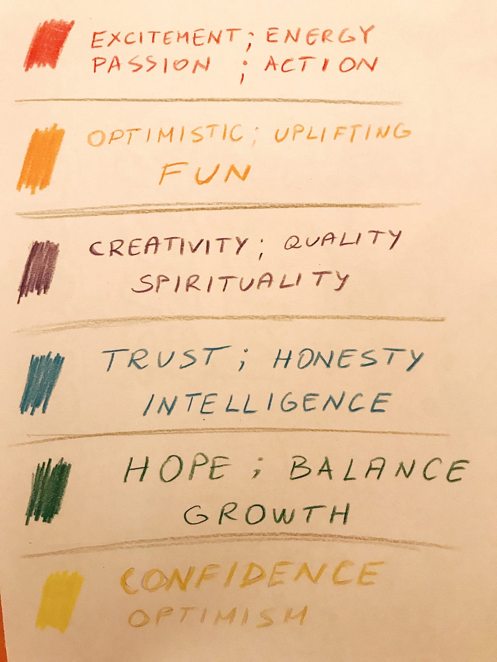
Use emotional triggers of colors in your design to gain some extra points.
Here are some books I would highly recommend, regarding the product design and the psychology of design.
[1] — The Brand Gap: How to Bridge the Distance Between Business Strategy and Design, Marty Neumeier
[2] — Confessions of an Advertising Man, David Ogilvy
[3] — The Design of Everyday Things, Donald Norman
User-centered design principle works like magic— i.e. was originally published in Hacker Noon on Medium, where people are continuing the conversation by highlighting and responding to this story.
Disclaimer
The views and opinions expressed in this article are solely those of the authors and do not reflect the views of Bitcoin Insider. Every investment and trading move involves risk - this is especially true for cryptocurrencies given their volatility. We strongly advise our readers to conduct their own research when making a decision.


