Latest news about Bitcoin and all cryptocurrencies. Your daily crypto news habit.
 A room of endless red chairs. Credit: Christian Fregnan on Unsplash.
Now that the winter holidays are over and the snow is beginning to melt, we find ourselves at the beginning of a new season. No, not spring, but tech conference season. By this time of the year, I have usually submitted a few talks to a handful of conferences, patiently waiting to hear back on decisions so I can try to figure out how I can magically stretch my limited budget.
Between coordinating work and family, travel schedules, and actually writing/practicing a talk, the simple act of submitting a talk should be the easy part. But each time I submit a talk to a tech conference, I pause. What track does this website accessibility talk fit under? Development? User experience? Diversity? Off the island (aka miscellaneous)? Do I choose a “soft science” category because the talk might be more likely to be accepted or do I choose something more technical to reach a broader audience? Sometimes the answer is obvious, but often it is not.
 This user of your website has no mouse and is in a low-light environment. Can he still use your website? Credit: Avi Richards on Unsplash.Accessibility vs Diversity vs User Experience
So let’s take a step back here a minute and review the terms Accessibility, Diversity, and User Experience. These topics are sometimes lumped together at tech conferences, but researchers see these as three separate and equally important areas of study.
According to Wikipedia, Accessibility:
Refers to the design of products, devices, services, or environments for people who experience disabilities. Accessibility is strongly related to universal design which is the process of creating products that are usable by people with the widest possible range of abilities, operating within the widest possible range of situations. This is about making things accessible to all people (whether they have a disability or not).
While User Experience is broadly defined as:
A person’s emotions and attitudes about using a particular product, system or service. Additionally, it includes a person’s perceptions of system aspects such as utility, ease of use and efficiency. User experience is dynamic as it is constantly modified over time due to changing usage circumstances and changes to individual systems as well as the wider usage context in which they can be found. In the end user experience is about how the user interacts with and experiences the product.
Looking up the term Diversity is a much more complex endeavor. Wikipedia gives you around 50 different possible sub-categories to choose from! If we look at the broadest definition we can of just the word Diversity, we get this from Merriam-Webster:
The condition of having or being composed of differing elements: variety; especially: the inclusion of different types of people (such as people of different races or cultures) in a group or organization.
I realize that just reading limited definitions of these three complex topics is akin to explaining Albert Einstein’s theory of relativity to a two-year-old. But the simple point I am trying to make is that in all three areas of study — Accessibility and Diversity and User Experience — the commonality between them is people.
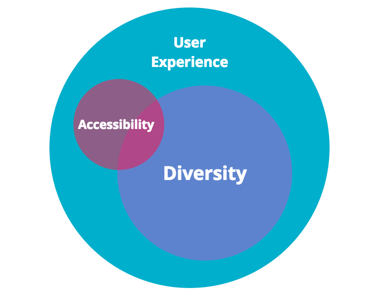
 One way to image the three concepts of Accessibility, Diversity, and UX working symbiotically together.
In a broad sense, I tend to think of Accessibility as an overlapping subset of Diversity, all under the User Experience umbrella. There are many theories and smarter people that may argue differently, but however you look at it, it boils down to people.
If we are talking about technology specifically, this commonality can be reframed to: How people create technology…how people use technology…how people interact and grow and change due to the technology. And at the end of the day, really what good is the technology if you must limit the people who can use it?
 The universe is nebulous and so is the topic of website accessibility. Credit: NASA on Unsplash.Website Accessibility is Nebulous to Many
At this point in time, Diversity and User Experience have been widely accepted (although not always put into practice) and are subjects that a lot of us in the tech community are familiar with, at least in a non-scholarly sense. Even at tiny tech conferences, they often have their own tracks. But I still feel like Website Accessibility is a bit nebulous to conference organizers and participants and they aren’t sure what to do with it.
Don’t believe me? Here is a typical conversation I often have at general tech conferences:
PersonX: Hi Carie it’s nice to meet you! What do you do?Me: Nice to meet you too PersonX! I primarily work as a front-end developer with a focus on accessibility.PersonX: Oh you mean like for screen readers for blind people.Me: Well, there is a bit more to it than that…[PersonX interrupts]PersonX: Oh yeah, I know about video captions for deaf people too.Me: Well, there are a lot of…[PersonX interrupts again]PersonX: Yeah, I went to a talk once where they mentioned checking website colors, but I’m not a designer so I didn’t pay much attention.Me: Well I’m not a designer either, but it is a really important step in making your website more accessible.[Pause, blinking, awkwardness]PersonX: Hey it was nice chatting. Catch you at the after party?Me: Sure…[insert: sad face]
News flash PersonX: Accessibility is not just for the disabled!
I use captions for videos all the time, but I am not part of the deaf community. I know people who refuse to use a computer mouse, but they do not have any mobility issues. A programmer friend of mine likes to use VoiceOver to quickly read documents, although he is not blind.
These three technologies — video captioning, keyboard navigation, screen readers — can obviously benefit people with disabilities, but they also can benefit many others that do not identify as having a disability. So why is it when we talk and think about accessible technologies, we do so with such a narrow lens? Why is accessibility in technology seen as “them” and not “us” — don’t we all benefit from advancements in technology?
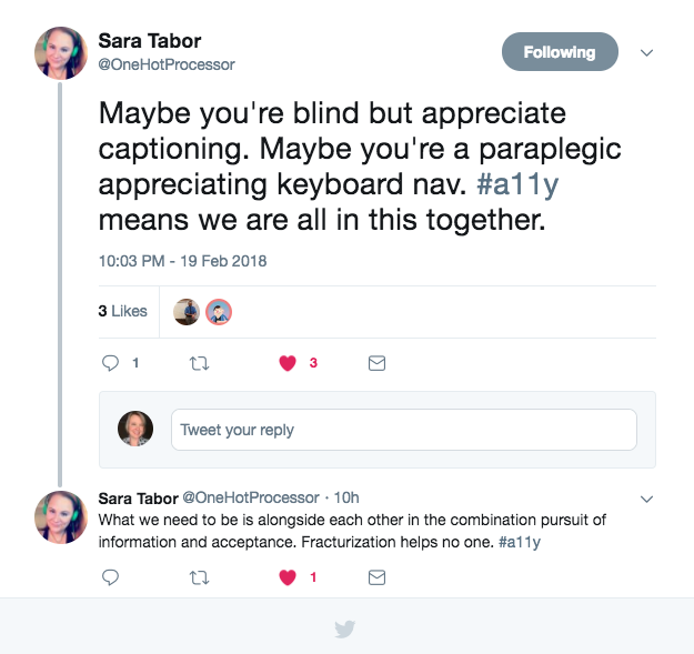
 I love this thought/thread. Sara Tabor calling it like it should be.
Part of the solution here is rethinking the way we approach design and development and how those topics are addressed at conferences. Website accessibility should be about making something valuable, not just accessible, to as many people as we can.
When we get to that magical tipping point of thinking about Website Accessibility as we do Diversity and User Experience — as essential pieces to the development process — it will be much easier to submit talks to tech conferences. In the meantime, you can find me trying out all of the various tracks until accessibility has one of its own.
❤ If you liked this article, show your support by clicking the clap icon (as many times as you want), sharing the story on social media, and by following me on Medium or Twitter. Thank you!❤
Finding a Place for Website Accessibility in Tech Conferences was originally published in Hacker Noon on Medium, where people are continuing the conversation by highlighting and responding to this story.
Disclaimer
The views and opinions expressed in this article are solely those of the authors and do not reflect the views of Bitcoin Insider. Every investment and trading move involves risk - this is especially true for cryptocurrencies given their volatility. We strongly advise our readers to conduct their own research when making a decision.
