Latest news about Bitcoin and all cryptocurrencies. Your daily crypto news habit.

User experience is key for mass adoption.
I just got my hands on the beta version of Nano iOS wallet and as a user experience guy I could not help to write up this review and share my thoughts with you.
Disclaimer: this article is not about the cryptocurrency itself, neither the technology behind it nor the price. It is purely an app review from a user experience perspective.
After all, we want this app to be in everyone’s hand ; the ultimate goal is that *anyone* in that world end up using it, right?
1. Welcome screen
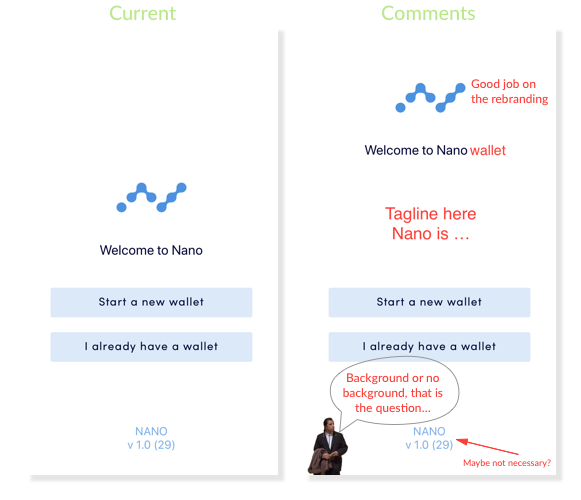
- First — the welcome message: “Welcome to Nano”, that sounds a bit plain to me, OK, it does the job, it welcomes you. But, is it really what Nano is all about? The vision of Nano’s team is much bigger than “Welcome to Nano” I’d love to feel this when I open this app. A tagline and/or an explanatory sentence could add context. Keep in mind, every screen on an app is an opportunity to communicate what a product is and how it will make user’s life better.
- There’s a lot of white space — not necessarily a bad thing — it keeps the user focus on the call to actions. At a later stage, this white space could be filled with a transparent background image or illustrations related to cryptocurrencies and instant transactions tools. This could help the user understand what to expect from the product. Not a must-have though.
- Call to actions are clear, “Start a new wallet” or “I already have a wallet”. It is as easy as it sounds. We could debate whether the buttons look clickable enough: the never ending debate of skeuomorphism vs flat design ; anyways — a darker colour or shadow could help. User testing will help find out whether users struggle to figure out where to click. You’d be surprised, users get lost…
- Button microcopy is simple and effective. In some cases it’s better to have consistent copy structure like “I don’t have a wallet” and “I already have a wallet” or “Create new wallet” and “Sync existing wallet”. Again, user testing will help find out which one of those work best. To me, the actions are clearly differentiated and we know what to expect after clicking, that’s the most important thing here.
“Good microcopy sets expectations.” — Richard Sison Nano Wallet — Button Microcopy
2. Start a new wallet
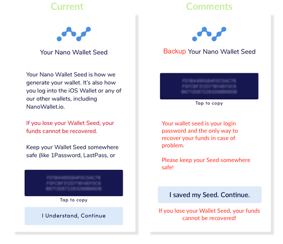 Nano Wallet — Backup Seed and Create Wallet
- This screen is very rich in text, not sure users will read it. I hope they will… No seed, no funds (no funds, no party) in case you lose your phone or encounter some kind of problems with your wallet. I reckon the copy can be shortened and optimised though.
- The title would be more contextual if changed to along the line of “Backup your wallet seed”.
- I played around with the content structure (screen on the right) to see if it makes things easier to understand. You be the judge.
- We’re missing a bit of the text here, “[…] or print it out and put it in a safe.”
- The 2 minutes “Clipboard timeout” mentioned in the prompt is a great security feature. At this moment, the clipboard buffer contains very sensitive information — your seed — and there is no easy way to clear it on iOS; except by using a hack. You don’t want to unintentionally send your Wallet Seed to your girlfriend or boyfriend later on.
 Nano Wallet — Timed out Prompt
- The suggestion about using a password manager or printing your Wallet Seed in the message at the bottom of the prompt might sound redundant but it’s a very important safety step to take. I’d like to think that people are smart and responsible (I know, I live in a gummy bear world) but sometimes they need reminders. Repeating a call-to-action sometimes increases conversion.
- On the other hand, it’s quite risky to introduce 3rd party apps while on-boarding users, you don’t want to break the flow and make them download/signup on something and never come back on your app for some reason.
- There is a 2nd prompt asking the user for backup confirmation. Again, this might seem redundant in the eyes of some users but if you carry on without saving your seed you might lose your funds. That’s it. You can only blame yourself if this ever happen.
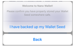 Nano Wallet Seed Backup — Confirmation Prompt
3. Home Wallet screen
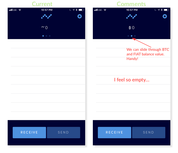
- On this screen, call-to-actions are in sight and I really feel like clicking on those “Receive” and “Send” buttons right away ; sending button is disabled as long as you don’t have funds, obviously.
- I noticed that the “Send” button stays disabled even when balance is positive sometimes...
 *Nano Wallet Home Screen - Call to Actions
- The empty state (i.e. no transactions) in the center could be filled with a copy and/or an illustration informing users that transactions will be shown there later on. Empty states can be used to educate and engage users during their “first-use”.
- Even when filled, the transactions list is a bit rough but for a beta version it‘s good enough. I would love to see dates and times of transactions somewhere though — maybe it’s just me.
- I don’t think the two icons do the job. To me, the grey colour makes it come across as transactions are pending. Grey is a neutral colour mostly used for de-emphasised elements (convention, not a rule). Reducing colour contrast with the bright blue used for the send transactions icon would fix that.
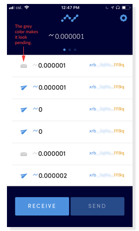 Nano Wallet — Transactions List
- There’s a space on the left side of the list and not on the right side. This messes up with my symmetry OCD.
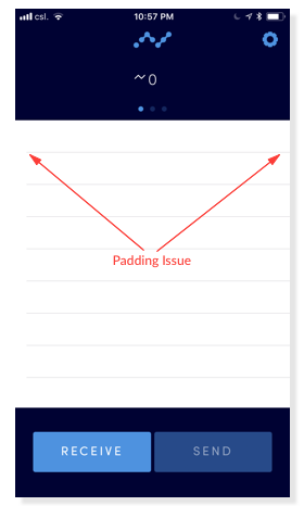 Nano Wallet — Home list padding issue
- In a later stage, consider adding animations and sounds for incoming and outgoing transactions. Audio signals and micro-interactions add emotional value to a product, it also helps users understand the environment and increases engagement.
4. Receive Nano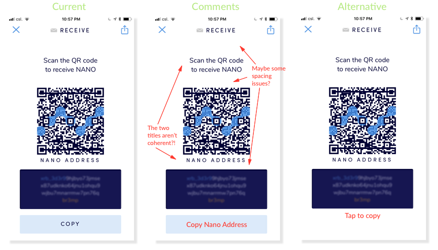 Nano Wallet — Receive Screen
- The title is straightforward and fits the context, the QR code is stylish with the Nano logo in it, quite different than the usual ones. Highlighting the start and the end of the XRB address is very smart as our brain is not good at remembering long lists of unrelated numbers. Emphasis through colour on a smaller part of the address will help us remember a piece of information. If you’re fearfully checking “receiving addresses” a hundred times when sending crypto, like I do. This is very handy!
- The “COPY” button could even be more contextual if changed to “Copy Nano Address”. We could also argue that this action is not inline with the previous copy actions (“tap to copy” on the Create Wallet screen, cf. #2). Consistency is key in user experience, users learn and remember how to interact with your app while discovering it, if there are different ways to accomplish similar actions, users get confused and feel less comfortable. I’ll bet that you’ll get taps on that address container.
- After clicking “COPY”, a prompt gives useful action feedback, I like that. Feedback is another important pillar of user experience as it conveys the results of an interaction.
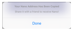 Nano Wallet — Address Copied Prompt
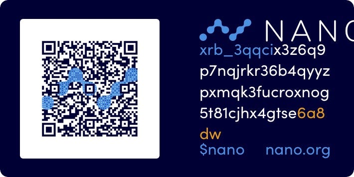
- When clicking on the sharing icon (top right) there’s an interesting sharing feature that generates a “Nano Name Card” (I just made that name up). It’s a great idea and I can’t wait to spam my friends. I’m not sure whether it makes sense to have the whole Nano address on here as you can’t select, copy and paste it. Maybe the QR code would be enough here? There’s a couple alignments issues on the image too — nothing alarming.
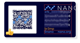 Nano Sharing Card5. Send Nano
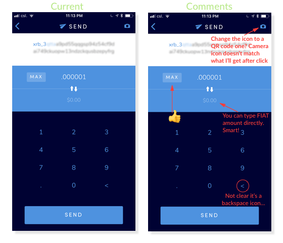 Nano Wallet — Send Screen
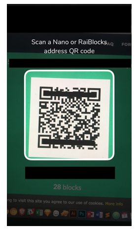
- On this screen you can manually input the receiving address on the top or use a QR code. I don’t think that the camera icon is the best icon to represent a QR-code-scanning action though. Maybe QR scan icon would be better?
- You can also manually type a Fiat amount to be sent, which will be very useful until cryptos take over the world and Fiat disappears (only a matter of years :p ).
- I have a doubt about the backspace button in the keyboard too, I’m not sure “<” is an accurate representation for a backspace action — anyway, this is very subjective. If your icon doesn’t show up in a Google search it’s not a good, usually.
- I tested the QR code reader and everything worked perfectly.
- There seems to be a little bug with the amount of Nano to be sent, in some cases the Touch ID prompt shows “Send 0 Nano?” even when I entered “.000001”. Looks like it’s only doing it with very small amounts though.I had to close and open the app a couple times before being able to send my .000001 Nano…
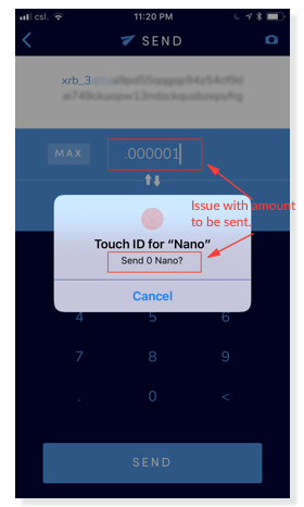 Nano Wallet — Amount Bug5. Other screens
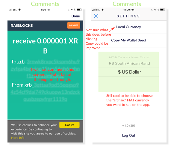 Nano Wallet — Transaction view (left) — Settings screen (right)
- Not much to say here, my comments are on the above screenshots. Only point, you get direct access to the explorer by clicking on a transaction from the wallet home screen.
Conclusion
Shilling alert!
I know this is not a tech review but I can’t help to say I am impressed with the speed at which the app is processing transactions! Try it yourself and you’ll see.
Also, as Nano transactions fees are inexistent, I made transactions back and forth for testing and kept my initial value. How cool is that? With other cryptocurrencies I would have got broke — and bored — after a couple transactions…
I hope my review will help the core team and the community grow.
- PM me on twitter if you want to get in touch.
- Here’s My Nano address if you think this was helpful: xrb_3qqcix3z6q9p7nqjrkr36b4qyyzpxmqk3fucroxnog5t81cjhx4gtse6a8dw
Nano (beta) iOS wallet — UX review was originally published in Hacker Noon on Medium, where people are continuing the conversation by highlighting and responding to this story.
Disclaimer
The views and opinions expressed in this article are solely those of the authors and do not reflect the views of Bitcoin Insider. Every investment and trading move involves risk - this is especially true for cryptocurrencies given their volatility. We strongly advise our readers to conduct their own research when making a decision.
